
A logo is more than just a graphic; it's the face of your brand. It serves as the first impression, the silent ambassador, and the visual cornerstone of your entire identity. But in a crowded marketplace, how do you create a mark that not only looks good but also tells your story, resonates with your audience, and stands the test of time? Generic solutions often fall flat, failing to capture the unique essence of a business.
This guide moves beyond the obvious to explore 10 distinct and powerful ideas for logo design. Before diving into specific styles, it's essential to consider the broader process of creating a comprehensive brand identity to ensure your logo aligns with your overall strategy.
Each concept below is broken down with actionable tips, real-world examples, and strategic insights to help you find the perfect direction for a truly memorable brand mark. Whether you are a startup founder, a small business owner, or a marketer, this list provides the creative foundation you need. From the strategic use of negative space to the timeless appeal of minimalist forms, let's explore the avenues that will define your brand’s visual future.
1. Minimalist and Simple Design
Minimalism is one of the most powerful and enduring ideas for logo design because it strips away all non-essential elements. This approach, guided by the "less is more" principle, focuses on clean lines, a limited color palette, and uncluttered composition. By concentrating on a single, core concept, a minimalist logo becomes instantly recognizable and highly memorable. Think of the Nike swoosh or the Apple icon; their power lies in their absolute simplicity.
Why Choose Minimalism?
A minimalist design excels in versatility. It scales effortlessly from a tiny app icon to a massive billboard without losing clarity or impact. This makes it ideal for modern brands, especially tech companies and startups that need a strong presence across countless digital and physical platforms. Its clean aesthetic also communicates professionalism, confidence, and efficiency. To explore this concept further, you can learn more about what minimalist logo design is.
How to Implement a Minimalist Logo
- Focus on a single story: Distill your brand's core message into one powerful visual element.
- Master negative space: Use the empty areas around your design to create secondary shapes or simply to give the main element room to breathe.
- Choose fonts carefully: Select a clean, legible typeface that complements the brand's personality, whether it's modern, elegant, or friendly.
- Test for versatility: Ensure your logo is just as effective in a single color (black and white) as it is in your full brand palette.
2. Typography-Based Logo (Wordmark)
A typography-based logo, often called a wordmark or logotype, is a powerful idea for logo design that puts the brand name front and center. Instead of relying on a separate symbol, the typography itself becomes the main visual identifier. This approach uses custom lettering, unique font choices, or artfully modified typefaces to craft a distinctive identity. Iconic examples like Coca-Cola's script, FedEx's clever wordmark, and Disney's whimsical signature prove that a name alone can be incredibly memorable and expressive.
Why Choose a Wordmark?
A wordmark is excellent for building name recognition, which is especially crucial for new businesses. It directly connects your company name with the visual identity, leaving no room for confusion. This style can convey sophistication, modernity, or tradition depending on the font, making it highly adaptable to a brand's personality. From the bold confidence of Netflix to the friendly, approachable look of Spotify, a wordmark communicates a brand’s essence through the power of letters alone.
How to Implement a Wordmark Logo
- Choose a font that reflects brand personality: Select a typeface that communicates your brand's core values, whether it's elegant, rugged, futuristic, or playful.
- Ensure excellent readability: The name must be legible at all sizes, from a small social media icon to a large sign. Test it extensively.
- Customize for uniqueness: Modify existing letterforms or commission custom lettering to create a truly one-of-a-kind logo that can be trademarked. If you want to dive deeper, you can learn more about how to make a typography logo.
- Pay attention to kerning: The spacing between individual letters is critical. Adjust it meticulously to create a balanced and professional look.
3. Geometric and Abstract Shapes
Geometric and abstract shapes are powerful ideas for logo design that use foundational forms like circles, squares, and polygons to create meaning. These designs rely on precision, symmetry, and the inherent psychological associations of shapes to build a brand identity. By moving away from literal representations, an abstract logo can convey complex ideas like unity, stability, or innovation in a universal visual language. Think of the interlocking circles of Mastercard or the iconic four rings of Audi; their strength lies in pure, memorable form.
Why Choose Geometric and Abstract Shapes?
An abstract or geometric logo is timeless and highly adaptable, making it an excellent choice for global brands, financial institutions, and tech companies. These designs transcend cultural and language barriers, communicating feelings of order, strength, and forward-thinking. Their structured nature ensures they remain clear and impactful across various applications, from a website favicon to large-scale signage. For a deeper understanding of this approach, you can learn more about what abstract logo design is.
How to Implement a Geometric or Abstract Logo
- Study shape psychology: Understand the meanings behind shapes. Circles can suggest community and unity, squares imply stability and trust, and triangles can represent power or direction.
- Use mathematical principles: Apply concepts like the golden ratio or grid systems to create a visually balanced and harmonious composition.
- Ensure distinction: Your abstract shape must be unique enough to be ownable and memorable, avoiding generic forms that could be confused with competitors.
- Test for recognition: Make sure the design is easily identifiable at various sizes and in different contexts, including as a single-color mark.
4. Symbolic and Iconic Representation
Symbolic representation is one of the most classic and powerful ideas for logo design, as it uses an icon or pictograph to convey a brand's essence through visual metaphor. This approach relies on recognizable symbols, either universal or newly created, to communicate meaning quickly and non-verbally. The goal is to create an icon that becomes synonymous with the company itself, much like the Twitter bird or the Shell scallop shell. These logos tap into cultural associations and shared understanding to build an immediate connection with the audience.
Why Choose Symbolic Representation?
A symbolic logo can transcend language barriers, making it an excellent choice for global brands or companies with diverse audiences. Because they rely on imagery, these logos are often highly memorable and foster strong brand recall. An effective symbol tells a story or represents a core value, such as the three-pointed star of Mercedes-Benz symbolizing dominance over land, sea, and air. This method is ideal for brands that want to communicate a big idea or abstract concept in a simple, tangible form.
How to Implement a Symbolic Logo
- Connect symbol to story: Ensure the icon you choose has a clear and logical link to your brand's mission, values, or origin.
- Prioritize simplicity and clarity: A strong symbol is easily recognizable even at small sizes or from a distance. Avoid overly complex illustrations.
- Research cultural meanings: A symbol can have different connotations across cultures. Verify that your chosen icon will be received positively in all target markets.
- Test for recognition: Show your draft symbol to members of your target audience without any brand context to see if they understand the intended message.
5. Vintage and Retro Aesthetic
A vintage or retro aesthetic is one of the most compelling ideas for logo design for brands that want to convey authenticity, craftsmanship, and a sense of history. This approach borrows from past design eras, using nostalgic typography, classic emblems, and weathered textures to create a feeling of timeless quality. It taps into our collective memory, building an emotional connection that suggests a brand is established and trustworthy. Think of the enduring logos of Levi's, Harley-Davidson, or Jack Daniel's; they all communicate heritage and reliability.
Why Choose a Vintage Aesthetic?
A retro-inspired logo is perfect for brands that value tradition, quality craftsmanship, or an artisanal approach. This includes businesses like breweries, coffee roasters, barbershops, and heritage apparel companies. The style immediately signals that the brand is not just a fleeting trend but is built on a foundation of quality and expertise. This nostalgic appeal can make a new company feel familiar and dependable, helping it stand out in a crowded market by evoking feelings of comfort and trust.
How to Implement a Vintage Logo
- Research specific eras: Identify a design period that aligns with your brand’s values, such as the Art Deco elegance of the 1920s or the bold simplicity of the 1960s.
- Use authentic typography: Select fonts inspired by the chosen era. Hand-lettered scripts, sturdy serifs, and classic sans-serifs work well.
- Incorporate classic elements: Use design motifs like badges, crests, ribbons, and illustrative linework to frame your logo.
- Apply subtle textures: Add a touch of authenticity with light distressing, faded colors, or grunge effects to mimic natural aging.
- Balance old with new: Ensure the design remains clean and legible enough for modern applications like websites and app icons.
6. Negative Space Utilization
Negative space is one of the most clever and sophisticated ideas for logo design, turning the empty areas in and around your design into a functional part of the mark itself. This technique creates a multi-layered visual that rewards viewers with an 'aha' moment of discovery. By embedding hidden symbols, letters, or shapes in the background, a logo becomes more engaging and memorable. The iconic FedEx logo, with its hidden arrow signifying speed and precision, is a masterclass in this approach.
Why Choose Negative Space?
A negative space logo communicates intelligence, creativity, and attention to detail. It invites interaction and creates a lasting impression because the viewer feels like they have discovered a secret. This makes it a powerful choice for brands that want to showcase ingenuity or a dual-purpose nature. Designs like the Baskin-Robbins logo, which cleverly incorporates the number "31" into its initials to represent its flavor variety, demonstrate how this technique can reinforce a core brand message in a subtle yet impactful way.
How to Implement a Negative Space Logo
- Start with a clear concept: Don't force a hidden element. Identify two simple concepts and explore how they might intersect.
- Prioritize clarity: The primary logo must be legible and stand on its own. The negative space element should be a bonus, not a requirement for understanding.
- Test at all sizes: Ensure the hidden detail is visible on a small business card but doesn't overpower the design on a large sign.
- Keep it relevant: The hidden symbol should connect directly to your brand's story, service, or values to maximize its impact.
This infographic provides a quick reference for the core considerations when working with negative space.
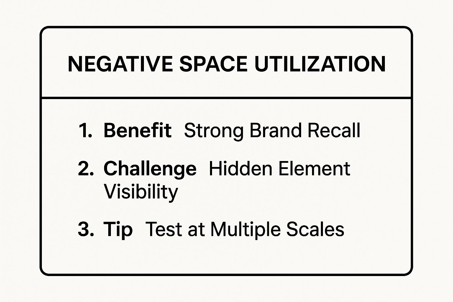
These key takeaways highlight the balance required: while the goal is strong brand recall, it hinges on making the hidden element visible enough without sacrificing the logo's overall clarity.
For a deeper dive into how designers craft these clever marks, the video below breaks down the process behind creating a dual-meaning logo using negative space.
7. Monogram and Initial-Based Design
Monogram logos are a classic and elegant idea for logo design, especially for brands with longer names or those founded by individuals. This approach uses the company's initials, combining two or more letters into a single, cohesive symbol. The result is a compact, memorable, and often sophisticated mark that acts as a shorthand for the brand. Iconic examples like the interlocked LV of Louis Vuitton or the stacked VW of Volkswagen demonstrate how initials can become powerful, standalone brand identifiers.
Why Choose a Monogram?
A monogram is an excellent choice for businesses with lengthy or difficult-to-pronounce names, as it simplifies the brand identity into an easily digestible visual. This style conveys a sense of heritage, legacy, and personalization, making it popular in fashion, automotive, and professional service industries. Because they are letter-based, these logos are extremely versatile and work well in various applications, from embroidered apparel to digital favicons, maintaining their clarity at any size.
How to Implement a Monogram Logo
- Prioritize legibility: Ensure that while the letters are stylized, they are still recognizable. The goal is a clever combination, not an abstract puzzle.
- Explore letter interaction: Experiment with how the initials can overlap, interlock, or share elements to create a unified and unique form.
- Ensure uniqueness: Research to make sure your initial combination doesn't closely resemble another well-known monogram, especially within your industry.
- Consider the full name: Design the monogram so it can be paired effectively with the full company name when needed, creating a consistent lockup.
8. Mascot and Character Design
Mascot and character design is a fantastic idea for a logo that aims to build a strong, emotional connection with an audience. This approach involves creating an illustrated character, animal, or personified object that acts as a brand ambassador. These characters embody the brand's personality, making the business feel more approachable, friendly, and memorable. Think of Mailchimp's cheerful chimpanzee, Freddie, or the trustworthy Michelin Man; they create a human-like bond that goes beyond a simple product or service.
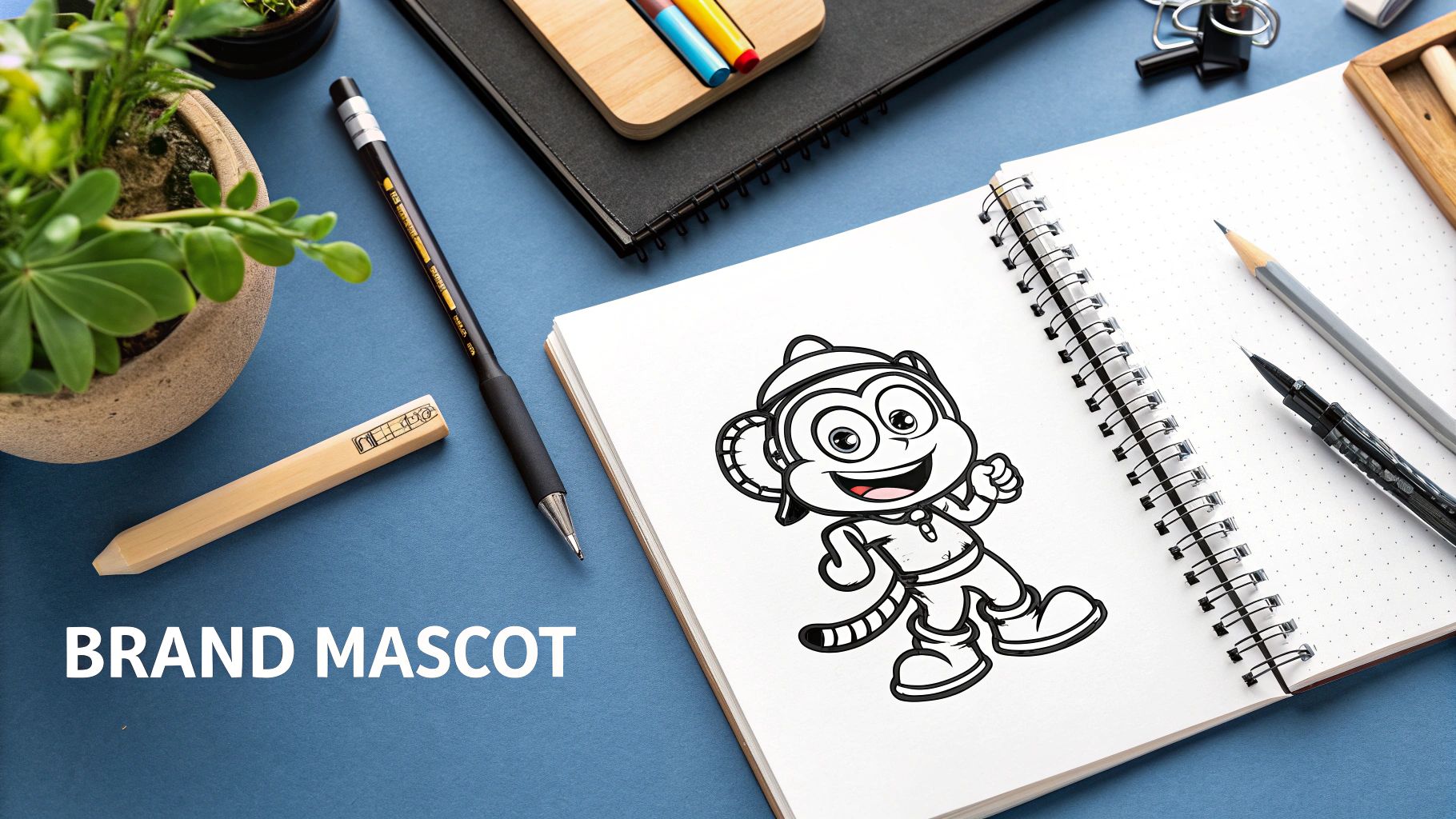
Why Choose a Mascot?
A mascot logo is exceptionally effective for brands targeting families, children, or those wanting to project a fun and engaging personality. These characters are highly versatile and can be adapted for various marketing campaigns, social media content, and merchandise, giving your brand a consistent and recognizable face. A well-designed mascot can tell a story, express emotions, and evolve with your brand over time, ensuring long-term relevance and appeal.
How to Implement a Mascot Logo
- Reflect brand values: Ensure the character's personality, from its expression to its attire, aligns perfectly with your core brand message.
- Design for versatility: Create the mascot in various poses and expressions to make it adaptable for different contexts and storytelling needs.
- Test your audience: Before finalizing the design, test its appeal with your target demographic to ensure it resonates positively.
- Consider long-term use: Think about how the character will age. A timeless design will prevent the need for a costly redesign down the line.
9. Industry-Specific Imagery
Incorporating industry-specific imagery is a straightforward and effective idea for logo design because it immediately communicates what your business does. This approach uses recognizable symbols, tools, or icons directly related to a company's field, creating an instant connection with the target audience. For a construction company, this could be a hammer or a hard hat; for a law firm, it might be the scales of justice. This clarity can be a significant advantage, as it removes ambiguity and builds immediate relevance.
Why Choose Industry-Specific Imagery?
This method is perfect for businesses that need to convey their core service quickly and clearly, such as local service providers or professional practices. A dental clinic using a tooth symbol or a café with a coffee cup logo instantly tells potential customers what to expect, making the brand easily identifiable. It builds trust by showing expertise and focus within a specific niche. This approach is particularly powerful for companies that rely on local search or storefront visibility, where quick recognition is key.
How to Implement an Industry-Specific Logo
- Avoid clichés through stylization: Instead of using a generic, overused image, stylize it to make it unique to your brand.
- Combine with other elements: Integrate the specific image with abstract shapes or a unique wordmark to create a more distinctive and modern logo.
- Research your competitors: Analyze what symbols are common in your industry and find a way to differentiate your design so it stands out.
- Ensure timelessness: Select imagery that will remain relevant and not become dated as your industry evolves over time.
10. Gradient and Color Transition Effects
Gradients introduce a dynamic and modern feel to logo design by blending multiple colors smoothly. This technique moves away from flat, single-color schemes, creating depth, dimension, and a sense of energy. The use of vibrant color transitions can make a logo feel more alive and engaging, a quality that resonates strongly in digital spaces. Well-known examples include the colorful Instagram camera icon and the overlapping circles of the Mastercard logo, both of which use gradients to create memorable and visually rich identities.
Why Choose Gradients?
A gradient-based logo is perfect for brands that want to communicate innovation, creativity, and modernity. It's an excellent choice for tech companies, digital apps, and creative agencies looking to stand out in a crowded market. The fluid nature of a gradient can symbolize concepts like transformation, connection, or a multi-faceted approach. This idea for logo design is particularly effective on screens, where lighting and high-resolution displays make the color transitions pop.
How to Implement a Gradient Logo
- Align with brand personality: Choose colors that reflect your brand’s values, whether they are energetic and bold or calm and sophisticated.
- Ensure print viability: Test how the gradient reproduces on physical materials like business cards or merchandise, as printing can sometimes alter the colors.
- Create a single-color version: Develop a simplified, one-color variant of your logo for situations where gradients are not practical, such as for favicons or embroidery.
- Check for accessibility: Make sure your color choices provide enough contrast for readability, considering users with various forms of color vision deficiency.
Top 10 Logo Design Ideas Comparison
Bringing Your Vision to Life
The journey through these diverse ideas for logo design reveals a fundamental truth: a great logo is more than just a pretty picture. It's a strategic business asset, a silent ambassador, and the visual cornerstone of your entire brand identity. We've explored a wide spectrum of concepts, from the elegant simplicity of minimalist designs and the directness of typography-based wordmarks to the cleverness of negative space and the nostalgic charm of retro aesthetics.
Each approach offers a unique pathway to connect with your audience. A geometric logo might communicate stability and precision, ideal for a tech company. A hand-drawn mascot can build an emotional, friendly connection, perfect for a consumer-facing brand. The key is not to simply pick a style you like, but to choose the one that most authentically tells your brand’s story and resonates with the people you want to reach.
From Idea to Impactful Reality
Transforming these concepts into a final, polished logo requires a thoughtful process. Your next steps should involve a focused effort to bridge the gap between initial inspiration and a market-ready design.
- Audit Your Brand: Revisit your brand’s core values, mission, and target audience. Which of the logo ideas we've discussed aligns most powerfully with these elements? Is your brand modern and innovative (gradients, geometric shapes) or timeless and trustworthy (monograms, minimalist icons)?
- Gather Inspiration: Create a mood board. Collect examples of logos you admire, paying close attention to the ones that use the techniques discussed, like symbolic representation or clever negative space. This will help you articulate your preferences to a designer.
- Sketch and Experiment: Don't be afraid to put pencil to paper. Even rough sketches can help you visualize how a concept might work. Try combining ideas. For instance, how could you use industry-specific imagery within a minimalist framework?
Leveraging Modern Tools and Expertise
As you move forward, remember that technology is a powerful ally in the creative process. For designers looking to leverage cutting-edge tools, understanding how to craft effective AI prompts can dramatically streamline the ideation process for your brand mark. Mastering the skill of writing effective AI prompts for text-to-image generation can help you quickly explore countless visual directions before committing to a final concept.
Ultimately, the best ideas for logo design are the ones that are executed with precision, clarity, and strategic intent. Your logo will appear on your website, your products, and your marketing materials, becoming the single most visible element of your business. Investing the time to get it right is not just a creative exercise; it’s a foundational step toward building a memorable and successful brand.
Ready to turn your vision into a professional logo that stands out? The expert designers at Softriver specialize in crafting custom brand identities with speed and precision, helping you choose and develop the perfect concept for your business. Explore our design packages and let's build your brand's future together.