
In today's competitive online space, a website is far more than just a digital brochure; it's your brand’s interactive storefront, your primary sales tool, and a crucial touchpoint for building customer trust. Getting the design right isn't merely about aesthetics; it's about engineering a high-performing asset that fuels business growth. Adhering to proven website design best practices is the bedrock for creating intuitive, accessible, and fast experiences that not only capture user attention but also convert visitors into loyal customers. A well-executed design directly impacts everything from user engagement to search engine rankings and, ultimately, your bottom line.
This guide moves beyond generic advice to provide a clear, actionable roundup of the 10 most essential practices you need to master. We will break down each principle, explaining why it matters and how to implement it effectively. You'll learn how to build a site that is visually appealing, functionally seamless, and strategically sound. For a comprehensive overview of strategies to ensure your website drives continuous growth, delve into these additional 10 Best Website Practices for Unstoppable Growth in 2025. Let's dive into the core components that transform a good website into a great one.
1. Mobile-First Responsive Design
A mobile-first approach is a non-negotiable component of modern website design best practices. Instead of designing for a large desktop screen and then trying to shrink everything to fit a phone, you start with the smallest screen first. This strategy forces you to prioritize the most critical content and features, ensuring a clean, focused, and high-performing experience for the majority of users who browse on mobile devices.

This approach directly addresses the reality that over 58% of global web traffic comes from mobile phones. Major brands like Airbnb have perfected this, offering a seamless booking process that feels natural on a small screen. By designing for mobile constraints first, you ensure your site is fast and easy to navigate for every user, which is also a key factor for Google's mobile-first indexing and your overall SEO performance.
How to Implement Mobile-First Design
To adopt this methodology, focus on a content-centric design that scales up. Start with a single-column layout for mobile and progressively enhance it for larger screens using modern CSS techniques.
- Use Flexible Layouts: Implement CSS Grid and Flexbox to create fluid layouts that adapt to different screen sizes without breaking.
- Set Strategic Breakpoints: While not rigid rules, common breakpoints for responsive design are 320px (small mobile), 768px (tablets), and 1024px (laptops).
- Optimize Your Images: Use the
<picture>element and thesrcsetattribute to serve different image sizes based on the user's screen resolution and device. - Test on Real Devices: Browser developer tools are great, but nothing beats testing on actual iPhones, Androids, and tablets to catch device-specific quirks.
By prioritizing mobile, you build a foundation that is inherently more accessible, performant, and user-friendly across all platforms.
2. Fast Loading Speed Optimization
In today's fast-paced digital world, users expect instant access to information, making fast loading speed a critical website design best practice. Your site should ideally load in under three seconds. Anything longer risks frustrating visitors and increasing bounce rates. A mere one-second delay in page response can result in a 7% reduction in conversions, directly impacting your bottom line and user satisfaction.

This principle is proven by major tech companies. Amazon found that every 100ms improvement in load time boosted revenue by 1%, while Pinterest saw a 15% increase in sign-ups after cutting wait times by 40%. These examples underscore that page speed isn't just a technical metric; it's a core component of the user experience that influences engagement, conversions, and search engine rankings, especially with Google's focus on Core Web Vitals. Optimizing your site's performance ensures visitors stay engaged, a key element of effective landing page design.
How to Implement Speed Optimization
Start by analyzing your site's performance with free tools like Google PageSpeed Insights and GTmetrix to identify specific bottlenecks. From there, focus on technical and on-page optimizations.
- Compress Your Images: Use modern formats like WebP and tools like TinyPNG to significantly reduce image file sizes without losing quality.
- Minimize Code: Minify your CSS, JavaScript, and HTML files to remove unnecessary characters and reduce their overall size.
- Leverage Browser Caching: Configure your server to store static files in a user's browser, so they don't have to be re-downloaded on subsequent visits.
- Eliminate Render-Blocking Resources: Defer the loading of non-critical CSS and JavaScript to ensure the main content appears as quickly as possible. To achieve optimal performance and enhance user experience, delve deeper into specific WordPress site speed optimization tips.
By prioritizing speed, you create a seamless and professional experience that keeps users on your site and encourages them to convert.
3. Intuitive Navigation Structure
An intuitive navigation structure is a cornerstone of effective website design best practices, acting as the primary roadmap for your users. If visitors can't find what they're looking for quickly, they'll leave. A logical, predictable navigation system reduces cognitive load, allowing users to move through your site effortlessly and find information without having to think about how to do it.
This principle, famously championed by Steve Krug in Don't Make Me Think, directly impacts user satisfaction and conversion rates. Brands like Apple excel at this with a minimalist main menu that uses clear, universal terms. By organizing content in a way that aligns with user expectations, you build trust and ensure visitors can accomplish their goals, whether it's finding a product, a service, or contact information. A confusing navigation is one of the fastest ways to lose a potential customer.
How to Implement an Intuitive Navigation
To build a user-friendly navigation system, prioritize clarity and simplicity over creativity. Your goal is to make the user’s journey as seamless as possible.
- Limit Main Menu Items: Stick to a maximum of 5-7 top-level navigation items to avoid overwhelming users with too many choices.
- Use Familiar Terminology: Use clear and descriptive labels like "Services" or "Contact" instead of vague or creative terms that might confuse visitors.
- Provide Visual Cues: Clearly indicate the user's current location within the site, often by highlighting the active menu item.
- Include a Search Bar: For content-heavy sites, a prominent search bar is essential for helping users find specific information quickly.
- Follow the Three-Click Rule: Aim to make it possible for users to find any critical information on your site within three clicks from the homepage.
By following these guidelines, you create a structured, predictable experience that enhances usability and keeps users engaged.
4. Accessibility Compliance (WCAG Standards)
Designing for accessibility means creating a website that is usable by everyone, including people with visual, auditory, motor, or cognitive disabilities. Adhering to the Web Content Accessibility Guidelines (WCAG) 2.1 AA standards is a core website design best practice that ensures equal access to information and functionality. This isn't just a legal or ethical requirement; it improves the overall user experience for all visitors.

When you make your site accessible, you create a more robust and flexible user experience that benefits everyone, from users on slow internet connections to those with temporary impairments. Major organizations like Microsoft and the BBC have championed this approach, integrating inclusive design into their products and content. This commitment not only widens their audience but also enhances their brand reputation and SEO, as search engines favor well-structured, accessible content.
How to Implement Accessibility Standards
To ensure your website is compliant, you must proactively test and build with accessibility in mind from the very beginning of the design process. This involves both automated checks and manual testing to catch nuanced issues.
- Check Color Contrast: Ensure text has a minimum color contrast ratio of 4.5:1 against its background to be readable for users with low vision.
- Implement ARIA Roles: Use Accessible Rich Internet Applications (ARIA) labels and roles to provide context for screen readers on dynamic content and interactive elements.
- Ensure Keyboard Navigation: All interactive elements, including links, buttons, and form fields, must be fully operable using only a keyboard.
- Provide Text Alternatives: Add descriptive alt text to all meaningful images and provide captions or transcripts for video and audio content.
- Use Testing Tools: Regularly test your site with tools like WAVE or axe to identify and fix accessibility errors, and test with screen readers like NVDA or JAWS.
By embedding these practices into your workflow, you create an equitable digital experience that serves the widest possible audience.
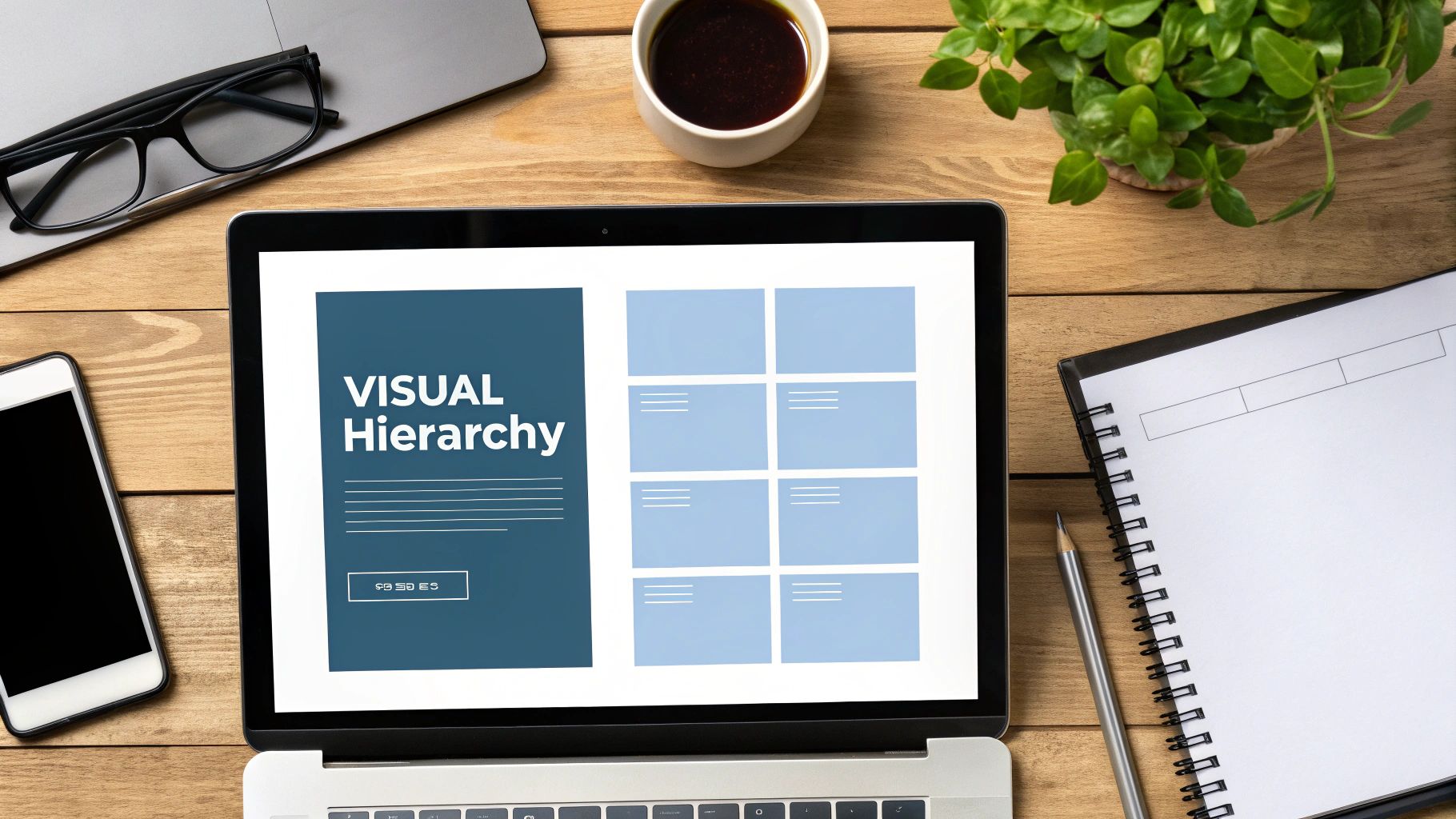
5. Clean Visual Hierarchy
A clean visual hierarchy is the art of strategically arranging elements to guide the user's eye through your content in a natural and intuitive way. This foundational website design best practice uses principles like size, color, contrast, and spacing to signal importance. It ensures that visitors can quickly scan a page and understand the most critical information without feeling overwhelmed.
This principle is about creating a clear path for the user’s attention, making your interface easy to digest and navigate. Platforms like Notion master this by using distinct headings, subtle color differences, and consistent spacing to separate content blocks, allowing users to find what they need instantly. A strong hierarchy reduces cognitive load, leading to a more pleasant user experience and higher engagement rates.
How to Implement a Clean Visual Hierarchy
To build an effective hierarchy, you need to make deliberate choices about how you present every element on the page, from headlines to call-to-action buttons.
- Establish a Clear Type Scale: Use a consistent typographic scale (e.g., a 1.25x ratio) to differentiate headings (H1, H2, H3) from body text, creating an immediate sense of order.
- Leverage Color and Contrast: Use a primary action color for the most important buttons and links. High contrast makes these elements stand out and draws the user's eye.
- Utilize Negative Space: Generous spacing around elements (whitespace) helps group related items and separates unrelated ones, decluttering the layout and improving readability.
- Follow Reading Patterns: Design your layouts to align with common scanning behaviors like the F-pattern (for text-heavy pages) or the Z-pattern (for simpler, visual pages).
By mastering visual hierarchy, you create a design that not only looks organized but also communicates its message more effectively.
6. User-Centered Design Approach
A user-centered design approach is a core website design best practice that places the user at the heart of the entire development process. Instead of designing a site based on assumptions or aesthetics alone, this methodology focuses on understanding user needs, behaviors, and goals through research and testing. This ensures the final product is not only beautiful but also intuitive, effective, and genuinely helpful to its intended audience.
This philosophy is about creating an experience that feels tailor-made for the user. Think of Duolingo’s gamified lessons that keep learners engaged or Spotify's personalized discovery features that make finding new music effortless. These platforms succeed because they are built around deep insights into what their users actually want and need. Adopting this approach reduces user frustration, increases engagement, and builds brand loyalty by demonstrating that you value your audience's experience.
How to Implement a User-Centered Design Approach
To integrate this methodology, you must involve users at every stage, from initial concept to post-launch updates. The goal is to build empathy and validate design decisions with real data.
- Conduct User Research: Start by conducting interviews, surveys, and competitive analysis to understand your audience’s pain points and motivations before you even begin designing.
- Create Detailed Personas: Develop user personas based on your research. These fictional characters represent your key audience segments and help keep the team focused on user goals.
- Prototype and Test: Build interactive prototypes (from low-fidelity wireframes to high-fidelity mockups) and test them with actual users to gather feedback early and often.
- Analyze User Behavior: Use tools like heatmaps and session recordings on your live site to see how people are actually interacting with it, then iterate based on those insights.
By consistently prioritizing user feedback, you create a website that not only meets business objectives but also delivers exceptional value to your visitors. You can get a deeper look into the methodology with this guide to the design thinking process on softriver.co.
7. Search Engine Optimization (SEO) Integration
Search Engine Optimization isn't just about keywords; it's a foundational element of effective website design best practices. SEO integration means building your site from the ground up with search engine visibility in mind. This involves weaving technical structure, content presentation, and user experience together to help search engines like Google understand, crawl, and rank your pages effectively.
A site designed for SEO is inherently user-friendly. Companies like HubSpot exemplify this by creating resource hubs that are both incredibly valuable to users and perfectly optimized for search. To ensure your website is easily discoverable and provides a seamless user experience, consider the importance of building a winning website structure for SEO. This strategic approach ensures every design decision supports your goal of attracting organic traffic.
How to Implement SEO Integration
Incorporate SEO principles early in the design and development phases, not as an afterthought. This ensures your site’s architecture and content are primed for performance from day one.
- Implement Structured Data Markup: Use schema markup to help search engines understand your content and generate rich snippets, like reviews or FAQs, in search results.
- Focus on E-A-T: Design your site to signal Expertise, Authoritativeness, and Trustworthiness. This includes clear author bios, citations, and easy-to-find contact information.
- Create Logical URL Structures: Use simple, descriptive URLs that include target keywords (e.g.,
yourdomain.com/services/web-design). - Build an Internal Linking Strategy: Strategically link between relevant pages on your site to distribute page authority and help users and search engines navigate your content.
By embedding SEO into your design process, you create a powerful asset that continually attracts and engages your target audience.
8. Consistent Brand Identity
A consistent brand identity is a fundamental pillar of effective website design best practices. It involves the systematic application of your brand's core elements, such as colors, typography, imagery, and tone of voice, across every page and interaction. This cohesion doesn't just make your site look professional; it builds familiarity and trust, making your brand instantly recognizable and memorable to visitors.
When users encounter consistent visual cues, they can navigate more intuitively and feel more secure. Brands like Coca-Cola, with its iconic red and script font, or Apple, with its minimalist aesthetic, demonstrate the power of this principle. Consistency transforms your website from a collection of pages into a unified brand experience, reinforcing your value proposition at every click and fostering long-term customer loyalty.
How to Implement a Consistent Brand Identity
The key to consistency is creating a single source of truth for all design decisions. This ensures that every element, from a button to a hero image, aligns with your brand's overarching identity and goals.
- Develop a Style Guide: Create a comprehensive brand style guide that documents official colors (with hex codes), typography, logo usage, and voice. Learn more about creating brand guidelines on softriver.co.
- Use Reusable Components: Build a library of reusable design components and templates for buttons, forms, and layout modules. This ensures visual and functional consistency across the site.
- Maintain Visual Patterns: Apply consistent spacing, layout grids, and visual hierarchy rules to create a predictable and harmonious user experience.
- Conduct Regular Audits: Periodically review your website to identify and correct any inconsistencies that may have emerged over time, ensuring your brand presentation remains flawless.
By enforcing brand consistency, you create a powerful, trustworthy digital presence that resonates with your audience and strengthens your market position.
9. Security and Privacy Protection
Integrating robust security measures and transparent privacy policies is a fundamental aspect of modern website design best practices. It's not just about protecting your business; it’s about building trust with your users by safeguarding their data from cyber threats and respecting their right to privacy. This approach involves implementing both technical defenses and clear, user-friendly privacy disclosures.
This practice is essential for complying with regulations like GDPR and CCPA and for earning user confidence. Companies like ProtonMail and DuckDuckGo have built their entire brands around privacy-first principles, demonstrating that a strong commitment to security can be a powerful market differentiator. A secure website reassures visitors that their personal and financial information is safe, encouraging higher engagement and conversion rates while protecting your brand's reputation.
How to Implement Security and Privacy
A proactive approach to security starts from the first line of code and extends to your hosting environment and user policies. Focus on creating multiple layers of defense and being transparent with your users.
- Always Use HTTPS: Secure your site with an SSL certificate to encrypt data transmitted between the user's browser and your server. This is a baseline requirement.
- Implement Strong Security Headers: Use headers like Content Security Policy (CSP) to prevent common attacks such as cross-site scripting (XSS).
- Provide a Clear Privacy Policy: Write a privacy policy that is easy to understand, outlining what data you collect, why you collect it, and how users can control it.
- Plan for Backups and Recovery: Regularly back up your website's data and have a clear disaster recovery plan in place to quickly restore service after an incident.
By embedding security and privacy into your design process, you create a safer, more trustworthy online environment for everyone.
10. Content-First Design Strategy
A content-first design strategy is an essential approach in modern website design best practices that puts your message at the center of the process. Instead of creating a beautiful visual container and then forcing content into it, you start with the actual substance: the text, images, and data. This methodology ensures the design perfectly serves the content, making it more effective, engaging, and valuable to the user.
This approach prevents the common problem where real content breaks a meticulously crafted design that was built using placeholder text. Companies like Basecamp master this by designing their pages around clear, concise explanations of their product features. By letting the content dictate the layout, you ensure the user’s goals are met efficiently, which also leads to stronger SEO outcomes as the design naturally supports the core information search engines are looking to index.
How to Implement a Content-First Strategy
To adopt this strategy, your team must prioritize content creation and auditing before a single pixel is designed. The goal is to build a flexible framework that supports the message, not constrains it.
- Audit and Structure Content First: Before starting the design phase, perform a thorough audit of existing content and define the structure and hierarchy for new content.
- Use Real Content, Not Lorem Ipsum: Design mockups and prototypes using the actual copy, headlines, and images that will be on the live site to identify potential layout issues early.
- Design Flexible Components: Create adaptable design systems and components that can accommodate varying lengths of text and different image aspect ratios without breaking the visual integrity.
- Develop a Content Style Guide: Establish clear guidelines for tone of voice, grammar, and formatting to ensure consistency and quality across the entire website.
By prioritizing your content, you create a website that is not just visually appealing but also fundamentally useful and user-centric.
Website Design Best Practices Comparison
Build a Future-Proof Foundation for Your Brand
Navigating the landscape of modern digital design can feel complex, but the journey to creating an exceptional website is built on a solid foundation of proven principles. Throughout this guide, we've explored ten critical pillars, from the non-negotiable standard of mobile-first responsiveness to the trust-building necessity of robust security and privacy protection. Each of these website design best practices works in harmony, forming a powerful ecosystem that serves one primary goal: delivering a seamless, valuable, and memorable experience to your audience.
The core message is that effective web design is not just about aesthetics; it is a strategic function of your business. It’s about understanding user behavior, anticipating needs, and removing friction at every turn. A fast-loading, accessible, and intuitively structured site doesn't just look professional, it respects your visitor’s time and demonstrates a commitment to inclusivity. This respect is the very cornerstone of brand loyalty.
Turning Principles into Practice
Mastering these concepts requires a shift in perspective. Instead of viewing your website as a static digital brochure, think of it as a dynamic, living asset that evolves with your audience and your business goals. The most successful brands treat their digital presence as an ongoing conversation with their customers. This means that embracing a content-first strategy, maintaining a consistent brand identity, and integrating SEO from the ground up are not one-time tasks but continuous processes.
The ultimate value in applying these website design best practices is building a resilient, future-proof digital foundation. A well-designed website will:
- Build Credibility and Trust: A professional, secure, and user-friendly site signals to visitors that you are a legitimate and trustworthy business.
- Drive Conversions: By simplifying the user journey and creating clear calls-to-action, you guide visitors toward becoming customers.
- Enhance Brand Recall: Consistent branding and a positive user experience make your brand more memorable in a crowded marketplace.
- Improve Search Engine Visibility: A technically sound, fast, and accessible website is favored by search engines, helping you attract more organic traffic.
As you move forward, the most actionable step you can take is to audit your current digital presence against the principles we've discussed. Identify the areas with the most significant gaps, prioritize them based on their potential impact on your users, and create a clear roadmap for improvement. Whether you're a startup founder launching your first site or a seasoned business owner looking to optimize, a deliberate and user-centered approach will always yield the greatest returns. Great design is an investment that pays dividends long into the future, creating a powerful engine for growth and a lasting legacy for your brand.
Ready to implement these best practices without the complexity? Softriver specializes in crafting professional, market-aligned brand identities and websites tailored for startups, small businesses, and tech companies. Let us build your future-proof digital foundation so you can focus on growing your business. Learn more at Softriver.