
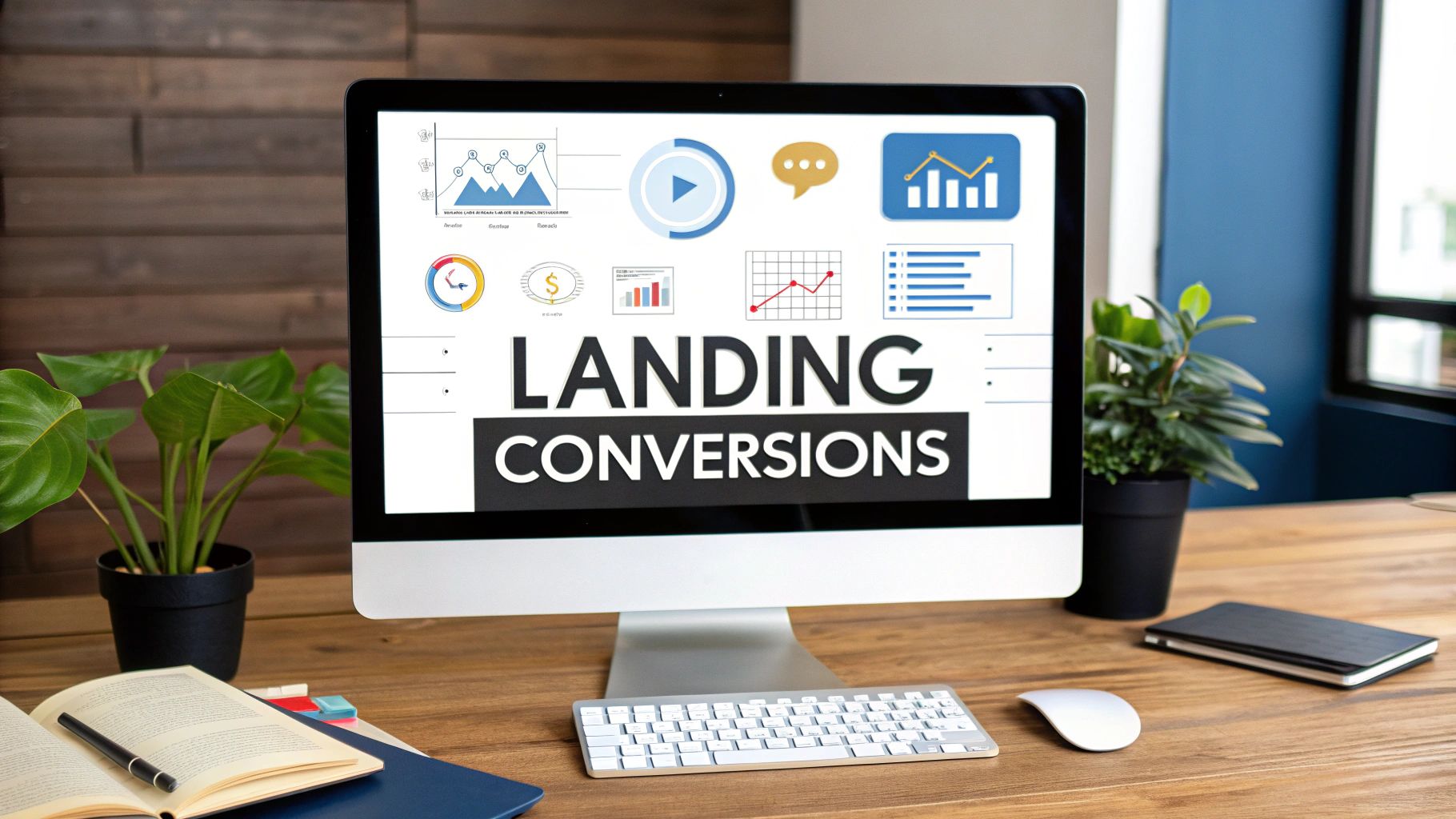
A great product or service deserves a landing page that converts. Yet, many businesses see high traffic but low conversions, leaving them wondering where the disconnect is. The gap between a curious visitor and a committed customer is often bridged by strategic design—not just aesthetics, but a carefully engineered user experience designed for a single, focused goal. This guide moves beyond generic advice to provide a deep dive into the most critical landing page design best practices that high-performing companies use to turn clicks into customers.
To truly understand why your landing page might not be performing, delving into the fundamental principles of conversion optimisation basics is essential. A well-designed page isn't about luck; it's about applying proven psychological and user experience principles that guide users toward a desired action. This article breaks down these principles into actionable, high-impact strategies.
We will explore the specific tactics behind creating a powerful value proposition, the importance of a single call-to-action, and why a mobile-first approach is non-negotiable. Furthermore, we'll cover how to leverage social proof, optimize for lightning-fast load times, and simplify forms to reduce friction. Each point is designed to be a practical, step-by-step instruction, complete with examples, that you can implement immediately. Whether you're a startup founder, an e-commerce entrepreneur, or a seasoned marketer, these insights provide a clear roadmap to building landing pages that don't just look good, but deliver measurable results and drive business growth.
1. Clear and Compelling Value Proposition
A visitor lands on your page and immediately asks, "What's in it for me?" Your value proposition is the answer. It's a clear, concise promise of the value a customer will receive from your product or service. This isn't just a slogan; it's the core reason someone should choose you over a competitor, making it one of the most critical landing page design best practices to get right.
It must instantly communicate three things: how your product solves a customer's problem, the specific benefits it delivers, and what makes it unique. If a visitor can't understand this within five seconds, they're likely to leave. A strong value proposition grabs attention and persuades users to stay and learn more.

How to Implement an Effective Value Proposition
The most common and effective structure is a combination of a headline, a subheadline, and supporting visuals or bullet points.
- The Headline: This should be a single, powerful sentence that grabs attention and states the primary benefit. Think of Slack’s classic "Be more productive at work with less effort." It directly addresses a pain point and a desired outcome.
- The Subheadline: A 2-3 sentence paragraph that expands on the headline. It can explain what you do, who it's for, and why it's useful.
- Bullet Points: List 3-5 key benefits or features that support your main claim. This makes the information easy to scan and digest.
Actionable Tips for Success
To ensure your value proposition hits the mark, focus on clarity and customer-centric language. Avoid internal jargon or technical specs that your audience won't understand.
Key Insight: A great value proposition uses the customer's own language to describe their problems and your solution. It should feel like you're reading their mind.
Test different versions to see what resonates most with your audience. A/B testing headlines and subheadlines can reveal surprising insights into what your customers truly value. A well-crafted value proposition forms the foundation of a high-converting landing page. To dive deeper into this topic, explore our comprehensive guide on how to create an effective value proposition and master this essential element.
2. Single Call-to-Action (CTA) Focus
Once a visitor understands your value proposition, what should they do next? A landing page must provide a single, clear answer to this question. The principle of a single call-to-action (CTA) is to eliminate distractions and guide visitors toward one specific goal, preventing the decision paralysis that kills conversions. This is a fundamental aspect of effective landing page design best practices because it creates a frictionless path for the user.
Presenting too many choices, like links to social media, blog posts, or multiple offers, dilutes the primary message and confuses the user. A focused landing page has one job, whether it's to generate a lead, sell a product, or schedule a demo. By removing competing actions, you channel all the visitor's attention toward the one action you want them to take, significantly increasing the likelihood they will complete it.

How to Implement a Focused CTA
The goal is to make your CTA the most obvious and compelling element on the page. Its design, copy, and placement all work together to draw the user's eye and encourage a click.
- The Button Design: Your CTA button should stand out visually. Use a contrasting color that pops against the background, like orange, green, or red, and make it large enough to be easily clickable on any device.
- The Action-Oriented Copy: The text on your button should be a clear command that communicates value. Use action verbs like "Get," "Start," "Download," or "Try" followed by the specific benefit, such as "Start Your Free Trial" or "Get Your Free Quote."
- The Strategic Placement: Place your primary CTA "above the fold" so it's visible without scrolling. For longer pages, it’s effective to repeat the CTA button at logical intervals, such as after a key feature section or at the very bottom of the page.
Actionable Tips for Success
To maximize your CTA's effectiveness, treat it as the culmination of your page's persuasive efforts. The entire page should build momentum toward this final, decisive click.
Key Insight: Every element on your landing page, from the headline to the images, should support the call-to-action. If an element doesn't help persuade a visitor to click the CTA, it's a distraction and should be removed.
Never stop testing. Small changes to your CTA's color, copy, or placement can have a dramatic impact on conversion rates. A/B test different variations to discover what truly motivates your audience to act. This commitment to optimization, pioneered by platforms like Unbounce, is what separates a good landing page from a great one.
3. Mobile-First Responsive Design
More than half of all web traffic now comes from mobile devices. This means designing for a desktop computer first and then shrinking it down for a phone is no longer effective. Mobile-first design flips this approach: you design for the smallest screen first and then adapt the layout for larger devices like tablets and desktops. This strategy is one of the most crucial landing page design best practices because it forces you to prioritize essential content and create a seamless user experience where most of your audience lives.
By starting with the most constrained environment, you ensure that your core message, call-to-action, and key features are clear and accessible. It results in a faster, cleaner, and more focused experience on all devices, which is critical for holding a user's attention and driving conversions. Think of Airbnb's streamlined mobile booking flow or Amazon's one-click mobile purchasing; these experiences are successful because they were built with mobile users in mind from the ground up.

How to Implement a Mobile-First Design
Adopting a mobile-first approach means making deliberate choices about content hierarchy and functionality early in the design process. It’s not just about aesthetics; it’s about performance and usability.
- Prioritize Content: On a small screen, you only have room for what truly matters. Identify your primary value proposition and call-to-action, and make them the star of the show.
- Design for Touch: Ensure buttons, links, and form fields are large enough to be easily tapped with a thumb. Add ample spacing between interactive elements to prevent accidental clicks.
- Optimize for Speed: Mobile users expect fast loading times. Compress images, minify code, and leverage browser caching to ensure your page loads almost instantly, even on weaker connections.
Actionable Tips for Success
To truly excel at mobile-first design, you need to go beyond simply resizing elements. The goal is to create an experience that feels native to the mobile environment.
Key Insight: Mobile-first isn't just a design trend; it's a strategic necessity aligned with user behavior and search engine priorities, like Google's mobile-first indexing.
Focus on a single-column layout for easy scrolling, use legible font sizes (at least 16px for body text), and keep forms as short as possible. Always test your landing page on actual mobile devices, not just browser simulators, to catch real-world usability issues. For a deeper understanding of responsive principles, see Luke Wroblewski's foundational book, Mobile First.
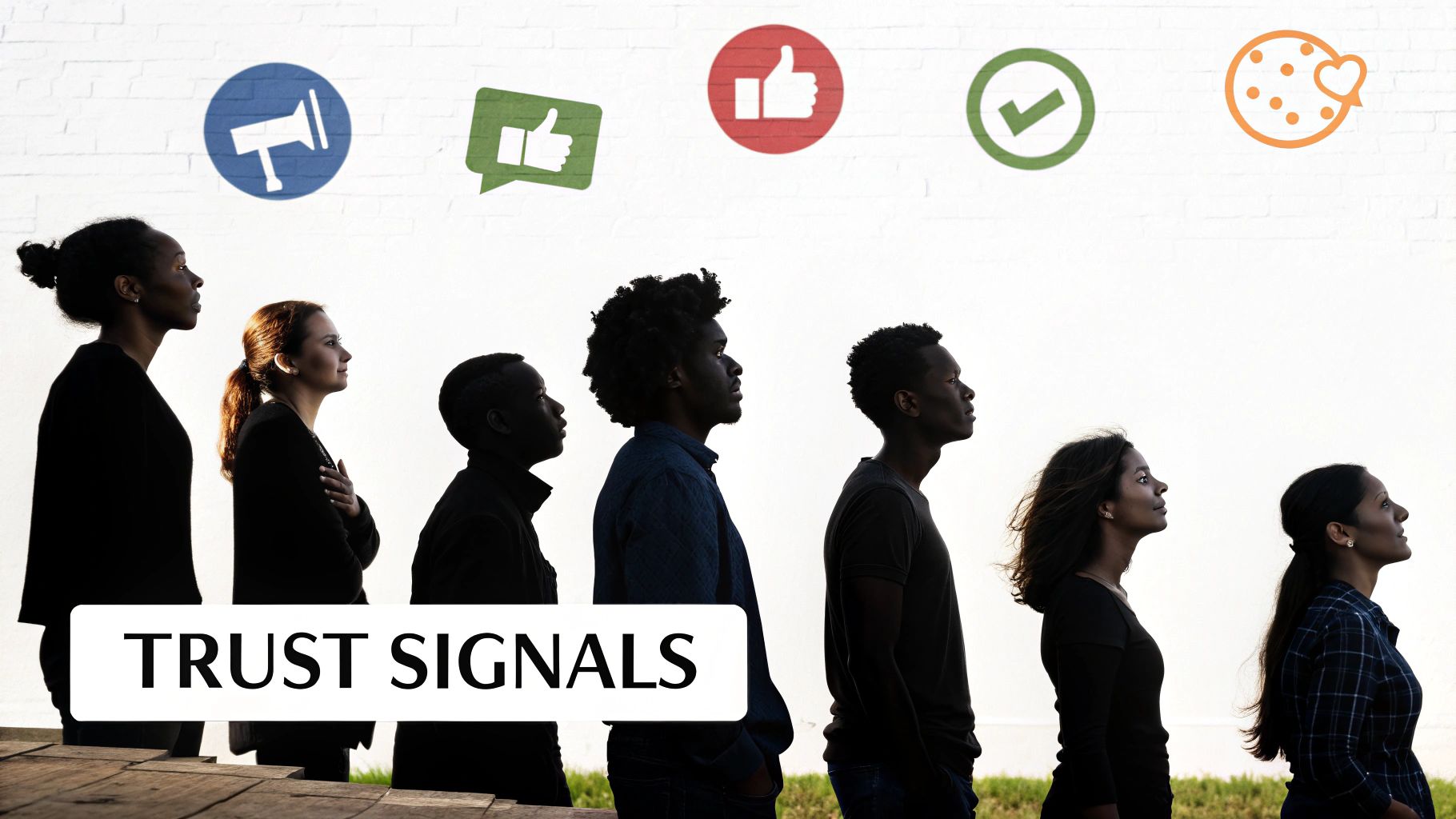
4. Social Proof and Trust Signals
When a visitor lands on your page, they are often skeptical. They wonder, "Can I trust this company?" Social proof is the answer. It’s the use of third-party influence to build credibility and reduce visitor anxiety. By showing that other people trust and value your product, you leverage a powerful psychological principle: people follow the actions of others, especially when uncertain. This makes incorporating trust signals one of the most effective landing page design best practices.
Social proof acts as a powerful endorsement, assuring new visitors that they are making a safe choice. Elements like customer testimonials, client logos, case studies, and industry awards all work to alleviate doubt and build confidence. When potential customers see that others, especially people or businesses they admire, have had a positive experience, it significantly lowers the barrier to conversion.
How to Implement Effective Social Proof
Strategically placing different types of social proof across your landing page can build a compelling case for your offering. The key is to make it authentic and relevant to your target audience.
- Testimonials and Reviews: Showcase quotes from happy customers. For maximum impact, include their name, company, and a photo. Basecamp does this brilliantly by featuring detailed customer stories that highlight specific results.
- Client Logos: Displaying the logos of well-known companies you've worked with acts as an instant credibility booster. This is a common practice for B2B companies like Zoom, which showcases its impressive list of enterprise clients.
- Case Studies and Data: Use specific numbers and success stories to demonstrate value. Shopify excels at this by prominently featuring merchant success stories backed by real data on growth and revenue.
Actionable Tips for Success
To make your social proof compelling, focus on specificity and authenticity. Generic praise is easily ignored, but detailed, relatable stories can be incredibly persuasive.
Key Insight: The most powerful social proof is specific. Instead of "Great service!", a testimonial like "Their tool helped us increase leads by 45% in just three months" provides concrete, believable value.
Place trust signals near key conversion points, like your call-to-action button, to overcome last-minute hesitation. Consider using video testimonials for a more dynamic and impactful effect. To master the art of building confidence with your audience, discover more about proven strategies for building customer trust and turn skepticism into conversions.
5. Fast Loading Speed Optimization
In the digital world, every second counts. A visitor lands on your page, and the clock starts ticking. If your page doesn't load almost instantly, they're gone. Fast loading speed is the practice of optimizing every element on your landing page to ensure it loads in three seconds or less. This isn't just a technical nicety; it's a foundational component of landing page design best practices that directly impacts user experience, bounce rates, and, most importantly, conversions.
Even a one-second delay can lead to a 7% reduction in conversions, an 11% drop in page views, and a 16% decrease in customer satisfaction. Major companies have built their success on this principle; Amazon famously found that every 100 milliseconds of improved speed translated to a 1% increase in revenue. If your page is slow, visitors assume it’s untrustworthy or broken, and they won't wait around to find out.
How to Implement Fast Loading Speeds
Optimizing for speed involves a multi-faceted approach, focusing on reducing the total size of your page and the number of requests the browser has to make. The goal is to deliver a seamless experience, especially for mobile users.
- Image and Media Compression: Large, unoptimized images are the most common cause of slow pages. Use modern formats like WebP and compress all images without sacrificing too much quality.
- Code Minification: Remove unnecessary characters, comments, and spaces from your HTML, CSS, and JavaScript files to reduce their size.
- Leverage Browser Caching: Instruct browsers to store static files (like your logo, CSS, and JavaScript) locally. This means return visitors will experience much faster load times.
- Use a Content Delivery Network (CDN): A CDN distributes your page's assets across a global network of servers. When a user visits, content is delivered from the server closest to them, dramatically reducing latency.
Actionable Tips for Success
To keep your landing page swift and responsive, regularly monitor its performance and proactively trim any digital fat. Use free tools like Google PageSpeed Insights or GTmetrix to analyze your page and get specific recommendations.
Key Insight: Speed optimization isn't a one-time task but an ongoing process. As you add content or features, always consider the performance impact. A fast, lightweight page shows respect for your visitor's time.
Focus on minimizing HTTP requests by combining CSS and JavaScript files where possible and removing any non-essential plugins or third-party scripts. To ensure your landing page loads quickly, delve into further strategies to improve website speed and build a foundation for a high-converting user experience.
6. Simplified and Optimized Forms
Your form is the final gateway between a visitor and a conversion. If it's long, confusing, or intimidating, users will abandon it, no matter how compelling your offer is. Simplified and optimized forms are about removing every possible point of friction, asking only for essential information, and making the completion process feel effortless. This is one of the most impactful landing page design best practices because it directly affects your conversion rate.
The core principle is that every additional field you ask a user to fill out increases the chance they will give up. Research has shown that reducing form fields from 11 to just 4 can boost conversions by as much as 120%. A streamlined form respects the user's time and makes it easy for them to say "yes," turning interested prospects into valuable leads or customers. Think of Slack’s simple email-only signup or Dropbox's minimal registration process as prime examples.
How to Implement Simplified and Optimized Forms
A high-converting form is designed with the user's psychology in mind. It should feel quick, logical, and secure.
- Ask Only What's Necessary: Scrutinize every field. Do you really need a phone number right now? Can you ask for their company name later? For initial sign-ups, an email address is often enough.
- Use a Single-Column Layout: A single column is easier for users to scan and follow from top to bottom, especially on mobile devices. It creates a clear, linear path to completion.
- Incorporate Smart Features: Use real-time validation to give immediate feedback on errors, like an incorrectly formatted email. Implement auto-fill capabilities and clear, conversational micro-copy to guide users through the process.
Actionable Tips for Success
To transform your form from a conversion killer to a conversion driver, focus on incremental improvements that reduce cognitive load.
Key Insight: Treat your form like a conversation. You wouldn't ask a stranger for their life story upfront. Start with the basics and build the relationship over time.
Clearly label optional fields so users know they can skip them. Use a prominent and descriptive call-to-action button that tells users exactly what will happen next, such as "Get Your Free Quote" instead of just "Submit." For deeper insights into form design, the work of UX experts like Luke Wroblewski provides a masterclass in creating user-friendly forms. By simplifying this crucial step, you can dramatically increase your landing page's effectiveness.
7. Above-the-Fold Optimization
What a visitor sees the moment your page loads, before they scroll, is your digital first impression. This "above-the-fold" content determines whether they stay or bounce. Optimizing this prime real estate is one of the most crucial landing page design best practices because it captures immediate attention and sets the stage for conversion.
Originating from the newspaper industry, the concept refers to the upper half of a folded front page. On the web, it’s the visible screen area that holds your most critical elements. If your value proposition, primary call-to-action, and compelling imagery aren't instantly visible, you risk losing a significant portion of your audience who may never scroll down to see the rest of your page.
How to Implement Effective Above-the-Fold Optimization
The goal is to provide a complete, compelling snapshot of your offer without overwhelming the user. A well-structured above-the-fold section should include your core message and a clear path forward.
- Compelling Headline: Your main value proposition should be front and center, grabbing the visitor's attention.
- Supportive Subheadline: Briefly expand on the headline, clarifying the benefit or introducing the problem you solve.
- Hero Image or Video: A high-quality visual that supports your message and helps the user visualize the outcome. For example, Shopify often shows a successful-looking entrepreneur using their platform.
- Primary Call-to-Action (CTA): The most important button on your page, such as "Start Free Trial" or "Get a Demo," must be clearly visible and stand out.
Actionable Tips for Success
To maximize the impact of this critical space, test and refine your approach constantly. User behavior and device sizes can dramatically alter what appears above the fold.
Key Insight: Above-the-fold content isn't about cramming everything in. It's about strategic prioritization to answer the visitor's key questions immediately: "What is this?" and "What should I do next?"
Use heat mapping tools like Hotjar or Crazy Egg to see where users are actually looking and clicking. This data is invaluable for confirming if your most important elements are getting the attention they deserve. Always test your design on multiple screen resolutions, especially on mobile, to ensure a consistent and effective experience for every visitor.
8. Consistent Visual Hierarchy and Design
When a visitor arrives on your landing page, their eyes need a map. A consistent visual hierarchy provides that map, guiding them from the most important information to the least, in a logical and intuitive sequence. It’s the art of organizing content so users can process it effortlessly, making it a cornerstone of effective landing page design best practices.
Without a clear hierarchy, your page becomes a cluttered mess of competing elements, causing confusion and high bounce rates. By using size, color, contrast, and spacing, you tell visitors what to look at first, what to read next, and where to click. This deliberate organization makes your message more scannable, understandable, and ultimately, more persuasive. A well-structured page feels professional and builds trust.
How to Implement a Consistent Visual Hierarchy
A strong visual hierarchy isn’t about making things look pretty; it’s about making them work. The goal is to create a clear path for the user’s eye to follow, leading them directly toward your call to action.
- Follow Established Patterns: Most Western readers scan screens in an F-pattern or a Z-pattern. Place your most critical elements (headline, CTA) along these natural viewing paths.
- Use Size and Scale: Your most important element, typically the main headline, should be the largest. Subheadings should be smaller, and body text smaller still. This creates an immediate sense of order.
- Leverage Color and Contrast: Use a limited color palette (3-4 colors) to maintain consistency. A bright, high-contrast color should be reserved for your most important interactive elements, like CTA buttons, to make them stand out.
- Master Spacing and Alignment: Generous whitespace around elements gives them room to breathe and draws attention to them. A consistent grid alignment creates a sense of harmony and professionalism, making the page easier to navigate.
Actionable Tips for Success
To build a hierarchy that converts, think like a director arranging a scene. Every element should have a clear role and purpose, contributing to the main story you want to tell.
Key Insight: Good design is invisible. A visitor shouldn't have to think about where to look next; the visual hierarchy should guide them there naturally and seamlessly.
Focus on readability above all else. Test your font sizes and color combinations to ensure they are accessible to all users. A logical flow is key, so map out the user journey before you finalize the design. To better understand how to structure your creative approach, explore our guide on the design thinking process and build a user-centric foundation.
Landing Page Design Best Practices Comparison
From Best Practices to High Performance
Navigating the world of digital marketing can feel complex, but the path to a high-converting landing page is paved with clear, user-centric principles. We've journeyed through the essential pillars of effective design, from crafting a compelling value proposition that instantly grabs attention to optimizing for the fast-paced, mobile-first world your audience inhabits. Each of the landing page design best practices we covered serves a singular purpose: to remove friction and build a direct, persuasive line of communication with your visitor.
The core lesson is one of focused simplicity. A successful landing page doesn’t try to be everything to everyone. Instead, it champions a single, powerful call-to-action, supported by every other element on the page. Your visual hierarchy guides the eye, your social proof builds immediate trust, and your lightning-fast load times respect your user's time. Think of each practice not as an isolated task but as an interconnected part of a conversion-focused ecosystem.
Synthesizing the Core Principles
The true power of these strategies emerges when they work in harmony. A visitor lands on your page, immediately understands what you offer from your above-the-fold content, and sees a clear CTA. As they scroll, they encounter authentic testimonials and trust badges that quell their anxieties. The form they need to fill out is short and non-intrusive, and the entire experience is seamless, whether on their desktop or their phone.
This isn't just about good design; it's about good psychology. It's about understanding user intent and building a digital experience that anticipates and meets their needs at every step. The most crucial takeaway is that a landing page is not a static brochure. It is a dynamic tool for conversation and conversion.
Your Actionable Path Forward
Knowledge without action is just potential. To transform these insights into tangible results, you need a clear plan. Here are your next steps:
- Conduct a Page Audit: Start with your most important landing page. Go through the best practices we've discussed one by one. Where are the biggest gaps? Is your CTA singular? Is your value proposition crystal clear within five seconds? Does it load in under three seconds?
- Prioritize the High-Impact Changes: You don't need to overhaul everything at once. Begin with the low-hanging fruit. Optimizing your form fields or adding a few strong testimonials can often yield quick wins and build momentum for larger projects.
- Embrace a Testing Mindset: The ultimate best practice is to let your audience tell you what works. Use A/B testing tools to experiment with different headlines, CTA button colors, form lengths, and social proof placements. Treat every element as a hypothesis to be tested.
- Analyze and Iterate: Don't just run tests; analyze the data. What did you learn from the results? Use those insights to inform your next set of changes. A high-performing landing page is the product of continuous improvement, not a one-time setup.
Mastering these landing page design best practices is more than just a technical skill; it's a strategic advantage. It empowers you to maximize your ad spend, increase lead quality, and build a brand that resonates with its audience. By putting these principles into consistent practice, you move from simply having an online presence to creating a powerful engine for business growth.
Ready to turn these best practices into a visually stunning and high-converting reality? The expert designers at Softriver specialize in creating brand identities and landing pages that are strategically built to perform from day one. Let us translate these principles into a powerful asset for your business.