
You'd think the meaning behind the Apple logo would be some grand, symbolic story. The truth is, it’s far more practical. While fascinating theories connect it to everything from biblical knowledge to Alan Turing, the famous bite is there for a very simple reason: scale.
The designer, Rob Janoff, added it to make sure everyone knew it was an apple, not a cherry. Pure and simple.
The Real Meaning Behind the Apple Logo Bite
The Apple logo is one of the most famous corporate symbols on the planet, but its true meaning is often lost in a sea of compelling myths. For decades, fans and tech enthusiasts have spun incredible tales that add a layer of mystique to the simple bitten fruit. Honestly, these stories are often more romantic than the real, straightforward reason for the design.
Digging into the why behind the bite helps separate the fascinating fiction from the actual, intentional branding. It's a perfect example of how a simple design choice can fuel decades of conversation. If you're interested in this process, our guide on how to make your logo meaningful dives deeper into how brands build purpose into their visual identity.
Popular Theories Vs. The Simple Truth
A few popular stories have taken root over the years, each trying to explain the logo's bite with its own symbolic flair. They're creative, for sure, but they just don't match up with what the designer himself has said.
Here are a few of the most common theories that float around:
- The Adam and Eve Story: This one connects the logo to the pursuit of knowledge, drawing a parallel to the biblical story of the Tree of Knowledge.
- The Alan Turing Tribute: Another well-known theory suggests the logo is a tribute to Alan Turing, the father of modern computing, who tragically died after eating an apple laced with cyanide.
It's a great story, but it's not the real one. Rob Janoff, the man who created the logo, has put these rumors to rest. He confirmed the bite was added for one very practical reason: to give it scale.
"I designed it with a bite out of it to distinguish it from a cherry," Janoff explained.
This simple design choice was brilliant. A small, solid silhouette of an apple could easily be mistaken for another fruit. That bite provides an immediate and unmistakable sense of scale, locking its identity in place. It was a clever solution for brand clarity that, completely by accident, kicked off a global guessing game.
What Does The Apple Logo Mean?
So, what’s the real meaning? It turns out it's less about hidden messages and more about smart, functional design. It’s a mark that works perfectly because it’s clear, memorable, and distinct—the hallmarks of a truly iconic logo.
To make things clearer, let's break down the most popular theories and where they stand today.
Key Theories Behind the Apple Logo's Meaning
While the romantic theories are certainly more exciting, the reality is a masterclass in effective design. The Apple logo proves that a symbol doesn't need a complex backstory to become powerful; it just needs to work.
From Isaac Newton to the Rainbow Apple
Believe it or not, the sleek Apple logo we know today started as something completely different. Back in 1976, co-founder Ronald Wayne sketched Apple's very first logo. It wasn’t a minimalist fruit; it was a detailed, pen-and-ink drawing that looked like it belonged on the cover of a classic novel.
The illustration showed Sir Isaac Newton, right at that legendary moment, sitting under a tree with an apple dangling above his head. A ribbon banner wrapped around the picture with the words, "Apple Computer Co.," and a quote from William Wordsworth was etched along the frame: "Newton… a mind forever voyaging through strange seas of thought… alone."
This first attempt was packed with meaning, connecting the company's name to a monumental flash of genius. But it had a huge practical problem. The design was just too complicated. Imagine trying to shrink that intricate drawing down to fit on a computer keyboard or a floppy disk. Steve Jobs knew it felt old-fashioned and wouldn't work for the forward-thinking brand he wanted to build.
A Modern Symbol for a New Era
Jobs realized they needed a logo that was simple, clean, and could be recognized in an instant. So, in 1977, he brought in a professional: art director Rob Janoff. The mission was clear—create something modern and memorable that could capture the entire spirit of the company in one small image.
Janoff delivered the iconic apple silhouette with a bite taken out of it. That famous bite wasn't just for style. It served a very practical purpose: it made sure no one would mistake the apple for a cherry or a tomato. It was a clever, functional tweak that locked in the logo’s identity.
The new logo was a complete break from the Newton drawing. It was friendly, clean, and you knew what it was in a split second—everything the old logo wasn't. This was a pivotal moment for Apple’s brand, shifting from a literal, complex story to a powerful, abstract symbol.
The Strategic Brilliance of the Rainbow Stripes
But the design had one more masterstroke: a spectrum of six colorful stripes. This wasn't just a random artistic choice; it was a genius marketing move. The colors—green, yellow, orange, red, purple, and blue—were there to shout about the Apple II computer's revolutionary ability to display color graphics.
At a time when most personal computers were stuck with monochrome screens, this was a game-changer. The rainbow logo instantly told people that Apple was different—it was vibrant, creative, and fun. It stood in sharp contrast to the corporate, buttoned-up image of competitors like IBM. The apple company logo meaning now broadcasted innovation and user-friendliness, all through the clever use of color. To see how other brands leverage color, you might find our guide on what logo colors mean insightful.
This evolution, from Newton's complicated scene to the simple rainbow apple, perfectly mirrors the company's own journey. Apple was growing from a niche hobbyist's dream into a force in personal computing, and it now had a logo that could lead the way.
How the Logo Became a Standalone Icon
The year 1984 was a huge turning point for Apple. It wasn’t just about the groundbreaking Macintosh computer changing the world; it was also about a major leap of faith in their branding. In a move that felt incredibly bold at the time, Apple decided to drop its own name from the logo.
Think about that for a second. They were so confident in their symbol that they bet the farm on it. By removing the words "Apple Computer," they were effectively saying, "You know who we are just by seeing this." It was a shift from telling people their name to just showing them a symbol.
This transition showed a new level of maturity. The logo was no longer just a sidekick to the company name—it was the name. The apple company logo meaning had become so deeply embedded in people's minds that the text just wasn't necessary anymore.
A Masterstroke of Minimalist Branding
Stripping the logo down to just the apple was a brilliant lesson in minimalist branding. It cleaned everything up, making the brand’s identity more versatile and instantly recognizable on everything from computers to ad campaigns. It's like a celebrity becoming so famous they're known by a single name. The apple had officially reached that level of stardom.
Landor Associates, the design firm behind this, subtly refined the apple's shape while keeping the beloved rainbow stripes. They also introduced a custom font, Apple Garamond, which gave all of Apple’s marketing a cohesive, polished look that competitors couldn’t match. From that point on, the standalone apple was everywhere, solidifying its status as one of the most powerful logos in the world.
The Symbol Becomes the Brand
Letting the image do all the talking paid off in a big way. This simple change helped elevate Apple from just another tech company to a cultural force. The logo became something people wanted to be associated with—a symbol of creativity and a different way of thinking.
This shift demonstrated a core principle of powerful branding: when a symbol becomes synonymous with a set of values, it transcends its role as a mere identifier and becomes an icon. The apple was no longer just a logo; it was an emblem of a movement.
The Apple logo’s journey to becoming a standalone icon also mirrors a broader trend in design, where simplicity and meaning are everything. It's a goal every brand strives for. Today, tools are even making that journey easier; you can learn more about AI in brand logo design and see how technology keeps pushing visual identities forward. For Apple back in 1984, the message was clear: the future was simple, elegant, and instantly recognizable.
The Shift to Monochrome and Modern Minimalism
For two decades, the rainbow apple was Apple. It was iconic. But when Steve Jobs came back in 1997, he returned to a company on the brink. Apple needed a serious shake-up, a signal to the world that it was back to building sophisticated, professional-grade tools. That playful rainbow, once a sign of a new frontier, suddenly felt like a relic from another time. It just didn't fit the more mature, focused vision.
Jobs understood that a company’s future is tied to its identity. To move forward, Apple’s look had to grow up. The brand needed to feel sleeker, more adaptable, and project an undeniable sense of authority. This realization kicked off one of the most important shifts in the logo's history: ditching the color and embracing modern minimalism.

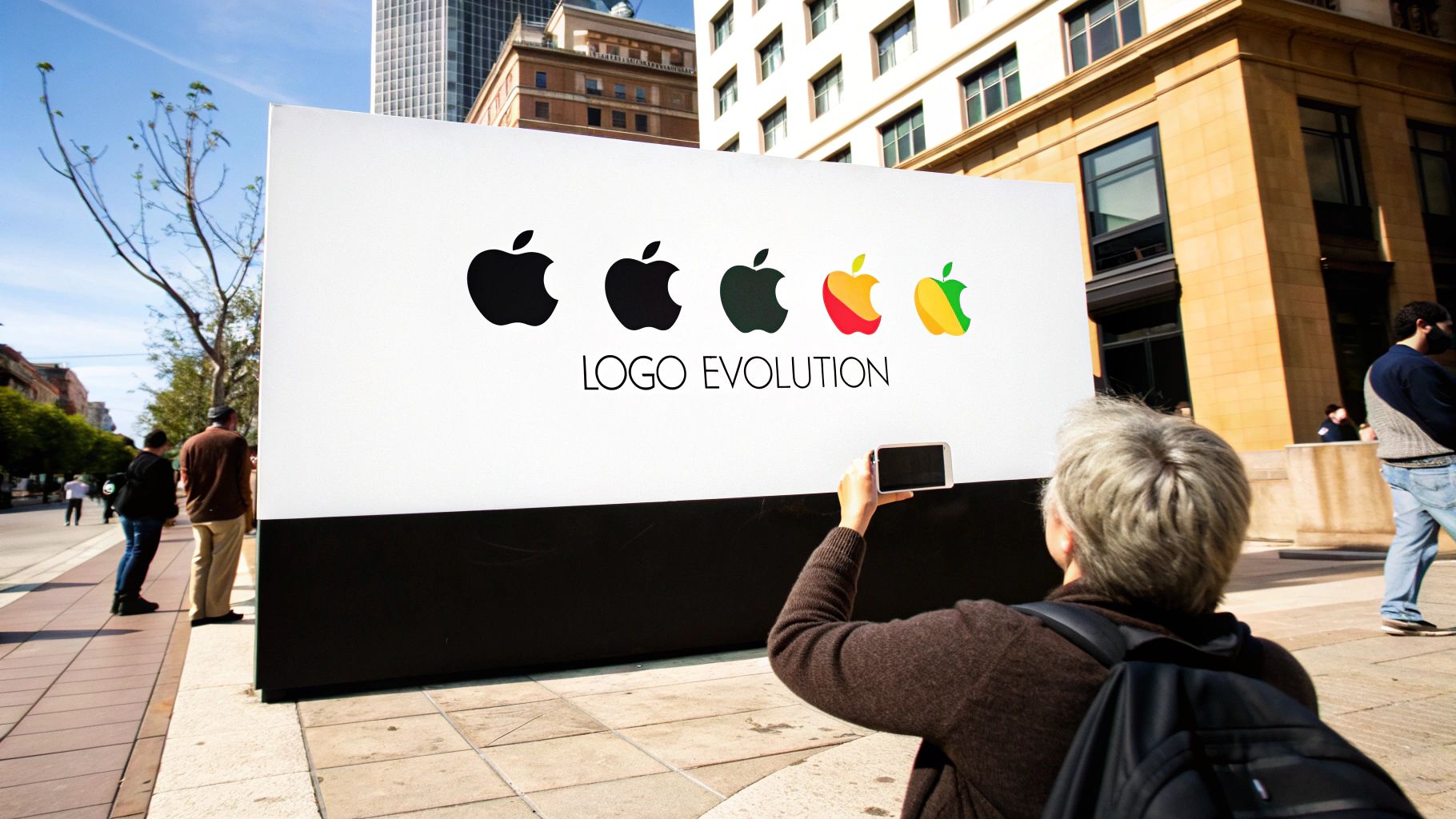
The image above perfectly captures the evolution. You can see the journey from a complex, almost historical drawing to a vibrant, friendly symbol, and finally to the clean, single-color form that became the foundation for today's brand.
The iMac G3 and the Birth of a New Look
The real turning point was the iMac G3. When it launched in 1998, it was a total design bombshell with its translucent, candy-colored shell. Can you imagine the old rainbow logo slapped onto a Bondi Blue iMac? It would have been a visual disaster. Apple needed something that looked elegant on any color, on any surface.
The answer was brilliantly simple: a solid, monochrome apple. This new logo could be black, white, or any single shade, which gave it incredible flexibility. It looked just as sharp embossed on a colorful iMac as it did on a sleek, silver PowerBook. This wasn't just a cosmetic change; it was a strategic shift in how the apple company logo meaning was conveyed. The message moved from "we can do color" to "we embody elegance."
"The move to a single-color logo was both a practical and philosophical choice. It streamlined manufacturing and branding while aligning the company's visual identity with the minimalist hardware designs that would define its future."
From Glossy Aqua to Flat Design
In 1998, Apple made it official with a monochrome black logo. This coincided perfectly with the iMac G3's launch and cemented the feeling that a new era under Jobs had begun. This wasn't just about looking better; a single-color mark was also cheaper to produce, reflecting Apple's transition from a quirky outlier to a premium global brand.
To give you a clearer picture of how these changes unfolded, here’s a quick timeline of the major redesigns.
Timeline of Major Apple Logo Redesigns
This table provides a chronological overview of the Apple logo's key visual transformations.
This timeline really shows how the logo has always mirrored the company's product philosophy at the time.
The first monochrome look was used until 2001, when it was updated to the famous "Aqua" style. This 3D version had a glassy, metallic sheen that felt incredibly high-end and defined the look of the early 2000s for Apple. You can dive deeper into this part of the logo's journey over at Fine Print Art's history of the Apple logo.
But design trends never stand still. By 2013, the tech world was all-in on flat design—clean, two-dimensional graphics that worked beautifully on screens of all sizes.
So, Apple adapted again. It stripped away the gloss, the gradients, and all the reflections, leaving the flat, simple logo we know today. This final step completed the evolution to pure minimalism. It was the ultimate proof that Rob Janoff's original shape was powerful enough to stand entirely on its own, no decoration needed.
The Enduring Power of the Apple Symbol
These days, the Apple logo is so much more than a corporate emblem. It's a full-blown cultural icon, instantly recognized anywhere in the world. Its path from a complicated drawing of Isaac Newton to the sleek, simple fruit we know today tells the story of Apple itself.
The logo’s evolution perfectly tracks the company’s own journey—from a small-time computer maker to an undisputed giant in technology and design. The real power of the symbol comes from what it’s come to mean. It's not just an apple with a bite taken out; it's a shorthand for innovation, creativity, and an obsessive focus on making things work beautifully for people.
A Symbol of Simplicity and Innovation
That minimalist design isn't an accident. It's a direct reflection of Apple's entire philosophy. Just like their products are designed to be intuitive and a joy to use, the logo is clean, approachable, and stripped of any clutter. This sends a clear message: sophistication doesn't have to be complicated.
The apple company logo meaning is tied directly to this principle. The simple shape captures the company's promise to pack powerful tech into an elegant and accessible form. This clear visual identity is a massive part of its incredible brand recognition. For a deeper dive into how this works, our complete guide explains what brand recognition is and why it's so crucial.
The logo's strength lies in its perfect blend of simplicity and adaptability. It has survived decades of design trends by stripping away everything but its essential form, proving that a strong concept is timeless.
More Than a Logo a Cultural Statement
When you get right down to it, the Apple logo has become a statement. For millions of people, it stands for a commitment to quality, a love of great design, and the courage to "think different."
It’s a symbol people are genuinely proud to have on their devices, transforming them from mere customers into passionate advocates. The logo's enduring power is woven into the fabric of its brand identity. To see how other major players build such a strong presence, it's worth exploring some unforgettable brand voice examples, including Apple. Apple proves that a great logo does more than just identify a company—it captures an idea that builds loyalty for generations.
Your Questions About the Apple Logo, Answered
Even with its long history, the Apple logo is still surrounded by a bit of mystery and a lot of myths. It's one of those symbols everyone recognizes, but not everyone knows the real story behind it.
Let's cut through the noise and get straight to the facts. Here are the answers to the most common questions people ask about the apple company logo meaning.
What’s the Real Story Behind the Bite?
The official reason for the bite is actually way more practical than you might think. It has nothing to do with Adam and Eve or some deep, hidden meaning.
According to Rob Janoff, the designer who created it, the bite is there for one simple reason: scale. He wanted to make sure nobody would mistake the apple for a cherry or another small, round fruit. It was a clever design trick to ensure the logo was instantly recognizable.
Why Was the Original Apple Logo a Rainbow?
For over two decades, from 1977 to 1998, Apple's logo was a vibrant rainbow. This wasn't just a stylistic choice; it was a brilliant piece of marketing.
The rainbow colors were there to show off one of the Apple II computer's biggest selling points: its ability to display color graphics. At a time when most computers were monochrome, this was a huge deal. The colorful logo sent a clear message that Apple was innovative, creative, and for everyone.
The rainbow stripes weren't just for looks—they were a direct advertisement for the Apple II’s groundbreaking color screen. The logo itself was a promise of what the technology could do.
Is the Logo a Tribute to Alan Turing?
This is a really powerful story that has circulated for years, but it’s a myth. The theory goes that the logo honors Alan Turing, the father of modern computing, who tragically died after eating a cyanide-laced apple.
While it's a compelling narrative, Rob Janoff has confirmed he didn't know about Turing's story when he designed the logo. The real reason for the bite was a practical design choice, not a tribute.
Who Actually Designed the Modern Apple Logo?
The iconic bitten apple logo we all know today was designed back in 1977 by a guy named Rob Janoff. He was an art director at the Regis McKenna advertising agency at the time.
Steve Jobs had hired the agency to come up with something simple and modern to replace the company’s first, much more complicated logo featuring Isaac Newton under a tree. Janoff’s design was so clean and timeless that it has defined Apple’s identity for more than 40 years.
Ready to build a brand as iconic as Apple's? At Softriver, our team of expert designers crafts custom logos and brand identities that make an immediate impact. We combine market research and artistic skill to create a timeless look for your business. Get your professional brand identity started today!