A professional letterhead is more than just sticking your logo, contact information, and brand colors at the top of a page. It’s about creating a clean, cohesive design that carries your brand’s authority and professionalism onto every document you send. It’s a subtle art, but getting it right makes a world of difference.
Why a Professional Letterhead Still Matters

Before you even think about opening a design tool, let's talk about why this is so important. A letterhead isn't just a fancy header; it's a fundamental piece of your brand identity. It’s your silent ambassador, building trust with every invoice, proposal, or formal letter you send, whether it’s a PDF in an email or a physical copy in the mail.
That consistency is what builds an impression of reliability. Imagine getting a contract on a plain, unbranded Word document versus one on a sharp, professional letterhead. The custom design immediately signals that the document is official and from a serious business. It cuts through the noise and adds a layer of authority that a plain page just can’t compete with.
The Core Components of an Effective Letterhead
Every great letterhead balances two jobs: representing your brand and giving people the information they need. If you drop the ball on either one, you risk looking amateurish or, worse, making it hard for people to do business with you.
Before you start designing, let's nail down the essentials. These are the non-negotiables that every professional letterhead needs to include.
Essential Letterhead Elements Checklist
Here's a quick checklist to make sure you've covered all the bases. Think of this as your pre-flight check before launching into the creative side of the design.
Getting these basics right ensures your letterhead is functional and professional, setting a solid foundation for the design itself.
A great letterhead doesn't just list information; it organizes it in a way that is intuitive and clean. The goal is to make it effortless for someone to know who you are, what you do, and how to contact you, all within a few seconds.
Beyond Aesthetics The Strategic Value
It’s easy to dismiss a letterhead as just a design element, but its strategic value is huge. It's a key player in the global stationery market, which hit a value of USD 108.88 billion in 2024 and is still on the rise. Letterheads are a big part of that, reinforcing a company's brand identity across all its official communications. You can dig deeper into the growth of the stationery products market on fortunebusinessinsights.com.
This small piece of design real estate does some heavy lifting. It ensures that every document you produce carries the full weight of your brand, making your business more memorable and credible to clients, partners, and anyone else who comes across it.
Gathering Your Core Brand Assets
A truly professional letterhead isn't just a template; it's a piece of your brand's identity in your customer's hands. Before you even think about layouts or spacing, you need to get your foundational elements in order. It’s like gathering your ingredients before you start cooking—it makes the whole process smoother and ensures a better result.
Getting this prep work done first helps you sidestep the most common design mistakes, like a fuzzy, pixelated logo or colors that look "off" when printed. By rounding up your core brand assets now, you're setting the stage for perfect consistency between your letterhead, your website, and everything in between.
Your High-Resolution Vector Logo
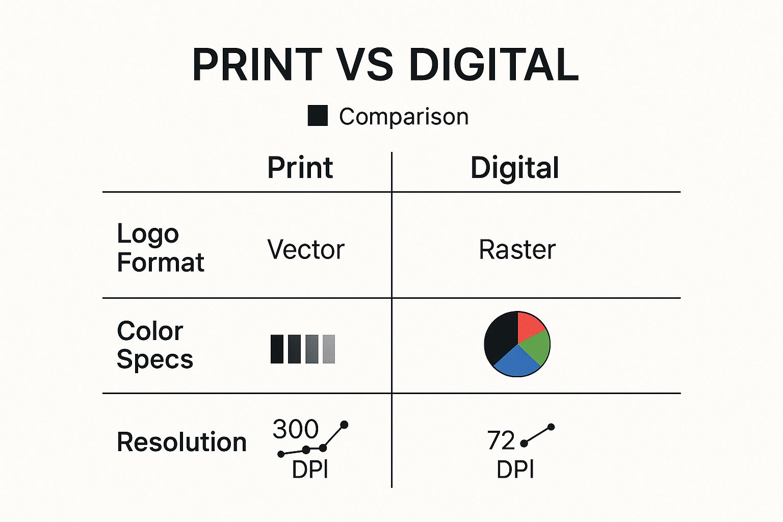
This is non-negotiable. The single most crucial asset for your letterhead is a high-quality logo, and it absolutely must be a vector file. Forget about JPGs or PNGs for this; those are raster images that will look blurry and amateurish once printed.
Vector files, which usually have extensions like .AI, .EPS, or .SVG, are built with mathematical paths. This means you can shrink them down for an envelope or blow them up for a banner, and they will always stay perfectly sharp. Dig through the logo package your designer sent you—that .EPS or .AI file is your golden ticket.
Defining Your Brand Colors and Fonts
Next up are your colors and fonts. These aren't just decorative details; they’re powerful cues that communicate your brand's personality and make your documents instantly recognizable.
- Color Palette: You'll need the exact color codes for both print and screen. For anything getting printed, you must use the CMYK (Cyan, Magenta, Yellow, Key/Black) values. For digital versions shared via email, you'll need the RGB (Red, Green, Blue) or HEX codes. They are not interchangeable!
- Brand Fonts: Nail down your primary and secondary fonts. The primary font is usually for headings and your company name, while the secondary one is for all the body copy. This simple pairing creates a visual hierarchy that makes your documents easier to read and look far more polished.
If you want to get a better handle on all the pieces that make up your brand's visual toolkit, this guide on what brand assets are and how they build business value is a great resource.
The infographic below really clarifies the technical differences you need to be aware of when prepping assets for print versus digital.

As you can see, a one-size-fits-all approach just doesn't cut it. To maintain that professional edge, it's also helpful to see how these elements come together in other essential business document templates, which can give you some great ideas for consistency.
Honestly, taking a few minutes to find the right vector logo, your specific CMYK color codes, and your brand fonts will save you hours of headaches later. This simple prep work is what separates a sharp, professional letterhead from one that just doesn't look right.
Crafting a Balanced and Clean Layout

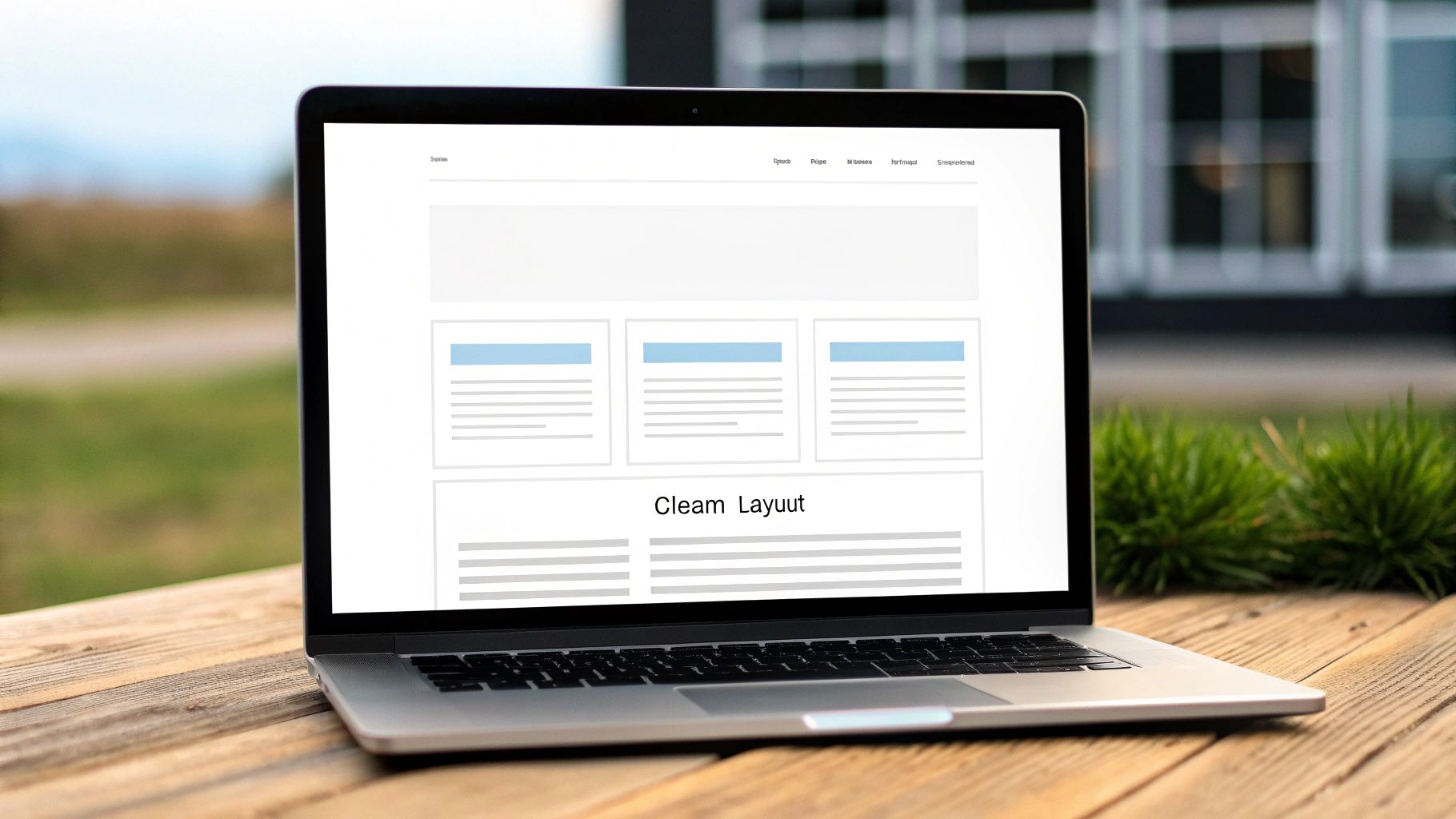
Now that you have your brand assets in hand, it’s time to arrange them on the page. Think of your layout as the architectural blueprint for your letterhead—it’s the structure that holds everything together and guides the reader's eye. A good layout prevents your document from feeling like a jumbled mess.
The magic ingredient here is visual hierarchy. It's a simple concept: arrange your information so the most important stuff gets noticed first. Your logo and company name should be the first thing someone sees. Your contact details need to be easy to find but shouldn't steal the spotlight. And, of course, the main body of the letter needs to remain the hero.
Choosing the Right Layout Style
There isn’t one single "best" layout. The right choice really comes down to your brand’s personality. Are you a traditional, buttoned-up law firm? Or a modern, edgy creative agency? Your layout says a lot about who you are before a single word of the letter is even read.
Picking a layout style is all about matching the design to your brand's voice. Below is a quick comparison of some common approaches to help you decide which one feels right.
Letterhead Layout Style Comparison
Your layout choice has real-world impact. The personalized stationery market was valued at USD 24 billion in 2022 and continues to grow as businesses realize the power of unique design. More importantly, a solid design strategy can boost brand recall by up to 80%. You can learn more about these personalized stationery market trends on kentleyinsights.com.
The Power of White Space
One of the most crucial elements in your design toolkit isn’t an element at all—it’s the empty space around everything else. We call it white space or negative space.
White space isn't wasted space; it's an active element of design. It gives your content room to breathe, reduces clutter, and makes your letterhead feel more organized and high-end. Don't be afraid to leave generous margins and space between elements.
Think of it as the frame around a beautiful painting. The frame enhances the art without competing with it. In the same way, using plenty of white space ensures the reader focuses on what’s important: your brand, your contact information, and your message.
Cramming too much onto the page is a classic rookie mistake. It instantly cheapens the look and makes the document hard to read. By using white space with intention, you create a professional, polished document that’s actually a pleasure to look at.
Making Your Fonts and Colors Do the Talking

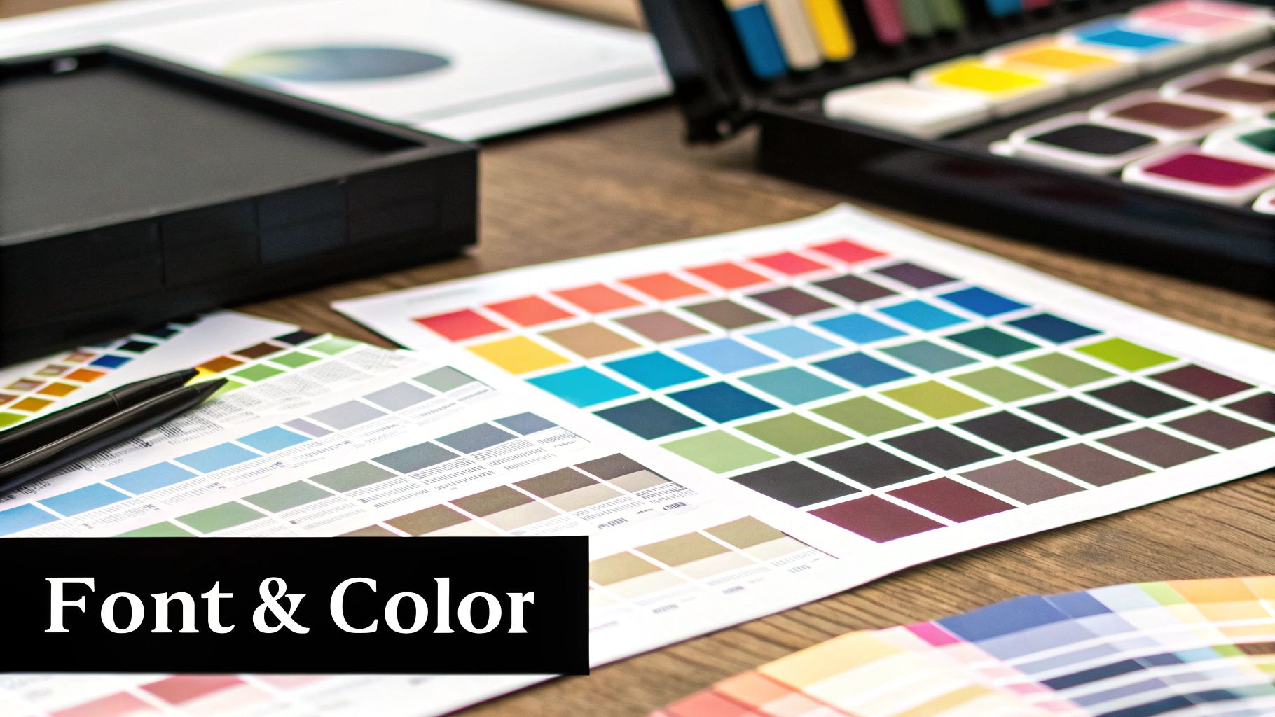
Long before anyone reads the first line of your letter, your typography and color choices have already made an impression. These aren't just decorative afterthoughts; they're the workhorses of your design, setting the tone and conveying your brand’s personality at a glance.
Think of fonts as your brand’s voice. A classic serif like Garamond feels established and trustworthy, which is why you see it used by law firms and financial advisors. On the flip side, a clean sans-serif like Helvetica feels modern and direct—a great fit for a tech startup or a design agency.
Picking and Pairing Your Fonts
Good typography is all about creating a clear visual hierarchy. You don't want every bit of text screaming for attention with the same volume. The simplest, most effective way to manage this is with a smart font pairing: one for headlines and another for the main text.
- Headline Font: This is where your primary brand font shines. It can be more distinctive and is typically used for your company name and maybe a major heading.
- Body Font: This one is all about readability. It has to be crystal clear even at smaller sizes, so prioritize legibility over personality for your paragraphs.
A classic rookie mistake is throwing too many fonts into the mix. It just creates visual chaos. Stick to two complementary fonts, and you'll get a much more polished, professional result. If you're struggling to find the right combination, our guide on choosing fonts for your brand offers real-world strategies that can point you in the right direction.
A well-chosen font pairing does more than look good—it guides the reader's eye. The contrast between your headline and body font makes the document scannable and helps the recipient quickly grasp the most important information.
Using Color with Purpose
Color is incredibly powerful, but on a letterhead, it needs to be handled with a light touch. Your goal is to support your brand identity, not create a piece of art that distracts from the message. The content of the letter must always be the star of the show.
Instead of splashing color everywhere, use it strategically to draw the eye to key information. A huge part of this is knowing how to choose color schemes that align with your brand's mission in the first place.
Here are a few smart ways to apply color:
- In Your Logo: This is the most obvious and essential use of your brand colors.
- As Subtle Accents: Think a thin horizontal rule, a colored sidebar, or a light background shade for your contact block.
- For Highlighting Info: Applying a brand color to your website URL or email address helps it pop just enough.
This intentional approach ensures your letterhead reinforces your brand and looks engaging without ever overpowering the words on the page.
Preparing Your Final Files for Print and Digital
https://www.youtube.com/embed/S-xp_uj-VoY
A brilliant design can fall flat if it isn't prepared correctly for its final destination. This is the crucial last step where you translate your creative vision into a flawless, functional file, ensuring your letterhead looks just as sharp on a screen as it does on paper.
The biggest hurdle here is understanding the fundamental difference between designing for print and for digital use. They're two distinct worlds with their own technical rules. If you ignore them, you're just asking for fuzzy logos and colors that look off.
Mastering Color Modes and Resolution
Your first big decision is about color modes. For anything you plan on sending to a professional printer, you absolutely must work in CMYK (Cyan, Magenta, Yellow, Key/Black). This is the four-color process every commercial printer uses. If you design in RGB and then convert it, you're gambling with your brand colors and will likely see disappointing shifts.
On the other hand, for digital files—the ones you’ll email or use online—RGB (Red, Green, Blue) is the standard. This color model is what screens use, so it keeps your brand colors looking vibrant and accurate in the digital space.
Resolution is just as critical. Here’s a simple way to think about it:
- Print Files: Must be 300 DPI (dots per inch). This high resolution is non-negotiable for getting crisp text and sharp graphics without any pixelation.
- Digital Files: A lower resolution of 72 DPI is perfect. It keeps file sizes manageable for quick downloads and easy emailing without sacrificing how it looks on a screen.
Setting Up Bleed and Margins
When you’re prepping a design for a professional printer, you have to account for bleed. Think of it as a small safety margin—usually 0.125 inches or 3mm—that extends your background color or image beyond the final trim edge of the page.
Printers can't print perfectly to the edge of a sheet, so they print on larger paper and trim it down. The bleed ensures that even if the trim is a millimeter off, you won’t end up with an ugly white sliver along the border. Of course, all your important stuff, like text and logos, should stay well within the "safe area" or margins, away from that trim line. For more on how this works, you can dive into the differences between digital printing vs. offset printing.
Always, always confirm the bleed and margin specs with your chosen print shop before you finalize anything. A quick phone call can save you from a costly and frustrating reprint.
Exporting the Right File Formats
You’re going to need a few different versions of your letterhead file to cover all your bases. One file type simply doesn't fit every scenario. Well-designed letterheads are a huge asset for businesses of all sizes, boosting credibility and brand recognition. And with hybrid work becoming the norm, having designs that work perfectly both in print and on-screen is more important than ever. The global stationery market is massive for a reason.
Here are the essential formats you should always prepare:
- High-Resolution PDF: This is the gold standard for professional printing. Make sure it's exported with CMYK color, 300 DPI resolution, and all your bleed settings included.
- Low-Resolution PDF: A lightweight, RGB version that’s optimized for email. It's perfect for sending digital invoices or proposals without clogging up someone's inbox.
- Microsoft Word Template (.docx): This one is for your team. A properly set-up Word template allows anyone in your company to create consistently branded documents without ever needing to open design software.
Common Letterhead Design Questions
When you start designing letterheads, a few questions always seem to pop up. Let's walk through some of the most common ones I hear from clients and designers to clear up any confusion and get you on the right track.
What Is the Standard Size for a Letterhead?
This is the very first thing you need to get right, and it all comes down to where you are in the world. Using the wrong size is a classic rookie mistake that can lead to major printing problems and even make your documents look unprofessional when they don't fit standard local envelopes.
- North America (U.S. & Canada): Your go-to is US Letter, which is 8.5 x 11 inches.
- Pretty Much Everywhere Else (Europe, Asia, etc.): The standard is A4, measuring 210 x 297 millimeters.
Before you do anything else, confirm the standard for your primary audience. It’s a simple check that saves a world of headaches later on.
Should I Add Social Media Icons?
This is a great question, and the answer really hinges on your brand's personality and how you connect with your audience. There's no right or wrong answer, but there is a right fit for your business.
If you're a modern creative agency or a retail brand that’s super active online, a few subtle icons can be a great touch. It signals that you're current and approachable. On the other hand, for a traditional law firm or financial institution, social icons can feel out of place and might undermine the formal, authoritative tone you want to project.
My rule of thumb? If you include them, keep them clean and minimal. Just the simple glyphs—no full URLs. Every single element on your letterhead needs to earn its spot, and the goal is to guide, not to clutter.
What Is the Best Software for Designing a Letterhead?
The tools you use directly affect the quality of the final product, especially if it’s heading to a professional printer. It can be tempting to reach for whatever software is already on your computer, but many common programs just aren’t built for high-quality print work.
For a truly professional result, you'll want to use either Adobe Illustrator or Adobe InDesign. These are the industry-standard tools for a reason. Illustrator is my choice for creating logos and any vector graphics, ensuring they stay sharp at any size. InDesign is the master of layout and typography, making it perfect for setting up the final print-ready file with proper bleeds and color profiles.
While tools like Canva or Microsoft Word are handy for quick digital documents, they don’t give you the precise control over technical details like CMYK color conversion or bleed setup. This lack of control can lead to disappointing—and expensive—surprises when you get your prints back from the shop.
How Much Information Should I Include?
When it comes to letterhead design, less is definitely more. A crowded design looks amateurish and makes it hard for your reader to find the information they actually need. Keep it clean and focus on the absolute essentials.
At a minimum, your letterhead needs:
- Company Name & Logo
- Physical Address
- Phone Number
- Website URL
- A primary contact email
Keep in mind, depending on your industry and location, you might be legally required to list a company registration or VAT number. It’s always worth a quick search to check your local business requirements. What you should always leave out are things like taglines, mission statements, or a laundry list of services. That content belongs in the letter itself, not framing it.
Ready to create a brand identity that commands attention? Softriver specializes in crafting custom logos and brand guidelines that ensure your business looks professional on every document, every time. Get your timeless brand identity today.
