
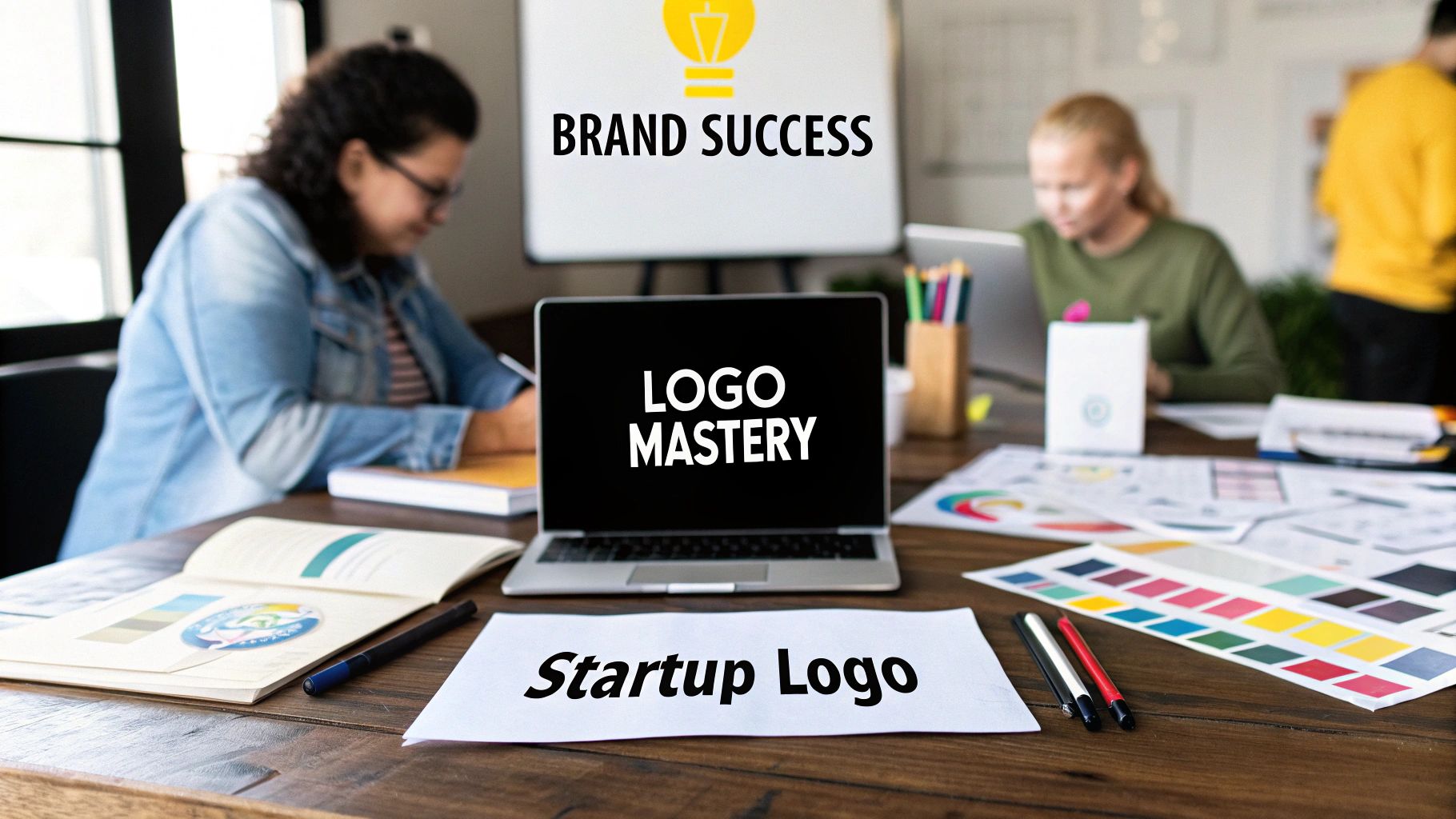
Why Your Startup Logo Matters More Than You Think
It’s tempting to treat your logo for a startup as just another task on an endless to-do list. You figure you'll get a pretty picture designed after handling the "real work" like product development. But here’s the thing: your logo is your silent co-founder, working 24/7 to make that critical first impression. It's the visual handshake that happens long before you ever speak to a customer, and it can open doors or close them in an instant.
To get why your startup's logo carries so much weight, it helps to understand the importance of brand recognition for online visibility and how your logo is the engine driving it. Your logo is the most concentrated version of your brand's entire story. It’s not just art; it's a strategic piece that communicates your values, professionalism, and market promise in a split second. A sharp, professional logo builds immediate credibility, while a weak one can make even the most brilliant idea feel like a garage hobby.
The Psychology of a First Impression
Think about the brands you trust. I’m willing to bet their logos popped into your head immediately. That’s not a coincidence; it's a deliberate result of good design. The human brain is built to process images way faster than text, which makes a logo a powerful tool for memory and recognition. For a new business, this visual shortcut is a game-changer. It’s what helps a potential customer remember you after seeing one ad or scrolling past your social media post.
This instant recall has a direct impact on customer behavior and, ultimately, your revenue. Consider this: research shows that 75% of consumers recognize a brand by its logo alone, and presenting that logo consistently can increase revenue by up to 23%. On the flip side, a poor design can actively hurt your business, as 60% of people will avoid brands with unattractive logos. These numbers tell a clear story: a professional logo isn't an expense—it's a core investment in building trust and attracting customers. You can dig into more of these insights about logo statistics and their impact on business growth.
More Than Just a Pretty Picture
A great logo does more than just look nice; it has to work everywhere. It needs to be clear and readable whether it’s a tiny favicon in a browser tab or blown up on a massive trade show banner. This adaptability is what separates a professional design from an amateur one. Before you even start sketching ideas, it’s a good idea to learn some basic principles. Our guide on the 12 rules of logo design is a great place to start building that foundational knowledge.
At the end of the day, your logo is the face of all your hard work. It stands for the late nights, the strategic pivots, and the big vision you have for your company. Getting it right from the beginning saves you the major headache and cost of a rebrand later on, a common mistake for new companies. It establishes a professional tone that draws in not just customers, but also potential investors and top talent.
Learning From Giants: What Fortune 250 Companies Know
Before you dive into sketching a dozen different ideas, let's take a peek behind the curtain at what the world’s most successful companies are doing. Their approach to creating a logo for a startup or a global brand isn’t just about looking good; it's a masterclass in strategy. When you analyze these giants, you start to see patterns that any founder can learn from, proving that real impact often comes from simplicity, not complexity.
The infographic below highlights some of these key trends, showing how designers can turn strategic insights into real-world brand impact.
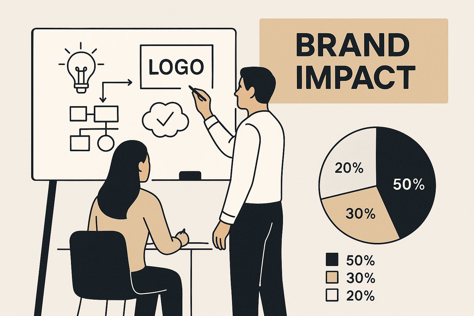
The biggest lesson here is that the most iconic brands build their identity on deliberate, informed choices, not fleeting design fads. This isn't about copying their work, but about understanding the psychology that connects with people on a massive scale and applying those principles to your own business.
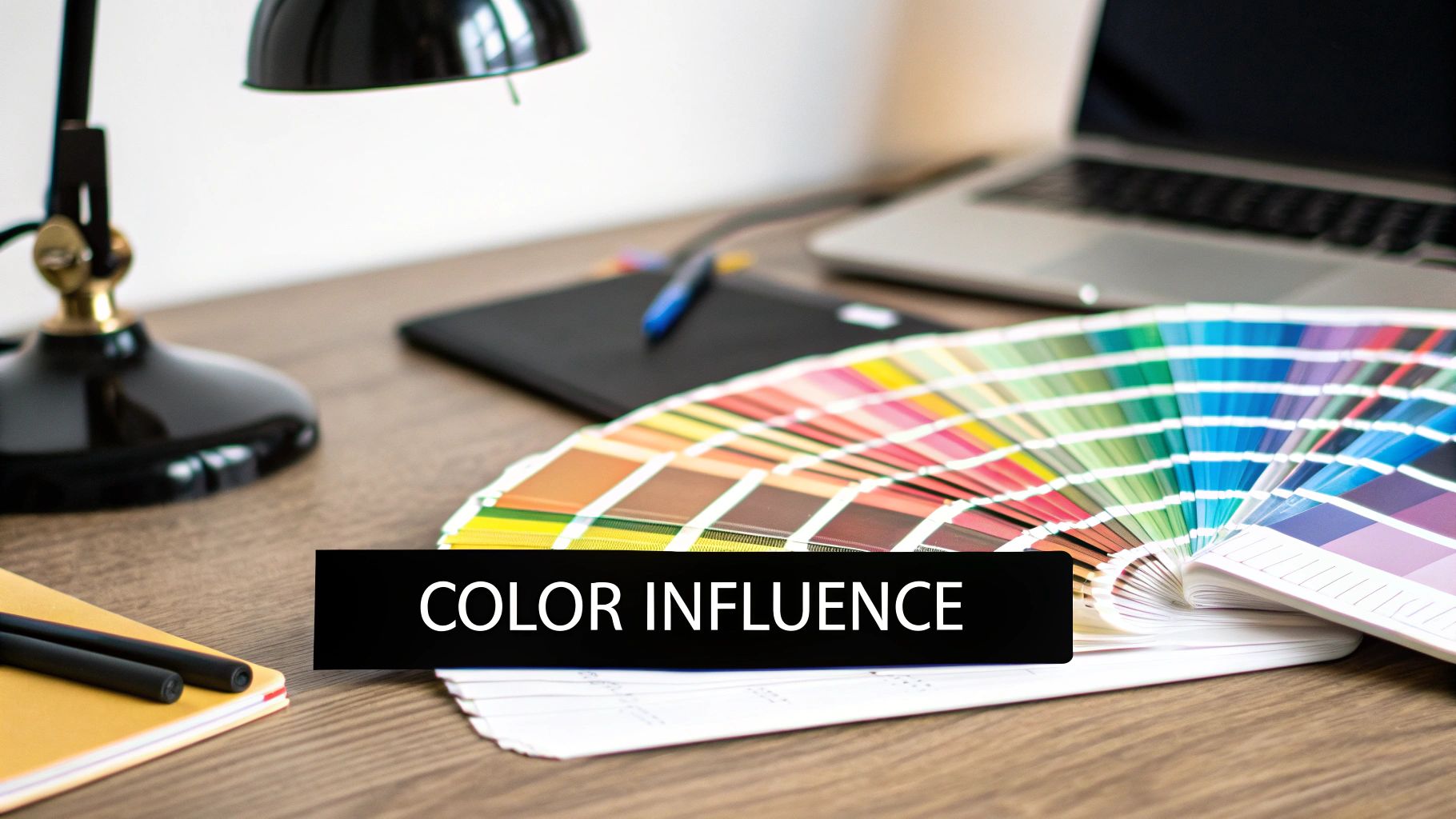
The Power of Simplicity
One of the most obvious patterns is a deep commitment to a minimalist color palette. A staggering 81.6% of the world's top 250 companies use logos with two colors or less. This is no accident. Using fewer colors makes a logo more memorable, cuts down on printing costs, and ensures it looks great everywhere, from a website to a billboard. This restraint helps create a clean and instantly recognizable brand mark.
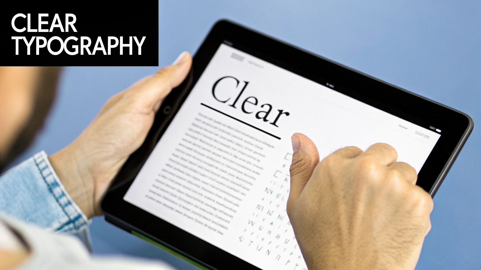
Blue is the undeniable king in the corporate world, showing up in 30.8% of these top company logos. It's often chosen for its strong association with trust and professionalism. When it comes to typography, 55.6% of text-based logos are in all-caps, a choice that projects strength and authority.
To see how the biggest players approach their visual identity, I've broken down some key data points from the Fortune 250. This table shows what elements are most common and why they work so well.
As you can see, these choices aren't random. They are strategic decisions aimed at building trust and creating a lasting impression. You can explore more of these logo design statistics and their implications to get an even deeper understanding.
What This Means for Your Startup
So, how can you apply these big-league lessons to your own logo? It's all about making intentional choices.
Be Deliberate with Color: Don't just pick your favorite color. Think about the emotion you want your brand to evoke. Limiting your palette to one or two main colors will help you build a strong, cohesive identity that’s easy for customers to remember.
Typography Speaks Volumes: The font you choose is your brand’s voice. All-caps can feel powerful and established, while lowercase letters might seem more approachable and modern. Pick a font that truly reflects your brand’s personality and what you stand for.
Focus on Clarity, Not Clutter: The most important lesson is that simple is powerful. A clean, uncluttered logo for a startup is far more likely to be memorable and stand the test of time than one that’s overly detailed and complicated.
Defining Your Brand Identity Before You Design
Diving headfirst into designing a logo for a startup without a solid brand identity is like trying to build a house with no blueprint. It's a surprisingly common mistake, and the results are often shaky. You might create something that looks great on its own, but if it doesn't say anything about who you are and what you stand for, it's really just a pretty picture. A powerful logo is a cornerstone of your brand, so it's critical to work out your branding strategy first.
This initial discovery phase is your non-negotiable first move. It’s where you do the deep-dive into your company's core to figure out its personality, mission, and what makes it unique. Without this groundwork, every design choice you make is just a shot in the dark.
Who Are You, Really?
Let's start by getting to the heart of your brand. Don't just gloss over these questions—grab a notebook or open a doc and really think through your answers. This exercise will become the creative brief for your entire visual identity.
- Your Mission: What’s the "why" behind your startup? What specific problem are you solving for people?
- Your Values: What are the 3 to 5 core principles that guide every business decision you make? Think about words like Innovation, Simplicity, or Community.
- Your Personality: If your brand walked into a room, what would it be like? Is it a quirky, playful friend? A wise, dependable mentor? A bold, rebellious innovator? This personality directly influences everything from the colors to the fonts you'll eventually choose.
- Your Audience: Who are you actually trying to reach? Get specific about your ideal customer—their age, their interests, and what they care about. A logo designed for Gen Z tech founders will look worlds apart from one aimed at retired luxury travelers.
- Your Unique Value Proposition (UVP): What makes you stand out from the crowd? This is the one thing you do better than anyone else. Your logo should be a visual echo of this promise.
Decoding the Competitive Landscape
Once you have a firm grip on who you are, it's time to scope out the competition. The goal here isn't to copy what others are doing, but to find an open lane for your brand to own. A simple way to do this is by creating a table to analyze the logos of your top 3 to 5 competitors.
This kind of analysis quickly shows you the visual trends in your market. You'll see what customers in your space are used to and, more importantly, where you can carve out a unique identity. For example, if every competitor is using safe blues and grays, maybe a warm, vibrant color is your chance to be different. The colors you pick are tied to perception; you can learn more about how different logo colors send different messages to make sure your choice lines up with your brand’s personality.
By doing this homework upfront, you're not just designing a logo—you're crafting a strategic piece of your business.
Navigating Modern Logo Design: Tools, Trends, and Tech
The world of logo design is moving incredibly fast, and for an ambitious startup, this is a fantastic opportunity. Getting a great logo for a startup isn't just about hiring a freelance designer and waiting weeks for concepts anymore. New tools and creative methods are making it possible to build a strong visual identity with more speed and strategic thinking than ever before.
AI as a Co-Pilot, Not the Pilot
Artificial intelligence has become a huge new player in the design space. AI-powered generators can spit out dozens of logo ideas in minutes, which is an amazing way to get the creative process started. Think of these tools as a brainstorming partner. They can help you quickly explore different layouts, font pairings, and icon styles you might not have thought of on your own.
The real magic, however, happens when you use this technology with a clear strategy. It's not about letting an algorithm do all the work. It's about using it to speed up your own creative vision and refine your best ideas into something truly unique. If you're curious about what the pros use, checking out a list of the best graphic design tools can give you a good sense of the software that powers both AI-assisted and fully manual design.
Worthy Trends vs. Passing Fads
Staying current is important, but jumping on every new trend can make your brand look dated in a hurry. The secret is to find a balance between modern style and timeless design principles. Here are a few current trends that have real strategic value for startups:
- Dynamic Logos: These are logos that can change or adapt depending on the context. Think of how Google’s logo changes for holidays and special events. A dynamic logo can show off your brand’s personality and keep things feeling fresh.
- Minimalism with a Punch: Clean, simple design still rules, but many startups are now adding bold colors or unique typography to make a statement. This approach keeps the logo from feeling cluttered while giving it a strong, memorable character.
- Nostalgia-Driven Aesthetics: A surprising number of brands are looking to the past for inspiration, using retro fonts and color palettes to create feelings of comfort and authenticity. This can be very powerful if it connects with your brand’s story.
Budgeting for Your Brand's Future
The mix of new technology and design trends is changing how startups approach logo creation. AI tools let founders generate concepts quickly, turning a weeks-long process into something that can happen in minutes. This makes everything more efficient and affordable. At the same time, trends like dynamic logos and bold minimalism are helping new businesses get noticed.
This tech-driven creativity has also changed how companies budget for their brand. Investments can range from a few thousand dollars for a basic package to £50,000 or more for a complete brand identity system. You can learn more about these startup branding and logo design trends to see how technology and strategy are coming together.
To help you figure out what makes sense for your startup, here's a breakdown of common approaches to getting a logo designed.
This table shows there's no single "right" price for a logo. The best path depends on your budget, timeline, and how deeply you want to invest in your brand's foundation from the start.
Creating Your Logo: From Concept to Final Design
Okay, you've finished the strategic homework, and now for the really fun part: bringing your logo for a startup to life. This is where all those abstract ideas about your brand’s personality start to become real, visible designs. The journey from a messy napkin sketch to a polished final file is a structured process, not just a random stroke of genius. It’s all about exploring, refining, and making careful choices that will define your brand’s public face for years to come.
From Rough Ideas to Refined Concepts
The best logos rarely show up fully formed. The process always starts with broad exploration. Instead of getting stuck on one "perfect" idea, professional designers generate several completely different concepts. This could mean sketching dozens of rough ideas, each focused on a different part of your brand. One concept might be a clever wordmark, another a symbolic abstract shape, and a third a friendly mascot. The main goal here is quantity over quality.
Once you have a few promising sketches, it's time to take them into the digital world. This is where you can begin to play with typography and simple layouts. For instance, if your brand’s personality is “authoritative and trustworthy,” you might test out strong, classic serif fonts. If it's more “innovative and modern,” clean, geometric sans-serif fonts would be a better fit. The trick is to judge these early concepts against your brand strategy, not your personal tastes. Ask yourself, “Does this visually communicate our core values?” instead of, “Do I like the color green?” Learning to critique logo design objectively is a skill, and it's vital for making the right call.
Honing In on the Final Design
After choosing one or two strong concepts, the real refinement begins. This is where you focus on the small details. You’ll make important decisions about color psychology, making sure the shades you pick match the emotions you want to stir. Using red, for example, might suggest energy and passion, while orange can feel more playful and creative. For more detailed advice, you might find our guide with startup logo design tips to create a memorable brand useful.
This stage also involves perfecting the layout and making sure the logo works at different sizes. A frequent mistake is creating a design that is too complex. A logo must be instantly recognizable as a tiny favicon on a browser tab and look just as good on a massive billboard. Vector files (like SVG or AI) are absolutely necessary here, as they can be resized to any dimension without losing quality. Your final logo package should always include these, along with raster files like PNGs for web use.
You'll also need to create several variations to cover all your bases:
- Primary Logo: The main, full-color version.
- Monochromatic: All-black and all-white versions for use on different backgrounds.
- Horizontal and Vertical Lockups: Different arrangements to fit various spaces.
- Logomark/Icon Only: The symbol by itself, which is perfect for social media profile pictures.
Following this thoughtful process ensures your final logo isn’t just a pretty picture, but a hard-working asset for your startup.
Testing and Refining Your Logo in the Real World
A logo might look flawless on your design software, but its true test happens when it leaves the nest. The most successful brands know that creating a logo for a startup isn't finished until it’s been pressure-tested in the real world. This is the moment that separates a memorable brand mark from one that falls flat. The idea isn't to get stuck in a loop of endless opinions, but to gather focused feedback that sharpens your final design.
Gathering Meaningful Feedback
The secret to getting useful feedback is asking the right people the right questions. Instead of polling friends and family who might just tell you what you want to hear, focus on people who actually represent your target audience. You don’t need a huge focus group; a handful of unbiased people from your ideal customer demographic will give you much better insights.
Instead of asking, "Do you like it?", which is all about personal taste, ask specific, objective questions:
- "What three words come to mind when you see this logo?"
- "What kind of company do you think this logo represents?"
- "Can you easily read the company name?"
This approach gives you real, actionable information about whether your design is hitting the mark. If your "innovative tech" brand is being described as "traditional" or "slow," you've found a disconnect that needs fixing.
Real-World Application Tests
A great logo has to be a chameleon, looking sharp wherever it appears. It’s critical to test its versatility across all the places your customers will see it. Don't just stare at it on a big screen; you need to see how it holds up in its natural habitat.
A simple way to do this is with mockups. Professional designers often use mockups to show clients how a logo will look on physical products, but you can easily do this yourself. Print it out and stick it on a product. Shrink it down to the size of a social media profile picture.
Here’s a quick checklist for your real-world stress test:
By putting your logo through these practical trials, you can spot and fix potential problems before you fully commit. This process ensures your final design isn't just a concept, but a tough, hard-working asset ready to build your brand’s recognition.
Implementing Your Logo for Maximum Impact
Your first move should be creating a brand guidelines document. Think of this as the official owner's manual for your logo. It’s a straightforward set of rules that makes sure everyone—from your marketing team to a freelance contractor—uses your logo correctly and consistently. This consistency is what builds trust; studies show that a consistent brand presentation can significantly boost revenue. Your guidelines should detail official colors (with hex codes), required clear space around the logo, and what not to do, like stretching or changing its colors.
Creating a Cohesive Brand Experience
With your guidelines ready, it's time to map out a rollout plan. This is about more than just swapping out the logo on your website header. The goal is to create a unified visual experience everywhere your brand appears.
- Develop Branded Templates: You can save countless hours by creating templates for presentations, social media posts, and email newsletters that already have your logo placed correctly.
- Design Social Media Assets: Your logo needs to look sharp on every platform. This means creating custom profile pictures, banners, and story templates that are perfectly sized for each network’s unique dimensions.
- Integrate into Your Product: If you have a physical product or software, consider how the logo can be integrated naturally. A subtle, well-placed logo can improve the user experience and reinforce your brand's presence without being intrusive.
Putting this into a real-world context is crucial. A SaaS startup, for example, might use its simple logomark as the app icon, display the full logo in the website footer, and feature animated versions in its marketing videos. Each use is different, but they all feel connected and part of the same brand story. This consistent presence is what helps customers remember you and builds a brand that feels professional and dependable.
By thinking through every application, from a business card to an invoice, you ensure your logo works as hard as you do. Ready to build a brand identity that truly makes a mark? The team at Softriver specializes in creating custom logos and complete brand systems that position startups for immediate impact and long-term success.