
The color magenta is all about harmony, emotional balance, and a cheerful sense of non-conformity. It's one of those unique colors that seems to bridge two worlds—it takes the fiery, passionate energy of red and combines it with the calm, spiritual vibe of blue to create something completely new.
Understanding the Core Meaning of Magenta
Magenta isn't just a fancy shade of pink or a toned-down purple. It occupies its own unique psychological space. It speaks to a kind of universal love and kindness, one that's compassionate and unconditional.
Interestingly, magenta is what’s known as an "extraspectral" color. You won't find it in a rainbow because it doesn't have its own light wavelength. Our brains actually create it when we see red and blue light waves at the same time. This fascinating origin story ties directly into its meaning as a uniter of opposites.
Think of magenta as a creative peacemaker. It borrows the power and intensity of red but smooths its rough edges with the quiet introspection of blue. What you get is a color that feels both uplifting and grounding, helping to create a sense of emotional equilibrium. This balancing act is why magenta is so closely linked to transformation and personal growth.
Key Symbolic Traits
Magenta has a way of encouraging us to rise above the daily grind and see the bigger picture. It’s a color that’s packed with symbolism.
- Non-Conformity: It champions individuality and the confidence to stand out from the crowd.
- Spiritual Awareness: Many associate magenta with the eighth chakra (the Soul Star), which represents our connection to a higher consciousness.
- Innovation: As a blend of two primary colors, magenta is a natural symbol for new ideas and creative thinking.
- Emotional Balance: It has a knack for calming frustration and anger while simultaneously lifting our spirits.
Magenta is a powerful symbol of change. It encourages us to let go of old ways of thinking and embrace a fresh, more positive perspective, bringing with it a real sense of optimism for what's ahead.
For a quick overview, here are some of the core feelings and ideas tied to the color magenta.
Key Meanings of the Color Magenta
This table gives you a snapshot, but the real power of magenta lies in its context.
Grasping the psychological weight of different hues is a huge part of visual communication. To dig deeper into this, you can learn more about what logo colors mean and how they shape our perceptions. This context makes it clear why a brand might pick a bold, unconventional color like magenta—it's less about aggression and more about cheerful disruption and positive change.
The Surprising History of Magenta
Most colors have roots in the natural world—think of the deep blues of the ocean or the rich greens of a forest. Magenta, however, is different. It wasn't discovered; it was invented. Its story begins not in nature, but in a laboratory, a direct result of the chemical boom during the Industrial Revolution. This man-made origin is key to understanding magenta’s meaning, forever linking it to innovation, conflict, and change.
The year was 1856. Chemists across Europe were in a race to create the first synthetic dyes, and a brilliant new hue was synthesized. It was originally called ‘fuchsine’, and it was an instant hit in the textile industry.
From Laboratory to Battlefield
This exciting new dye was about to get a new name, thanks to a major conflict brewing on the world stage. In 1859, the French and Sardinian armies won a decisive, yet incredibly bloody, victory over the Austrians near the Italian town of Magenta.
To celebrate this victory, the dye ‘fuchsine’ was renamed "magenta." Just like that, the color’s identity was forever tied to a moment of intense struggle and transformation. It’s more than just a pigment; it’s a piece of history. You can dive deeper into the vibrant origins of magenta to see just how much this event shaped its modern symbolism.
This timeline helps visualize how magenta came to embody emotional balance, a core part of its psychological meaning today.
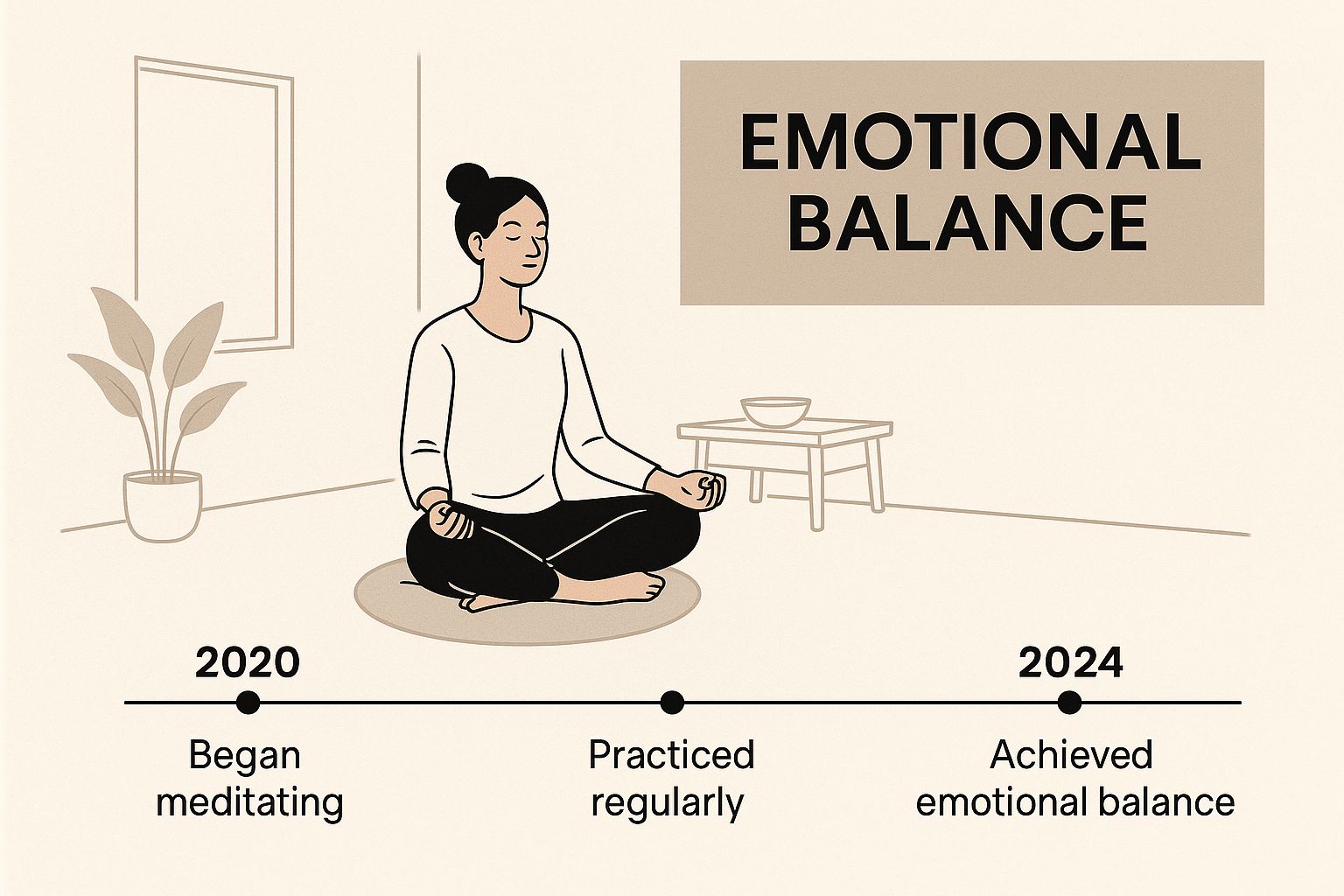
Born from both a scientific breakthrough and a historic battle, the color itself serves as a powerful symbol for finding equilibrium in the midst of chaos.
A Legacy of Boldness
This unusual backstory—part science, part war—gives magenta a character all its own. It lacks the ancient, organic feel of a color like yellow or red. Its history is one of pure human creation, followed by a dramatic rebranding.
Magenta's birth in a lab and its renaming after a battle permanently connects it to themes of rapid invention and bold disruption. It represents the power of human ingenuity to create something entirely new and striking.
This context is exactly why magenta is so strongly tied to non-conformity and originality. It has always been a color that demands attention, refusing to simply fade into the background. From its very creation, magenta has been a symbol of the powerful, game-changing moments that reshape our world.
How Magenta Influences Your Emotions
Colors aren't just things we see; they're things we feel. And when it comes to emotional impact, magenta is a fascinating case. Its meaning is all about creating a unique kind of emotional equilibrium, and it does this by borrowing from two very different ends of the color spectrum.
Think about it: you have the passionate, assertive energy of red and the calm, stable tranquility of blue. Magenta steps in as the ultimate mediator between these two powerful forces. It takes that fiery, high-energy vibe from red and tempers it with the soothing presence of blue, giving us a color that feels both uplifting and grounded at the same time. This unique blend makes it an incredible tool for finding balance in our emotional lives.
When you're surrounded by magenta, it can quiet feelings of frustration and irritation. But it doesn't just calm you down; it also sparks a sense of optimism and hope.
Sparking Creativity and Positive Change
Magenta is often seen as the color of the free-thinker, the innovator, and the non-conformist. It doesn't play by the standard rules of the primary color palette, and its psychological effect is just as independent. Its presence can help you break down mental blocks and shake up rigid ways of thinking.
This makes it a fantastic color for any space where creativity is the goal—think studios, workshops, or brainstorming rooms. It fosters a mental environment where new ideas can really flourish, free from the constraints of convention.
- Encourages Innovation: Magenta gently pushes us to think outside the box and explore unconventional solutions.
- Promotes Change: It inspires us to let go of old, unhelpful patterns and embrace positive transformation.
- Boosts Confidence: The color's cheerful, bold nature can give you that little nudge of confidence to pursue something new.
The emotional lift you get from magenta isn’t aggressive or demanding. It's more of a gentle but firm push toward a more open-minded and forward-thinking perspective.
Cultivating Kindness and Spiritual Growth
Beyond creativity, the meaning of magenta is deeply tied to universal kindness and compassion. It’s a color that feels generous and open-hearted, encouraging a connection to something larger than ourselves.
This spiritual side comes from its incredible balancing act. By uniting the physical world (red) with the spiritual or intellectual world (blue), magenta represents a more holistic view of life. It’s a subtle reminder to care for others while also tending to our own inner growth.
Magenta is an emotional and spiritual mediator. It helps bridge the gap between our everyday concerns and our higher aspirations, promoting a feeling of complete well-being and universal connection.
This quality makes it a color that can help people feel supported and understood. It fosters an atmosphere of acceptance and kindness, making it perfect for environments focused on personal development or community building. In the end, magenta doesn't just represent emotional balance—it actively helps us feel it, encouraging a more compassionate and creatively fulfilled state of being.
Why Top Brands Choose Magenta
When a brand chooses a color, they're not just picking a pretty shade. They're making a calculated decision about the story they want to tell. The psychological weight of magenta makes it a powerful tool for ambitious companies looking to send a very specific message.
By splashing their logo or products in magenta, brands tap into its deep-seated symbolism of non-conformity, forward-thinking, and vibrant energy. It's a way to build an identity that sticks.

Take the telecom industry, for instance. For years, it was a sea of corporate blues and serious, dependable reds. Then T-Mobile came along and painted the town magenta. This wasn't a whim; it was a masterstroke of branding. They used magenta to position themselves as the fun, friendly, and even rebellious alternative to the old guard. Their color became their identity, signaling a clean break from the stuffy, buttoned-up norms of their rivals. It was a visual shout that said, "We're different, and we're here to shake things up."
In a similar vein, Taco Bell uses bold strokes of magenta to connect with a younger, more energetic audience. The color’s mix of excitement and fun perfectly captures the spirit of their "Live Más" slogan. It telegraphs creativity, playfulness, and a refusal to follow the rules—all key ingredients of their brand recipe.
Projecting Innovation and Approachability
Brands often turn to magenta when they want to be seen as leaders of the pack, but without losing that human touch. It strikes a rare and effective balance, making it a go-to for market disruptors.
- Innovative Edge: Magenta’s link to creativity and out-of-the-box thinking helps brands feel modern and inventive. It shows they aren't afraid to push boundaries.
- Energetic Vibe: The color radiates a lively, positive energy. This makes a brand feel dynamic and exciting, catching the eye of consumers hungry for something new.
- Friendly Demeanor: Unlike an aggressive red or a cold, distant blue, magenta has a welcoming and compassionate feel. This can make a brand seem much more accessible to its customers.
Using color psychology this way is absolutely fundamental to building a strong brand. If you want to explore this further, our guide on choosing colors for your brand is a great place to start.
By embracing magenta, a company instantly sets itself apart. The color acts as a visual shortcut, telling customers that the brand is confident, unconventional, and customer-focused—all without saying a single word.
Capturing a Loyal Following
At the end of the day, great branding is about forging an emotional connection with people. Magenta is unusually good at this because it speaks to our desire for individuality and positive change. It resonates with consumers who value creativity and independent thought, drawing them to brands that mirror their own values.
This emotional bond is what builds true loyalty. When customers feel like a brand just "gets" them, they're far more likely to stick around. For companies like T-Mobile, their audacious magenta branding helped them cultivate a tribe of customers who identified with their challenger spirit. It just goes to show that color meaning isn't just an abstract theory; it's a practical business tool that turns a simple hue into a real market advantage.
Magenta's Role in Printing and Design

When you look at printed materials, you're seeing magenta in action. It’s one of the four foundational inks in the CMYK model, and you can think of it as the secret ingredient that gives reds their fire and purples their depth.
In professional printing, magenta works alongside cyan, yellow, and black (the 'K') to create a massive spectrum of colors. Imagine layering incredibly thin, tinted sheets of plastic on top of each other—that’s basically how these inks combine on paper to build a full-color image.
This layering technique is what gives professionally printed materials such a rich, precise feel.
- Mixed with yellow, magenta creates brilliant oranges and fiery reds.
- Combined with cyan, it produces vivid purples and deep violets.
- It provides rock-solid consistency, ensuring the first printed page looks just like the ten-thousandth.
CMYK Printing Essentials
Magenta officially entered the scene in the 1890s as process magenta, quickly becoming a cornerstone of the CMYK four-color system. This method still reigns supreme in commercial printing today, reproducing millions of shades by layering tiny dots of these four inks. In a typical four-color job, magenta ink accounts for roughly 25% of the total color applied.
Of course, magenta also exists on our screens, but it’s a different beast entirely. Digital displays use the RGB (Red, Green, Blue) model, creating magenta not with ink, but by combining red and blue light.
To get a better sense of how physical ink layering stacks up against digital methods, take a look at our guide on https://www.softriver.co/blog/digital-printing-vs-offset-printing-which-is-best.
Magenta is the quiet workhorse that bridges traditional printing with modern digital media. For designers, it's an indispensable tool.
Physical vs. Digital Scenes
For any graphic designer, knowing the difference between how magenta works in print versus on a screen is absolutely critical. What looks perfect on your monitor might not translate well to a business card, and vice-versa.
A fashion magazine, for instance, relies on process magenta to reproduce a designer's signature shade perfectly on its cover. Meanwhile, a mobile app's splash screen achieves the same color by telling the screen's pixels which red and blue values to light up. This same attention to color and its psychological impact is vital in fields like modern game UI design, where every hue affects the player's experience.
Best Practices for Designers
To master magenta and avoid frustrating surprises, here are a few pro tips:
- Always start by calibrating your monitor and printer with a trusted color profile.
- Proof your work by printing small swatches before committing to a large run.
- Test digital mockups on multiple devices—an iPhone, an Android, and a desktop monitor will all display colors differently.
- Carefully adjust magenta levels to match your client's specific brand guidelines for both print and digital.
From packaging that leaps off the shelf to a website banner that stops you in your tracks, magenta is the unsung hero working behind the scenes. Whether you’re running a massive offset press or coding a simple webpage, it’s a key ally for making sure your colors communicate exactly what you intend.
Common Questions About the Color Magenta
It’s no surprise that a color as unique as magenta raises a few questions. It doesn't quite play by the same rules as the primary colors we learn about as kids, which makes people curious about where it comes from, where it sits on the color spectrum, and how to actually use it.
Let's clear up some of the most common points of confusion. Think of this as a quick-fire round to round out your understanding of this powerful and unconventional color.
Is Magenta a Real Color?
Yes and no. It's a bit of a mind-bender. The most fascinating thing about magenta is that it's what scientists call an 'extraspectral' color. In simple terms, this means there's no single wavelength of light for magenta. You won't find it in a rainbow because a rainbow is a clean spectrum of individual light wavelengths.
So, where does it come from? Our brains basically invent it. When our eyes see a mix of red and blue light waves at the same time, our brain fills in the gap between red and violet on the color wheel and perceives the color we call magenta.
So, while magenta doesn't exist as a single wavelength of light, the color we see and experience is absolutely real. And in the world of printing, it's a very real ink—one of the foundational colors in the CMYK process.
What Is the Difference Between Magenta, Fuchsia, and Pink?
People often use these names interchangeably, but they're distinct shades with their own personalities. Think of them as close cousins, not identical twins. Nailing down their differences helps clarify the specific meaning of magenta.
- Pink: This one is the easiest. Pink is simply red mixed with white, making it a tint of red. It’s generally lighter and softer than its more vibrant relatives.
- Magenta: This is a pure, deep hue sitting perfectly balanced between red and blue. It's a primary color in the CMYK printing model and a secondary color in the RGB model used for screens.
- Fuchsia: Named after the flower, fuchsia is a vivid shade very close to magenta. The main difference is that fuchsia often leans a little more toward pink or purple, usually by containing a bit more blue than pure magenta.
Basically, magenta is the core, balanced hue, while fuchsia is a specific, often brighter, variation of it.
What Feelings Does Magenta Evoke?
Magenta gets its emotional punch from its parent colors: red and blue. Because of this unique blend, it typically brings up feelings of balance, creativity, and cheerful optimism.
It takes the raw energy of red and tempers it with the calm stability of blue, creating a sense of emotional harmony and even spiritual awareness. It's a color often tied to non-conformity, out-of-the-box thinking, and a feeling of universal kindness. While its vibe is overwhelmingly positive, be careful not to overdo it—too much magenta can sometimes come across as a bit eccentric or overwhelming.
How Should I Use Magenta in Home Decor?
Magenta is a fantastic tool for injecting a room with vibrant energy, but without the full-on aggression of a pure red. The key is to use it strategically as a statement piece.
If you’re feeling bold, an accent wall in a creative space like a home office or studio can look amazing. For a more subtle approach, weave it in through your accessories.
- Add throw pillows or blankets to a neutral-colored sofa.
- Hang a piece of abstract artwork where magenta is the star.
- Anchor the room with a statement armchair or rug.
It looks stunning next to neutrals like gray, charcoal, and cream, as they really let the magenta pop. If you want a more dynamic and modern look, try pairing it with complementary colors like teal or lime green.
At Softriver, we understand that color is the cornerstone of a memorable brand. If you're ready to build a powerful brand identity that stands out, our expert designers are here to help. Discover how our custom logo and branding packages can bring your vision to life. Learn more about our services.