
Color theory in marketing is so much more than just picking pretty colors. It’s about strategically using color to tap into your audience's emotions, guide their perceptions, and influence their decisions. Think of it as a powerful psychological tool that can build your brand identity, steer customer actions, and ultimately, grow your sales.
The Hidden Language of Color in Marketing

Imagine color as your brand's silent salesperson. Before a potential customer even reads your headline or figures out what you sell, they see your colors. This happens in a fraction of a second, and that first visual impression sets the entire tone for their experience with you.
Every color sends a subconscious message. It can spark excitement, build trust, create urgency, or bring a sense of calm. This is why color theory in marketing isn't just a final touch for the design team; it’s a core piece of your brand strategy. It’s the invisible hand that can either nudge a customer to click "Buy Now" or cause them to leave your site without a second thought.
Why Color Is a Strategic Business Tool
The power of color isn't just a hunch; the numbers back it up. Research shows that for 93% of consumers, a product's visual appearance is the most important factor in their buying decision. Even more telling, a massive 85% say color is the primary reason they pick one product over another. This makes it clear that using color theory isn't just an option—it's essential for any business serious about connecting with its audience. You can learn more about how color influences branding decisions on Ironmark USA.
When you get color right, you can:
- Create a Strong First Impression: Grab attention immediately and show off your brand's personality before anyone reads a single word.
- Boost Brand Recognition: Sticking to a consistent color palette can improve brand recognition by up to 80%.
- Influence Purchasing Decisions: Use certain colors to make your calls-to-action pop, trigger a sense of urgency, or build trust during checkout.
- Differentiate from Competitors: A unique color scheme is one of the easiest ways to make your brand memorable in a crowded market.
Building a Foundation for Success
Getting a handle on these principles is like learning a new language—one that your customers already speak fluently. It provides a clear roadmap for creating marketing materials that don't just look good but actually work.
The right color combination doesn’t just decorate your brand; it communicates its core value. It’s the difference between a brand that blends in and one that becomes unforgettable.
In this guide, we're going to walk through the essentials of color theory, step by step. We’ll start with the basics of the color wheel and move all the way to the deep psychological links people have with different hues. You’ll walk away with practical skills to transform your branding and advertising, turning casual visitors into loyal fans. This isn't about fuzzy art-school concepts; it's about making smart, informed choices that deliver real business results. Let’s dive in.
Decoding the Color Wheel for Marketers
Let’s be honest, all the talk about color wheels and design theory can feel a little intimidating. But you don't need to be a graphic designer to get it. For marketers, the color wheel is less about art class and more about understanding what makes people tick.
Think of it as a cheat sheet for combining colors in ways that create a specific mood. Once you grasp the simple logic behind it, you can start making deliberate choices that support your brand’s message, instead of just picking colors that look good.
The Building Blocks of Color
Every color you've ever seen starts from the same three places. The entire color wheel is built from these fundamental hues.
- Primary Colors: These are the big three: red, yellow, and blue. They're the original colors—you can't mix anything to create them.
- Secondary Colors: This is what you get when you mix any two primary colors. Think back to elementary school: green (blue + yellow), orange (red + yellow), and purple (red + blue). They sit right between their "parent" colors on the wheel.
- Tertiary Colors: Go one step further and mix a primary color with a secondary color next to it, and you get a tertiary color. This is how you get shades like blue-green or red-orange, which add much-needed subtlety to your palette.
Understanding this simple structure is key. It’s what lets us predict how colors will interact, which is the first step toward building a powerful visual brand. From here, we can start combining them using proven formulas called color schemes.
Crafting Moods with Color Schemes
A color scheme is just a fancy name for a group of colors chosen to work together. Each combination has its own vibe and psychological effect, making them one of the most effective tools a marketer has for setting a tone.
A color scheme isn't just a random assortment of nice-looking colors. It's a strategic selection designed to guide perception and create a specific emotional atmosphere for your brand.
Here are four of the most reliable schemes you can start using right away:
1. Complementary Schemes for High Impact
A complementary scheme grabs two colors from directly opposite sides of the color wheel—like red and green, or blue and orange. This pairing creates the highest possible contrast, which makes each color pop and appear more vibrant.
- When to Use It: This is your go-to for grabbing attention. It’s perfect for call-to-action buttons or any element you need to stand out. The FedEx logo is a classic example; the strong contrast between purple and orange makes it impossible to miss.
2. Analogous Schemes for Harmony
An analogous scheme uses colors that are neighbors on the color wheel, like blue, blue-green, and green. Since they're so similar, they create a very comfortable, calm, and cohesive look. There’s no clashing or tension here.
- When to Use It: This is a fantastic choice if you want to project trustworthiness, calm, or a connection to nature. You'll see it used all the time by wellness brands and eco-friendly companies to create a peaceful, unified feel.
3. Triadic Schemes for Vibrant Balance
A triadic scheme pulls in three colors that are evenly spaced around the wheel, forming a triangle. The most famous example is using the primary colors: red, yellow, and blue. This approach gives you strong contrast, but it feels more balanced and less in-your-face than a complementary scheme.
- When to Use It: These schemes feel energetic and creative. They're great for brands that want to seem fun and dynamic. Think of Burger King's classic logo—the red, yellow, and blue work together to create a playful and bold impression.
By getting a handle on these basic combinations, you move beyond guesswork. You start making strategic choices that align your brand’s look with its goals, shaping how customers perceive you from the very first glance.
Connecting Color Psychology with Consumer Emotions
Knowing which colors look good together is just one piece of the puzzle. The real magic happens when you understand why certain colors make us feel a certain way. Think of color as a universal language. It taps into our deepest emotions and memories without ever saying a word.
This is why a bank like Chase chooses a calming blue to build trust, while Ferrari goes for a fiery red to scream passion and speed. A color’s meaning can shift depending on the context, so getting these details right is what makes a brand’s message truly connect. It’s the difference between a color palette that’s merely pleasant and one that actively builds a relationship with your audience.
The Two Sides of Every Color
Here's a secret: no color is inherently "good" or "bad." Its power comes from how you use it, the industry you're in, and who you're talking to. A color that’s perfect for one brand could be a total miss for another. This duality is what makes color psychology so fascinating.
Let's look at a few examples:
- Red: It’s the color of pure energy, passion, and excitement. That’s why you see it on clearance signs and "Buy Now" buttons—it creates a sense of urgency. But red is also tied to danger and aggression, so overdoing it can feel stressful.
- Blue: Almost everyone sees blue as the color of trust, stability, and calm. It's a go-to for banks, tech companies, and healthcare. The downside? The wrong shade or too much of it can come off as cold, corporate, and impersonal.
- Yellow: Yellow is sunshine in a can—bright, cheerful, and optimistic. It’s fantastic for grabbing attention and giving off friendly vibes. On the flip side, it can cause eye fatigue and sometimes feels cheap or signals caution (think warning signs).
A color's emotional impact isn't set in stone. It’s shaped by the story you tell, your industry, and your audience’s cultural background. The goal is to pick colors that perfectly match your brand’s personality and what you promise your customers.
Matching Colors to Brand Personality
Your color palette should be a direct reflection of your brand. Are you playful and creative? Serious and dependable? Luxurious and exclusive? The right colors will communicate these traits instantly, often much faster than words ever could.
This infographic does a great job of showing how famous brands align their logos with specific color psychologies to create harmony.
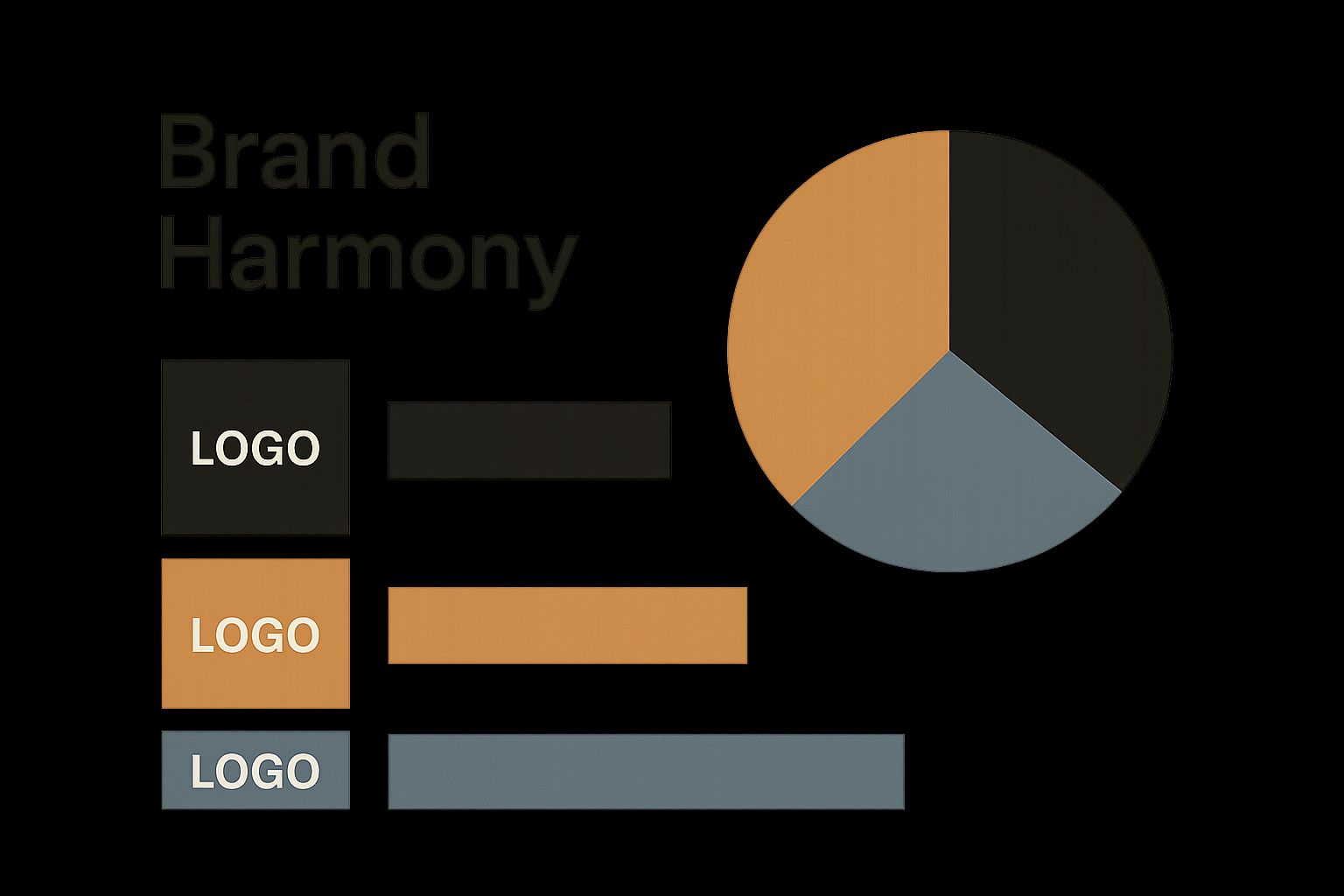
As you can see, successful brands don’t just pick colors they like. They make deliberate choices that reinforce who they are and what they stand for.
Going Deeper With Specific Hues
To give you a clearer picture, let's break down the emotional weight behind some of the most common colors used in marketing today. The following table explores the good, the bad, and the ideal industries for each.
Emotional Resonance of Common Marketing Colors
Understanding these nuances helps you move beyond personal preference and start making strategic decisions that resonate with your target audience on a psychological level.
A Closer Look at Key Colors in Action
Green's Connection to Growth and HealthGreen is almost universally tied to nature, health, and peace. This makes it the obvious choice for organic food brands, wellness spas, and eco-friendly companies. Just think of Whole Foods—their green logo instantly brings freshness and sustainability to mind. The color also hints at wealth, making it a solid pick for financial services wanting to project growth.
Orange for Fun and ConfidenceOrange is what you get when you mix the energy of red with the happiness of yellow. It feels fun, enthusiastic, and confident, making it a brilliant choice for brands that want to seem approachable and creative. Nickelodeon, for instance, has built its entire youthful, energetic identity around orange. It's also less aggressive than red, which makes it a great alternative for calls-to-action that feel encouraging instead of demanding.
Purple's Aura of Luxury and WisdomHistorically, purple dye was incredibly rare and expensive, so it has long been associated with royalty, luxury, and wisdom. This makes it a perfect fit for high-end beauty products or any brand aiming for a sophisticated, imaginative feel. The Syfy channel uses purple to tap into a sense of mystery and creativity. For a more detailed breakdown, you can check out our guide on what logo colors mean and their strategic uses.
Black and White for Simplicity and PowerYou can't get more classic than black and white. Black is the ultimate symbol of sophistication and power, which is why luxury fashion brands like Chanel and Prada use it to create a feeling of timeless elegance. White, on the other hand, stands for simplicity, cleanliness, and modernity. Apple’s minimalist white-and-gray palette is famous for making its technology feel clean and easy to use.
When you start seeing colors not just for how they look, but for the stories they tell, you can choose a palette that does more than just decorate your brand—it gives it a soul.
How to Use Color to Boost Conversions
It's one thing to understand the emotional side of color theory, but it's another thing entirely to turn that knowledge into real, measurable results. When you get it right, strategic color choices can guide your users, boost your key performance indicators (KPIs), and ultimately drive more sales. This isn't about guesswork; it's about using color as a powerful tool to create a clear, compelling path for your customers to follow.
The whole secret is making specific elements on a page impossible to ignore. A well-placed, high-contrast call-to-action (CTA) button doesn't just ask for a click—it demands one. This is the cornerstone of turning passive browsers into active customers.
The Power of Contrast in Guiding Attention
If you remember one thing, make it this: contrast is the single most important principle when designing for conversions. It's the visual difference between elements on a page, and it's how you tell a user's eye where to look first. Without enough contrast, your most important buttons and links simply fade into the background, becoming almost invisible.
Think of it like this: imagine your landing page is a room, and in that room is one bright red door. No matter what else is happening, everyone’s attention will naturally snap to that door. In web design, your CTA button needs to be that red door. This is often done by using a complementary color—one from the opposite side of the color wheel—to create a powerful visual pop against your site's main color scheme.
The goal isn’t to find the "best" color for conversions, but to find the best color for your design. A bright orange button might work wonders on a blue website but disappear on a red one. The key is visual distinction, not a specific hue.
And the data backs this up. Up to 90% of snap judgments people make about products are based on color alone. What's more, marketing campaigns that use high-contrast colors see 47% higher interaction rates. Giants like Amazon and Booking.com have seen massive boosts in conversions just by tweaking their color schemes. You can dive deeper into how design psychology impacts conversion rates at Striven.
High-Converting CTAs: A Case Study in Color
A simple color change can produce surprisingly dramatic results. One of the most famous examples comes from a large-scale A/B test run by HubSpot. They wanted to see if changing their CTA button color from green to red would affect sign-ups.
- The Control: A green button that matched the site's branding but didn't really stand out.
- The Variation: A red button that created a stark visual contrast with the page's green design elements.
The result? The red button outperformed the green one by a whopping 21%. This wasn't because red is some magical, "better" color. It was simply because the red button was more visually prominent, making it far easier for users to spot and click. This test is perfect proof that the most effective CTA color is the one that stands out the most.
Actionable Strategies for Higher Conversions
You can start applying these principles to your own marketing right now. Here are three practical steps to improve your conversion rates using color:
Isolate Your CTA Color: Don't dilute the power of your primary action color. If your "Buy Now" button is a specific bright orange, avoid using that same orange for less important things like headlines or icons. Save that color's power for the clicks that matter most.
Use the Squint Test: This is a classic designer trick, and it works. Step back from your screen and squint until the page becomes blurry. Which elements still pop? If your CTA button isn't one of them, it doesn't have the contrast it needs to do its job.
Consider Cultural Context: While contrast is a universal principle, color meanings aren't. If you're marketing to a global audience, it pays to stick with colors that have broadly positive associations. For instance, red often signals urgency in Western cultures but can mean good fortune in Eastern cultures. Always test what works for your audience. After making changes, it's crucial to know how to measure advertising effectiveness to ensure your new colors are actually delivering results.
Ultimately, the colors you choose for your calls-to-action are a critical part of your brand’s visual language. They should feel consistent with your overall identity while being distinct enough to drive action. For more on building a cohesive brand, check out our in-depth logo design tips to make sure your colors work beautifully across all your assets.
Building a Memorable Brand Identity with Color
Getting someone to click once is a great start, but the real magic happens when you build a brand they'll remember and return to. This is where consistent color use becomes one of your most powerful tools. When customers can spot your brand from its colors alone, you’ve built something that sticks.
Think about the titans of industry. Coca-Cola doesn't just use red; they own it. Tiffany & Co.’s signature blue is so iconic it’s legally protected as Tiffany Blue. That kind of instant recognition isn't an accident. It comes from deliberately and consistently applying color theory in marketing across every single touchpoint.
This is how a simple color palette evolves into a core business asset. It creates a mental shortcut for your customers, linking your colors directly to your brand’s personality and what you stand for.
How to Choose Your Brand's Color Palette
Picking your brand colors is a strategic decision, not just a matter of personal taste. Your palette needs to capture the very essence of your brand while also helping you stand out from the competition. For a deeper dive into how this all comes together, understanding a comprehensive Shopify Design System is a great place to start, as it outlines all the visual elements that create a cohesive brand.
So, where do you begin? Ask yourself these key questions:
- What's our personality? Are you energetic and playful, or more serious and dependable? Your colors are often the first clue people get.
- Who are we talking to? Think about your target audience. What colors will resonate with their age, culture, and expectations?
- What is everyone else doing? Take a look at your main competitors. You can either choose colors that align with your industry or pick something completely different to make a bold statement.
The data behind color’s influence is staggering. Research shows that about 60% of people will decide whether they like a new product based on its color alone. Even more striking, between 62% and 90% of a person's initial gut feeling about a product is based on color. And it’s no surprise that color ads get noticed 42% more often than black and white ones.
Applying Your Palette with the 60-30-10 Rule
Okay, you've picked your colors. Now what? To avoid a visual mess, designers often turn to a classic, time-tested framework: the 60-30-10 rule. It’s a simple but incredibly effective way to create balance and consistency.
The 60-30-10 rule is a design principle that guides you in creating a harmonious color scheme. It ensures no single color dominates the design, giving your branding a structured, polished feel.
Here’s the breakdown:
- 60% Primary Color: This is your main brand color, the one that will take up the most visual space. Think website backgrounds, packaging, or the primary color in your store.
- 30% Secondary Color: This color supports your primary hue and adds visual interest. It's perfect for things like headlines, subheadings, and important information that isn't the main event.
- 10% Accent Color: This is your "pop" of color. Use it sparingly for the elements you absolutely want people to notice, like call-to-action buttons, special offer highlights, or key icons.
Following this simple rule helps your brand feel intentional and cohesive everywhere it shows up—from your website and social media down to your business cards. For a more detailed walkthrough, check out our strategic guide to choosing colors for your brand.
Common Questions About Using Color in Marketing
Even when you've got a good handle on the theory, putting color to work in the real world can be tricky. Where do you even begin with a brand new project? What happens when a color that means one thing here means something totally different across the globe? This section is all about tackling those practical questions that pop up for marketers.
Think of this as your troubleshooting guide. We’ll walk through the most common sticking points and clear up any confusion, so you can move from theory to action with confidence.
How Do I Choose a Color Palette for a New Brand?
Staring at a blank canvas and a limitless color wheel can be intimidating. The secret is to ground your decisions in strategy, not just what looks good to you. It all starts with defining your brand’s personality. Is your brand a shot of espresso—energetic and bold? Or is it more like a sturdy oak tree—stable, dependable, and trustworthy?
Once you’ve nailed down that personality, you can start connecting it to the psychology of color.
- Define Your Brand in a Few Words: Jot down three to five adjectives that capture your brand's essence. Think "bold," "innovative," or "friendly."
- Match Words to Colors: Use what you know about color psychology to find hues that echo your keywords. "Bold" might naturally lead you to a powerful red, while "friendly" could point toward a welcoming yellow or orange.
- Scope Out the Competition: Take a look at what your direct competitors are doing. Do you want to blend in with the industry standard (like so many tech companies that rely on blue)? Or do you want to break the mold? Choosing a completely different color is a fast and powerful way to signal that your brand is different.
- Think About Your Audience: Who are you trying to connect with? A younger crowd might be drawn to bright, vibrant colors, while a corporate, B2B audience might feel more comfortable with classic, professional tones like deep blue or charcoal gray.
Walking through this process helps you build a palette that isn’t just visually appealing—it's strategically sound. It's a look that communicates your brand's core value from the very first glance.
Do Colors Mean the Same Thing in Every Culture?
This is a huge one for any brand with global ambitions, and the short answer is a hard no. While a few color associations feel almost universal (blue is pretty consistently linked to water and the sky), many meanings are deeply tied to culture. Get it wrong, and you can dramatically change how your message is received.
A color that symbolizes celebration in one country might represent mourning in another. Overlooking these nuances isn't just a small mistake; it's a major marketing risk that can confuse, or even offend, your audience.
For example, in most Western cultures, white is the go-to color for weddings and purity. But in many East Asian cultures, white is traditionally the color of funerals and mourning. In China, red is all about luck and good fortune, which is why it’s everywhere during festivals. Head to South Africa, though, and red is the color of mourning.
So, what's a global marketer to do?
- Focus on Your Main Market: If your business primarily serves one region, it makes sense to optimize your colors for that culture first and foremost.
- Lean on "Safe" Colors: Blue is often seen as the most universally accepted color. It generally carries positive feelings of trust, calm, and professionalism almost everywhere.
- Do Your Homework: Before launching a campaign in a new country, take the time to research local color symbolism. Tweaking your palette for a specific region shows respect and helps you build a much stronger connection.
How Important Is Color Compared to Copy or Price?
Color is incredibly powerful, but it’s just one ingredient in the marketing recipe. It has to work together with your messaging, product quality, customer experience, and price. Think of color as the amplifier for everything else you're doing.
A great color choice can make compelling copy feel more persuasive or a great price seem more urgent. But on the flip side, not even the most beautiful color palette in the world can rescue a bad product or a confusing message.
Here’s a simple way to think about its role:
- Color Sets the Stage: It makes the first impression and creates an emotional backdrop. It's often the very first thing a customer notices, shaping their mood and expectations before they've even read a word. In fact, one study found that up to 90% of snap judgments about products can be based on color alone.
- Copy and Price Provide the Logic: Once color has grabbed their attention and set a certain tone, your words and price have to deliver on that promise. The copy explains the "what" and the "why," while the price confirms the value.
At the end of the day, color speaks to the heart, while copy speaks to the mind. They aren't in competition with each other—they're partners. A truly strong brand uses them in harmony to create a seamless and persuasive experience.
Can I Use More Than One Accent Color?
Absolutely. The 60-30-10 rule is a fantastic guideline for creating balance, but it’s not an unbreakable law. You can definitely use more than one accent color, but it takes a thoughtful and deliberate touch to keep your design from feeling cluttered or chaotic.
You often see this approach from brands that want to communicate variety, creativity, or a diverse range of products. Just think of companies like Google or Slack, which masterfully juggle multiple vibrant colors.
If you decide to go with multiple accents, just follow these tips to keep things in line:
- Give Each Color a Job: Assign a specific, unique purpose to each accent color. For example, one color might be exclusively for your main call-to-action buttons, while another is used for secondary links, and a third highlights informational icons.
- Make Sure They Get Along: Your accent colors need to work well together and with your dominant and secondary colors. Even if they're bright and contrasting, they should feel like they belong to the same visual family.
- Be Ruthlessly Consistent: This is the most important rule. If green means "Add to Cart" and orange means "Learn More," that rule has to be applied everywhere, without a single exception. Consistency is what makes it work.
Using multiple accents can add a ton of energy and visual interest, but it also adds complexity. When in doubt, sticking to a single, powerful accent color is almost always the safest and most effective way to guide your users toward a clear action.
Ready to build a brand identity that stands out and connects with your audience? The expert designers at Softriver specialize in creating custom logos and brand guidelines rooted in strategic color theory. We combine market research with top-tier design talent to deliver a brand that not only looks great but also performs. Get a timeless, market-aligned brand in as little as 48 hours. Discover our branding packages at softriver.co and see how we can position your business for success.