
A professional business card is so much more than a way to share your contact info. Think of it as a pocket-sized billboard for you and your brand. When done right, it’s the perfect mix of smart design, quality materials, and a clear message that makes an instant connection, showing you mean business long after the handshake is over.
Why Your Business Card Is a Strategic Investment
Picture this: you’re at a networking event and get two business cards. The first is thin, generic, and printed on flimsy paper. The second feels solid in your hand, with a sharp, thoughtful design that catches your eye. Which company do you instinctively trust more? That split-second judgment is exactly why a professional business card isn't just an expense—it's an investment in how people see your brand.

This little piece of paper is often the very first tangible thing someone experiences from your business. It's a physical reminder of your conversation, a tiny portfolio showcasing your brand's quality, and a direct line to future opportunities. In a world full of fleeting digital DMs and connection requests, a well-made card is a memorable, physical touchpoint that truly stands out.
The Power of a First Impression
The feeling you get from a quality business card isn't just a hunch; the numbers back it up. A huge 72% of people admit they judge a company or person based on the quality of their business card. That single stat proves your card is doing some heavy lifting as a first impression tool, well before they ever see your website.
On the flip side, a cheap card can do real damage. Research shows that 39% of people would flat-out choose not to do business with someone if their card felt cheap or poorly designed. If you want to dig deeper, you can learn more about these business card statistics and how they affect professional relationships. The takeaway is clear: your card is actively influencing whether or not someone decides to work with you.
A great business card doesn’t just say who you are; it shows who you are. It’s a handshake that lasts, representing your attention to detail, commitment to quality, and the overall value of your brand.
More Than Just Contact Information
A truly great business card wears a lot of hats. It's not just a Rolodex entry; it's a multi-purpose networking tool. A well-executed design will:
- Build Credibility: Quality paper and a polished design send a clear signal: you're serious, professional, and trustworthy.
- Reinforce Your Brand: It’s a mini-version of your brand identity, using your logo, colors, and fonts to build recognition and keep everything consistent.
- Create a Memorable Experience: Unique finishes, a clever layout, or premium paper make your card—and by extension, your business—stick in someone's mind.
- Drive Action: A simple call-to-action or a QR code can guide people to your website, portfolio, or social media, turning a simple exchange into the next step of a relationship.
Throughout this guide, we'll break down the entire process into simple, actionable advice. Our goal is to help you turn your card from just another piece of paper into a powerful networking asset that opens doors and builds real connections.
Building Your Brand on a Tiny Canvas
https://www.youtube.com/embed/-KdA6aTikWc
Before you even think about layouts or fancy paper, let's get back to basics. Your business card is a tiny ambassador for your brand. It’s the front door to your business that fits in a wallet. For it to work, it has to be a perfect reflection of the identity you’ve already built.
This all starts by taking your core brand elements and translating them onto this small but mighty canvas. Your logo, color scheme, and fonts aren't just for decoration; they're your company's visual language. Consistency is everything. Your card needs to feel like it belongs with your website, your social media, and everything else you put out there.
When everything matches, you build an instant sense of trust and professionalism. It tells people you're organized, you care about the details, and you mean business.
Prioritizing Your Core Information
You’ve only got a few square inches to work with, so every millimeter counts. The goal here is crystal clarity, not cramming in every last detail about your company. You have to be strategic and guide the reader’s eye to the most important stuff first.
Pretend you have five seconds to make an impression. What does someone absolutely need to know? This little exercise is great for cutting through the clutter and focusing on what will actually get someone to take the next step.
It all comes down to creating an information hierarchy. Some details are simply more important than others. Your name and what you do should grab their attention first, followed by the best way to reach you.
Your business card isn’t a complete biography; it's a compelling headline. Its job is to provide just enough information to make someone curious and give them a clear, simple way to learn more.
Establishing a Clear Brand Hierarchy
To get that hierarchy right, think about the information in tiers. This approach makes your card easy to scan and understand at a quick glance.
- Your Logo and Company Name: This is who you are. It should be prominent and instantly recognizable without taking over the whole design.
- Your Name and Title: This is your personal introduction. It answers the simple question, "Who is this person?"
- Essential Contact Information: This is the practical, can't-miss part. Stick to your main phone number and professional email—the most direct ways to connect.
- Website URL: Your website is the main portal to everything else. It’s where people can dig deeper into what you offer, see your work, and learn about your company.
By organizing your info this way, you create a natural flow that makes the card genuinely useful. Anything extra—like a long list of social media handles or a physical address (unless you're a retail shop)—can probably live on your website.
Think about this: roughly 100 billion business cards are printed globally each year, but an estimated 88% of them get tossed within a week. A cluttered, confusing design is a one-way ticket to the trash can. To make sure your card sticks around, it needs to be a model of clarity. To get this right, it helps to start by creating a cohesive style guide for your brand.
Mastering the Principles of Visual Design
A great business card does more than just list your contact info—it tells a story and guides the viewer's eye with purpose. This is where we go beyond the basics and step into the art of visual communication. By getting a handle on a few core design principles, you can turn a simple card into a tiny, powerful marketing tool that people actually want to keep.
Don't worry, these aren't complicated rules only for seasoned graphic designers. They're practical concepts that help you arrange information so it makes sense instantly. Think of it like setting up a storefront window—you want to draw people to the most important items first, creating an experience that's clean, inviting, and easy to take in.
Create a Clear Visual Hierarchy
Visual hierarchy is the secret ingredient to a design that people "get" in a matter of seconds. It's simply the art of arranging things to show what's most important. Without it, a business card is just a jumble of text where everything screams for attention at once, meaning nothing truly stands out.
Think of your card as a quick introduction. You want to lead with your most important point first. On a business card, that's almost always your name or your company’s logo. This element should be the biggest and boldest, grabbing attention right away.
Next up is your secondary information, like your job title and essential contact details (phone and email). These should be a bit smaller but still perfectly clear. Finally, details like your website or social media handles can be the smallest. This natural flow makes the card easy to scan and use.
A strong visual hierarchy isn't about being loud; it's about being clear. It guides the eye from the most to the least important information, ensuring your message lands exactly as you intended.
Embrace the Power of White Space
One of the most common rookie mistakes is cramming information into every last millimeter of the card. White space (often called negative space) is just the empty area around your text and logo. It’s not wasted space—it's an active design element that gives your content room to breathe.
Imagine a beautiful painting. The frame around it doesn't take away from the art; it enhances it by creating focus and separation. A cluttered card feels overwhelming and cheap, but a card with plenty of white space feels clean, modern, and confident. It tells the person holding it that you value clarity over chaos.
Here’s how to use white space like a pro:
- Widen Your Margins: Keep text and logos away from the edges. This creates a clean, professional frame.
- Group Related Info: Place your name and title together, and your contact details in another group, with space between them.
- Be Ruthless: Only include what is absolutely essential. If it can live on your website, it probably doesn't need to be on the card.
Choose Your Typography Wisely
The fonts you select say a lot about your brand's personality, and they have a huge impact on readability. Typography is more than just picking a font you like; it’s about choosing a style that matches your brand and is easy to read. A law firm, for instance, would probably go for a classic, sturdy serif font to look traditional and authoritative. A tech startup, on the other hand, might pick a clean, modern sans-serif font to feel fresh and approachable.
Try to stick to a maximum of two fonts to keep the look clean. A common and effective pairing is one font for headings (like your name) and another for the body text (your contact info). Most importantly, make sure the font size is legible. Anything smaller than 7pt is a real gamble and can make your contact information totally useless.
Your logo is the anchor of your card's typography and brand identity. If you're looking for ideas, our guide on essential logo design tips can help you polish your brand's most important visual asset.
Use Color with Purpose
Color is a powerful tool for triggering emotion. The colors on your business card should come directly from your brand's palette and be used to create a specific feeling. Warm colors like red and orange can spark a sense of energy, while cool colors like blue and green often feel trustworthy, calm, and stable.
Your brand colors should create contrast and highlight key information, but don't go overboard. A simple two or three-color scheme is usually the most effective approach for a professional business card. To dive deeper into this, you can learn more about how graphic design tools like Canva can empower your design process and help you experiment with color palettes. The goal is a design that looks fantastic without being distracting.
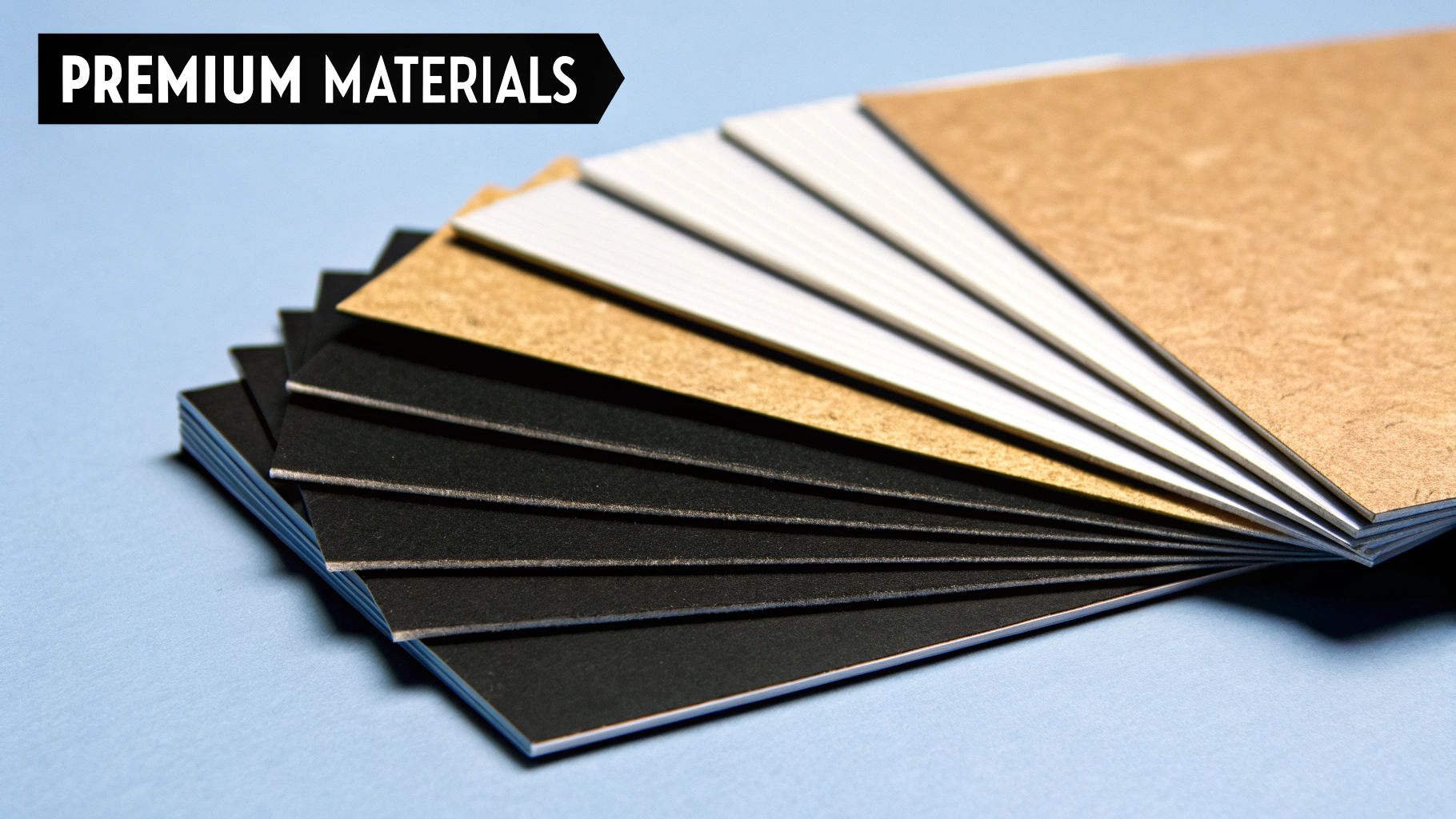
Choosing Materials That Communicate Quality
A business card does more than just share your contact information; it’s a physical representation of your brand that someone holds in their hand. The way it feels—its weight, its texture—is your first, unspoken introduction. A flimsy card feels cheap and disposable, but a card with some heft and a unique finish tells a different story. It says you care about the details.
Think of your business card like a handshake. Is it firm and confident, or weak and forgettable? The material you choose is that handshake. It's your chance to make a tangible impression of quality before they even visit your website or see your work.
Understanding Paper Weight and Thickness
The first thing you’ll probably decide on is the paper stock, and its thickness is a huge deal. In the printing world, we measure this in points (pt). You don't need to get lost in the jargon, just remember this: a higher number means a thicker, sturdier card.
Your average, run-of-the-mill business card is usually around 14pt. It gets the job done, but it also bends and creases easily. It doesn't exactly scream "premium." If you want to convey a sense of substance, you should start at 16pt or higher. A 32pt card, which feels almost like a credit card, is seriously impressive and immediately makes you stand out.
A thicker card isn't just about feeling nice. It’s a subtle signal that your brand is solid, established, and willing to invest in quality, right down to the smallest touchpoint.
Selecting the Right Finish for Your Brand
After the paper, you need to think about the finish. This is the coating that goes on top, and it completely changes the card's look and feel. Each one has a different personality, and picking the right one is key to matching your card to your brand's vibe.
This image shows just how popular the different finishes are among professionals.
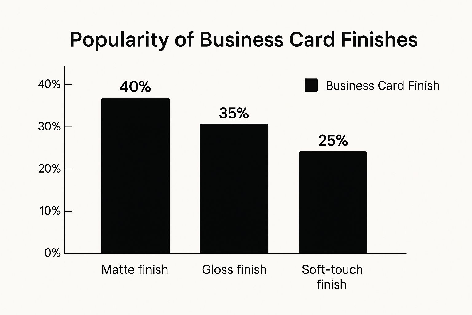
As you can see, matte is the clear winner for its clean, modern feel, but gloss still holds its own for brands that need that extra pop of color. Let's break them down.
Here’s a quick look at the most common finishes and what they say about your brand.
Business Card Finish Comparison
Each finish creates a totally different experience. Choosing the right one helps reinforce the story you want your brand to tell.
A deeper dive into the most popular options:
Matte Finish: This gives you a smooth, glare-free surface that looks incredibly clean and professional. It’s the go-to for elegant, minimalist designs because text is super easy to read. A matte finish hints at sophistication and works for just about any industry.
Gloss Finish: If you want your colors to jump off the card, gloss is your friend. This shiny coating makes everything look more vibrant and is perfect for designs that rely on photography or bold graphics. It’s a great fit for creative, high-energy brands.
Soft-Touch Finish: People can’t help but comment on this one. It feels like suede or velvet and gives the card an immediate sense of luxury. It has a matte look, but the tactile feel is what makes it unforgettable. This is the choice for high-end brands that want to communicate exclusivity. Your color palette is also critical here, which we cover in our guide to https://www.softriver.co/blog/logo-colors-for-business.
Adding a Touch of Luxury with Special Techniques
Want to really push the boat out? Special printing techniques can add texture and visual flair that people notice. These are great for highlighting your logo or name.
Foil Stamping: This is where a metallic foil—think gold, silver, or copper—is stamped onto your card. It adds a touch of class and catches the light beautifully.
Embossing & Debossing: Embossing raises a part of your design up from the surface, while debossing presses it in. Both create a 3D effect that makes people want to run their thumb over it.
Spot UV: This is a clever trick where a glossy varnish is applied to specific "spots" on a matte card. It creates a subtle, elegant contrast that can make a logo or a pattern stand out without being loud.
And if you really want to make an unforgettable statement, you can move beyond paper altogether. Exploring options like custom metal business cards leaves a lasting impression of strength, durability, and undeniable quality.
Turning Your Card into a Smart Networking Tool
Your business card isn't just a convenient way to hand over your contact details. It's supposed to start a conversation and, more importantly, get someone to take the next step. Think of it less like a static piece of paper and more like a dynamic tool in your networking kit. The whole point is to turn a quick handshake into a real connection.
So many people miss the most valuable real estate on their card: the back. Leaving it blank is a huge missed opportunity. That empty space could be working for you, reinforcing your value and giving someone a reason to follow up long after you've met.
The goal here is simple. We want to transform your card from a passive slip of paper into an active bridge that builds a professional relationship. A little bit of strategy ensures your card gets remembered and used, dramatically improving its odds of avoiding the bin.
Activating the Back of Your Card
The back of your card is a blank canvas, perfect for delivering one last, compelling message. It's your chance to add a little something extra, show off your personality, and guide the recipient toward a specific action.
Here are a few powerful ways to put that space to work:
- A Clear Call-to-Action (CTA): This is the most direct route. Just ask them to do something. It could be "Scan to see my portfolio," "Visit our site for a free consultation," or "Follow us on LinkedIn for industry insights."
- A Powerful Testimonial: A short, punchy quote from a happy client builds instant credibility. A single line like, "Working with them doubled our leads in six months," says more than a paragraph of self-promotion ever could.
- Your Value Proposition: In a nutshell, what makes you different? A tagline like "Handcrafted branding for ambitious startups" immediately tells people who you are and what you do best.
- A Special Offer: Give them a reason to hang onto your card. An exclusive discount code or an invitation to a free webinar turns it into something with tangible value.
A business card with a clear next step is no longer just a piece of contact information; it’s the beginning of a customer journey. It transforms a simple exchange into a measurable marketing interaction.
This kind of strategic thinking is a cornerstone of a strong brand identity. If you want to dive deeper into building your market presence, check out these essential top branding tips for small business success and see how every little touchpoint adds up.
Bridging the Physical and Digital Worlds with QR Codes
Let's be honest, everyone has a smartphone in their pocket. That makes QR codes the easiest way to link your physical card to your digital world. A quick scan can open up a wealth of information, making it incredibly simple for someone to engage with you right then and there.
Nobody wants to manually type in a long website URL from a tiny card. A QR code removes all that friction. The trick is to make sure it links to something genuinely useful and, critically, mobile-friendly.
Smart Ways to Use QR Codes on Your Card
Think about the one thing you want someone to do after meeting you. That's what your QR code should help them accomplish.
- Link to Your Digital Portfolio: If you're a creative—a designer, photographer, or artist—nothing beats a QR code that opens a beautiful online portfolio. It's an instant showcase of your best work.
- Connect on LinkedIn: Send them straight to your LinkedIn profile. It makes connecting effortless and helps you grow your professional network on the spot.
- Book a Meeting: Use a scheduling tool like Calendly to create a link where someone can book a meeting with you. This is a brilliant way to capture their interest while it's still fresh.
- Drive Website Traffic: Sometimes, the simplest option is the best. Link directly to your homepage or a landing page you've set up specifically for new contacts.
- Share a Digital Business Card: You can link the QR code to a vCard (.vcf file). With one tap, they can save all of your contact information directly into their phone's address book.
By putting these smart elements to work, your business card becomes so much more than an introduction. It becomes an interactive tool that forges connections, demonstrates your value, and creates real opportunities.
A Few Common Questions About Business Card Design
Even after you've nailed down the big ideas, a few practical questions always seem to pop up right at the end. Let's tackle some of the most common ones so you can finalize your design with total confidence.
What’s a Realistic Budget for Business Card Design?
This is a classic "it depends" scenario, but the range is pretty wide. Grabbing a template from an online service is your cheapest route, no question.
If you bring a freelance designer on board, you could be looking at anywhere from a few hundred dollars to over a thousand. It all comes down to their experience and how complex your vision is. Just remember to think of your card as an investment in that all-important first impression, not just a line item on your expense report.
A great business card isn't an expense; it's an investment in how people see your brand. When it opens the right doors and builds instant trust, it pays for itself many times over.
What Absolutely Has to Be on My Business Card?
Less is almost always more. You want to avoid that cluttered, desperate look at all costs. Stick to the absolute must-haves:
- Your full name and title
- Company name and logo
- One good phone number and a professional email
- Your website address
Tempted to add all your social media handles? Don't. A clean QR code that links to a simple landing page with all your profiles is a much slicker solution.
Should I Put My Photo on It?
This really comes down to your industry. If you're a real estate agent, a consultant, or anyone whose business is built on personal connection, a photo is a fantastic way to help people put a face to your name. It makes you memorable.
But if you're in a more buttoned-up field like finance or law, it's not standard practice and might even look a bit out of place. If you go for it, make sure it’s a professional, high-quality headshot that matches your brand's vibe. No selfies from your last vacation!
What Are the Biggest Design Mistakes People Make?
I see the same few mistakes over and over. The biggest culprits are using too many fonts (it looks chaotic), picking a font size that's too small to read without squinting, and cramming way too much information onto that tiny space.
Oh, and printing on cheap, flimsy paper stock. It just screams "I cut corners." Always put clarity and quality first. A clean, simple design will beat a busy one every single time.
Ready to create a brand identity that makes a powerful first impression? The expert designers at Softriver deliver custom logos and complete brand packages with unmatched quality and speed. Start building your professional brand today.