
Ever wondered what keeps a great brand looking and feeling the same everywhere you see it? The secret is a style guide. Think of it as the single source of truth for your brand's identity, covering everything from your logo and colors to the way you write.
It's the instruction manual that guarantees anything your team creates—whether it's a social media post, a website update, or a new brochure—feels cohesive and instantly recognizable.
The Blueprint for Your Brand
Imagine trying to build a house without a blueprint. The electrician wouldn't know where to run the wires, and the plumber might put pipes in the wrong wall. The final result would be chaotic and dysfunctional. That's exactly what happens to a brand that doesn't have a style guide.
A style guide isn't just a list of restrictive rules. It’s a strategic tool that aligns your entire team, from designers to copywriters, ensuring everyone is on the same page. This consistency is what builds brand recognition and makes your business feel professional and trustworthy. This is especially true when you're just getting started, like when starting a photography business, where a strong brand identity can make all the difference.
The Essential Components
So, what actually goes into one of these guides? While they can get incredibly detailed, every solid style guide is built around a few core elements that define how your brand looks, feels, and sounds.
- Logo Usage: This section outlines the do's and don'ts for your logo. It specifies things like minimum size, how much empty space to leave around it (clear space), and which logo versions to use on different backgrounds.
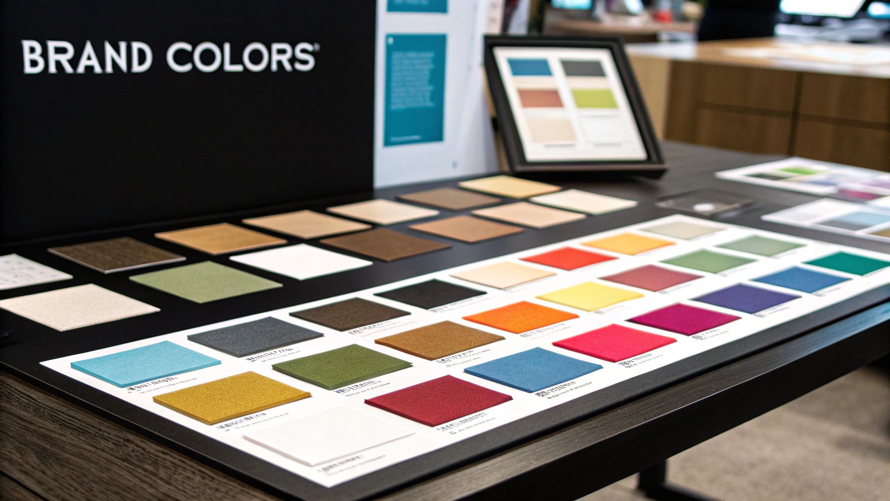
- Color Palette: Here, you'll define your brand's official colors. This includes your primary and secondary colors, along with any accent shades, complete with their hex codes for digital use and CMYK/Pantone values for print.
- Typography: These are your brand's official fonts. The guide will specify which fonts to use for headlines, body paragraphs, and smaller text, along with rules for size, weight, and line spacing.
- Voice and Tone: This is all about personality. It defines how your brand should sound in writing—is it friendly and witty, or formal and authoritative? This ensures your messaging is just as consistent as your visuals.
Let's take a quick look at how these pieces fit together.
Key Components of a Style Guide at a Glance
This table breaks down the essential elements of a style guide and the role each one plays in building a cohesive brand.
By defining these key areas, you create a powerful framework that keeps your brand strong and consistent, no matter who is creating content for it.
Building Your Visual Foundation with Logo, Color, and Typography
When you think about a brand, what comes to mind first? It's almost always the visual stuff—the logo, the colors, the look of their text. These three elements are the absolute bedrock of your brand identity. They're the fastest way to get recognized, so getting them right is non-negotiable.
A good style guide lays down the law for these visual pillars. It ensures your brand looks polished and professional every single time, whether it's on a billboard or in a social media post.
Getting the Logo Right
Think of your logo as your brand's unique signature. You wouldn't sign your name differently on every document, would you? The same principle applies here. Your style guide needs to set clear, strict rules for how your logo is used.
- Clear Space: This is the "breathing room" around your logo. It’s a dedicated keep-out zone that prevents other elements from crowding it and ensures it always stands out.
- Minimum Size: How small is too small? Your guide should specify the absolute minimum size for your logo on both digital screens and printed materials to guarantee it's always readable.
- Don't Do This: It's just as important to show what not to do. Include visual examples of incorrect usage, like stretching the logo, changing its colors, or adding weird drop shadows.
Defining Your Brand Colors and Fonts
Choosing your color palette isn't just about picking shades you like; it’s about setting a mood and triggering emotions. Your style guide needs to be specific. List your primary, secondary, and accent colors, and provide their exact color codes (like HEX for web and CMYK for print) to remove any guesswork.
Typography is the other half of this equation. It's the voice of your brand in written form. Are you modern and clean, or traditional and elegant? Your font choices make that statement.
This is where you define your brand's typographic hierarchy—the fonts for headlines, subheadings, and body text. Consistency here is key for readability and reinforcing your brand's personality.
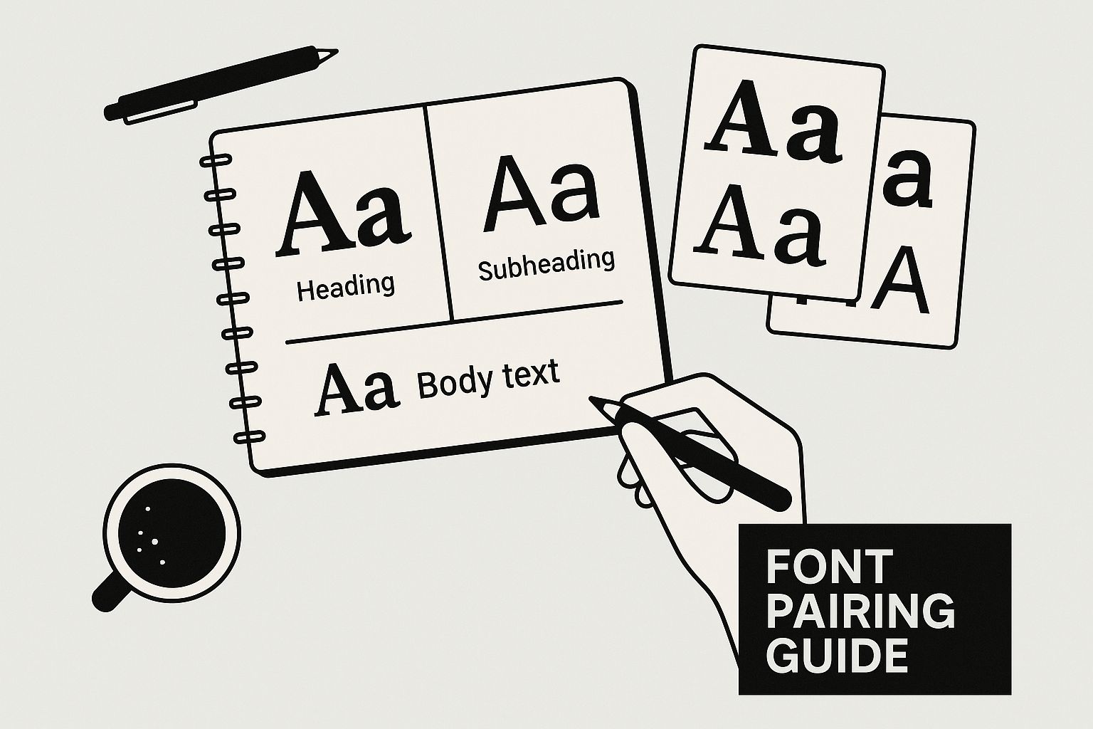
As the image shows, pairing the right fonts creates a clear visual flow that guides the reader's eye. It’s a subtle but powerful part of the user experience. You can dive deeper into typography for logo design in our dedicated guide.
The whole point of a style guide is to create consistency. People crave simplicity and clarity. When your branding is consistent, it’s easier for them to understand and trust you. This isn't just a design trend; it’s a reflection of how people prefer to interact with information online.
Giving Your Brand a Unique Personality with Voice and Tone
Once you've nailed down the visual side of your brand, it's time to figure out its personality. This is the fun part where you go from what your brand looks like to what it sounds like. People often mix up brand voice and tone, but they're two different tools that work together to shape how your audience connects with you.
Here's the simplest way to think about it: voice is your brand’s core personality, and that personality stays the same. It's who you are, day in and day out. Tone, on the other hand, is the emotional flavor you add to that voice depending on the situation.
Think about a friend who is naturally funny and lighthearted. That's their voice. But if you call them with bad news, they won't crack a joke. Their tone will shift to become serious and empathetic, even though they're still the same person. Your brand works the same way.
Defining Your Brand Voice
To pin down your brand's voice, try to describe it with a handful of powerful adjectives. "Professional" isn't going to cut it—it's too vague. Get specific. Are you authoritative but still friendly? Playful yet sharp? Quirky and innovative?
Your brand voice is the constant, foundational personality that underpins all your communication. The tone is how that personality is expressed in different scenarios—it’s the emotional color you add to your fixed voice.
One of the most effective ways to make this real for your team is to create a simple "We are / We are not" or "Dos and Don'ts" chart in your style guide. It moves the idea from abstract to actionable.
For a brand with a “Clear and Confident” voice, your chart might look like this:
- Do: Use direct, active language that gets straight to the point.
- Don't: Lean on corporate jargon, passive voice, or wishy-washy phrases like "we think" or "perhaps."
When you clearly map out your voice and the nuances of its tone, your style guide gives everyone—from marketers to customer support—the ability to speak with one, unified personality. This kind of consistency is what builds trust and a real relationship with your audience.
Telling a Cohesive Story with Brand Imagery and Graphics

If your logo and colors are the skeleton of your brand, then images and graphics are what give it flesh and a personality. They're powerful storytellers, but only when they all speak the same visual language. A style guide provides the essential playbook to make sure every photo, icon, and illustration tells a unified, recognizable story.
This part of the guide goes way beyond just your logo. It defines the entire feel of your visual assets. Think of it like a film director setting the mood before a single scene is shot. Without this direction, your brand can feel disjointed—imagine a gritty, black-and-white photo on one page and a bright, cartoonish graphic on the next. It just doesn't work.
Your style guide ensures every visual element pulls in the same direction. To get a better handle on how this works in practice, it’s worth exploring the core principles of visual storytelling.
Defining Your Photography Style
First things first, you need to establish clear rules for photography. This step is crucial because it guarantees that whether you're grabbing stock photos or commissioning a full-blown photoshoot, the final images always feel like your brand.
Your guidelines should nail down the answers to a few key questions:
- Subject Matter: Do we show real, diverse customers using our product? Or is our look more about clean, crisp product shots against a simple backdrop?
- Composition: Are we going for candid, in-the-moment shots that feel authentic? Or do we need perfectly staged, professional compositions?
- Lighting and Color: Is our vibe bright and airy, or do we lean toward a more muted, natural light? Should every photo get a specific color treatment or filter?
Guidelines for Illustrations and Icons
Consistency is just as critical for all the other graphics you use, like icons and illustrations. These little details pack a punch, adding personality and guiding users, so they absolutely must look like they belong to the same family.
The goal is to build a visual library where every single element, no matter how small, reinforces your brand identity. An icon on your website should feel like it belongs with the photography in your annual report.
Your guide needs to get specific here. It should dictate the style (e.g., simple line art vs. colorful flat design), explain when to use them, and lock in the approved color palette for any and all graphics. Setting these rules empowers your team to create visuals that are consistently and unmistakably yours.
Making Your Style Guide a Living Document
Let’s be honest: a style guide gathering dust on a server is useless. If your guide is just a PDF saved on one person’s computer, it creates a bottleneck and pretty much guarantees it’ll be ignored.
To give it real power, it needs to be accessible to everyone who creates content for your brand—from your internal teams to freelance partners. The goal is to make using the guide a natural part of the creative process, not a chore.
A central, shared location is the key. This could be a dedicated page on your company intranet, a cloud document like a Google Doc, or a dynamic brand management platform. By integrating it into your daily work, you’ll find it’s much easier to Master Your Content Creation Workflow.
Keep Your Guide Relevant with Regular Updates
A great style guide is never "finished." It has to evolve right alongside your brand. The digital world moves fast, and guidelines created today might feel dated in just a year. You can learn more about how to create brand guidelines that are built to last in our other article.
Think of your style guide like software, not a stone tablet. It needs regular updates and version control to stay effective, just like any other tool in your toolbox.
This doesn't have to be a massive undertaking. Scheduling periodic reviews is a simple way to keep your guide sharp and aligned with your business goals.
Here’s a simple review schedule to get started:
- Quarterly Check-ins: A quick look-over to handle any new situations or make small tweaks for new marketing channels.
- Annual Overhaul: A deeper dive to make sure the guide reflects any major strategic shifts, new products, or bigger brand updates.
Your Top Style Guide Questions, Answered
So, you're on board with why a style guide is crucial. But when it's time to actually build one, the practical questions start popping up. Let's tackle some of the most common ones I hear from teams, from tiny startups to growing companies.
Think of this as your practical FAQ for turning the idea of a style guide into a real, working document that people actually use.
I'm a Small Business. Where Do I Even Start?
This is a big one. The good news? You don't need a massive, 100-page document right out of the gate. For a small business, less is absolutely more. The goal is to be practical, not exhaustive.
Start with a simple, one-page guide that covers the essentials. These are your brand's non-negotiables:
- Logo Rules: Show your main logo. Define how much empty space to leave around it (clear space) and the smallest it can be used without looking blurry.
- Core Colors: Pick 3-4 primary brand colors. List their HEX codes so anyone can replicate them perfectly.
- Basic Typography: Keep it simple. Choose one font for your headlines and another for your main body text.
- Brand Voice: Brainstorm 3-5 adjectives that capture your brand's personality. Is it "Friendly, knowledgeable, and direct"? Or maybe "Playful, bold, and inspiring"?
This single page is your foundation. It's easy to make, easy to share, and you can always build on it later as your business and brand mature.
Is a "Brand Book" the Same Thing as a "Style Guide"?
Great question. You’ll hear these terms thrown around a lot, often interchangeably, but there's a classic distinction between them.
A style guide is the tactical playbook. It's focused on the how—how to use the logo, which colors to pick, what fonts to apply. It’s all about execution.
A brand book is usually more expansive. It covers the why behind your brand. This is where you'd find your company's mission, vision, core values, and a deep dive into your target audience. The style rules are often included, but they're part of a bigger story.
These days, the lines have blurred quite a bit. The most useful guides are a hybrid, weaving in key brand strategy elements to give context to the rules. It’s about combining the "why" and the "how" into a single, powerful resource.
How Often Should We Update Our Style Guide?
Your style guide should never gather dust. Think of it as a living, breathing document that grows with your brand. If you just create it and forget it, it'll become useless fast.
To keep it relevant, you need a rhythm for updates. Here's a schedule that works well for most teams:
- Quarterly Check-in: A quick, light review. Did we start using a new social media platform? Do we need to add a quick guideline for something that keeps coming up? This is for minor tweaks and additions.
- Annual Overhaul: A deeper dive once a year. This is your chance to make sure the guide aligns with any bigger shifts in your business, a major marketing campaign, or a brand refresh.
This simple habit keeps your guide from becoming obsolete and ensures it remains the source of truth for your entire team.
Ready to build a brand identity that commands attention and builds trust? The expert designers at Softriver create custom logos and comprehensive brand guidelines that set you up for success. Get your professional brand identity started today.