
A great logo is so much more than just a pretty picture. It's the face of your brand, a visual shortcut that instantly tells people who you are and what you're all about. The best ones are built on five core ideas: simplicity, memorability, timelessness, versatility, and appropriateness. When these elements click, you get a symbol that's not just recognizable but truly lasting.
The Anatomy of a Successful Logo
Think of a great logo as the cornerstone of your brand's identity. It doesn't just put a name to your business; it shares your story, reflects your values, and starts building a real connection with your audience. It’s often the very first impression you make and the last thing someone remembers.
An effective logo has to juggle a few key jobs at once. It needs to be simple enough for our brains to process in a split second, but unique enough to cut through all the noise in a crowded marketplace. This is what separates an iconic logo, like Apple's bitten fruit or Nike's swoosh, from the thousands of forgettable designs out there. They're boiled down to their absolute essence, which is what makes them so powerful and easy to recall.
Core Principles for Lasting Impact
Those five foundational pillars—simplicity, memorability, timelessness, versatility, and appropriateness—aren't just fancy design-speak. They're the practical tests that decide whether a logo will stand the test of time or fizzle out. A design that's too busy will fail the versatility test the moment you try to shrink it for a social media profile. A logo that chases a fleeting trend will quickly look dated, forcing an expensive rebrand just a few years down the line.
This visual map breaks down how key principles like simplicity, timelessness, and versatility are the bedrock of any successful logo.
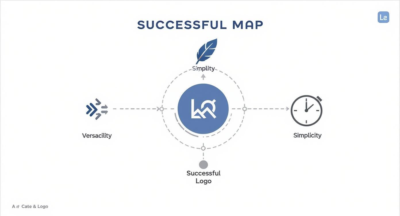
As you can see, these aren't separate ideas but interconnected parts that support the whole design. Each one strengthens the others, creating a balanced and effective brand mark that can adapt and endure for years to come.
A successful logo is an exercise in intelligent reduction. It’s not about what you can add, but what you can take away while still communicating a powerful message.
If you want a deeper dive into the whole process of creating a brand-defining symbol, from the initial idea to the final design, you can learn more about how to create professional logos. It's a great resource that walks you through turning these principles into a real-world design.
To get us started, here’s a quick breakdown of what each of these core pillars really means. Think of this as your cheat sheet for understanding the concepts we'll be exploring throughout this guide.
The Five Pillars of a Successful Logo
Getting these five principles right is the secret to creating a logo that doesn't just look good, but works hard for your business.
Why Simple Designs Are So Powerful
When you think of the world's most recognized brands, what do you see? A simple swoosh? A bitten apple? A pair of golden arches? These symbols didn't become famous by accident. Their power is baked into their simplicity.
A simple logo isn't a boring one. It's a design that's been carefully stripped down to its most essential, potent form. Think of it as a visual shortcut for your entire brand. In a world jam-packed with information, people don’t have time to solve a complicated puzzle. A clean, uncluttered design cuts right through the noise, delivering its message in a heartbeat.
The Science of Instant Recognition
Our brains are wired to process simple visuals quickly. A logo packed with intricate details and multiple colors forces our minds to work harder, which slows down recognition. A bold, simple shape, on the other hand, is processed in a fraction of a second. This "cognitive ease" is why you can spot the Target bullseye from a hundred yards away.
This isn't just about looking good; it's about how we remember things. The world’s biggest brands have proven this time and again. A staggering 95% of top brands use simple, clean logos. And for good reason—our brains process logos up to 60,000 times faster than words, meaning people form an opinion about your brand in as little as 10 seconds.
They also keep their color palettes tight: 94% of the world's top 100 brands use just one or two colors. You can dig into more stats like these in this great overview of logo statistics and findings.
A great logo is an exercise in reduction. It’s not about how much you can add, but how much you can take away while keeping the core message intact. This restraint is what creates a timeless and powerful symbol.
How Simplicity Drives Adaptability
Beyond being memorable, simplicity is what makes a logo truly adaptable. A great logo has to look perfect everywhere, from a tiny favicon on a browser tab to a massive billboard in Times Square.
Think about all the places a logo needs to work:
- Scalability: A complicated design with fine lines and gradients turns into a blurry mess when you shrink it down for a social media profile. A simple mark, like the Nike swoosh, stays sharp and clear at any size.
- Color Versatility: Your logo will absolutely need to appear in a single color—on printed documents, merchandise, or as a watermark. An overly detailed logo that relies on color to make sense will fall flat. A simple one works just as well in black and white.
- Medium Flexibility: From digital screens to embroidered uniforms, your logo has to be versatile. Simple shapes and clean lines are far easier to reproduce accurately across different materials and printing methods.
If you want to go deeper on this, our guide on what minimalist logo design is explores how "less is more" can make your brand even stronger.
Distilling Your Brand to Its Essence
Getting to a simple design isn't about being generic; it's about being focused. The whole point is to pinpoint the single most important idea your brand needs to communicate and then express it in the most direct way possible. Is your brand about connection? Innovation? Speed?
Look at Amazon. That arrow pointing from 'A' to 'Z' is brilliant. It says two things at once: we sell everything from A to Z, and we deliver it with a smile. This is what a successful logo does—it tells a story without saying a word. By stripping away everything that isn't essential, you create a symbol that’s not just powerful, but built to last.
How Your Logo Builds Brand Trust
Think of your logo as your brand's visual handshake. It's often the very first thing a potential customer sees, and it instantly sets the tone for everything that follows. A great logo is far more than just a pretty picture; it’s a strategic asset that communicates your core values before you’ve even said a word. It’s like the cover of a book—it doesn't tell the entire story, but it sure does influence whether someone decides to pick it up.

That first impression is everything. A polished, professional logo sends a clear signal: this business is competent, reliable, and pays attention to detail. On the flip side, a sloppy or generic logo can make a company seem amateurish. This is where trust begins—with a simple symbol that promises a consistent, quality experience.
Aligning Your Logo with Your Audience
To truly build trust, your logo has to speak the right visual language to the right crowd. It needs to connect with your target audience's tastes, values, and what they expect to see from a company like yours. For example, a bright, playful logo might be a home run for a kids' toy brand, but it would feel completely wrong for a serious financial advisory firm.
Getting this alignment right is a huge part of what makes a logo work. It shows you've done your homework and you genuinely understand who your customers are. Using powerful brand positioning strategies is the key to designing a logo that clicks with your audience and builds confidence from that very first glance.
Just look at these examples of perfect alignment:
- Patagonia: That rugged mountain silhouette speaks directly to outdoor lovers who value durability and nature.
- Rolex: The crown emblem screams luxury, precision, and status—a perfect match for the aspirations of its high-end buyers.
When a logo just feels "right" for its industry, it creates an instant sense of familiarity and credibility. That connection is the bedrock of the long-term relationships that lead to real customer loyalty.
Consistency Creates Familiarity and Reliability
Trust isn’t a one-and-done deal; it's earned through repeated, positive experiences. Your logo is the visual anchor for all of them. Every single time a customer sees your logo—on your website, a product, a social media post, or an ad—it reinforces their memory of your brand.
This repetition is incredibly powerful. It takes an average of 5–7 exposures for someone to even begin to recognize a brand. That familiarity eventually turns into confidence. In fact, studies show 59% of shoppers prefer to buy from recognizable brands, and this feeling is so strong that 60% will actively avoid companies with logos they find unappealing or unprofessional.
A logo is the most identifiable aspect of a brand. Its consistent application across all touchpoints turns it from a simple graphic into a dependable symbol that customers can rely on.
Seeing your logo consistently makes your brand feel stable and permanent, not like some fly-by-night operation. It shows you’re a professional entity here to stay. This idea of visual consistency is a cornerstone of a trustworthy brand image, something we explore more in our guide on proven strategies for building customer trust.
Ultimately, when people see your logo, you want them to feel a sense of assurance. They should know exactly what they’re going to get. That reliability is the very essence of brand trust.
Choosing the Right Color, Typography, and Form
If the big principles are the "what" of logo design, then color, typography, and form are the "how." These are the technical, hands-on details that actually bring a great idea to life.
Think of it like cooking a meal. The core design principles are the recipe, but these elements are your ingredients. The quality of your ingredients—and the skill with which you combine them—is what makes the final dish either forgettable or fantastic.
The Psychology of Color
Color hits you first. Before you even read a word, the color of a logo has already sent a message and triggered a feeling. It's the most immediate and emotional part of your design.
Why do so many banks and tech giants use blue? It’s not a coincidence. We’re wired to see blue as a color of trust, stability, and intelligence. Red, on the other hand, screams energy and passion, while green instantly makes us think of nature, health, or money.
A logo’s color is its primary emotional messenger. It works on a subconscious level, creating a powerful first impression that can define how customers perceive your brand’s personality.
These choices have a real impact on the bottom line. Research shows a colored logo can boost brand recognition by a stunning 80% over a black-and-white one. Blue is the reigning champ, used by about a third of the world's top companies. This matters because maintaining a consistent visual identity—with color at its heart—can increase sales by 23%. You can dig into more of these fascinating insights in this compilation of logo design statistics and their impact.
The Voice of Typography
If color sets the mood, typography gives the brand its voice. The font you pick says a ton about your company's personality without speaking a single word. Are you serious and traditional, or are you modern and friendly?
Let’s break down the two main families:
- Serif Fonts: These are the ones with the little "feet" on the ends of the letters, like Times New Roman. They feel classic, established, and trustworthy. You'll often see them used by luxury brands, universities, and law firms that want to project a sense of heritage and authority.
- Sans-Serif Fonts: "Sans" just means "without," so these fonts have clean, modern lines with no feet (think Arial or Helvetica). They feel fresh, straightforward, and approachable. Tech startups and lifestyle brands love them for this very reason.
Choosing the right font doesn't just make your name readable; it infuses it with character. For ideas on how to pair your typography with the perfect palette, check out our guide on unforgettable logo color combinations.
The Power of Form and Shape
Form is the logo's overall structure—the final shape created by combining color and type. It's the visual scaffolding that holds everything together into a distinct mark. This can be anything from a simple geometric shape to a clever use of the space around the design.
A logo’s shape can be literal (like Twitter's bird) or totally abstract (like the Chase Bank octagon). Even basic shapes carry subconscious weight. Circles often suggest community and wholeness, squares imply stability and order, and triangles can convey power or forward momentum.
One of the most impressive tricks in a designer's toolkit is the use of negative space—the empty area in and around the logo. The most famous example is the hidden arrow in the FedEx logo, tucked between the 'E' and the 'x'. That tiny detail brilliantly communicates speed and precision, adding a whole new layer of meaning without adding any clutter. A well-executed form makes a logo feel balanced, interesting, and smart.
A Practical Guide to Logo File Formats
Once your logo's color, type, and form are set, the final technical hurdle is saving it in the right file formats. Using the wrong file type is like printing a beautiful photo on a cheap, flimsy piece of paper—it completely undermines the quality.
A logo needs to look crisp and clear everywhere, from a tiny favicon in a web browser to a massive billboard. That’s why understanding the difference between vector and raster files is so important.
Logo File Formats and Their Best Uses
In short, you'll want a master vector file (like an SVG or EPS) for scalability and professional printing, and high-quality raster files (like PNGs) for all your day-to-day digital needs. Having both on hand ensures your brand always looks its best, no matter where it appears.
Common Logo Design Mistakes to Avoid
Knowing what makes a logo great is only half the story. You also need to know what makes one fail. Understanding the common design traps is key to creating a logo that helps your brand instead of holding it back.
Most of these pitfalls come from a few classic missteps, like getting carried away with flashy details or falling for the latest design trend. Spotting these issues early can save you a ton of time, money, and frustration down the road.
Overcomplicating the Design
The number one mistake is trying to cram too much into a single mark. When a logo is packed with intricate illustrations, clashing fonts, and a whole spectrum of colors, it stops being a brand mark and becomes a visual puzzle. This kind of complexity kills the two most important qualities of a great logo.
- Memorability: Our brains latch onto simple, clean shapes. A busy, cluttered design is difficult to process and even harder to recall, meaning it won’t stick in your customer’s mind.
- Scalability: What looks good on a huge monitor can quickly turn into an unrecognizable smudge when shrunk down for a favicon or a business card. All those beautiful details just blur together.
As one designer famously said, a logo should be clear enough to be recognized "zipping by on signage at 70 miles per hour." That kind of instant clarity only comes from simplicity.
Chasing Fleeting Trends
Building your logo around the latest design fad is like building a house on sand. Sure, that trendy gradient or popular script font looks cool right now, but it will likely look dated in just a year or two. Great logos are built to last.
A successful logo sidesteps temporary hype. It’s designed from the ground up to feel relevant for years, so you aren't forced into constant redesigns that confuse your audience and dilute your brand recognition.
Instead of asking what's popular, ask what’s authentic to your brand. A design rooted in your company's story and values will have genuine staying power.
Common Technical and Strategic Errors
Beyond the big conceptual mistakes, a few technical blunders can trip you up. Getting these details right is crucial for a professional, functional logo.
- Using Raster Instead of Vector: If your logo is made with pixels (like in Adobe Photoshop), it will get blurry and distorted the moment you try to resize it. A vector-based logo (created in a program like Adobe Illustrator) is built with mathematical points, so it can be scaled to any size—from a pen to a billboard—without losing an ounce of quality.
- Poor Font Choices: Type that’s hard to read, especially when small, makes your brand name useless. The style of the font also sends a message. A playful, bubbly font might feel jarring for a serious financial firm, sending a mixed signal to potential clients.
- Relying on Color: Your logo has to work in a single color. Period. If it becomes unrecognizable or loses its meaning when printed in black and white on an invoice or a promotional item, it isn't versatile enough for the real world.
- Using Stock Art: Pulling a generic icon from a stock image website is a recipe for a forgettable brand. It won’t be unique, it won’t differentiate you, and—worst of all—another company could be using the exact same image. Your logo must be original to be effective.
Your Checklist for a Winning Logo
Knowing the theory behind a great logo is one thing, but actually creating one is another beast entirely. To help you bridge that gap, I’ve put together this practical checklist. It breaks the whole process down into three main stages: Strategy, Design, and Finalization.
Whether you're tackling the design yourself or bringing in a professional, use these questions as your guide. They'll make sure you cover all your bases, from the initial idea to the polished final mark.
Stage 1: The Strategy Phase
Before you even think about opening a design program, you need a solid foundation. This stage is all about defining what you're trying to achieve and getting a lay of the land. Nailing these questions down first saves you from headaches and costly redos later.
- Who are you talking to? Get specific about your target audience. Think about their age, what they care about, and what they expect. A logo for a Gen Z gaming app needs a completely different vibe than one for a financial advisor targeting retirees.
- What’s your core message? If your logo could only say one thing, what would it be? Are you all about innovation, trust, speed, or maybe affordability? Your logo needs to echo that message loud and clear.
- Who’s your competition? Take a good look at the logos of your main competitors. See what’s working, what isn’t, and—most importantly—how you can design something that doesn’t just blend in with the crowd.
Stage 2: The Design Phase
Once your strategy is locked in, it's time to get visual. This is where you start turning those strategic ideas into actual designs, constantly checking your work against the principles we’ve been talking about.
A great logo isn’t just a pretty picture; it’s a hard-working tool. Every single choice, from the color palette to the spacing, should have a strategic reason behind it.
As you work, ask yourself these crucial questions:
- Is it simple and memorable? Seriously, could someone sketch it from memory after seeing it once? That’s the real test.
- Does it work in one color? Your logo has to look good in plain black and white. Think about how it will look on an invoice, stamped on a box, or as a watermark.
- Is it scalable? Test it out. Shrink it down to the size of a tiny favicon for a browser tab or a social media profile pic. Is it still clear and recognizable?
- Is it timeless? It's so tempting to jump on the latest design trend, but try to resist. A logo that looks cool today might look dated in two years. Aim for classic and enduring instead.
Stage 3: The Finalization Phase
You're almost there. This last stage is all about taking your best concept, polishing it up, and getting it ready for the real world. That means getting some outside opinions and making sure you have all the right files to use your logo everywhere.
- Have you gotten feedback? Don’t do this in a vacuum. Show the design to people you trust and, if you can, a few people from your target audience. Does it connect with them the way you hoped it would?
- Do you have all the file formats you need? This is a big one. Make sure you get vector files (SVG, EPS) for things that need to be scaled (like signs or t-shirts) and raster files (PNG, JPG) for everyday digital use. Having the right files is the key to keeping your logo looking crisp and professional, no matter where it shows up.
Got Questions About Logo Design? We've Got Answers.
Even after you've got a handle on the principles, actually starting a logo design project can feel a little daunting. Let's tackle some of the most common questions that pop up for business owners and designers alike.
How Much Should I Expect to Pay for a Professional Logo?
Ah, the million-dollar question—or maybe just a few hundred dollars. The truth is, a logo can cost you anything from the price of a coffee on a freelance site to a five-figure investment with a top-tier agency. The range is massive.
For most small businesses and startups, a realistic budget falls somewhere between $200 and $2,500. This gets you a professional designer who will do their homework, sketch out a few solid concepts, and hand over all the file types you'll ever need. A word of caution: if a price seems too good to be true, it probably is. Super-low costs often mean you're getting a generic template, which completely defeats the purpose of creating a unique identity.
How Long Does It Take to Get a Logo Designed?
The timeline really hinges on the project's complexity and the designer's process. A quick, simple design from a fast-turnaround service might only take a couple of days. On the other hand, a full-blown branding project with a large agency could easily stretch over several weeks or even a month or two.
A standard professional workflow usually breaks down like this:
- Discovery & Research: The designer gets to know your business, your customers, and your competition.
- Concept Development: Time for sketching, brainstorming, and building out the first visual ideas.
- Feedback & Revisions: You review the concepts and work with the designer to refine your favorite.
- Finalization & Delivery: The chosen design gets its final polish, and all the files are packaged up for you.
As a general rule of thumb, plan for the entire process to take anywhere from one to four weeks for a quality, custom logo. Trying to rush it is usually where you start cutting corners on strategy.
What's the Big Deal About Vector vs. Raster Files?
Getting your head around this technical detail is absolutely critical. It’s the difference between a logo that looks crisp and clean everywhere and one that turns into a pixelated mess the moment you try to resize it.
Think of a vector file (formats like SVG or EPS) as a set of instructions. It uses math to draw the shapes, which means you can scale it up to the size of a building or down to the size of a pinhead, and it will always be perfectly sharp. This is your master logo file.
A raster file (like a JPG or PNG), however, is made of a grid of tiny squares, or pixels. When you make it bigger, the computer just stretches those same squares, making the image look blurry and jagged. These are useful for specific things, like website images, but they aren't flexible. Always, always make sure your designer gives you the vector source files.
Ready to create a logo that nails all the essentials without the guesswork? Softriver is all about crafting professional, lasting logos and brand identities through a smart, efficient process that can deliver top-notch quality in as little as 48 hours. Our expert design team takes care of everything from the initial research to the final file delivery, making sure your brand gets noticed for the right reasons. Start your design journey with Softriver today.