A combination mark logo is exactly what it sounds like: a design that combines a visual symbol with a company's name. Think of it as a brand's full signature. It has both the icon (the picture) and the text (the wordmark), which come together to create a single, powerful identity.
It’s no surprise this is one of the most popular logo styles out there.
The Anatomy of a Combination Mark Logo
At its heart, a combination mark gives you the best of both worlds. It takes two separate branding elements and fuses them into one cohesive design, giving your audience multiple ways to recognize and connect with you. Instead of just relying on a picture or a name, you get a powerful synergy between the two.
This approach is fantastic for building brand recall. The text clearly states your company’s name, so there's no confusion for new customers. At the same time, the icon acts as a visual shortcut that, over time, becomes instantly recognizable on its own.
The Two Core Components
A successful combination mark is all about balance. It’s a marriage of two key parts that have very different but complementary jobs.
Let's break down how these two elements work together.
When these two pieces are designed to work in harmony, they create a brand asset that's both clear and compelling.
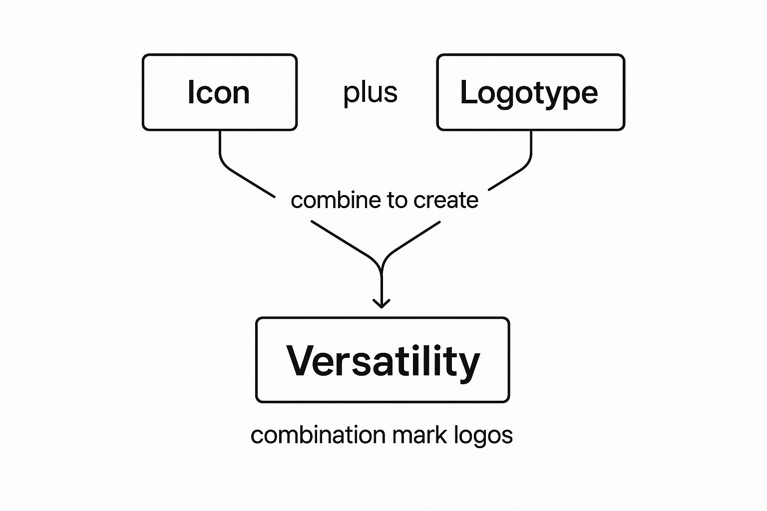
This visual concept map shows just how the icon and logotype can come together to create a flexible brand identity.

The real magic here is flexibility. These elements work together to build an identity that can be adapted for just about any situation you can think of.
The power of a combination mark lies in its ability to tell a complete story. The name provides the 'who,' while the symbol provides the 'what' or 'why,' creating an immediate connection with the audience.
This strategic pairing is why over 60% of Fortune 500 companies, including giants like Adidas and Microsoft, rely on a combination mark. It gives them the freedom to use the icon, the text, or both together, strengthening their brand identity across every single platform.
This adaptability is a huge advantage, making sure the brand looks consistent whether it's on a massive billboard or a tiny app icon. To see how this style stacks up against others, you can learn more about the 7 different types of logo designs and see which one might be right for you.
Why Top Brands Choose a Combination Mark

The world’s most recognizable brands don't just pick a logo style out of a hat. When you see a combination mark, it’s almost always a deliberate, strategic choice. Why? Because it delivers a powerful mix of clarity, personality, and flexibility that other logo types struggle to match. Think of it as a complete branding toolkit packed into one design.
This approach is fantastic for building brand recognition, and fast. By pairing a name with a visual symbol, you’re giving your audience two mental hooks to hang their memory on. The human brain processes images an incredible 60,000 times faster than text. The icon acts as an instant visual cue, while the text clears up any confusion about who you are. This one-two punch is a huge part of why logo design is important for locking your brand into a customer's mind.
Enhanced Storytelling and Connection
A combination mark does more than just state your name—it tells a story. The way the symbol and text work together lets you communicate your mission, your values, or just your overall vibe without a single word of copy.
Take the Amazon logo. The wordmark is straightforward, but that little arrow-shaped smile underneath is doing some heavy lifting. It points from A to Z, hinting at their massive product selection, while also looking like a satisfied smile. That layered meaning creates a much richer emotional connection than a simple name or icon ever could on its own.
A great combination mark is like a movie poster. It gives you the title so you know what you’re about to see, but it also uses powerful imagery to set the mood and hint at the plot before you even step into the theater.
This storytelling power allows a brand to pack complex ideas into a tight, memorable package. It’s a key reason so many leading companies go this route, as it fits perfectly within their broader brand development strategies by providing a strong, yet flexible, visual foundation.
Unmatched Versatility Across Platforms
From a practical standpoint, the biggest win for a combination mark is its sheer versatility. Since you have two distinct pieces—the symbol and the wordmark—you gain the freedom to adapt your logo for just about any situation.
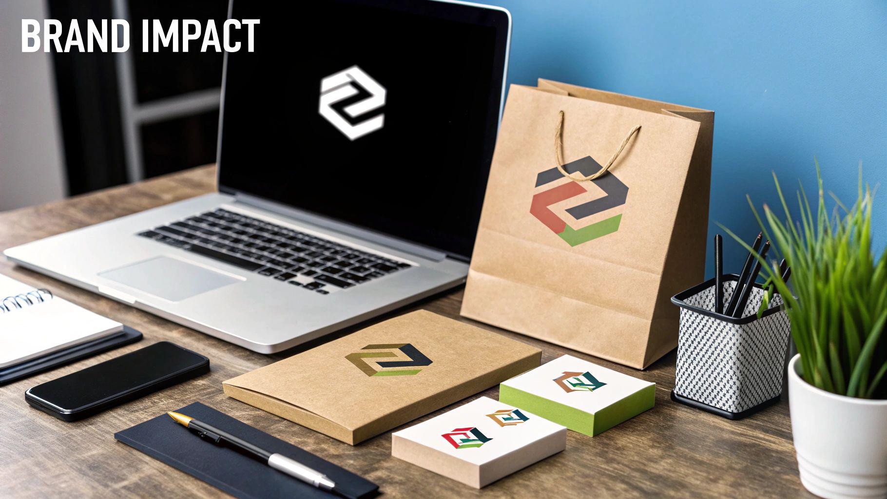
This adaptability is crucial for keeping your brand looking consistent everywhere it shows up. You can use the full logo on your website’s homepage or on product packaging, but then switch to just the symbol for tiny spaces where the full version would be unreadable.
Think about all the places your logo needs to live:
- Full Logo: The go-to for primary spots like your website header, business cards, and print ads.
- Symbol Only: Perfect for social media profile pictures, app icons, and website favicons.
- Wordmark Only: Works well in formal documents or anywhere a clean, text-only look is preferred.
This built-in flexibility ensures your brand always looks sharp and professional, no matter the medium. You never have to shrink a detailed logo down to an illegible smudge—you just use the piece that fits best.
Iconic Combination Logos and What They Do Right

It’s one thing to talk about theory, but the real magic happens when you see a combination mark logo out in the wild. The world’s most unforgettable brands are masters at weaving together text and symbols to tell a story, spark a feeling, and build an identity that sticks.
Let's pull back the curtain on a few iconic examples to see what makes them tick. You’ll notice that every element has a purpose, all working together to create a brand message that connects with millions.
Lacoste: The Tenacious Crocodile
The Lacoste logo is storytelling at its finest. You have the clean, bold wordmark right next to its famous crocodile icon. The legend behind it is that founder René Lacoste was nicknamed "The Alligator" because of his ferocious style on the tennis court. That story of tenacity is baked right into the brand’s DNA.
And the combination just works. The elegant font gives off a classic, high-end vibe, while that fierce little crocodile injects personality and a competitive edge. Together, they tell a story of sophisticated performance that has kept the brand relevant for nearly a century. It's a balance that makes the logo instantly recognizable, even from across a room.
A great combination mark does more than just show a name and a picture. It tells you who the brand is and what it believes in. The symbol gives it a soul, and the text gives it a name.
This blend of story and style is a perfect example of how a combination mark builds an identity that runs deep. If you’re hunting for more clever ways brands have paired symbols and text, digging into different examples can give you some fantastic logo design inspiration.
Burger King: The Playful Burger
Burger King’s logo is a genius take on an integrated combination mark—the text and symbol are literally one and the same. The company name is squished between two golden-orange bun halves. It’s fun, witty, and tells you exactly what they sell in a split second.
The design is so effective because you can't separate the name from the product. You read "Burger King" and see a burger at the exact same time. That creates an instant, powerful connection in your mind. Plus, the rounded shapes and bright colors give it a fun, friendly feel that fits right in with the fast-food world.
Adidas: The Symbol of Performance
Over the years, Adidas has rolled out a few different combination marks, but one thing has always remained: the three stripes. Whether it's the classic Trefoil for their lifestyle gear or the slanted three bars for their performance line, those stripes are the brand's North Star.
Adidas pairs these powerful symbols with a simple, lowercase wordmark. This strategy gives them incredible flexibility:
- The Full Logo: This version appears on products and in major campaigns to lock in the brand name.
- The Symbol Alone: The stripes are so recognizable they can stand on their own on shoes, apparel, and sponsorships.
- The Wordmark Alone: This is often used in more formal settings or corporate communications.
This adaptability allows Adidas to stay consistent while tailoring its look for different products and audiences. The combination mark builds the initial connection, and from there, each element is strong enough to work on its own without missing a beat.
How to Design an Effective Combination Mark Logo
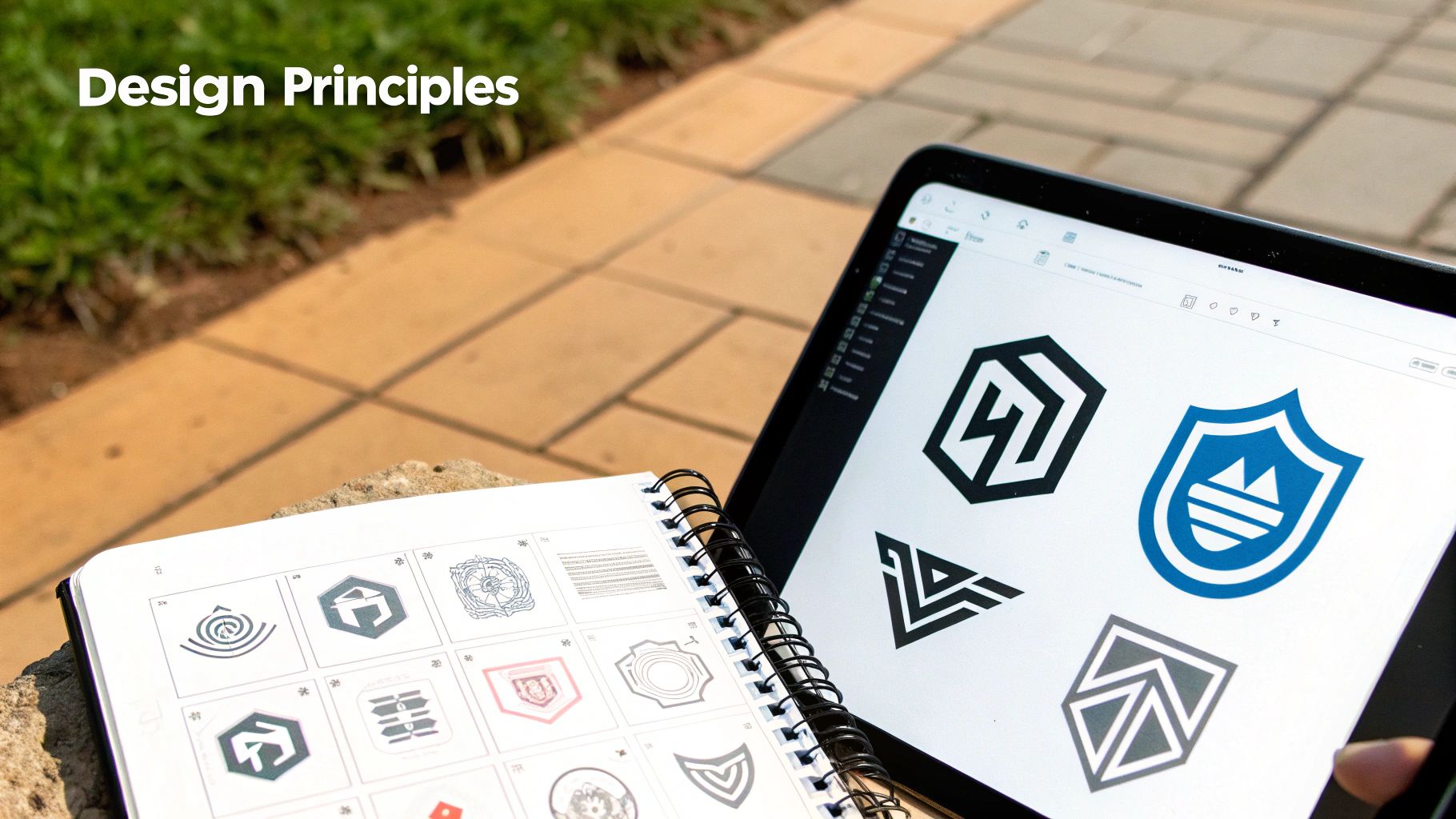
Making a great combination mark logo is all about getting two very different things—a symbol and your company name—to play nicely together. It’s not about just sticking a cool graphic next to some text. It’s about creating a single, unified team where both elements feel like they were made for each other.
When you get this right, you end up with a brand asset that's professional, easy to remember, and incredibly versatile.
Think of it like a dance. Neither partner should steal the show or step on the other's toes. The goal is visual harmony, creating a logo that looks deliberate and polished, not like an afterthought. This is crucial because a well-crafted logo is the cornerstone of your brand’s look, impacting everything from business cards to what makes good website design.
Find the Perfect Visual Balance
The relationship between your icon and text is everything. The first thing you need to nail is creating a visual hierarchy that feels natural and isn't a strain on the eyes. A lopsided logo, where the icon is huge and the text is an afterthought, just looks amateur.
To get the balance right, focus on a few key things:
- Weight and Scale: Make sure the visual "heaviness" of your symbol matches the text. A thick, bold icon needs a sturdy font to hold its own, while a delicate, thin-line symbol looks best next to a lighter typeface.
- Spacing (Kerning): The empty space between your symbol and wordmark is just as important as the elements themselves. You need to give them enough breathing room so they don't feel squished, but keep them close enough that they're seen as one cohesive unit.
Prioritize Scalability and Versatility
Here’s the reality check: your logo has to look amazing everywhere. It needs to be just as sharp on a giant billboard as it is as a tiny favicon in a browser tab. This is all about scalability.
If your design is packed with intricate details, it’s going to turn into an unrecognizable blob when you shrink it down.
Key Takeaway: A truly effective logo is designed for extremes. Always test your design at different sizes, from tiny to huge, to make sure it stays clear, readable, and impactful no matter what.
This is where the combination mark really shines. For those super small spaces, you can often just use the symbol by itself—but only if the design is clean enough to still be recognized.
Choose a Strategic Color Palette
Color isn't just for looks; it's a shortcut to your customers' emotions and sets the whole vibe for your brand. Color choices are a huge deal in brand identity, with some clear favorites emerging worldwide.
Data shows that about 65% of the world’s top brands lean on red or blue. Blue is the most popular by a long shot, showing up in nearly 40% of Fortune 500 logos because it makes people think of trust and reliability. Red, on the other hand, is all about excitement and is used by around 30% of leading brands.
But here's a pro tip: keep it simple. Over 80% of top companies use just one or two colors to keep their logo clean and clear.
Harmonize Your Font and Symbol
Last but not least, your font and symbol have to get along. The typography you choose should echo the personality of your icon. If your symbol is modern and geometric, a stuffy, traditional serif font is going to create a weird visual clash.
Think about what pairs well together:
- A playful, rounded icon? Try a friendly, sans-serif font.
- An elegant, sophisticated symbol? A classic serif or a clean, minimalist typeface is probably the right call.
Your font is half your logo's personality, not just something you tack on at the end. Getting this relationship right is what ensures your combination mark logo sends a strong, consistent message.
Before you finalize your design, run through this checklist. It's a simple way to make sure you've covered all the bases and created a logo that’s built to last.
Your Combination Mark Design Checklist
Following these principles will help you create a logo that’s not just visually appealing, but a true strategic asset for your business.
The Enduring Power of Combination Mark Logos

In a world filled with design trends that come and go, the combination mark logo is a solid anchor. Picking this style isn't about jumping on a bandwagon; it’s a strategic move to build a brand identity that lasts. You’re creating a foundation that can grow and change with your business without ever losing its soul.
Just think about the brands that have been around forever. Many of them have leaned on this classic mix of a symbol and text for centuries, proving just how resilient this approach is. It lets a brand stay fresh and modern while holding onto the history and trust they've built over time. The icon becomes a familiar shorthand, while the text leaves no doubt about who you are.
It's no coincidence that some of the world's oldest logos are combination marks. Their very structure is built for adaptation. Take Stella Artois, for instance—that horn symbol has been part of their identity since 1366. Or the English tea company Twinings, which has used its crest and wordmark since 1787. These brands prove that a great combination mark can connect with people across wildly different time periods. You can dig deeper into how historic logos create global trust in the latest logo statistics.
Building a Lasting Legacy
A combination mark is built to endure because it works on two levels. The symbol forges a quick, emotional connection that often jumps language barriers, while the text grounds the brand with its clear, specific name. This one-two punch creates an identity that's hard to forget.
And as the brand evolves, the logo can be tweaked—a font updated here, an icon simplified there—without throwing away all the brand recognition you've worked so hard to build.
A combination mark gives your brand both roots and wings. The wordmark provides the stable roots of your identity, while the symbol gives it the wings to adapt and fly across different marketing channels and eras.
This beautiful balance between stability and flexibility is precisely why choosing a combination mark is more than just a design decision. It's a smart business strategy.
Confidence in a Timeless Choice
When you look at the brands that have truly stood the test of time, you can feel confident in this choice. A combination mark logo is a powerful and secure investment for any business that wants to build a brand that not only works today but will still be going strong for decades to come. It's an approach that ensures your identity is built on a rock-solid foundation of clarity, personality, and lasting strength.
Got Questions About Combination Mark Logos? We’ve Got Answers.
Diving into logo design can bring up a ton of questions, especially when you’re looking at something as flexible as a combination mark. Since this style blends both a symbol and text, it’s a full branding package in one. Let's tackle some of the most common questions to help you get a clearer picture.
Thinking through these points will help you figure out if a combination mark is the right move for your brand, both for today and for the long haul.
Is a Combination Mark a Good Idea for a New Business?
Definitely. For a brand new business, a combination mark is one of the smartest and safest bets you can make. Why? Because it immediately starts building a connection in people's minds between your company name and a visual symbol. This one-two punch is huge when you’re trying to become memorable to a new audience.
If you just use an icon, new customers might not have a clue who you are. And if you only use a wordmark, you might miss out on having that memorable visual hook. A combination mark elegantly solves both issues from day one.
Think of a combination mark as a visual introduction. It clearly tells your audience, "This name goes with this symbol," forging a strong mental link that's the bedrock of solid brand recognition.
Then, as your business grows and people get to know you, you have the flexibility to start using the symbol by itself. You’ve already done the hard work of teaching everyone what it stands for.
How Do I Know When to Use the Full Logo vs. Just the Symbol?
This all comes down to context and how well-known your brand is. It’s a bit like knowing when to introduce yourself with your full name versus just going by a nickname.
As a general rule, use the full combination mark logo anywhere you need to be crystal clear. This means primary spots like your website header, official letterhead, business cards, and the main packaging for your products. Using the full logo here leaves no room for confusion, especially for people who are just discovering you.
You can start using the symbol on its own in a few key situations:
- When space is tight: It’s perfect for tiny spots like a website favicon, an app icon, or a social media profile picture where your full name would be impossible to read.
- For internal branding: Slapping the symbol on company t-shirts or internal memos is a great way to build a sense of team identity.
- As a subtle design element: The symbol can work as a faint watermark on presentation slides or images without stealing the show.
The real test is simple: wait until your audience has seen the full logo enough times that the symbol alone instantly makes them think of your brand. If a customer saw just the icon, would they know it’s you? When the answer is yes, you're good to go.
Are Combination Mark Logos More Expensive to Design?
Not necessarily, but they do demand more creative strategy than a straightforward wordmark. The price of any logo design really depends on the designer's experience and how complex the project is. A combination mark involves creating two separate elements—the symbol and the text—that have to look great together and stand on their own.
That means a bit more creative heavy lifting and concept work than just picking a cool font for your company's name. So yes, the initial design phase can be a bit more involved. But that upfront investment almost always pays for itself down the road, thanks to how incredibly versatile and powerful it is for building your brand.
It's less of an expense and more of an investment in a complete branding toolkit that will grow with you.
Ready to build a brand identity that's both timeless and versatile? The team at Softriver specializes in crafting custom combination mark logos that tell your unique story. Get a professional logo design that sets your business up for success.
