

In a crowded market, a memorable brand is more than just a logo; it's a complete, consistent experience. The secret behind the world's most iconic brands? A meticulously crafted brand style guide. This document is the single source of truth that ensures every color, font, and image works together to tell a cohesive story. A well-defined style guide ensures every touchpoint reinforces your brand's message, contributing significantly to building strong brand awareness.
This article breaks down some of the best brand style guide examples from industry giants like Apple, Spotify, and Mailchimp. We will move beyond surface-level observations to analyze the strategic thinking behind their design choices, revealing actionable tactics you can apply directly to your own branding efforts. We won't just show you what they did; we will explain why they did it and how you can replicate their success.
Whether you're a startup founder building a brand from scratch or a marketer refining an existing one, understanding these principles is the first step toward creating an identity that connects with your audience. Let's dive into the playbooks of the world's leading brands and uncover the secrets to building an unforgettable visual identity.
1. Airbnb Brand Style Guide
Airbnb's brand style guide, famously built around the concept of "Belong Anywhere," is a masterclass in creating an emotional connection through design. It’s one of the most referenced brand style guide examples because it successfully translates an abstract feeling, belonging, into a concrete and globally consistent visual system. The guide moves beyond simple logo usage rules to define an entire communication philosophy.
This approach is centered on humanizing the brand. Every element, from the friendly, custom-designed "Cereal" typeface to the warm and inviting color palette, is chosen to feel approachable and personal. This philosophy extends to their photography, which prioritizes authentic, user-generated-style content over sterile, corporate stock photos.
Strategic Breakdown
Airbnb's strategy works because it's built on a clear, singular idea. The "Bélo" symbol, representing people, places, and love, serves as a memorable and flexible cornerstone of the visual identity. This central concept guides all creative decisions, ensuring every asset feels cohesive.
- Emotional Core: The brand is built around the feeling of "belonging," which resonates universally and informs all design choices.
- Flexible System: The guidelines are comprehensive but not overly rigid, allowing for adaptation across different cultures and contexts, from the app interface to host welcome kits.
- Authentic Storytelling: By prioritizing real-life imagery, Airbnb builds trust and reinforces its community-focused mission.
Actionable Takeaways
To apply Airbnb's strategy, focus on defining your brand's core emotional promise first. Instead of starting with colors and fonts, ask what feeling you want customers to associate with your brand.
For a quick reference, this summary box highlights the key components that make Airbnb's brand system so effective.
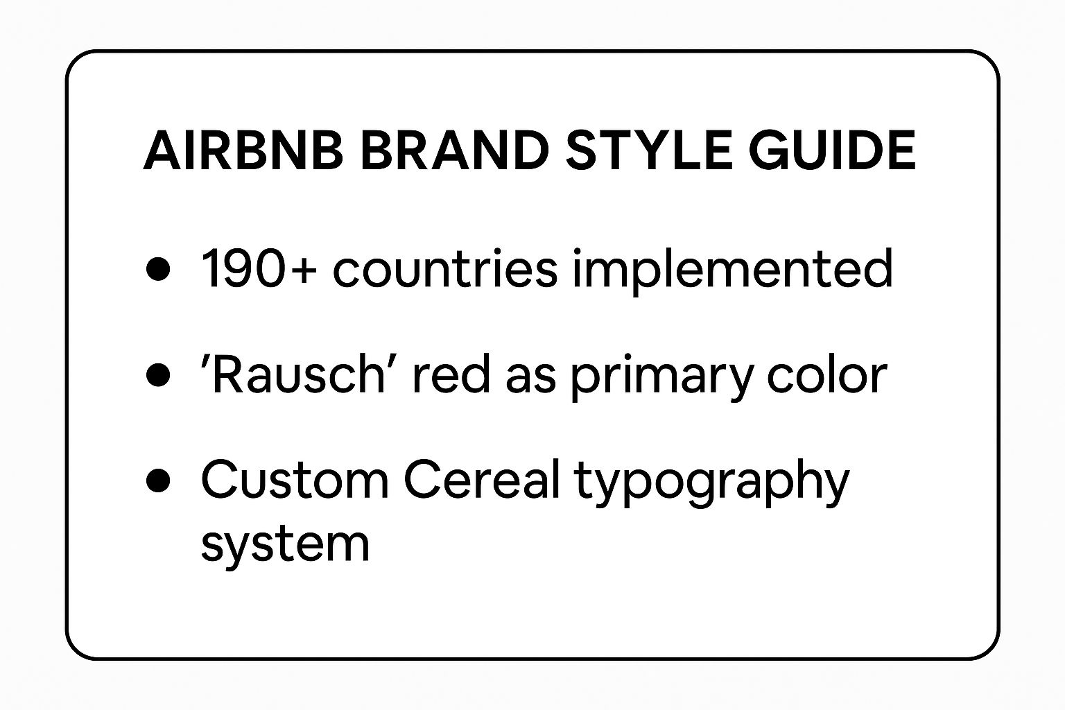
These elements demonstrate how Airbnb created a distinct and scalable identity that supports its massive global presence. By establishing a signature color ("Rausch" red) and a custom typeface, the brand ensures instant recognition and a consistent user experience. You can learn more by exploring some top brand guidelines examples in PDF format. This approach shows that investing in unique brand assets pays dividends in brand recall and cohesion.
2. Apple Brand Style Guide
Apple's brand style guide is the gold standard for communicating premium quality and minimalist sophistication. It’s one of the most powerful brand style guide examples because it achieves its power through extreme discipline and simplicity. The guide isn't just about rules; it’s a reflection of a core philosophy where less is more, and every detail serves to elevate the product as the hero.
The entire system is built on a foundation of clean aesthetics, generous white space, and an unwavering focus on high-quality product photography. This approach ensures that whether you're unboxing an iPhone, visiting a retail store, or browsing their website, the experience feels intentional and luxurious. Apple’s strict control over brand presentation reinforces its market position as an innovator and a leader in premium technology.
Strategic Breakdown
Apple’s strategy is rooted in product-centric minimalism. By stripping away unnecessary visual noise, the brand ensures the product itself is always the focal point. The guidelines are famously precise, governing everything from the exact gray tones used in marketing materials to the lighting angles in product shots.
- Uncompromising Simplicity: The brand’s identity is defined by what it omits. The lack of clutter directs all attention to the product’s design and functionality.
- Consistency as a Doctrine: Apple's brand is applied with near-perfect consistency across all touchpoints, from digital interfaces to physical retail architecture, creating a seamless and powerful brand world.
- Premium Positioning: High-quality materials, meticulous typography (using their custom San Francisco font), and flawless imagery work together to communicate value and justify a premium price point.
Actionable Takeaways
To emulate Apple’s approach, prioritize quality control and precision above all else. Your brand guidelines should be treated as a sacred text, not a loose set of suggestions. This means investing heavily in training teams and establishing rigorous approval processes for every piece of creative.
Start by defining the non-negotiable elements of your brand presentation. For Apple, it's the pristine product shot and the use of white space. For your brand, it might be a specific typographic treatment or a color application rule. Enforce these rules relentlessly to build the same sense of trust and quality that Apple has mastered. By maintaining such strict standards, you ensure every brand interaction reinforces your core message of excellence.
3. Spotify Brand Style Guide
Spotify's brand style guide is a powerful example of how to build a visual identity around an experience, in this case, music discovery and personalization. It stands out among brand style guide examples by using vibrant, dynamic visual elements to capture the energy and emotion of music. The brand's identity, developed with the agency Collins, moves beyond a static logo and color palette to create an immersive and evolving system.

This approach is centered on expressing sound visually. The famous duotone photo treatment, bold typography using their custom Circular typeface, and vibrant color gradients all work together to create a high-energy, contemporary feel. This system is brilliantly showcased in their annual "Spotify Wrapped" campaigns, which translate personal listening data into shareable, visually exciting stories.
Strategic Breakdown
Spotify's strategy is successful because it is fluid and adaptable, much like music itself. Instead of a rigid set of rules, the brand provides a flexible toolkit that can be applied to diverse content, from podcast covers to artist profiles, while maintaining a cohesive look.
- Expressive Visual Language: The brand uses duotone imagery and energetic color pairings to visually represent the emotion and diversity of music.
- Dynamic and Adaptable System: The guidelines are designed for a digital-first world, allowing for constant evolution and application across countless pieces of unique content, like user-generated playlists.
- Data-Driven Personalization: The brand system is strong enough to incorporate personalized data, making campaigns like Wrapped feel unique to each user yet instantly recognizable as Spotify.
Actionable Takeaways
To apply Spotify's strategy, build a brand system that is expressive and flexible rather than restrictive. Invest in dynamic design elements that can adapt to different types of content, especially for digital platforms.
The key is to focus on the emotional connection your product creates. For Spotify, the brand isn't just about accessing songs; it's about the feeling of discovering your next favorite artist. This emotional focus ensures the brand remains relevant and exciting in a fast-paced culture. By creating a flexible yet distinctive system, Spotify ensures its identity resonates across its app, web platform, and global marketing campaigns.
4. Mailchimp Brand Style Guide
Mailchimp's brand style guide is celebrated for injecting a playful, quirky personality into the often-dry world of B2B software. It stands as one of the most distinctive brand style guide examples by proving that business tools don't have to be bland. The guide champions a friendly, encouraging, and slightly eccentric tone that makes email marketing feel less intimidating and more creative.
This brand personality is brought to life through its unique illustration style, featuring whimsical, hand-drawn characters and a vibrant, warm color palette. The brand voice is intentionally conversational and informal, moving away from corporate jargon to speak directly and empathetically to its core audience of small business owners and entrepreneurs. This consistent approach makes the entire user experience, from the website to the app interface, feel cohesive and supportive.
Strategic Breakdown
Mailchimp’s strategy succeeds because it forges an emotional connection with users who might feel overwhelmed by marketing technology. By positioning itself as a friendly, helpful partner instead of a cold, functional tool, it builds loyalty and stands out in a crowded market. The iconic mascot, Freddie the chimp, personifies this approachable nature.
- Personality-Driven Branding: The brand is built on a clear, defined personality: quirky, creative, and supportive. This informs everything from typography to error messages.
- Balancing Fun and Function: While playful, the design never sacrifices usability. The guidelines ensure that illustrations and vibrant colors enhance the user experience rather than distract from it.
- Consistent Voice and Tone: Mailchimp maintains a consistent, encouraging voice across all touchpoints, from onboarding tutorials to customer support emails, reinforcing its brand promise.
Actionable Takeaways
To emulate Mailchimp's success, dare to give your brand a distinct personality, especially if you operate in a traditionally conservative industry. Define a voice that resonates with your specific audience and apply it consistently across all communications.
Invest in unique brand assets like custom illustrations that can set you apart visually. Remember that a strong brand is an exercise in consistency, so ensure every team member understands and can apply the guidelines. For those looking to build their own comprehensive guidelines, you can learn more about how to create a brand style guide in our step-by-step guide. This method proves that a memorable personality can become your most powerful differentiator.
5. Google Brand Style Guide
Google’s brand style guide, widely known as Material Design, is less a set of rules and more a comprehensive design system. It’s one of the most influential brand style guide examples because it provides a unified framework for creating clean, intuitive, and accessible digital experiences across countless products and platforms. The guide prioritizes functionality and user experience, establishing a visual language that feels both innovative and deeply familiar.
At its core, Material Design is built on principles of tactile reality, inspired by paper and ink yet open to the imaginative possibilities of technology. It emphasizes purposeful use of color, typography, and motion to guide the user's attention and provide meaningful feedback. This system ensures consistency across a massive ecosystem, from Google Search and Gmail to the entire Android operating system, creating a seamless user journey.
Strategic Breakdown
Google's strategy succeeds by providing an incredibly detailed and well-documented system that developers and designers can easily adopt. Material Design is open-source, which has led to its widespread implementation beyond Google's own products, making it a universal language for modern digital interfaces.
- System-First Approach: Instead of focusing on individual assets, Google built a holistic system that dictates how components interact, move, and respond.
- Accessibility as a Priority: The guidelines have built-in accessibility standards for color contrast, typography sizing, and interactive elements, ensuring usability for everyone.
- Comprehensive Documentation: Google provides extensive documentation, tools, and resources, making it simple for anyone to learn and implement the system correctly.
Actionable Takeaways
To emulate Google’s approach, focus on building a design system rather than just a style guide. Think about how components will work together and scale across different products and screen sizes. Prioritize user experience and accessibility from the very beginning of the design process.
Investing in detailed documentation is key. Create a living resource that is easy for your entire team to access and understand. This ensures that as your brand evolves, your design language remains consistent and effective, preventing fragmentation across your digital presence. This method proves that a well-defined system is the foundation for scalable and user-centric branding.
6. Nike Brand Style Guide
Nike's brand style guide is the embodiment of athletic power, inspiration, and the iconic "Just Do It" ethos. It stands as a pinnacle among brand style guide examples by perfectly capturing the essence of movement, energy, and peak performance. The guide ensures every visual element, from the legendary Swoosh to its motivational messaging, radiates an unwavering focus on pushing human potential.

The brand's identity is defined by its dynamism. High-contrast, action-oriented photography is central, capturing athletes in moments of intense effort and triumph. This is paired with bold, clean typography and a simple, powerful color palette that lets the action speak for itself. This approach has allowed Nike to dominate not just footwear and apparel, but also digital ecosystems like the Nike Training Club, creating a unified brand experience.
Strategic Breakdown
Nike’s strategy is built on the universal language of athletic aspiration. The Swoosh, designed by Carolyn Davidson, is a simple yet profound symbol of motion and victory, while the "Just Do It" tagline, famously coined by Dan Wieden, provides the motivational voice. These elements create a powerful and consistent brand narrative.
- Core Focus on Performance: The brand consistently prioritizes authentic athletic achievement over general lifestyle imagery, building credibility with its core audience.
- Dynamic Visual Language: The use of high-impact action photography and videography creates an energetic and inspirational visual identity that is instantly recognizable.
- Motivational Messaging: The brand’s voice is consistently empowering and direct, reinforcing the "Just Do It" attitude across all marketing, from global campaigns to in-app encouragement.
Actionable Takeaways
To emulate Nike's powerful branding, anchor your identity in a single, compelling action or feeling. Build your visual and verbal language to consistently support that core concept, making it the heart of every brand interaction.
For a quick reference, this summary box highlights the key components that make Nike's brand system so effective.
This framework demonstrates how Nike built a flexible yet fiercely consistent identity that adapts across diverse sports categories, from running to basketball. By investing in high-quality, performance-focused content and maintaining a strong motivational tone, your brand can also create a deep, lasting connection with its audience. The key is to define your brand’s core drive and let it power every creative decision.
7. Slack Brand Style Guide
Slack’s brand style guide is a prime example of how to build a brand for a tool that is both professional and human. Its core mission is to make work "simpler, more pleasant, and more productive," and this philosophy is embedded in every design choice. As one of the most compelling brand style guide examples in the SaaS world, it showcases how to balance corporate credibility with a friendly, approachable personality.
The guide is built around creating an experience that feels helpful, not intrusive. This is achieved through a vibrant yet controlled color palette, the clear and legible "Lato" typeface, and a suite of custom illustrations and icons that add warmth to a digital workspace. The brand carefully avoids the cold, sterile aesthetic common in enterprise software, opting instead for a look that encourages collaboration and engagement.
Strategic Breakdown
Slack's strategy is successful because it directly addresses the user's emotional state at work. The brand identity is crafted to reduce friction and foster a sense of teamwork and progress. The playful yet purposeful logo, a refined version of its original hashtag symbol, represents different elements coming together to create a unified whole.
- Human-Centric Design: The brand prioritizes making its users feel supported and connected, transforming a productivity tool into a positive part of their workday.
- Consistency Across Platforms: Whether in the app, on the website, or in marketing materials, the brand experience is seamless, which builds trust and reliability, especially for enterprise clients.
- Aspirational yet Relatable: Slack’s imagery and messaging focus on idealized but achievable workplace scenarios, inspiring teams to improve their collaboration.
Actionable Takeaways
To emulate Slack's approach, focus on the user experience first and let the brand identity grow from it. Consider the emotional journey of your customer and design visual elements that support a positive and productive state of mind. Make sure every touchpoint reinforces this core feeling.
For instance, their guide ensures that even third-party app integrations within the Slack marketplace feel cohesive with the overall brand. This level of detail demonstrates a commitment to a unified user experience. By defining not just visuals but also the brand's personality and voice, Slack ensures it communicates as a helpful colleague rather than a piece of software. You can ensure your own guidelines are this thorough by reviewing a top brand guidelines checklist for a strong identity. This comprehensive approach is key to building a beloved brand in a competitive market.
Brand Style Guide Comparison: Top 7 Examples
From Examples to Execution: Building Your Own Brand Guide
We've explored a diverse set of world-class brand style guide examples, from the meticulous minimalism of Apple to the vibrant, human-centric approach of Slack. Each guide, while unique in its execution, reinforces a singular, powerful idea: a brand is not just what you see, but how you feel, communicate, and connect. It's a strategic system built on deliberate choices.
The most effective brand guides are more than just rulebooks. They are living documents that translate a company's core mission into a tangible and consistent experience for customers, employees, and partners. They empower everyone, from marketers to developers, to become a brand champion.
Your Blueprint for a Cohesive Brand
As you move from inspiration to action, remember the core principles that unite these successful examples. Your own brand guide should be built on a foundation of clarity, consistency, and strategic purpose. The goal isn't just to have rules, but to have the right rules that amplify your unique identity.
Here are the key takeaways to guide your process:
- Define Your Core 'Why': Just as Nike’s guide is fueled by its "Just Do It" ethos, your brand's purpose must be the starting point. Every rule for your logo, color palette, or tone of voice should support this central idea.
- Balance Flexibility with Firmness: Spotify's guide is a masterclass in this, providing a solid framework but allowing for creative expression within it. Your guide should be prescriptive enough to ensure consistency but flexible enough to evolve with new marketing channels and campaigns.
- Make it Accessible and Usable: A brand guide is useless if no one can find it or understand it. Google and Mailchimp excel at creating intuitive, digitally native guides. Prioritize clear navigation, simple language, and practical examples over dense, academic text.
Putting Your Brand Strategy into Action
Building a comprehensive brand guide from scratch can feel daunting. The key is to start with a clear structure that covers all essential components, from your mission and vision to the specific applications of your visual and verbal identity. For those looking to create their own comprehensive brand guide, starting with a well-structured brand style guide template can provide a strong foundation. This ensures you cover all the critical elements required for a cohesive and professional brand presence.
Ultimately, studying these brand style guide examples reveals that a great brand isn't an accident. It's the result of strategic foresight, meticulous planning, and an unwavering commitment to consistency. By creating your own robust guide, you are not just designing a logo; you are building a legacy, crafting an experience, and laying the groundwork for enduring customer loyalty and market recognition.
Ready to build an identity that stands out and drives growth? At Softriver, we specialize in crafting comprehensive brand identities and style guides with market-ready speed and precision. We go beyond just a logo to build a complete Brand Ecosystem®, providing you with the strategic tools you need to achieve immediate impact and long-term success.