
Welcome to the world of analogous colors: the secret weapon behind some of the most harmonious and visually pleasing designs. Unlike bold, high-contrast complementary schemes, analogous palettes use colors that sit next to each other on the color wheel. This proximity creates a sense of unity, calm, and sophisticated flow, making them versatile, natural, and incredibly effective at guiding the user's eye and establishing a specific mood.
But how do you move from theory to practical application? This guide is designed to bridge that gap. We provide a deep dive into specific analogous color scheme examples, complete with hex codes, strategic analysis, and actionable tips for your projects. We'll break down the psychology behind each palette and show you how to implement them effectively in branding, web design, and marketing materials.
Our focus is on tangible strategy, not just pretty swatches. You will learn not only what these palettes are but how and why they work. By understanding the nuances, you can ensure your brand communicates its message with clarity and impact. To further explore the depth and subtlety you can bring to your palettes, consider the characteristics and impact of using muted colors to refine your selections.
1. Blue-Green-Teal Ocean Palette
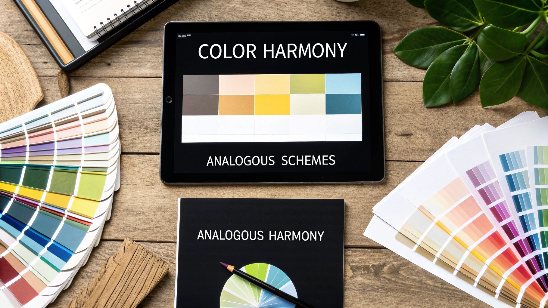
The Blue-Green-Teal Ocean Palette is a classic and highly effective analogous color scheme example. It works by combining adjacent colors on the wheel, specifically those spanning from cyan-blue to seafoam green. This creates an immediate sense of harmony and balance, evoking the calming and restorative qualities of water, nature, and tranquility.
This palette is exceptionally versatile. In branding, companies like Tiffany & Co. have built an empire on a single, iconic shade of robin's egg blue-green, associating it with luxury and exclusivity. Similarly, healthcare and wellness brands frequently use these colors to create a serene, trustworthy, and clean atmosphere in their facilities and marketing materials.
Strategic Breakdown
This color scheme's strength lies in its strong psychological associations. Blue conveys trust and stability, while green suggests health, nature, and peace. Teal, the bridge between them, balances these qualities, adding a touch of modern sophistication. When used together, they form a cohesive and reassuring visual message.
The following summary box highlights the core attributes of this versatile palette.
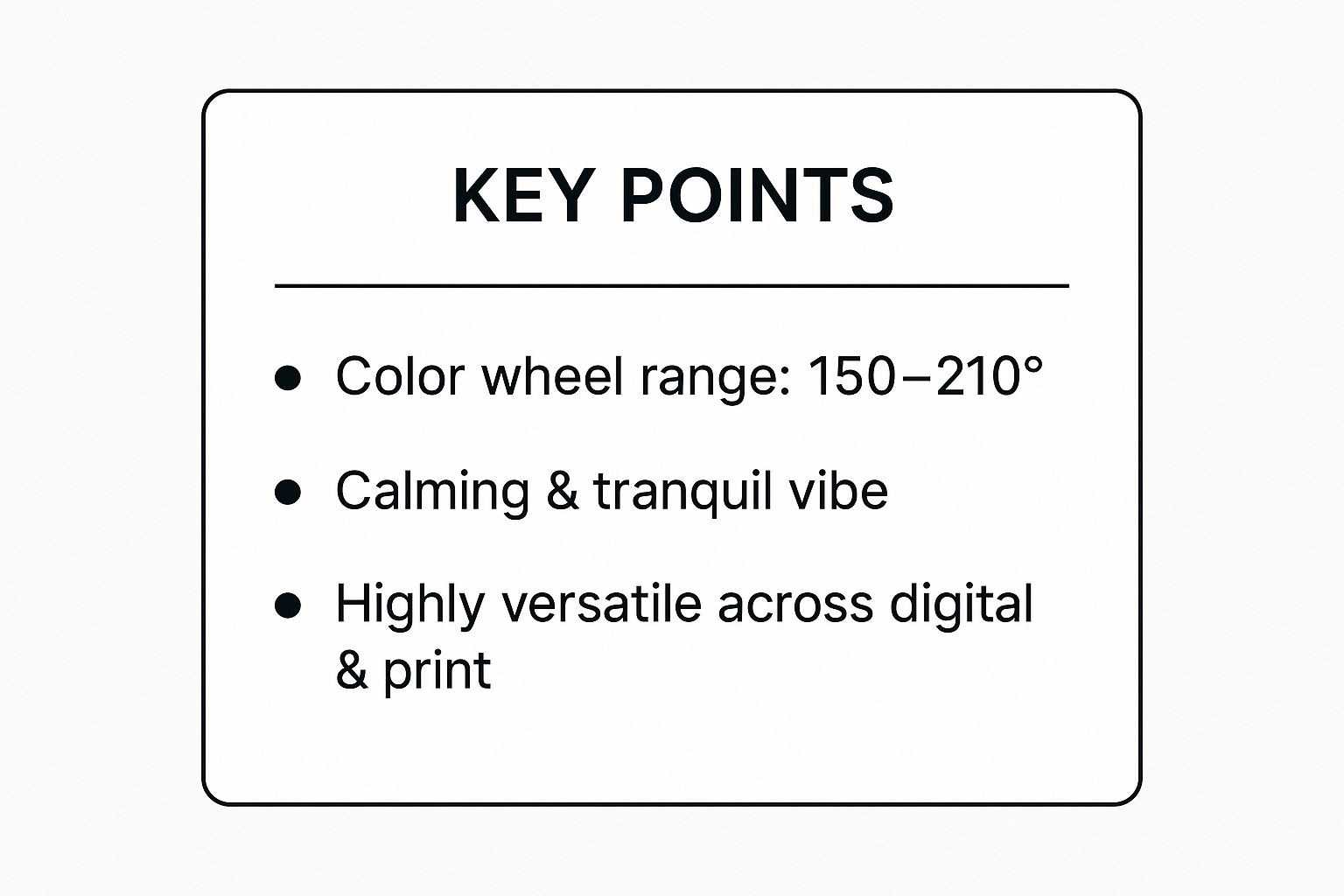
As the infographic shows, this palette’s tight grouping on the color wheel is the key to its calming effect, making it a reliable choice for both digital and physical applications.
Actionable Takeaways & Application
To implement this palette successfully, focus on creating visual hierarchy through value and saturation.
- Establish a Dominant Color: Choose one shade (e.g., a mid-tone teal) as your primary background or brand color.
- Use Darkest for Readability: Reserve the darkest blue or deep teal for text and critical call-to-action buttons to ensure high contrast and accessibility.
- Add an Accent: Use a lighter, less saturated seafoam green for secondary elements or highlights.
- Incorporate Neutrals: Pair the palette with crisp white, soft cream, or light grey to prevent the colors from overwhelming the design and to enhance the clean aesthetic.
For a deeper dive into creating palettes with these colors, this video provides excellent visual guidance.
2. Red-Orange-Yellow Sunset Palette
The Red-Orange-Yellow Sunset Palette is one of the most vibrant and energetic analogous color scheme examples available. It combines adjacent warm hues on the color wheel, spanning from a deep red through a fiery orange to a bright yellow. This combination naturally evokes feelings of warmth, enthusiasm, excitement, and optimism, reminiscent of a brilliant sunset or autumn foliage.

This high-energy palette is a favorite in industries that want to grab attention and stimulate appetite or action. Fast-food giants like McDonald's have used this scheme to create an iconic, instantly recognizable brand that signals speed and satisfaction. Similarly, brands like Fanta and the Firefox browser logo use these colors to convey fun, innovation, and dynamic energy.
Strategic Breakdown
The power of this palette lies in its psychological impact. Red is associated with passion and urgency, orange with friendliness and confidence, and yellow with happiness and optimism. When combined, they create a compelling visual narrative that is both inviting and action-oriented. The natural gradient from red to yellow provides visual movement, guiding the viewer's eye across a design seamlessly.
The harmony between these colors makes the palette feel cohesive despite its intensity. This is a critical factor when choosing colors for your brand, as it ensures the visual identity is memorable without being chaotic.
Actionable Takeaways & Application
To effectively use this powerful palette, you must carefully manage its intensity to avoid overwhelming your audience.
- Establish a Dominant Color: Use a warm orange or a muted red as the primary color to ground the design.
- Use Yellow for Accents: Reserve the brightest yellow for small, strategic elements like call-to-action buttons or icons to draw attention without causing visual fatigue.
- Incorporate Neutrals: Balance the warmth with generous amounts of white space, charcoal grey, or deep brown. This allows the vibrant colors to pop and improves overall readability.
- Prioritize Readability: Test text legibility rigorously. Dark red or brown text on a light orange or yellow background often works well, but high-contrast pairs are essential.
3. Purple-Blue-Indigo Night Sky Palette
The Purple-Blue-Indigo Night Sky Palette is a sophisticated and compelling analogous color scheme example. It draws together adjacent colors on the wheel, spanning from the creativity of purple to the trustworthiness of blue. This combination creates a sense of mystery, luxury, and innovation, reminiscent of twilight skies and deep space.

This palette is highly effective for brands aiming to project a premium or forward-thinking identity. The streaming platform Twitch has built its entire brand around a vibrant purple, associating it with gaming, creativity, and community. Likewise, brands like Roku and historical examples like Yahoo have used these hues to signify technological innovation and user engagement.
Strategic Breakdown
The power of this color scheme lies in its rich psychological blend. Blue brings a sense of calm, stability, and intelligence, while purple introduces elements of luxury, creativity, and spirituality. Indigo acts as the perfect bridge, combining blue's depth with purple's regal energy. Together, they create a visual identity that feels both established and visionary.
This palette is particularly well-suited for tech, wellness, and luxury sectors where differentiation and a high-end feel are critical. Its inherent depth allows for dramatic and engaging designs that capture attention.
Actionable Takeaways & Application
To successfully implement this palette, focus on contrast and balance to avoid a design that feels too dark or overwhelming.
- Establish a Dominant Color: Choose a vibrant purple or a deep indigo as the primary brand color to set a definitive tone.
- Use Lighter Tints for Text: Employ lighter shades like lavender or periwinkle for body text on dark backgrounds to ensure readability and accessibility.
- Create Contrast with Neutrals: Pair these deep hues with crisp white, light grey, or cream to create visual breathing room and make the core colors pop.
- Add Modern Accents: For tech or entertainment brands, consider incorporating silver or shimmering holographic elements to enhance the futuristic and innovative feel.
4. Yellow-Green-Lime Spring Growth Palette
The Yellow-Green-Lime Spring Growth Palette is a vibrant and highly energetic analogous color scheme example. It combines the adjacent colors of yellow, yellow-green, and bright lime, creating a visual experience closely tied to nature, vitality, and fresh beginnings. This palette immediately brings to mind new spring leaves, citrus fruits, and an overall sense of optimism.
This color scheme is a popular choice for brands that want to communicate freshness and a connection to the natural world. Companies like Subway and Whole Foods Market leverage these colors to reinforce their focus on fresh ingredients and healthy living. Similarly, the agricultural giant John Deere uses a distinct yellow and green to symbolize productivity and growth in the fields.
Strategic Breakdown
This palette's power comes from its direct psychological connection to growth and energy. Yellow is associated with optimism and happiness, while green signifies health, nature, and renewal. The lime green that sits between them acts as a high-energy bridge, amplifying the youthful and zesty feel of the entire scheme. When used together, these colors send a clear, positive message of vitality.
The combination of these bright, natural tones makes this palette an excellent choice for brands in the food, health, and environmental sectors. Understanding how these colors work together is a key part of leveraging color theory in marketing. To learn more about how you can master color theory in marketing to boost sales, exploring these concepts further is essential.
Actionable Takeaways & Application
To apply this palette without it becoming overwhelming, strategic balance is crucial.
- Select a Dominant Tone: Choose one color, often a foundational yellow-green or a more muted sage, to serve as the main background or brand color.
- Use Darkest for Text: A deep forest or olive green provides excellent contrast for text and important interface elements, ensuring readability.
- Bright Lime as an Accent: Use the most vibrant lime green sparingly for call-to-action buttons, icons, or highlights to draw attention without causing visual fatigue.
- Balance with Neutrals: Incorporate plenty of white space, soft beige, or earthy browns to ground the bright colors and give the design a more sophisticated, organic feel.
5. Orange-Red-Pink Coral Warmth Palette
The Orange-Red-Pink Coral Warmth Palette is a vibrant and contemporary analogous color scheme example that exudes energy and friendliness. It combines adjacent warm hues on the color wheel, typically spanning from a zesty orange to a rich red-orange and a soft coral pink. This blend creates an inviting atmosphere that feels both dynamic and welcoming, making it a popular choice in modern branding and interior design.
This palette has seen a surge in popularity, particularly in lifestyle and tech sectors. Brands like Airbnb leverage a specific coral shade, "Rausch," to foster a sense of community and belonging. Similarly, the beauty brand Glossier has built a strong aesthetic around soft pinks and corals, creating a modern, approachable identity. The scheme is effective because it balances the high energy of orange and red with the gentler, more accessible nature of pink.
Strategic Breakdown
This color scheme’s power comes from its blend of passion and approachability. Red-orange communicates excitement and action, while coral pink softens the intensity, adding a touch of modern sophistication and warmth. The result is a palette that feels optimistic and full of life without being aggressive or overwhelming.
Its association with sunsets and tropical florals gives it a naturally positive and uplifting feel. This makes it a fantastic choice for brands aiming to connect with a younger, design-conscious audience.
Actionable Takeaways & Application
To apply this palette effectively, the key is to balance its inherent vibrancy with softer, grounding elements.
- Select a Primary Hue: Use a welcoming coral or a soft pink as the dominant color for backgrounds or key brand assets.
- Use Boldness for Accents: Reserve the most saturated red-orange for calls-to-action, highlights, or accent elements that need to draw immediate attention.
- Leverage Negative Space: In digital design, use plenty of white or light neutral space to prevent the warm colors from becoming visually fatiguing and to keep the layout feeling clean and modern.
- Pair with Natural Textures: In physical spaces or product design, complement the palette with natural materials like light wood, rattan, or linen to ground the scheme and enhance its warm, organic feel.
6. Green-Blue-Turquoise Tropical Palette
The Green-Blue-Turquoise Tropical Palette is one of the most vibrant and refreshing analogous color scheme examples. It combines adjacent hues on the color wheel, specifically spanning from lush green to serene blue-green and vibrant turquoise. This creates an immediate feeling of vitality and escape, evoking images of tropical paradises, clear waters, and dense jungles.
This palette is exceptionally effective for brands in the travel, hospitality, and wellness sectors. Fiji Water uses these colors in its branding and packaging to communicate purity and its exotic origin. Similarly, tourism campaigns for Caribbean destinations frequently use this scheme to attract visitors with the promise of a serene, natural getaway, while brands like Animal Planet use it to connect with nature and wildlife.
Strategic Breakdown
This color scheme’s power comes from its dual psychological impact. Green is associated with life, nature, and renewal, while blue brings calm, trust, and depth. Turquoise acts as the perfect bridge, injecting energy and a touch of exotic sophistication. Together, they form a visual narrative that is both invigorating and peacefully restorative.
The combination of these colors creates a scheme that feels both aspirational and grounded in the natural world, making it highly appealing.
Actionable Takeaways & Application
To implement this palette effectively, the key is to balance its vibrant energy with calming undertones to guide the user's eye.
- Establish a Dominant Color: Use a mid-tone green or a muted turquoise as the primary background color to establish a natural, immersive feel.
- Use Darkest for Readability: Reserve a deep teal or forest green for text, icons, and essential interface elements to ensure strong contrast and clarity.
- Add an Accent: Employ a bright, saturated turquoise as an accent for buttons, links, or key highlights to draw attention and add a pop of energy.
- Incorporate Neutrals: Pair this palette with sandy beiges, soft whites, or light grey to mimic a natural beach environment and prevent the vibrant colors from becoming overwhelming. Adding warm wood tones can also prevent the scheme from feeling too cool.
7. Red-Violet-Magenta Berry Palette
The Red-Violet-Magenta Berry Palette is a dynamic and luxurious analogous color scheme example that commands attention. It unites adjacent hues on the color wheel, from a warm, passionate red to a cooler, vibrant magenta, with red-violet serving as the perfect bridge. This combination creates a rich, energetic, and sophisticated atmosphere, evoking feelings of passion, creativity, and modern luxury.
This palette is incredibly effective in branding for fashion, beauty, and technology. T-Mobile has famously built its entire brand identity around a bold magenta, associating it with innovation and disruption. Similarly, brands like Barbie and Victoria's Secret have leveraged shades within this range to create iconic and instantly recognizable visual identities that feel both powerful and playful.
Strategic Breakdown
The power of this palette comes from its blend of warm and cool tones. Red brings energy and passion, while the violet and magenta elements introduce a sense of creativity, royalty, and sophistication. Together, they create a complex and visually stimulating experience that feels both confident and approachable, which is a difficult balance to strike.
This scheme's modern appeal makes it ideal for brands targeting a youthful yet discerning audience. It is a bold choice that communicates confidence and forward-thinking values.
Actionable Takeaways & Application
To apply this palette without overwhelming the viewer, a strategic approach to balance and hierarchy is crucial. The intensity of these colors requires careful handling to maintain a professional look.
- Establish a Dominant Color: Use a less saturated red-violet or a deep berry shade as the primary color for larger areas to set a sophisticated mood.
- Use Magenta as an Accent: Reserve the brightest, most saturated magenta for calls-to-action, logos, or key highlights to draw the eye without creating visual fatigue.
- Balance with Neutrals: Incorporate ample white, soft grey, or charcoal black to provide negative space. This allows the vibrant colors to stand out and maintains a clean, organized design.
- Incorporate Metallics: Pairing this palette with silver or rose gold accents can elevate the sense of luxury, making it perfect for high-end product packaging or premium branding.
For brands considering bold logo designs, exploring effective logo color combinations on softriver.co can provide further inspiration on how to balance vibrant palettes like this one.
8. Yellow-Orange-Gold Autumn Harvest Palette
The Yellow-Orange-Gold Autumn Harvest Palette is a warm and inviting analogous color scheme example that taps into deep-seated feelings of comfort and abundance. By blending adjacent hues like golden yellow, rich orange, and burnished gold, it creates a visual experience that is both energizing and reassuring. This scheme evokes the familiar warmth of autumn, harvest seasons, and traditional values.
This palette is a favorite in industries that want to convey authenticity, quality, and a connection to nature. Food and beverage brands, especially artisanal or craft producers, use these colors to suggest natural ingredients and handcrafted care. Similarly, outdoor and lifestyle brands like Timberland leverage this scheme to communicate ruggedness, durability, and a connection to the earth, making their products feel reliable and timeless.
Strategic Breakdown
The strength of this color scheme lies in its powerful psychological associations with warmth, joy, and nostalgia. Yellow brings optimism and energy, orange conveys enthusiasm and creativity, and gold adds a touch of luxury and quality. Together, these colors create a welcoming atmosphere that feels both dependable and uplifting, making it ideal for brands aiming to build a comforting and positive connection with their audience.
This palette works by wrapping the viewer in a sense of familiar comfort, much like a warm blanket on a cool autumn day.
Actionable Takeaways & Application
To effectively use this palette, the goal is to balance its inherent warmth to avoid overwhelming the design.
- Ground with Neutrals: Pair these vibrant hues with cream, off-white, or deep brown. This prevents the warmth from becoming too intense and adds a layer of sophistication.
- Emphasize Texture: This palette is enhanced by natural textures. Incorporate elements like wood grain, burlap, or leather in backgrounds and imagery to amplify its rustic and authentic feel.
- Use Metallics for Luxury: Introduce a metallic gold accent for logos, highlights, or packaging details. This elevates the design and positions a product as premium or high-quality.
- Control Saturation: Use a more muted, desaturated version of orange or yellow as a primary background color, reserving the brightest shades for calls-to-action or key focal points.
Analogous Color Scheme Examples Comparison
Putting It All Together: Choosing Your Perfect Palette
You've explored the calm of oceanic blues, the energy of fiery sunsets, and the sophistication of twilight purples. Throughout these analogous color scheme examples, a clear pattern emerges: harmony is a powerful tool for visual communication. These palettes, by their very nature, create an immediate sense of cohesion and order, which translates directly into a more professional and trustworthy brand perception.
The core lesson is that color choice is never arbitrary. It’s a strategic decision rooted in brand identity, audience psychology, and intended emotional impact. An analogous scheme provides a sophisticated framework, but its success depends entirely on how you apply it.
From Inspiration to Implementation
To move from browsing examples to building your own effective palette, focus on these critical steps:
Anchor to Your Brand's "Why": Before you even look at a color wheel, define the core feeling you want your brand to evoke. Is it excitement and urgency (like the Red-Orange-Yellow Sunset Palette) or tranquility and trust (like the Blue-Green-Teal Ocean Palette)? Your brand's mission statement should be your primary color guide.
Define Your Dominant, Supporting, and Accent Roles: Remember the 60-30-10 rule. Your dominant color will set the overall mood, the supporting color will create interest, and the accent will draw attention to key elements like calls to action. This structured approach prevents visual chaos and ensures a balanced design.
Refine with Neutrals and Saturation: A pure analogous scheme can sometimes feel overwhelming. Skilfully integrating whites, grays, or beiges provides visual breathing room and makes your key colors pop. Adjusting saturation and brightness is also a pro-level move; a muted, low-saturation version of the Yellow-Orange-Gold Autumn Harvest Palette feels sophisticated and earthy, while a bright, high-saturation version feels energetic and playful.
Final Checks for a Flawless Palette
As you finalize your selections, remember that usability is just as important as aesthetics. One of the most crucial considerations is readability. It's vital to ensure your text and background colors have sufficient contrast, not just for style but for inclusivity. For a deeper dive, this guide on mastering color contrast for accessibility provides essential, actionable insights to ensure your design is usable by everyone.
Ultimately, mastering analogous color schemes gives you the ability to build palettes that are not only beautiful but also deeply strategic. You can guide user emotion, reinforce your brand message, and create a memorable visual identity that connects with your audience on a subconscious level. These skills move you from simply choosing colors to architecting brand experiences.
Ready to build a brand identity with a color palette that captivates and converts? The expert designers at Softriver specialize in crafting complete, strategic brand systems from the ground up. We translate your vision into a cohesive visual language that makes a powerful first impression. Learn more at Softriver.