
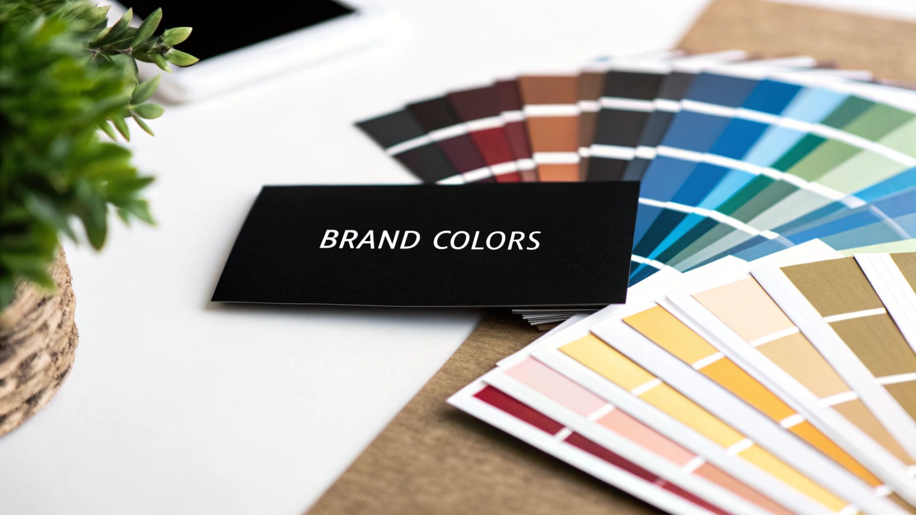
The best colors for your business card aren't just about what looks good; they're about what feels right for your brand. Think blue for a law firm to build trust, or a sleek black for a luxury boutique. Getting the color palette right is the first, and arguably most important, step in creating a card that’s memorable, professional, and a true extension of your business.
Why Your Business Card Colors Matter More Than You Think

Think of the color on your business card as a silent handshake. Before a single word on it is read, the color has already made an introduction, setting the tone for who you are. This isn't just about aesthetics; it's a strategic decision that frames a potential client's entire first impression of your brand.
The right palette instantly communicates your company's personality. A potential client holding a minimalist black card instinctively thinks of authority and premium quality. On the other hand, a card splashed with a bright, energetic orange suggests creativity, innovation, and a friendly vibe. The colors you choose are doing the talking for you.
Turning a Glance into an Opportunity
A well-chosen color scheme does more than just catch the eye—it makes people want to hold onto your card. Imagine a stack of business cards on a desk. Which one stands out? Not the generic white one. It’s the card with a pop of color or a thoughtful, unique palette that gets a second look.
This isn't just anecdotal. The data backs it up. Studies have shown that a colored business card is 10 times more likely to be kept than its plain black-and-white counterpart. That single detail could be the difference between your card ending up in a desk drawer versus the trash can. You can dig deeper into the stats behind effective business card design on wavecnct.com.
Your business card is a tiny billboard for your brand. The colors you select are the foundation of its message, determining whether it feels forgettable or unforgettable.
At the end of the day, your business card's colors are a powerful tool in your networking toolkit. They help you:
- Build a strong brand identity: Consistent colors create recognition and reinforce what your company is all about.
- Trigger the right emotions: You can use color psychology to make people feel confident, excited, or secure about your business.
- Stand out from the crowd: A unique palette makes your card impossible to ignore in a sea of sameness.
When you understand these principles, you can turn a simple piece of paper into a networking asset that keeps working for you long after the conversation is over.
Understanding The Psychology Of Color In Branding
Colors talk. Long before someone reads your name or job title on a business card, the colors have already made an introduction. They tap into a universal language of emotion and memory that we all share, setting the stage for that first impression. This is the heart of color psychology—the science of how colors affect our perceptions and decisions.
When you're picking colors for your business card, you're doing more than just making it look nice. You're choosing the exact feeling you want to give someone. Think of it like a movie soundtrack. An upbeat, high-tempo score tells you something exciting is happening, while a quiet, melodic tune signals a calm or emotional moment. Your color palette does the same job, instantly.
Color is a powerful communication tool that can signal action, influence mood, and even cause physiological reactions. The right color choice can highlight your brand's strengths and help you connect with your target audience on a deeper level.
This instant emotional connection is why you see certain colors pop up again and again in specific industries. A wealth management firm will almost always lean into a deep, dependable blue rather than a bright, playful yellow. That’s no accident. It’s a strategic decision rooted in the feelings those colors stir up.
The Emotional Spectrum Of Key Colors
To make the right call for your brand, you need to know what these colors are "saying." Each one comes with its own set of built-in meanings, shaped by culture, nature, and shared human experience.
Blue for Trust and Stability: Think of the sky or the deep ocean. Blue feels calm, stable, and reliable. It’s a classic choice for finance, tech, and law—fields where building unshakable client trust is everything.
Red for Energy and Action: Red is pure energy. It screams passion, excitement, and urgency. As a powerful accent color, it grabs attention and is perfect for brands that want to inspire someone to act now.
Green for Growth and Wellness: Directly tied to the natural world, green communicates health, new beginnings, and environmental consciousness. It's a no-brainer for wellness coaches, organic food companies, and any business with a focus on sustainability.
Expanding Your Color Vocabulary
But your options don't stop there. Other colors bring their own unique personalities to the table. For instance, you’ll often see purple in the tech and SaaS world because it projects wisdom and creativity. At the same time, its connection to spirituality makes it a favorite in holistic wellness circles.
Black, on the other hand, is all about sophistication and power. It’s the color of luxury brands and high-end services that want to convey an air of exclusivity. Then there's orange—a mix of red's fire and yellow's cheerfulness. It feels friendly, optimistic, and creative, making it a great fit for brands that want to seem approachable and forward-thinking.
To get a better handle on how this all fits into your bigger brand strategy, take a look at our complete guide on choosing colors for your brand.
Below is a quick-reference table to help you match common colors with the messages they send and the industries that use them most effectively.
Common Color Meanings In Business Branding
This table is just a starting point, of course. The key is to think beyond aesthetics and consider the principles of emotional design. When you intentionally choose a palette that reflects your brand’s core values and connects with your audience's desires, your business card transforms from a simple piece of paper into a genuinely effective networking tool.
How to Align Colors with Your Brand Identity
Knowing what colors mean is one thing, but making them work for your business is where the magic really happens. The right business card colors don’t just look good; they should feel like a natural extension of your brand’s personality. After all, a playful tech startup and a hundred-year-old law firm speak two completely different languages, and color is the first word in that conversation.
This all starts with a quick brand audit. Before you even think about picking a color, you need to be crystal clear on what your brand stands for. Are you disruptive and modern? Or are you all about reliability and tradition? Nailing down these core values is the first step to building a color palette that feels authentic.
Your brand's identity is its DNA. The colors you choose for your business card should be a perfect genetic match, instantly telling the world who you are, what you do, and why you matter.
Mapping Values to Your Color Palette
Once you have a list of your core values, you can start pairing them up with the color meanings we've talked about. Think of it like a matching game, where you connect your brand’s personality traits with the feelings that different shades stir up. This makes your color choices strategic, not just a shot in the dark.
This simple exercise closes the gap between abstract ideas and real-world design. For example, a brand that’s all about creativity and optimism is naturally going to lean into yellows and oranges. On the other hand, a company built on luxury and exclusivity will find its voice in black, gold, or deep purples. Getting a good handle on what different logo colors mean is a fantastic place to start.
Let's look at a couple of real-world scenarios:
- The Organic Bakery: This business needs to convey freshness, natural ingredients, and health. Earthy tones like forest green, warm brown, and creamy beige immediately send that message, making the brand feel wholesome and trustworthy.
- The Financial Advisor: Here, the goal is to build trust and communicate security. A palette of deep navy blue, charcoal gray, and a hint of silver projects an image of stability, professionalism, and wisdom.
Documenting Your Color Choices
After you've landed on your primary and secondary colors, consistency is everything. The best way to keep your look cohesive across all your marketing materials is to create effective brand guidelines. Think of this document as your rulebook for all things visual.
Your guidelines should lock in the exact color codes (like CMYK for print) for every color you use. This guarantees that the sophisticated navy blue on your business card is the exact same shade on your website, social media, and letterhead. It’s this kind of consistency that builds strong, memorable brands over time.
Building an Effective Business Card Color Palette
Choosing a single brand color is a great first step, but a full palette is what really gives your business card that professional, polished look. A well-designed palette doesn't just look nice; it guides the eye, makes key information pop, and shows that you've put real thought into your design. It's the difference between playing a single note and composing a full melody.
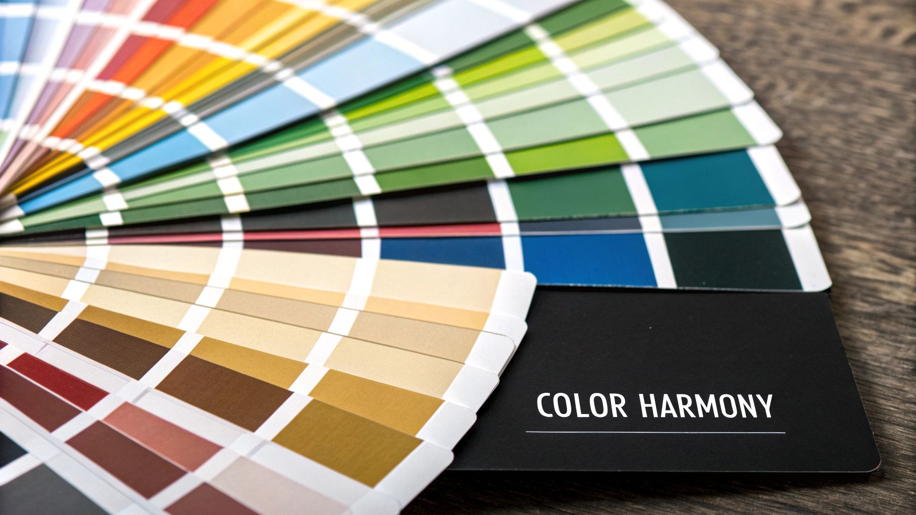
This isn’t about just picking a few colors you personally like—it’s about creating visual harmony. With a few basic color theory concepts under your belt, you can combine shades that work together to tell a consistent story about your brand. This strategic approach is what makes your card look balanced, professional, and memorable.
The infographic below breaks down the three pillars that should guide every color decision you make.
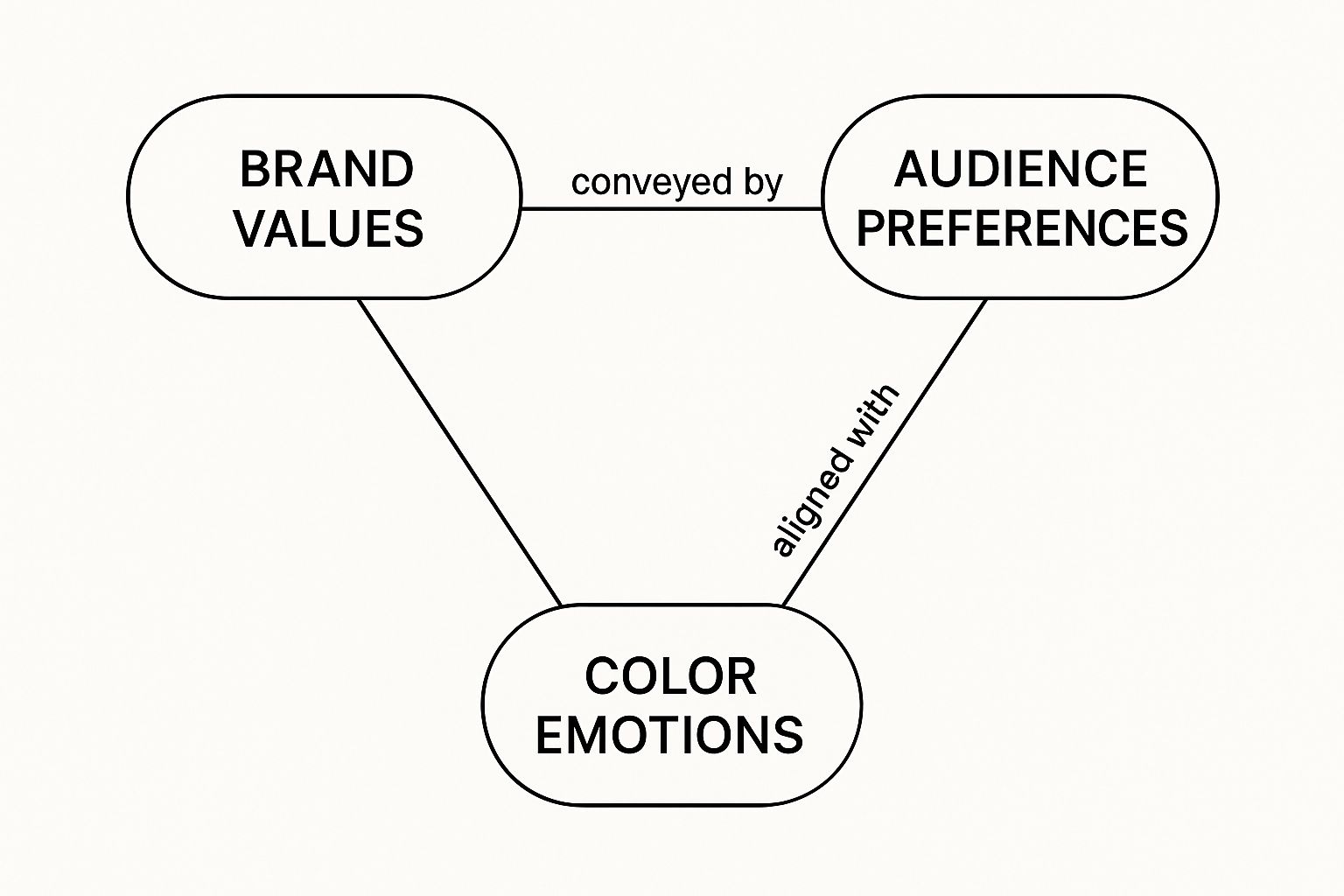
As you can see, your brand values, the emotion you want to evoke, and what your audience expects are all connected. Together, they form the foundation of a powerful color strategy.
Finding Your Color Harmony
Creating that perfect balance is easier than you might think. A couple of time-tested approaches can give you a solid starting point for any business card design. Each one creates a totally different vibe, so pick the one that feels right for your brand’s personality.
Complementary Colors: These are the colors sitting directly opposite each other on the color wheel—think blue and orange, or purple and yellow. They're a power duo. Their high contrast creates an energetic, vibrant look that demands attention, making it a great choice for brands that want to come across as bold and confident.
Analogous Colors: These colors are neighbors on the color wheel, like a few different shades of blue and green. They're like a close-knit family, blending together seamlessly. This approach gives you a calm, cohesive, and often sophisticated look, perfect for brands that want to project harmony and trustworthiness.
A well-chosen color palette does more than just decorate your card—it creates a visual hierarchy. In a split second, it tells people what to look at first, what's next, and what details to save for last.
Applying the 60-30-10 Rule
So you have a few colors in mind. How do you actually use them without making a mess? There’s a classic design trick called the 60-30-10 rule that gives you a simple recipe for a perfectly balanced palette. It ensures your colors are distributed in a way that’s easy on the eyes.
Here’s the breakdown:
- 60% Dominant Color: This is your primary brand color, and it should take up the most space. Think of it as the main background color that sets the overall tone of the card.
- 30% Secondary Color: This color is there to support the dominant one and add some visual interest. Use it for things like subheadings, icons, or highlighting a specific section.
- 10% Accent Color: This is your "pop" of color. You'll use it sparingly to draw the eye to the most important bits of information, like your name, phone number, or website.
This simple formula keeps your design from feeling cluttered or overwhelming. By giving each color a specific role, you create a business card that’s not just attractive but also incredibly easy to read and digest. It’s a practical way to turn a handful of colors into a truly effective design.
Considering Your Industry and Target Audience
The perfect colors for your business card don’t exist in a vacuum. A palette that’s brilliant for a creative agency might be a total miss for a financial advisor. The real secret is understanding that your color choice is a direct conversation with a specific audience in a particular setting.
Think about it like getting dressed for an event. You wouldn’t show up to a black-tie gala in shorts and a t-shirt, and you wouldn’t wear a three-piece suit to a casual backyard BBQ. Your business card’s colors operate on the same principle—they need to fit the industry you’re in and resonate with the people you want to reach.
Decoding Industry Norms
Every field has its own unspoken visual language. These aren't rigid rules, but they are established expectations that help people quickly understand who you are. For example, industries like healthcare and finance lean heavily on blue because it conveys trust, security, and stability—exactly what their clients are looking for.
On the flip side, a creative field like marketing or graphic design is all about pushing boundaries. A designer who uses a splash of neon or a bold, unexpected color combination comes across as confident and innovative. That same choice for a lawyer? It might come off as unprofessional and could even undermine their credibility.
A successful color choice is one that resonates with the right people in the right environment. It's less about your personal favorite color and more about what your audience needs to feel to trust you.
Getting a handle on your industry's visual norms is the first step toward making a smart, strategic decision.
Researching Competitors and Finding Your Niche
A fantastic way to get the lay of the land is to see what your competitors are doing. Collect a few business cards from others in your industry or just browse their websites. The point here is not to copy them. Instead, you’re looking for patterns and, more importantly, for opportunities to do something different.
- Are most cards in your industry playing it safe with muted tones? Adding a single, carefully chosen accent color could make your card pop without looking out of place.
- Is everyone using the exact same shade of corporate blue or gray? Maybe a deeper navy or a sophisticated charcoal could offer a subtle, yet distinct, alternative.
- Do your competitors' cards look a little... dated? This is your chance. A more modern, tranquil, or earthy palette could position you as a fresh, forward-thinking voice.
This kind of reconnaissance helps you understand the visual conversation already happening in your market. From there, you can decide if you want to join that conversation by blending in, or if you want to change it by standing out. For more tips on crafting a card that truly connects, check out our guide on professional business card design that wins clients.
By striking the right balance between industry expectations and your unique brand personality, you’ll end up with a business card that doesn't just look great—it works hard for your business.
From Screen to Print: Getting Your Colors Right

You've spent hours perfecting your business card design on screen, and the colors look incredible. But the job isn't done yet. The final, and arguably most important, step is making sure those vibrant colors translate just as beautifully onto a physical card.
This is where a few technical details can make or break your design. Getting it wrong can turn a stunning concept into a dull, disappointing reality.
The biggest hurdle is the difference between RGB and CMYK color modes. Think of it like this: your screen speaks one language, and your printer speaks another.
RGB (Red, Green, Blue) is the language of light, used by digital screens to create millions of brilliant colors. CMYK (Cyan, Magenta, Yellow, Key/Black) is the language of ink, used by printers to mix pigments on paper.
When you try to print an RGB file, the printer has to make its best guess at translating those light-based colors into ink. This "translation" almost always results in a loss of vibrancy.
To avoid this common letdown—where your bright electric blue turns into a muddy navy—your final print files must be designed in or converted to the CMYK color space. This ensures what you see on your calibrated screen is what you'll get in your hand.
The Impact of Paper and Finish
Color doesn't exist in a vacuum. The physical paper you choose plays a huge part in how your colors will look in the real world. The paper’s texture, brightness, and finish can either elevate your palette or completely wash it out.
Let’s look at the two most popular finishes:
- Glossy: A shiny, reflective coating makes colors pop. It acts like a spotlight, making everything feel more vibrant and saturated. This is a great choice for designs with photos or bold, bright colors you really want to stand out.
- Matte: This finish has no glare, giving your colors a more subtle, sophisticated, and modern feel. It’s perfect for minimalist designs where you want to communicate a sense of understated, premium quality.
When in doubt, talk to your printer. They’re the experts. Always ask for a printed proof before you commit to a full batch. A proof lets you see exactly how your colors, paper, and finish all come together, giving you the confidence that the final product will be something you're proud to hand out.
Common Questions About Business Card Colors
Even after you've done your homework, a few questions always seem to pop up right when you're about to hit "print." Let's tackle some of the most common ones so you can feel confident in your final color choices.
What’s the Go-To Color for a Professional Business Card?
If there’s one color that's universally seen as a safe bet, it’s blue. Think about it—blue communicates trust, stability, and a sense of calm reliability. It's a natural fit for just about any corporate, tech, or financial business.
But "safe" isn't always "best." The truly best color is the one that tells your brand’s story. A high-end consultant might find a sophisticated black or deep charcoal far more effective. The real goal is to match the feeling your color gives off with the professional image you want to project.
How Many Colors Is Too Many?
When in doubt, stick to a simple rule: two or three colors is usually perfect. This gives you enough variety to create something memorable, but not so much that the design becomes chaotic and hard to read.
A tried-and-true method for getting this right is the 60-30-10 rule. It’s a simple design principle that works wonders for business cards:
- 60% of the space should be your dominant, primary brand color.
- 30% should be a secondary, complementary color.
- 10% is reserved for an accent color to make key details pop.
This simple formula helps keep everything looking balanced and professional.
Can the color of my business card really affect my business? Absolutely. That first impression is made in a split second, and color is a huge part of it. Research has shown that people hang onto colored cards much longer than plain white ones, which directly boosts your odds of getting that follow-up call.
At the end of the day, your business card colors are doing more than just looking pretty—they’re sending a message. When you choose a palette that's intentional and aligned with your brand, you’re not just handing over your contact info. You're creating a powerful tool that helps build the right connections from the very first handshake.
Ready to build a brand identity with colors that truly speak for your business? The expert designers at Softriver can craft custom logos and brand guidelines that leave a lasting mark. Get your professional branding started today.