
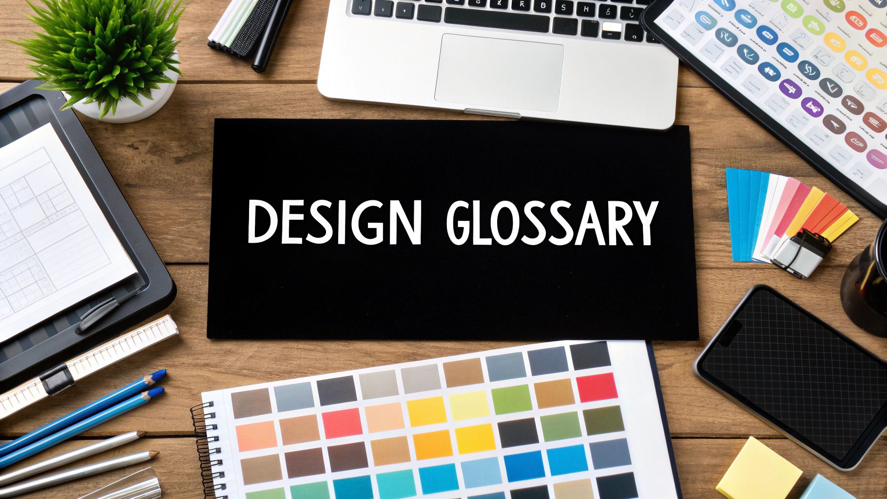
Ever felt like your designer is speaking a completely different language? You're not alone. Graphic design, like any specialized field, comes with its own set of terms for everything from color and typography to layout and digital files.
Getting a handle on this vocabulary is the secret to smoother projects and better results. When you and your designer are on the same page, your vision comes to life faster, with fewer headaches and revisions along the way. This glossary is here to be your translator.
Why Bother Learning Design Jargon?
Trying to guide a design project without knowing the lingo can be frustrating. Vague feedback like "make it pop more" or "it just doesn't feel right" leaves too much room for guesswork, leading to endless revisions and a final product that might miss the mark.
Think of this guide as your cheat sheet. When you can confidently talk about kerning, white space, or the need for a vector file, you give your designer the precise, actionable feedback they need. It’s about more than just sounding smart; it's about making sure your investment in design pays off.
A Quick Bit of History
It's funny to think that the field itself needed a name before it could build its own vocabulary. The term "graphic design" was actually coined back in 1922 by a book designer named William Addison Dwiggins. He needed a way to describe his work—organizing text, images, and other elements on a printed page.
He gave a name to a craft that had been around for centuries, and in doing so, helped formalize it as a distinct profession. If you're curious about the backstory, Canva has a great piece on the history of graphic design.
By learning the terms that follow, you’re not just picking up jargon. You're gaining insight into the craft and strategy behind creating powerful visuals.
Decoding the Language of Typography
Typography is so much more than just picking a font. It's the art of arranging letters and text in a way that makes the words clear, easy to read, and visually engaging. Think of it as a fundamental pillar of graphic design—it sets the mood, establishes a tone, and helps guide your audience through the message. Getting a handle on a few key typography terms will make your feedback to a designer incredibly more effective and ensure the final product truly speaks your language.

Let's clear up a common point of confusion right away: typeface vs. font. While most people use them interchangeably, in the design world, they mean two different things. A typeface is the design family—like Helvetica or Times New Roman. It's the overall look and feel of the characters.
A font, on the other hand, is a specific variation within that family. Think of it as one member of the family, like Helvetica Bold in size 12. Knowing this difference helps you be more precise. Instead of asking for a new typeface, you might just need a different font weight to get the effect you're after.
Serif vs. Sans Serif: The Foundational Styles
One of the first and biggest distinctions you'll hear about is serif versus sans-serif. This simple difference can completely change the personality of a design.
Serif typefaces are the ones with the little decorative "feet" at the ends of the strokes on each letter. These serifs give off a classic, traditional, and often elegant vibe.
- Examples: Times New Roman, Garamond, Baskerville
- Best Use: They're a classic choice for long passages of text in print, like books and newspapers. Many believe the serifs help guide the eye smoothly along each line.
Sans-serif typefaces, as the name implies ("sans" is French for "without"), don't have those little feet. The result is a clean, modern, and more minimalist look.
- Examples: Arial, Helvetica, Futura
- Best Use: Hugely popular for digital screens, from websites to apps. Their clean lines offer fantastic legibility at almost any size, making them perfect for headlines and user interfaces.
The choice between serif and sans-serif is a big one that really helps define a brand's character. If you want to go deeper into how these styles influence a brand's identity, you can find more on typography for logo design.
Mastering Space Between Letters and Lines
Great typography isn't just about the letters themselves—the space around them is equally important. Three terms you'll hear designers talk about are kerning, tracking, and leading. These are the tools we use to fine-tune spacing for better readability and a more polished look. Getting them right is what separates amateur work from professional design.
"Good typography is like a clear window to the content, letting the reader see the message without distraction. The details of spacing—kerning, tracking, leading—are the invisible polish that makes this clarity possible."
These adjustments might sound tiny, but their combined effect is massive. Let's break down what each one does.
Kerning
Kerning is the art of adjusting the space between two specific letters. Some letter pairs, like 'A' and 'V' or 'T' and 'o', have awkward natural gaps. A designer manually kerns these pairs to make the spacing look visually consistent and balanced. This is absolutely critical for logos and headlines, where every detail is under a microscope.
Tracking
Where kerning is about individual pairs, tracking (also called letter-spacing) is about adjusting the spacing uniformly across a whole group of letters—be it a word, a sentence, or a paragraph. Loosening the tracking can give text an airy, sophisticated feel, while tightening it can create a more compact and urgent look.
Leading
Leading (pronounced "ledding," a term from the old days of lead type) is the vertical space between lines of text. You might also hear it called line-height. Without enough leading, text feels cramped and is hard to read. Proper leading gives your eyes a clear path from the end of one line to the start of the next, which is essential for making paragraphs easy on the eyes.
Getting to Grips with Color Theory
Of all the tools in a designer's toolkit, color is easily the most powerful. It’s what grabs your attention, sets a mood, and builds brand recognition—all without saying a word. Moving beyond "I just like that color" to making strategic, intentional choices is what separates good design from great design. A solid understanding of color ensures your brilliant on-screen design looks just as stunning on a printed business card.
At its core, color theory is built on three key components: Hue, Saturation, and Value. Think of them as the three main dials you can turn to adjust any color you can imagine.
- Hue: This is what we usually mean when we say "color." It's the pure thing itself—red, green, blue, yellow. It’s the color's fundamental identity.
- Saturation: This is all about the intensity of a hue. A highly saturated color is rich and vibrant, while low saturation makes a color look washed-out, muted, or grayish.
- Value: Often called brightness, value is simply how light or dark a color is. When you add white to a hue, you get a lighter value (a tint). When you add black, you get a darker one (a shade).
Digital vs. Print: A Tale of Two Color Models
One of the most common hangups for clients is the difference between RGB and CMYK. It’s a crucial distinction, and getting it wrong is why the vibrant colors on your screen can end up looking dull and muddy on paper. The key is knowing where the design will ultimately live.
RGB (Red, Green, Blue) is what’s called an additive color model, and it’s used exclusively for digital screens—think computer monitors, phones, and TVs. It starts with black and adds red, green, and blue light in various combinations to create a full spectrum of color. When all three are mixed at their brightest, you get pure white.
CMYK (Cyan, Magenta, Yellow, Key/Black), on the other hand, is a subtractive model designed for printing. It starts with a white surface (like paper) and subtracts brightness by layering inks. The printer combines cyan, magenta, yellow, and black ink to absorb light and create the image you see. Mixing them all together produces a deep, rich black.

Choosing the Right Color Model: RGB vs. CMYK
To make it even clearer, here’s a quick-glance guide to help you figure out which model is right for your project.
Ultimately, always start with the end in mind. If your design is destined for a screen, stick with RGB. If it's going to be printed, CMYK is the only way to go.
Creating Harmony with Color Schemes
So, how do designers pick colors that just... work? It’s not magic; it’s color harmony. This is the art of combining colors in a way that’s pleasing to the eye, and it relies on proven relationships on the color wheel. These schemes give designers a reliable starting point for building a brand’s entire look and feel.
A smart color palette is more than just a handful of nice shades; it’s a business asset. The right combination can increase brand recognition by up to 80%, making it an incredibly important part of your brand identity.
Here are a few of the most common schemes you’ll encounter:
- Monochromatic: This scheme uses a single hue and plays with its different tints and shades. It’s a surefire way to create a look that feels clean, elegant, and cohesive. Think light blue, royal blue, and deep navy all working together.
- Analogous: This approach uses colors that sit side-by-side on the color wheel, like yellow, yellow-green, and green. The result is often serene and comfortable, as the colors naturally blend into one another.
- Complementary: For a bold, high-impact look, designers turn to complementary colors. These are colors directly opposite each other on the color wheel, like red and green or blue and orange. This pairing creates maximum contrast, making it perfect for drawing attention to key elements.
Getting a handle on these color principles is a huge step toward communicating more effectively with your designer. To dig deeper into how these ideas are put into practice, check out this guide to master color theory in marketing to boost sales. Every choice, from a single hue to an entire palette, shapes how your audience sees and feels about your brand.
Mastering Composition and Layout Principles
Great design doesn’t happen by chance. It’s all about the deliberate placement of every single element on the page or screen. This art of arrangement is called composition, and it's what makes the difference between a cluttered, confusing mess and a design that’s clear, compelling, and easy to follow. Getting a handle on these terms will help you give your designer specific, useful feedback on how a design is structured and where it leads your eye.

Many of these core ideas were cemented as the design field grew up. As printing and magazine publishing took off in the 19th and 20th centuries, there was a real need for systems to organize visual content effectively. That history gave us the very language we use today to bring order and clarity to design.
Building a Foundation with Grids and Alignment
Behind almost every professional layout, you’ll find a grid. Think of it as an invisible skeleton of intersecting lines that helps a designer organize text, images, and other elements in a consistent, logical way. It’s what brings order to the chaos and makes sure everything feels like it belongs.
Alignment is simply the act of placing items so their edges or centers line up along a common axis, either vertically or horizontally. It creates a clean, organized look and subtly tells the viewer that different elements are connected. Without proper alignment, a design can quickly feel sloppy and unprofessional.
Guiding the Eye with Hierarchy and White Space
Not everything in a design should shout for attention at the same time. Visual hierarchy is how designers arrange elements to signal their order of importance. By playing with size, color, contrast, and placement, they ensure you see the most important message first, then the second, and so on down the line.
Hierarchy’s best friend is white space (also called negative space). This isn't "wasted" space—it's the empty area around the elements. White space is an active and crucial part of the design that cuts down on clutter, makes text easier to read, and helps create focus. Plenty of white space can give a design a calm, sophisticated, and modern feel.
Juggling these elements is a key skill that separates a basic graphic from a truly strategic piece of design. If you're curious about where that line is drawn, check out our guide on https://www.softriver.co/blog/logo-design-vs-graphic-design.
Creating Unity with Proximity, Repetition, and Balance
Beyond just the structure, a few other principles work together to make a design feel cohesive and harmonious.
Proximity: This one’s straightforward—related items should be grouped together. When things are placed close to each other, our brains see them as a single unit. It’s a simple way to organize information and make a layout much easier to scan.
Repetition: When you repeat visual elements like colors, shapes, or specific fonts throughout a design, you build a sense of unity and consistency. Repetition is fundamental to branding because it creates a familiar and recognizable visual language.
Balance: This refers to how the visual weight of elements is distributed. It generally comes in three flavors:
- Symmetrical Balance: Elements are mirrored on either side of a central line. This feels formal and stable.
- Asymmetrical Balance: Elements aren’t mirrored, but the design still feels balanced because items with different visual weights are arranged to offset each other.
- Radial Balance: Everything radiates out from a central point, like spokes on a wheel.
Many of these concepts cross over into other visual fields. For more practical examples, looking into essential composition rules for photography can offer some great insights.
Understanding Image and File Format Types
https://www.youtube.com/embed/y_2P5o_msuo
Getting the right file for the right job is one of the most important—and often misunderstood—parts of any design project. A simple mix-up here can lead to blurry logos, pixelated photos, and printing disasters. Let's break down the technical terms for images and file formats so your projects always look sharp and professional, whether they're online or on a printed page.
The first thing to get your head around is the difference between raster and vector graphics. These are two totally different ways of building and storing images, and each has its own strengths and weaknesses. Choosing the right one from the start is absolutely essential for a quality result.
Raster vs. Vector: The Core Difference
You're probably most familiar with raster images. Think of them as a mosaic. They're built from a grid of tiny colored squares called pixels. Photographs are the classic example of a raster image. Because they're made of a fixed number of pixels, they have a set size. If you try to blow up a raster image too much, it loses quality fast and starts to look blurry or "pixelated."
Vector images, on the other hand, are created with math. Instead of pixels, they are built from a series of points, lines, and curves defined by mathematical equations. This means they are infinitely scalable. You can stretch a vector logo to fit on a tiny business card or a massive billboard, and it will stay perfectly crisp every single time. This is why designers will always ask for your logo in a vector format.
Key Takeaway: For anything that needs to be resized, like logos and icons, vector is non-negotiable. For images with complex color and detail, like photographs, raster is the standard.
Navigating Common File Types
Now that you know the difference between raster and vector, let's look at the most common file formats you’ll run into. Each one is designed for a specific purpose.
JPEG (or JPG): This is a raster format, and it's the workhorse for photographs and complex images on the web. JPEGs use "lossy" compression to keep file sizes small, which means they throw away a bit of image data. This is usually fine, but over-compressing can ruin the quality. They also don't support transparency.
PNG: Another raster format, but with one huge advantage over JPEG: it supports transparency. This makes it perfect for web graphics that need to sit on top of a colored background, like logos or icons. PNGs use "lossless" compression, which means they don't sacrifice quality to reduce file size.
GIF: A classic raster format known for two things: simple animations and a limited color palette. GIFs are great for short, looping clips online, but their color limitations make them a poor choice for high-quality photos.
SVG (Scalable Vector Graphics): As the name implies, this is a vector format made specifically for the web. Because it's vector, an SVG logo or icon will look perfectly sharp on any screen, at any size. They also tend to have very small file sizes.
EPS (Encapsulated PostScript): This is a legacy vector format that you'll still see used, especially for print projects. While it's a reliable standard, many modern workflows are shifting toward AI (Adobe Illustrator) or PDF files for sharing vector artwork.
To make things a bit easier, here’s a quick-reference table that breaks down which format to use and when.
Common Image File Formats and Their Uses
A summary table to help you understand which file format is best suited for different design applications, from web graphics to print materials.
Choosing the right format ensures your design looks exactly as intended, without any nasty surprises when it's time to go live or send it to the printer.
Resolution: DPI and PPI Explained
Finally, let's talk about resolution. This term simply describes the amount of detail packed into an image, but it's measured differently for print versus digital screens.
DPI (Dots Per Inch) is all about printing. It refers to the physical dots of ink a printer lays down within a one-inch space. For a high-quality print job, like a brochure or magazine ad, the industry standard is 300 DPI. If you send a low-DPI image to a printer, you’ll end up with a final product that looks fuzzy and unprofessional.
PPI (Pixels Per Inch) is the screen equivalent. It measures the number of pixels displayed in one inch of a digital screen. For a long time, 72 PPI was the standard for web graphics, but with today's high-resolution displays (like "Retina" screens), it’s more useful to focus on the actual pixel dimensions of the image (e.g., 1080 x 1080 pixels). This ensures your graphics look sharp on every device. If you're working with video, a great resource for understanding social media video dimensions can help you apply these concepts effectively.
Key Terms in Branding and Logo Design
Branding is what gives a company its visual soul. To build it right, you need to speak the language. Getting a handle on the key terms in this space helps you have much clearer, more strategic conversations with your designer and give feedback that actually gets results.

Think of a company’s visual identity as more than just a logo. It’s the entire suite of visual elements—colors, fonts, imagery—that represents your organization. When all these pieces work together, they form a cohesive and recognizable brand identity.
The Different Types of Logos
People often just say "logo," but in a designer's world, there are several distinct types. Knowing the difference helps you get specific about what you want for your brand's most important visual asset.
Logotype (or Wordmark): This is a logo built entirely from the company's name, set in a specific, often custom, typeface. Think of Google, Coca-Cola, or Visa. The typography does all the heavy lifting here to create a memorable look.
Logomark (or Brandmark): This one is all about the symbol. A logomark is an image or icon that represents the brand without any text at all. The Apple logo and the Nike "swoosh" are prime examples. These are incredibly powerful but usually need a lot of brand recognition to work on their own.
Combination Mark: As the name suggests, this is a mix of a wordmark and a logomark. It's probably the most common approach you'll see, used by brands like Adidas and Spotify. You get the best of both worlds: a distinct symbol paired with the brand name for total clarity.
Emblem: With an emblem, the company name is woven directly into the symbol, creating a single, unified piece. Think of the Starbucks siren or a Harley-Davidson crest. They often have a classic, established feel to them.
Bringing a Brand to Life
Once you’ve got a logo, a few other key pieces come into play to make sure it’s used correctly and looks its best everywhere. These are the tools that keep your brand looking professional and consistent.
A mockup is simply a realistic preview of how a design will look out in the wild. For instance, a designer might show you a mockup of your new logo on a t-shirt, a business card, or a website. This is a huge help for visualizing the final product before you commit to printing or publishing anything.
To keep everyone on the same page, designers create a brand style guide. This is your brand’s rulebook. It lays out exactly how every visual element should be used—from logo placement and color palettes (HEX, RGB, CMYK codes) to your official fonts and even the brand's tone of voice. This guide is essential for keeping your brand looking unified across your whole team and with any outside partners.
If you're curious about how new technology is impacting this space, you can find some great information on AI in brand and logo design and see how the field is evolving.
Answering Your Design Questions
Even with a handy glossary, some design terms can still be a bit confusing. Let's tackle some of the most common questions that come up during projects to make sure you and your designer are always on the same page.
What's the Real Difference Between UI and UX?
People often mix these two up, but they're fundamentally different roles that work hand-in-hand. A simple way to think about it is that UI is what you see, and UX is what you feel.
User Interface (UI) design is all about the visuals. It covers every aesthetic detail you interact with—the buttons you click, the fonts you read, and the colors that guide you. A UI designer's job is to make the product look beautiful and polished.
User Experience (UX) design, on the other hand, is about the entire journey. A UX designer is focused on how the product works and how it feels to use. Is it logical? Is it easy to navigate? Is it a pleasant experience from start to finish? That's all UX.
Why Does My Designer Insist on a Vector Logo?
This is one of the most important things for keeping your brand looking its best. The reason is all about how the file is built.
A vector file, like an SVG or an AI file from Adobe Illustrator, isn't made of pixels. Instead, it’s constructed using mathematical equations. This means you can scale it up to the size of a billboard or shrink it down for a tiny favicon, and it will never lose quality or look blurry.
On the flip side, a raster file (like a JPEG or PNG) is just a grid of tiny squares called pixels. When you try to make a raster image bigger, the software has to guess and stretch those pixels, which is why it ends up looking blocky and unprofessional.
Think of your vector logo as the master key to your brand. It guarantees a sharp, professional look no matter where it's used.
What Is a "Bleed" in Printing?
You'll hear the term bleed a lot when you're getting anything printed, from business cards to brochures. It's a simple but crucial concept.
A bleed is just a small, extra margin of your design that extends beyond the final trim line of the page. Designers usually add about 1/8th of an inch all around. This way, when the printer cuts the paper down to its final size, there's no risk of a thin, accidental white border showing up if the cut is slightly off. It ensures your design goes right to the very edge for a clean, polished look.