
Creating a logo for your photography business is about so much more than just picking a cool font. It's the process of capturing your unique artistic vision—whether that’s dramatic landscapes or sun-drenched weddings—and distilling it into a single, memorable mark. It’s a blend of deep self-reflection and smart design choices that come together to build a symbol clients will trust and remember.
Your Logo Is Your Brand’s North Star
Before you even think about opening a design program, let's get one thing straight: your logo is a powerhouse. It’s not just a little graphic you stick in the corner of your website. It’s the face of your business, a silent ambassador working for you 24/7, communicating your style and professionalism at a glance. A great logo does the heavy lifting long before a potential client ever sees your portfolio.
Think of it as a visual handshake.
- It Tells Your Story Instantly: A logo for a moody, high-fashion portrait photographer will look and feel completely different from one designed for a fun, vibrant family photographer. The colors, shapes, and fonts immediately set the right expectations.
- It Forges Instant Trust: A polished, professional logo sends a clear signal: you take your craft seriously. This little detail builds perceived value, helping to justify your pricing and attract the kind of clients you want to work with.
- It Makes You Unforgettable: The photography market is crowded. A unique and memorable logo helps you cut through the noise. When people see it consistently on your website, social media, and watermarks, your brand becomes instantly recognizable.
The Tangible Impact of a Great Logo
Your logo becomes a mental shortcut for your audience. Research shows that a staggering 75% of consumers recognize a brand just by its logo. That’s the power of a strong visual identity. Even better, when your branding is consistent across all your platforms—with your logo leading the charge—it can boost your revenue by an average of 23%. A cohesive brand presence directly fuels business growth.
Once you’ve nailed your visual identity, you can amplify its reach through content marketing. That’s where something like understanding the essentials of Blogging for Photographers can really pay off.
Your logo is often the very first and last thing a client sees. It frames their entire experience with your brand, from the moment they discover you on social media to the day they receive their final photo album.
Ultimately, putting real thought into your logo is an investment in your business’s future. It’s the foundation you build everything else on—your reputation, your client relationships, and your connection with your ideal audience. The right logo doesn’t just identify your business; it elevates it.
To give you a clearer picture, let's break down what truly makes a photography logo work.
Table: Key Elements of a Standout Photography Logo
Here’s a quick overview of the essential components that all come together to create a successful logo for a photographer.
A great logo is a careful balance of these five elements, each playing a critical role in how your brand is perceived.
For a deeper dive into this topic, you can learn more about why logo design is important for your brand.
Finding Your Visual Identity Before You Design
The best photography logos don't just appear out of thin air. They're built, piece by piece, on a solid foundation of who you are as a photographer. Before you even think about opening a design app or sketching a concept, you need to get crystal clear on the story your brand is meant to tell.
This homework is what separates a forgettable icon from a powerful brand mark. It’s the difference-maker. It ensures every color, font, and shape you choose has a purpose and speaks directly to the people you want to work with. Think of it as mapping your route before you start the car.
What's Your Brand's Personality?
First things first: what's the vibe? Your brand’s personality is the human character you want to project. Is your photography style romantic and ethereal, or is it bold and edgy? Are you the warm, approachable photographer who feels like an old friend, or the high-end expert with a polished, luxury touch?
Getting this right is everything. A wedding photographer aiming for a “timeless and elegant” feel needs a logo that looks and feels completely different from a commercial photographer whose brand is all about being “modern and confident.”
- Timeless & Elegant: This might lead you to delicate script fonts, soft color palettes (think muted golds or pastels), and clean, spacious layouts.
- Modern & Confident: You'd probably lean into bold, sans-serif typography, strong geometric shapes, and a high-contrast color scheme like classic black and white.
Without this clarity, you’re just guessing. A client searching for dramatic, moody portraits isn't going to click with a logo that screams playful and bright.
Get to Know Your Ideal Client (and Your Competition)
Who are you trying to book? Be specific. “An adventurous couple planning a mountain elopement” is a much clearer target than just “people getting married.” When you truly understand their values, what they're drawn to, and what they expect, you can design a logo that hits them right in the heart.
At the same time, you need to scope out what other photographers in your area are doing. The goal here isn't to copy them—it's to analyze them. Notice what’s common, but more importantly, look for what’s missing. If every other wedding photographer in town uses a swirly, cursive font, maybe a clean, powerful serif typeface is your ticket to standing out.
Your goal isn’t to blend in. It’s to create a visual identity so distinct that your ideal client sees it and immediately thinks, “That’s the one.”
Curate a Mood Board That Actually Works
A mood board is your visual playbook. This is where you start turning abstract ideas like “romantic” or “adventurous” into actual visual elements. But here’s a pro tip: stop looking at other photography logos for inspiration. That’s a fast track to a design that looks like everyone else’s.
Instead, pull inspiration from everywhere else.
- Architecture: The clean, sharp lines of a modern building could inspire a geometric monogram.
- Interior Design: That color palette from a cozy, rustic cabin photo on Pinterest? Perfect for a nature-focused brand.
- Fashion: The typography on a high-fashion magazine cover might spark an idea for a luxury wedding logo.
- Nature: Look at the organic shape of a fern or the texture of a rock. These can lead to unique, abstract icons that feel completely original.
This process forces you to be creative and helps ensure your final design feels authentic to you. When you ground your logo in a well-defined identity, you’re no longer just making a logo—you’re building a brand that will last.
Bringing Your Logo Concept to Life
Okay, you've done the research and put together a mood board. Now for the fun part: turning those abstract ideas into an actual design. This is where we go from a rough sketch on a napkin to a polished digital file, and it all starts with the most powerful creative tool you own—a pencil.
Seriously, don't jump straight into design software. It's a common trap. You get so caught up in the technical tools that you can easily lose that initial creative spark. Starting with a pencil and paper is simply the fastest, most fluid way to get ideas out. Sketch different layouts, play with shapes, and see how your name fits with different icons. Just let it flow.
From Paper Sketch to Digital Vector
Once you have a few sketches that feel right, it’s time to bring them onto the screen. The main goal here is to create a vector file. This is non-negotiable for a professional logo. A vector can be scaled to any size—from a tiny favicon on a website to a giant billboard—without ever losing quality.
Which software should you use? It really depends on your comfort level and budget.
- Adobe Illustrator: This is the undisputed industry standard for a reason. It gives you incredible control for creating those clean lines and perfect curves you need to turn a rough sketch into a flawless vector.
- Canva: If you're not a design pro, Canva is a fantastic, user-friendly option. It might not have every bell and whistle that Illustrator does, but its tools are more than capable of helping you create a high-quality, professional-looking logo.
As you start turning your ideas into actual visuals, it's really helpful to understand the core process of designing a logo. This knowledge will guide your decisions and help you refine your sketch into a digital masterpiece.
Designing for Real-World Versatility
Here’s something a lot of people forget: a great logo has to work everywhere. As you digitize your design, think beyond just one static image. What you really need is a small family of logo variations that can adapt to different situations.
This is more important than ever. The 2025 State of the Photography Industry report found that personalization and diversification are huge now, with about 10% of photographers running multiple types of businesses. Your logo needs to keep up.
This image breaks down the key pieces of a versatile logo system.
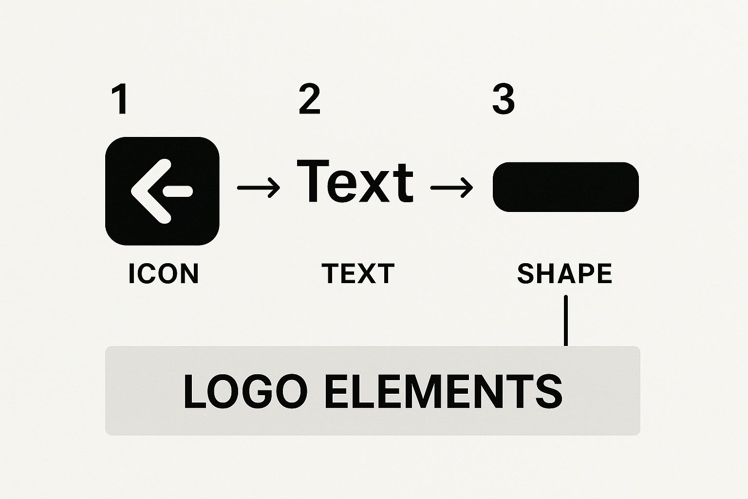
Thinking about how your icon, text, and overall shape can be rearranged from the get-go will save you so many headaches later on.
Pro Tip: Plan for a primary logo, a secondary version (maybe stacked or horizontal), and a simple submark (like an icon or monogram). This ensures your brand looks sharp and consistent whether it's on a business card, a website header, or a tiny photo watermark.
By building these variations from day one, you’re not just designing a logo. You're building a complete visual system that will serve your business for years.
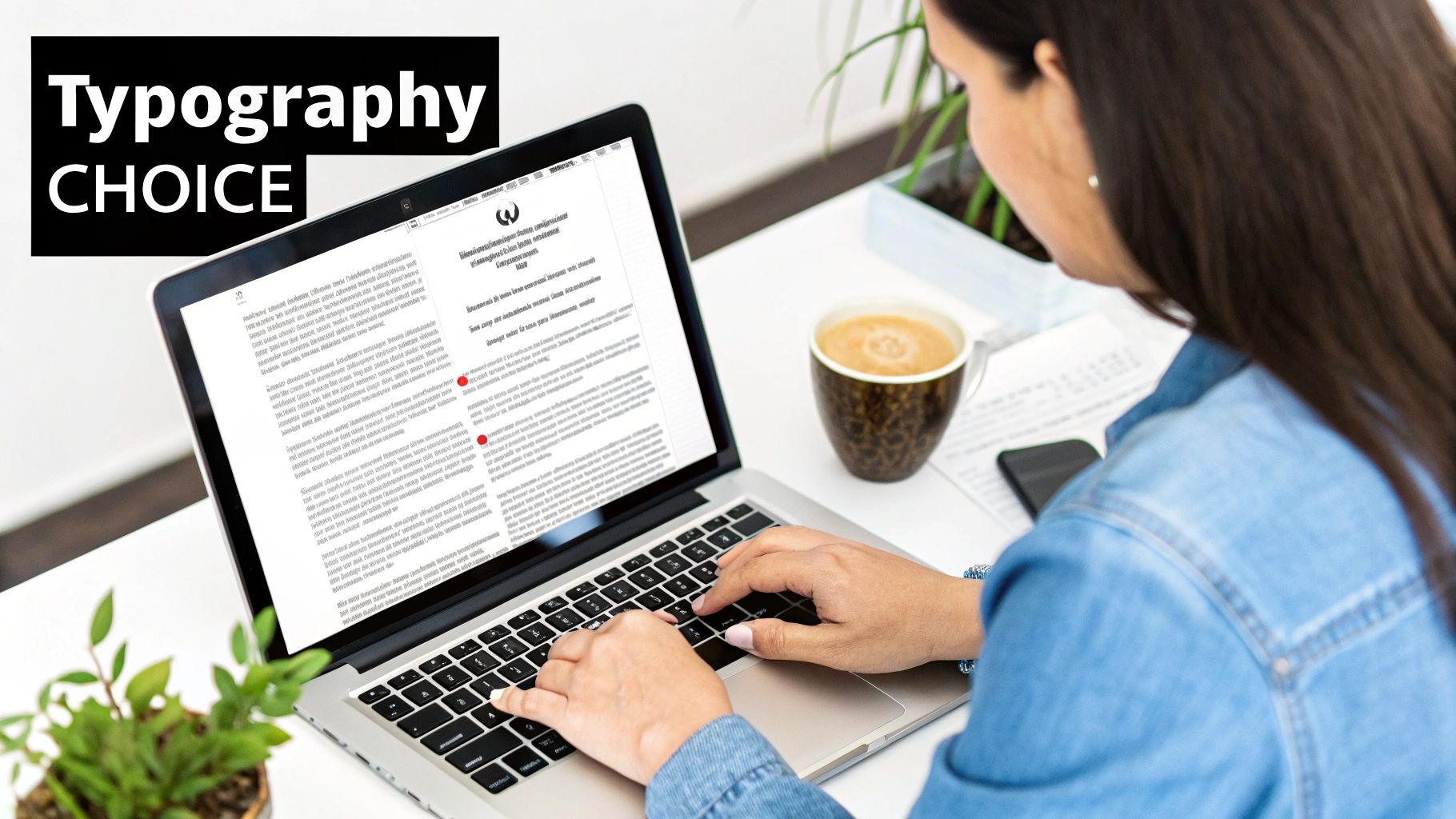
Choosing Fonts and Colors That Connect
Now that you have your concepts digitized, it's time to breathe some life into them. This is where typography and color come into play, turning a basic shape into a brand mark that actually connects with people. These aren't just decorative choices; they're powerful tools that tell potential clients who you are before they ever see your work.
Think of your font as your brand's voice. Is it classic and refined? Or modern and approachable?
A classic serif font, with those little "feet" on the letters, instantly suggests tradition, elegance, and reliability. It's a natural fit for fine art photographers or anyone in the luxury wedding space who wants their brand to feel timeless and high-end.
On the other hand, a clean sans-serif font—no extra frills—gives off a vibe of simplicity, confidence, and friendliness. This style is perfect for commercial, lifestyle, and family photographers whose work is fresh, bold, and direct.
Decoding Font Psychology
Choosing a font is less about what looks "cool" and more about strategy. The right typeface sets an immediate expectation.
- Serif Fonts (like Playfair Display or Garamond): These feel classic, sophisticated, and trustworthy. A fine art portrait photographer might use a serif to signal a premium, artistic experience from the get-go.
- Sans-Serif Fonts (like Montserrat or Proxima Nova): These are your go-to for a modern, clean, and friendly brand. If you specialize in vibrant, candid family sessions, the open feel of a sans-serif is a perfect match.
- Script Fonts (like Allura or Great Vibes): Handwritten styles create a personal, elegant, and often romantic mood. They're a staple for wedding photographers, but be careful here—they absolutely must be legible, especially when used as a tiny watermark.
It really helps to see how different styles work in the real world. For a handpicked list of typefaces that are proven to work for photographers, check out our guide on the best fonts for photography logos.
Remember, the best font doesn't just look good. It aligns perfectly with the feeling you want your photos to evoke. It's all about creating harmony between your visual identity and your artistic style.
Building an Intentional Color Palette
Color is easily the most potent tool you have. It's what people notice first, and it triggers instant emotional reactions. Your color palette should be a direct reflection of your editing style and the mood you create in your images.
In fact, research shows that color alone can influence up to 80% of a person's perception of a brand. Since a logo only has a couple of seconds to make an impression, your color choices are critical. Learn more about the impact of branding visuals on cropink.com.
For example, a light and airy wedding photographer would naturally build a palette around soft pastels, muted golds, and off-whites. This mirrors their bright, romantic photos perfectly. A dramatic landscape photographer, however, might use deep greens, slate grays, and a pop of burnt orange to capture a moody, adventurous spirit.
When you're picking colors, don't just go with your personal favorites. Ask yourself: do these colors match my brand's core message? Do they resonate with my ideal client? Your logo's colors should feel like they were pulled directly from the art you create.
Fine-Tuning and Finalizing Your Logo
Alright, you’ve got a design concept you love. That’s a huge step, but we're not at the finish line just yet. The real craftsmanship comes in the refinement phase, where we polish that rough diamond into something truly brilliant and, most importantly, functional.
This is where we separate the professional logos from the amateur ones. A great idea needs to survive in the wild. What looks fantastic on your 27-inch monitor might completely fall apart as a tiny watermark or a social media icon. So, before you pop the champagne, it's time to put your design through a boot camp.
The Real-World Gauntlet
You have to stress-test your logo. Don't just keep it safe inside your design software—throw it into every real-world scenario you can think of. This is how you spot the weak points before it’s too late.
Here’s a practical checklist I run through with every design:
- The Squint Test: This is a classic for a reason. Shrink your logo down to the size of a tiny favicon or Instagram profile picture. Step back from your screen and squint. Does it just turn into a meaningless smudge, or can you still make out the core shape?
- The Watermark Challenge: Slap a semi-transparent version over one of your most detailed, "busy" photographs. A good watermark should be present enough to protect your work but subtle enough that it doesn’t scream over the top of your art.
- The Black & White Flip: Can your logo survive without its colors? Convert it to pure black and pure white. If the design relies on gradients or multiple colors to be recognizable, it’s not strong enough. Its silhouette alone should be iconic.
- The Print Preview: Mock it up on a business card or a letterhead. How does it look in a physical format? Does it feel balanced and professional, or does it look awkward and out of place?
Pushing your design through these hoops is non-negotiable for creating a logo that actually works for you. For a deeper dive into what makes a logo truly effective, you can explore our guide on what is a good logo for photography.
Think of your logo as your hardest-working employee. It has to look just as sharp on a tiny Instagram icon as it does embroidered on a camera bag. If it fails in any one of these scenarios, it’s not ready for prime time.
Assembling Your Final Logo Toolkit
Once your design has passed every test with flying colors, it's time to build the final package. The goal here is to create a comprehensive set of files so you have the right format for any application imaginable—web, print, video, you name it. You should never have to scramble or compromise on quality.
This professional polish is more important than ever. The global photography market was valued at $55.6 billion in 2023 and is expected to climb to $81.83 billion by 2032. In a field this crowded, a versatile and high-quality brand identity isn't just nice to have; it's essential for standing out. You can learn more about the growing photography industry on imageretouchinglab.com.
Your go-to logo toolkit should always include:
- Vector Files (AI, SVG): These are your master files, the holy grail. They can be scaled to the size of a billboard or a pen without losing a single pixel of quality. Absolutely essential for professional printers.
- Raster Files (PNG): For everything digital. You'll want high-resolution PNGs with transparent backgrounds for your website, social media profiles, and email signatures.
- Color Variations: Don't forget to export full-color, all-black, and all-white versions. This ensures your logo will look incredible on any background, light or dark.
Common Questions About Photography Logos
As you start designing a logo, you’ll probably run into a few common questions. Getting these sorted out early on can save you a ton of headaches and help you feel confident in your final design.
Let's clear up some of the most frequent things that trip photographers up.
Do I Really Need a Camera Icon in My Logo?
This is easily the question I hear most often, and my answer is almost always no. It feels like the most obvious choice, right? But that’s the problem—it's what everyone else is doing.
Think about it: thousands of photographers are using some variation of a camera or an aperture. It makes your brand blend in when you need it to stand out. Instead of being literal, try to be evocative. Your logo should capture the feeling and style of your photography, not just show the tool you use. A beautiful script font or a subtle abstract shape can say way more about your unique vision than a generic camera silhouette ever could.
What’s the Difference Between a Logo and a Watermark?
They're related, but they have very different jobs. A logo and a watermark are part of the same brand family, but you wouldn't send them to do the same task.
- Your Logo: This is the face of your brand. It’s the full, official version you’ll put on your website, business cards, and social media. Its entire purpose is brand recognition.
- Your Watermark: This is a stripped-down, semi-transparent version of your logo. Its only job is to protect your images online from being used without your permission. It needs to be visible but not distracting.
When you finalize your logo design, make sure you have a version specifically created to work as a clean, effective watermark.
A great logo is your brand's official signature, while a watermark is a quiet security guard. One is for recognition; the other is for protection. Both are essential for a professional photographer.
Can I Design My Own Logo, or Should I Hire a Pro?
You can absolutely design your own logo! Plenty of successful photographers have gone the DIY route, especially with all the user-friendly design tools available today. Canva and other platforms have made it easier than ever to create something that looks professional.
Going DIY is a great option if you have a really clear vision for your brand and you genuinely enjoy the creative process. On the other hand, if you're feeling stuck or want something truly strategic, investing in a professional designer is worth every penny. A good designer brings an objective eye and years of expertise, turning a simple idea into a timeless brand identity that really connects with your market.
Ready to create a logo that truly represents your unique style? At Softriver, our expert designers build custom brand identities that capture your vision and connect with your ideal clients. Let's create your perfect logo today.