
A great logo feels inevitable-simple, memorable, and perfectly aligned with the brand it represents. But achieving that result is rarely an accident. It's the product of a deliberate process, checking off critical elements to ensure the final design is not just visually appealing, but also a hardworking business asset. This definitive logo design checklist breaks down the eight essential pillars that separate amateur efforts from iconic brand marks. It serves as a strategic blueprint for creating a logo that performs flawlessly across every application, from a tiny app icon to a massive billboard.
Whether you're a founder launching a new venture, a marketer leading a rebrand, or a designer aiming for excellence, this guide provides the framework needed for success. We'll move beyond generic advice and dive into actionable steps, real-world examples, and the technical specifics that guarantee your logo is scalable, versatile, and legally sound. For those seeking comprehensive assistance, exploring professional design services can provide valuable support throughout your branding journey. By following this checklist, you can confidently navigate the design process, avoid common pitfalls, and build a logo that connects with your audience and stands the test of time.
1. Brand Alignment and Strategic Purpose
Before a single pixel is placed or a sketch is drawn, the most critical step in any professional logo design checklist is ensuring deep alignment with your brand's core strategy. A logo isn't just an artistic mark; it's a strategic business tool designed to communicate your brand's essence at a glance. It's the visual translation of your company's mission, values, and promise to your audience.
Een fundamenteel aspect van een succesvol logo is de alignment met je algehele merkstrategie. Voordat je diep in het designproces duikt, is het cruciaal om te begrijpen wat branding nu écht betekent voor je bedrijf. This foundational understanding ensures your logo will resonate with the right people and support your long-term business goals.
Why It's a Critical First Step
A logo without strategy is merely a decoration. A strategically aligned logo, however, works tirelessly for your business. For example, Patagonia's stylized mountain silhouette instantly evokes feelings of adventure and a commitment to the outdoors. Likewise, the "T" in Tesla's logo subtly represents a cross-section of an electric motor, communicating innovation and technological prowess. These logos succeed because they are anchored in a clear and powerful brand purpose.
Key Insight: Your logo should answer the question "Why should I care?" before a customer ever reads a word about your company. It sets the tone for every future brand interaction.
How to Achieve Strategic Alignment
To ensure your logo is built on a solid foundation, focus on discovery before design. This proactive approach prevents costly redesigns and ensures your final logo connects meaningfully with your target market. To learn more about this crucial first step, you can explore this guide on brand strategy for startups.
- Conduct Brand Workshops: Gather key stakeholders to define your brand's mission, vision, values, personality, and target audience.
- Create Detailed Mood Boards: Translate abstract brand attributes like "trustworthy" or "playful" into a visual language of colors, fonts, and imagery.
- Analyze the Competition: Understand how competitors position themselves visually so you can create a logo that stands out and carves its own unique space in the market.
2. Color Versatility and Monochrome Functionality
While a vibrant color palette can capture attention, a truly professional logo must prove its strength and clarity without it. An essential item on any logo design checklist is ensuring your design is versatile enough to function in monochrome (black and white) and single-color applications. This adaptability is not just an aesthetic consideration; it's a practical necessity for brand consistency across countless mediums, from printed documents to embroidered apparel.
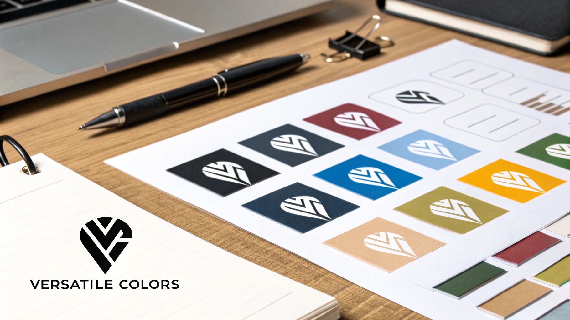
A logo that depends solely on its color scheme to be recognizable is a fragile asset. True strength lies in a form that remains iconic whether it's in full color on a website or as a simple white stamp on a colored background. The right color strategy ensures your visual identity is both powerful and practical. You can explore a strategic guide to choosing colors for your brand to build a foundation that supports this versatility.
Why It's a Critical Design Constraint
A logo that fails in black and white will fail your brand in real-world scenarios. Consider the Coca-Cola script; its elegant shape is instantly recognizable in its signature red, but it's just as powerful in stark black or white on a can. Similarly, the hidden arrow in the FedEx logo maintains its clever impact regardless of color variation. These logos succeed because their core design is strong enough to stand alone, making them universally applicable and cost-effective to reproduce.
Key Insight: A great logo's identity is defined by its shape and form, not its colors. Color should enhance the logo, not be its crutch.
How to Achieve Color Versatility
The best practice is to design in grayscale first. This forces you to focus on creating a strong silhouette, clear negative space, and a balanced composition. Once the form is perfected in black and white, adding color becomes a strategic enhancement rather than a corrective measure.
- Design in Black and White First: Begin the design process in a monochrome environment to prioritize form and structure over color.
- Test on Various Backgrounds: Place your single-color logo on a wide range of light, dark, and colored backgrounds to check for visibility and impact.
- Ensure Sufficient Contrast: Verify that your logo's elements have enough contrast to be legible, especially for users with visual impairments. This is crucial for digital accessibility.
- Consider Production Costs: A versatile, single-color logo is often cheaper to print on promotional materials like t-shirts, pens, and packaging.
3. Simplicity and Memorability
In a world saturated with visual information, the most powerful logos are often the simplest. An essential item on any professional logo design checklist is the deliberate pursuit of simplicity to achieve memorability. A simple logo is not an uninspired one; it is a design distilled to its most potent, recognizable form, free of clutter that can confuse the viewer or dilute the brand’s message.

The core principle is that a less complex design is easier for the human brain to process, recall, and recognize across various contexts. This approach, championed by design legends like Paul Rand and Saul Bass, ensures a logo remains effective whether it's on a giant billboard or a tiny app icon. This clarity is fundamental to building lasting brand equity.
Why It's a Critical Design Principle
A complex logo demands too much cognitive effort from the viewer. In contrast, a simple mark communicates its idea instantly. Think of the Nike swoosh, a single fluid line that perfectly conveys motion and victory, or Target’s bullseye, which is impossible to misinterpret. These logos are successful because their simplicity makes them versatile, timeless, and instantly embeddable in our memory.
Key Insight: A memorable logo passes the "doodle test." If you can't easily sketch it from memory in a few seconds, it's likely too complicated to be effective.
How to Achieve Simplicity and Memorability
Achieving powerful simplicity requires discipline and a focus on a single, core idea. The goal is to strip away every non-essential element until only the most impactful visual remains. This process ensures your final design is both distinctive and easy to remember.
- Embrace the "Less is More" Philosophy: Start with your core concept and challenge yourself to remove at least one element. Repeat this until nothing more can be taken away without losing the core meaning.
- Focus on a Single Visual Concept: Avoid trying to tell your brand's entire story in the logo. Instead, concentrate on communicating one key idea, emotion, or value.
- Conduct a Three-Second Test: Show your logo to someone for just three seconds and then ask them what they saw and what it made them feel. Their immediate recall is a strong indicator of its memorability.
4. Originality and Trademark Viability
Beyond aesthetics, a professional logo must be both unique and legally defensible. Originality ensures your brand stands out in a crowded marketplace, while trademark viability protects that uniqueness as a valuable business asset. This dual focus is a non-negotiable part of any serious logo design checklist, safeguarding your brand against infringement claims and copycats.
A logo that is too similar to a competitor's can cause brand confusion and lead to costly legal disputes. Investing in a truly distinctive mark from the outset is a strategic move that builds brand equity and provides a solid legal foundation for your identity. For practical application, exploring winning color combinations for logos can provide immediate inspiration and guidance for your brand.
Why It's a Critical Legal & Creative Step
A logo that isn't original fails at its primary job: to distinguish your business. Airbnb's 'Bélo' symbol is a powerful example of a completely original mark that is instantly recognizable and legally protectable. Similarly, Spotify's distinct sound wave icon is a unique visual take on audio, making it inherently ownable. These logos succeed because their originality makes them memorable and defensible.
Key Insight: Your logo isn't just a creative asset; it's a piece of intellectual property. Treat its creation and protection with the same diligence you would any other valuable company asset.
How to Ensure Originality and Protectability
Verifying uniqueness should happen early and often in the design process, not as an afterthought. This proactive approach minimizes the risk of having to abandon a nearly finished design due to a trademark conflict.
- Conduct Comprehensive Trademark Searches: Before finalizing a design, perform thorough searches on the USPTO (or your country's equivalent) database.
- Avoid Common Tropes: Steer clear of generic stock imagery or overused symbols within your industry (like globes for global companies or gears for tech).
- Document Your Design Process: Keep records of sketches, revisions, and creative rationale. This documentation can serve as proof of original creation if ever needed.
- Consult with an IP Attorney: For ultimate peace of mind, have an intellectual property lawyer review your final logo and handle the official trademark filing process.
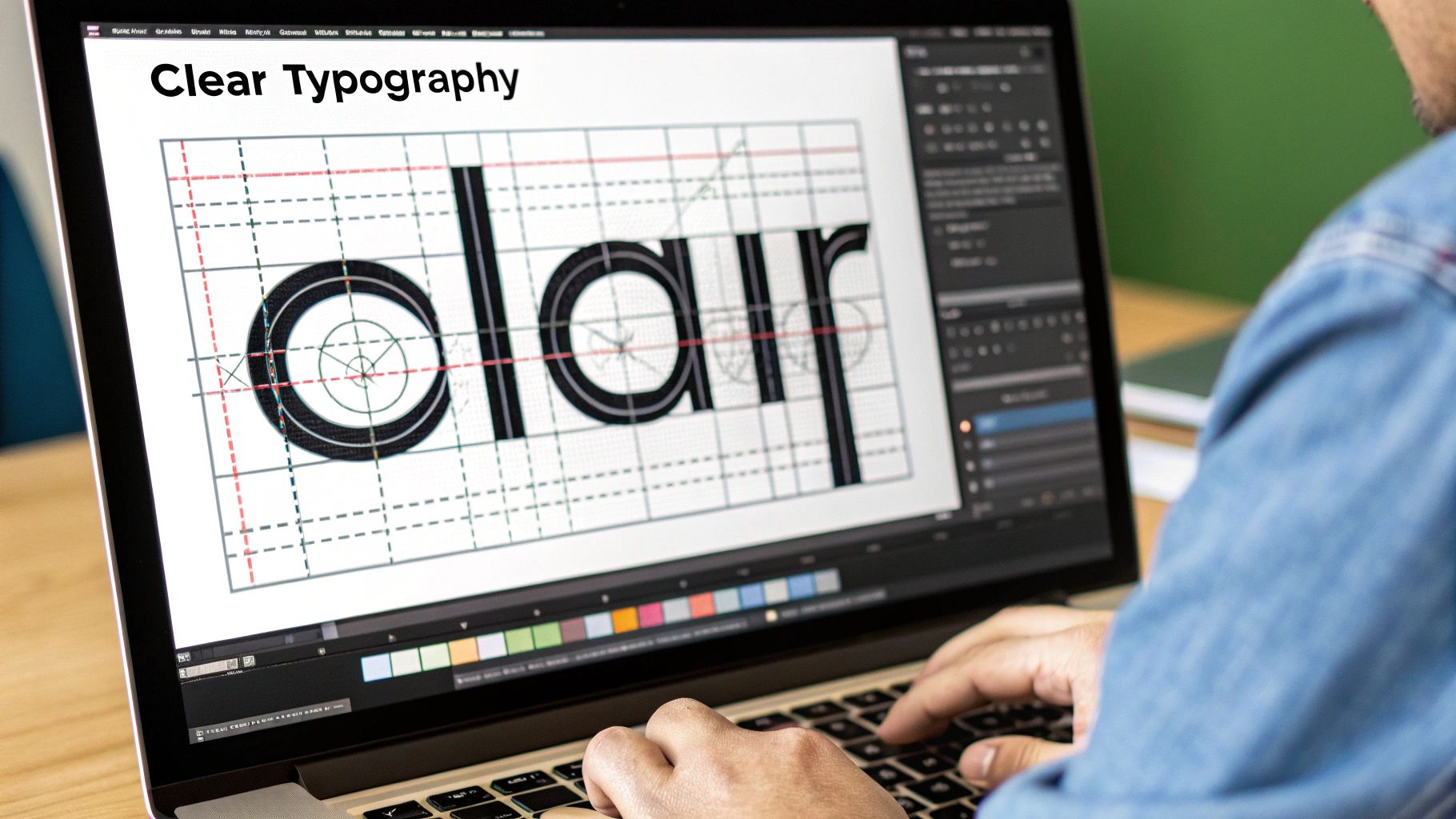
5. Typography and Readability
Beyond color and shape, the typography of your logo is the primary vehicle for its name and, by extension, its voice. The choice of font is not merely an aesthetic decision; it's a critical component of your brand's personality and must be impeccably legible across every potential application. Poor typography can render a logo unprofessional and illegible, undermining its entire purpose.
A key part of any professional logo design checklist is scrutinizing the chosen typeface. It must communicate your brand's character, whether that's the technological precision of IBM's custom slab serif or the timeless, elegant script of Coca-Cola. The font becomes a core brand asset that builds recognition and communicates your essence.
Why It's a Critical Design Element
Typography directly influences how your brand is perceived. A modern, geometric sans-serif font might convey innovation and simplicity, while a classic serif font can evoke tradition, authority, and trustworthiness. Google's custom font, "Google Sans," was specifically designed to balance the mathematical purity of geometric shapes with the friendly, humanist style of old-style serifs, making it highly readable and approachable on any screen.
Key Insight: The font you choose is your brand’s voice made visible. It must speak clearly and in a tone that resonates with your target audience, whether it's on a giant billboard or a tiny app icon.
How to Achieve Typographic Excellence
Mastering typography requires testing, attention to detail, and a clear understanding of brand personality. Before finalizing any design, you must ensure its text elements are flawless in every context.
- Test for Legibility at All Sizes: View the logo at its smallest intended size, such as a browser favicon or social media profile picture. If the text becomes a blurry, unreadable smudge, the font is not suitable.
- Secure Proper Font Licensing: Using a font for a commercial logo often requires a specific license. Ensure you have the legal right to use the chosen typeface for all commercial applications to avoid future legal issues.
- Consider Custom Lettering: For a truly unique and ownable brand mark, consider custom lettering. This creates a one-of-a-kind asset that cannot be replicated by competitors and perfectly captures your brand’s unique spirit.
- Refine Kerning and Spacing: Pay close attention to the spacing between letters (kerning). Awkward or inconsistent gaps can make a logo feel cheap and amateurish, while well-crafted kerning elevates its professional polish.
6. Cultural Sensitivity and Global Appropriateness
In an increasingly connected world, a logo might be seen by audiences far beyond your local market. A crucial yet often overlooked item on any comprehensive logo design checklist is ensuring your design is culturally sensitive and globally appropriate. A logo that works perfectly in one country could be ineffective, confusing, or even offensive in another.
Designing with a global mindset means anticipating how your visual identity will be interpreted across different cultures. This involves a deep consideration of symbols, colors, and imagery to avoid unintended negative associations. This proactive step is essential for any brand with ambitions for international growth, safeguarding its reputation and ensuring a positive reception worldwide.
Why It's a Critical Consideration
A lack of cultural awareness can lead to significant brand damage and costly marketing blunders. For example, Starbucks simplified its logo by removing the words "Starbucks Coffee," making it more universally recognizable and adaptable as it expanded into non-English-speaking markets and diversified its product offerings. Similarly, KFC has subtly adapted its image of Colonel Sanders in certain regions to better align with local cultural perceptions of age and authority.
Key Insight: A globally appropriate logo transcends language barriers and cultural nuances, communicating your brand's value universally without causing accidental offense or misinterpretation.
How to Achieve Global Appropriateness
Building a culturally aware logo requires research and empathy. Before finalizing a design, especially for brands with a global reach or diverse customer base, take the time to vet it through a cultural lens. This diligence protects your brand and demonstrates respect for your audience.
- Research Color Meanings: The color white signifies purity in Western cultures but is associated with mourning in many Eastern cultures. Thoroughly investigate the symbolic meaning of your brand's color palette in key target markets.
- Test with Diverse Focus Groups: Before launching, share your logo concepts with individuals from different cultural backgrounds to gather feedback and identify any potential red flags.
- Avoid Ambiguous or Sensitive Symbols: Steer clear of religious, political, or historical symbols that carry deep and varied meanings across cultures. What is benign in one region may be highly charged in another.
- Consider Text and Orientation: If your brand name is part of the logo, consider how it translates. Also, be mindful of cultures that read from right to left, as this can affect the balance and flow of a logo lockup.
7. File Format and Technical Specifications
A beautifully designed logo is only as effective as its technical execution. A critical, yet often overlooked, part of any professional logo design checklist is the final file package. Proper logo file organization ensures your brand can be reproduced accurately and consistently across every conceivable medium, from a tiny favicon on a website to a massive billboard.
This final handoff is where the design becomes a functional asset for your business. It's not just about sending a single JPEG; it’s about providing a comprehensive toolkit that empowers your team and partners to apply the brand correctly. To ensure you have the right assets, it's vital to understand the difference between various file types. A deeper dive into this topic can be found in this guide explaining logo file formats and their uses.
Why It's a Critical Final Step
Without the correct file formats, your logo can appear blurry, pixelated, or display incorrect colors, severely undermining your brand's credibility. For example, major brands like Google and Microsoft provide extensive brand centers with meticulously optimized files for every application, ensuring their visual identity remains pristine everywhere. This technical rigor prevents common issues like a web developer using a low-resolution print file, which would slow down page load times, or a printer using a web-optimized file, which would result in poor quality.
Key Insight: Your logo file package is a brand asset insurance policy. It guarantees that anyone, anywhere, can represent your brand with technical precision and visual consistency.
How to Achieve Technical Excellence
A professional designer will always deliver a well-organized package containing a variety of file types and color variations. This proactive approach prevents endless back-and-forth requests for different versions and ensures your brand is always ready for any marketing opportunity that arises.
- Create Master Files in Vector Format: Always start with a vector file (AI, EPS, SVG). This is the infinitely scalable master file from which all other formats are derived.
- Include Color Variations: Provide files in full color, black, and white (or reversed) to ensure the logo works on any background.
- Separate Print and Web Files: Deliver CMYK color mode files (like PDF, EPS) for print and RGB color mode files (like PNG, SVG, JPG) for digital screens.
- Use Consistent Naming Conventions: Clearly label files for easy identification (e.g.,
BrandName-Logo-Color-RGB.pngorBrandName-Logo-Black-CMYK.eps).
8. Brand Alignment and Strategic Purpose
Before a single pixel is placed or a sketch is drawn, the most critical step in any professional logo design checklist is ensuring deep alignment with your brand's core strategy. A logo isn't just an artistic mark; it's a strategic business tool designed to communicate your brand's essence at a glance. It's the visual translation of your company's mission, values, and promise to your audience.
A fundamental aspect of a successful logo is its alignment with your overall brand strategy. Before diving deep into the design process, it is crucial to understand what branding truly means for your business. This foundational understanding ensures your logo will resonate with the right people and support your long-term business goals.
Why It's a Critical Foundational Step
A logo without strategy is merely a decoration. A strategically aligned logo, however, works tirelessly for your business. For example, Patagonia's stylized mountain silhouette instantly evokes feelings of adventure and a commitment to the outdoors. Likewise, the "T" in Tesla's logo subtly represents a cross-section of an electric motor, communicating innovation and technological prowess. These logos succeed because they are anchored in a clear and powerful brand purpose.
Key Insight: Your logo should answer the question "Why should I care?" before a customer ever reads a word about your company. It sets the tone for every future brand interaction.
How to Achieve Strategic Alignment
To ensure your logo is built on a solid foundation, focus on discovery before design. This proactive approach prevents costly redesigns and ensures your final logo connects meaningfully with your target market. To learn more about this crucial first step, you can explore this guide on brand strategy for startups.
- Conduct Brand Workshops: Gather key stakeholders to define your brand's mission, vision, values, personality, and target audience.
- Create Detailed Mood Boards: Translate abstract brand attributes like "trustworthy" or "playful" into a visual language of colors, fonts, and imagery.
- Analyze the Competition: Understand how competitors position themselves visually so you can create a logo that stands out and carves its own unique space in the market.
Logo Design Checklist Comparison
Bringing It All Together for a Lasting Brand Mark
Navigating the path to a powerful logo can feel complex, but it doesn't have to be a journey of guesswork. The comprehensive logo design checklist we've explored serves as your strategic map, guiding you from a foundational idea to a polished, professional, and lasting brand mark. By methodically addressing each point, you transform the design process from a purely subjective exercise into an objective evaluation of effectiveness.
This isn't just about creating something that looks good; it's about building a strategic asset. A logo that fails in scalability will disappear on a mobile app icon, while one that lacks color versatility will become a costly headache for merchandise production. Each item on our checklist is an essential pillar supporting the final structure. A weakness in one area, like poor typography or a lack of originality, can compromise the integrity of your entire brand identity.
From Checklist to Confident Branding
Think of this checklist as a quality assurance system for your brand's most visible ambassador. The true power of this systematic approach lies in its ability to instill confidence. You will know your logo works, not just because you like the color, but because you have verified that it meets critical criteria for real-world application.
Here are the core takeaways to remember:
- Strategy First, Aesthetics Second: Your logo must first and foremost serve a strategic purpose and align with your brand's core message.
- Versatility is Non-Negotiable: A successful logo performs flawlessly across every medium, from a massive billboard to a tiny favicon, in full color and in monochrome.
- Simplicity Breeds Recognition: The most iconic logos are often the simplest. They are easy to recall, identify, and reproduce, making them incredibly memorable.
- Technical Precision Matters: The right file formats and technical specifications are crucial for ensuring your logo is always crisp, clear, and professional, no matter where it's used.
Key Insight: A great logo isn't born from a single moment of inspiration. It is forged through a deliberate process of strategic thinking, creative refinement, and rigorous technical testing. This checklist is your guide through that essential process.
Ultimately, mastering these principles empowers you to create more than just a picture; you create a symbol that communicates value, builds trust, and stands the test of time. This diligence is what separates amateur designs from professional brand identities that anchor market leaders. By investing the effort to tick every box on this logo design checklist, you are making a direct investment in the long-term equity and success of your brand.
Ready to ensure your logo checks every box with professional precision? The expert designers at Softriver specialize in a streamlined process that covers every item on this checklist, delivering a strategic and versatile logo that sets your brand up for success. Partner with us to build a brand mark you can be confident in. Visit Softriver to get started today.