
A design system is the complete set of standards, reusable components, and clear guidelines that come together to form your product's single source of truth. Think of it as a shared library that your designers and developers can pull from to build a consistent and polished user experience.
This system ensures that every button, icon, and layout looks, feels, and functions the same across your entire platform.
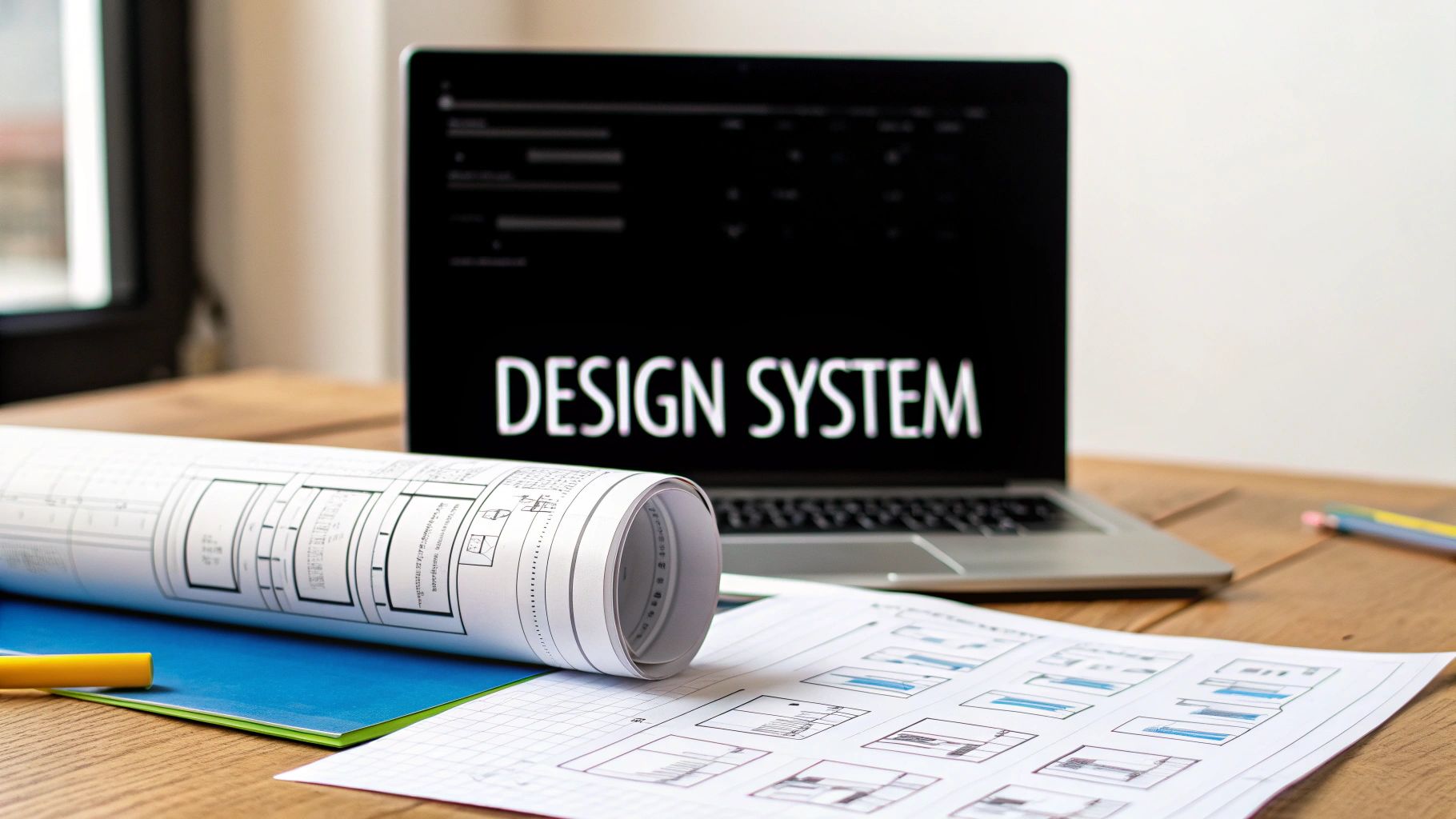
Your Digital Product’s Single Source of Truth
Imagine trying to build a house without a blueprint. The electricians, plumbers, and carpenters would all be working from their own assumptions. The result? A chaotic, unstable, and frankly, unusable building. This is exactly the kind of mess a design system prevents in digital product development.

At its heart, a design system is the central rulebook and toolkit that guides every decision. It gets rid of the guesswork, empowering teams to build faster and with more confidence. Instead of reinventing the wheel for every new feature, your team can grab pre-approved, pre-coded elements straight from this central hub.
More Than Just a Style Guide
It’s easy to confuse a design system with a simple style guide, but they're worlds apart. A style guide might define your brand's colors, fonts, and logos. That's just one small piece of the puzzle. A true design system is a living, breathing ecosystem that includes:
- UI Components: These are the actual building blocks—buttons, forms, navigation bars—that exist as both design assets and coded elements.
- Design Principles: This is your North Star. A set of shared values that guides your team in making smart design choices.
- Clear Guidelines: These are the instructions for how to use everything, from spacing and accessibility rules to the proper tone of voice.
This comprehensive approach creates a shared language that bridges the gap between different departments. But a design system is only as good as its documentation. For it to truly be a single source of truth, everyone needs to understand how to use it. You can learn more about mastering design system documentation to make sure your team is aligned.
A design system is a collection of solved problems. Instead of creating new solutions for every challenge, it provides a library of reliable, standardized answers that have been proven to work.
Ultimately, having this foundation in place frees up your product teams. They can stop debating minor visual details and start focusing on what really matters: solving complex user problems. It's the infrastructure that lets you scale, maintain brand integrity, and deliver a seamless experience to your users, no matter how big your team gets.
Why Modern Teams Build with Design Systems
Putting a design system in place isn't just a trendy move; it's a smart business decision with real, measurable payoffs. While the idea sounds good on paper, its true value shines when you see the impact it has on a team’s daily workflow. Think of it as the engine that powers speed, consistency, and growth for the entire organization.

This move toward structured, reusable design is fueling massive industry growth. The global UX services market rocketed from $2.59 billion in 2022 and is on track to hit $32.95 billion by 2030. Likewise, the UI design market is forecast to jump from $2.43 billion in 2024 to $7.43 billion by 2032. This explosive growth proves just how vital these systems are for building products today.
Accelerate Product Delivery
Picture this: without a design system, every new feature starts from square one. A designer mocks up a new button, a developer codes it from scratch, and they spend hours going back and forth on tiny details. It's a slow, repetitive grind that eats up precious time and energy.
A design system short-circuits that entire cycle.
Designers can pull together new screens in minutes—not days—using a library of pre-built, pre-approved components. Developers grab the corresponding code from a shared repository and are good to go. The result? Teams can ship products and features at a dramatically faster pace.
A design system shifts your team's focus from reinventing basic UI to solving actual user problems. It frees up creative energy for innovation, not repetition.
This speed means your business can react to market shifts faster, get features into users' hands sooner, and build a serious competitive advantage.
Create Unbreakable Brand Consistency
Your brand isn't just a logo; it's the sum of every interaction a customer has with your product. When buttons look different from page to page or the navigation works inconsistently, it chips away at user trust and makes the whole experience feel disjointed and unprofessional.
A design system is your brand’s best guardian. It guarantees that every color, font, icon, and interaction is perfectly aligned across every single touchpoint—your website, mobile app, and even your marketing materials. This creates a cohesive and dependable user experience. For many teams, embracing design systems is a natural partner to understanding the benefits of a Digital Experience Platform (DXP), as both are geared toward creating seamless digital products.
This kind of uniformity is non-negotiable. By reinforcing your visual identity at every turn, you build recognition and make your product feel polished, professional, and trustworthy. For a deeper look, check out our guide on what brand consistency is and why it matters.
Scale Teams and Products Efficiently
As a company grows, keeping quality high becomes a huge challenge. New team members need to get up to speed quickly, and the product gets more complex, often leading to a messy pile of "design debt." This is where a design system truly pays off.
- Faster Onboarding: It acts as a clear, hands-on guide for new hires. Designers and developers can quickly learn the rules of the road and start contributing meaningfully from day one.
- Reduced Design Debt: By offering a standardized toolkit, it stops the pile-up of one-off solutions and inconsistent styles that slow down development over time.
- Improved Collaboration: It creates a shared language that bridges the gap between design, development, and product teams, making sure everyone is on the same page and speaking the same language.
The Building Blocks of a Great Design System
To really get what a design system is, you have to look under the hood. It’s more than just a collection of buttons and colors; it’s a living ecosystem of distinct, interconnected parts.
Think of it like building with LEGOs. You have the instruction manual that explains the overall goal (the principles), the individual bricks (the assets), and the specific steps for putting them together (the documentation). Each piece is essential. Some are abstract ideas—the "why" behind your choices—while others are the tangible tools your teams use every single day.
Abstract Foundations: The 'Why' Behind Your Design
Before you can build anything, you need a blueprint. The abstract foundations of a design system are the guiding principles that shape every single component and pattern. They’re the North Star for your entire team, making sure every decision pushes the product in the right direction.
These aren't just fluffy mission statements. They are concrete rules that create a shared language. For example, a core principle like "Clarity Over Cuteness" immediately helps a designer decide to use a simple, universally understood icon instead of a more artistic but potentially confusing one.
- Design Principles: These are the core goals that steer your team's work. They answer the big questions, like "What do we value most in our user experience?" You might land on principles like "Accessible by Default," "Efficient and Unobtrusive," or "Playful yet Professional."
- Brand Values & Identity: This is where your brand’s personality shines through. It covers your mission, voice, and tone, ensuring the product feels like your brand, not just looks like it.
Having a solid set of principles turns subjective arguments into objective conversations based on agreed-upon standards. This is where a design system starts to blend with your larger brand strategy. You can learn more by exploring what is in a style guide and how it acts as your brand blueprint, as these documents often hold the seeds for these big ideas.
Tangible Assets: The Actual Building Blocks
With your foundation firmly in place, it’s time to create the tangible assets. These are the reusable, functional pieces that make up your user interface. They are the most visible part of the system and what your teams will interact with constantly.
Typically, these assets live in two perfectly synchronized libraries: one for designers and one for developers.
UI Kit (For Designers)
The UI Kit is a treasure chest of visual elements inside a design tool like Figma. It’s packed with pre-made buttons, icons, form fields, and other components. Designers can simply drag and drop them to build layouts with incredible speed and consistency.
Component Library (For Developers)
The Component Library is the developer's version of the UI Kit. It contains the exact same elements, but as ready-to-use blocks of code. When a developer needs a button, they don't code it from scratch. They grab the standardized, pre-tested button component, guaranteeing the final product is a pixel-perfect match to the design.
This hierarchy is key. It shows how small, abstract design decisions (tokens) form the basis for tangible UI elements (components), which are then combined into recognizable experiences (patterns).

This structure makes it clear how foundational choices directly impact the final user experience, creating a system that’s both logical and easy to scale.
Essential Documentation: The Instruction Manual
A design system without documentation is just a messy folder of files. The documentation is the instruction manual that brings everything together. It explains how, when, and why to use each component.
Clear documentation is what drives adoption. It transforms abstract principles and isolated components into practical tools that everyone on the team can use confidently.
Great documentation is clear, easy to find, and always up-to-date. It should include:
- Usage Guidelines: Simple "do's and don'ts" for every component. For instance, it might state that a primary button should only be used once per page for the most important action.
- Code Snippets: Ready-to-copy code examples that let developers get moving instantly.
- Accessibility Notes: Practical instructions on how to use components in a way that’s inclusive for all users, including those with disabilities.
To pull it all together, this table breaks down the core parts of a design system, who uses them, and why they're so important.
Anatomy of a Design System
Here's a quick look at the essential components that make up a design system, what they do, and who relies on them the most.
By understanding these individual building blocks—the principles, the assets, and the documentation—it’s easy to see how a design system becomes more than just a library. It’s a complete ecosystem that gets your entire organization aligned to build better products, together.
How to Build Your First Design System
Building a design system from scratch can feel overwhelming, but it really doesn't have to be. The secret is to start small and focus on solving real, immediate problems. Think of it less like trying to build a skyscraper on day one and more like planting a garden—you start with the most important seeds and nurture them as they grow.
This approach keeps things manageable and, more importantly, shows value right away. By treating it as an iterative, collaborative process, any team can start laying the groundwork for a powerful and scalable design system.
Start With an Interface Audit
Your first step is a thorough interface audit. This is basically a scavenger hunt across all of your products to catalog every single UI element you're currently using. Grab screenshots of all your buttons, forms, icons, dropdowns, and navigation bars.
The point is to get an honest, complete picture of where things stand. As you collect these elements, the inconsistencies will jump right out at you: five different shades of blue, three different styles for a "primary" button, and a dozen unique font sizes. This visual evidence is a powerful way to get buy-in from your team and stakeholders.
Once you have everything, start grouping similar components. This process quickly highlights redundancies and shows you which elements are used most often, giving you a clear list of what to standardize first.
Establish Your Design Language
With your audit done, it's time to build a shared design language. This is the foundation of your entire system. It defines the core aesthetic rules that will guide every other component you build. Think of it as the grammar and vocabulary for your product's visual communication.
Stick to the basics here. Don't try to define everything at once. Focus on the critical elements that will have the biggest impact on consistency.
- Color Palette: Define a tight set of primary, secondary, and neutral colors. Give each one a specific job, like
color-primary-actionfor buttons orcolor-text-bodyfor paragraphs. - Typography Scale: Create a clear visual hierarchy for your text. Define the exact sizes and weights for headings (H1, H2, H3), body copy, and smaller captions.
- Spacing and Layout Rules: Set up a consistent spacing system (using multiples of 4px or 8px is common) for all your margins, padding, and layout grids. This one simple step does wonders for visual harmony.
This design language is the heart of your brand's identity. To see how these fundamentals fit into a larger strategy, check out our how to create brand guidelines with an easy step-by-step guide. These principles are the bedrock of a solid system.
Build Your First Components
Now for the fun part: building your first set of core components. Use your audit to prioritize the elements that show up most often and cause the most headaches. For most teams, that means starting with the essentials.
- Button: It’s the most fundamental interactive element. Define its primary, secondary, and tertiary versions, along with all its states (default, hover, disabled).
- Input Field: A critical piece of any form. Standardize its look, labels, and error states.
- Icon: Create a single, unified set of icons to make visual communication clear and consistent.
Just focus on getting these few components right. Build them in your design tool (like Figma) and have your developers create the matching code. Scoring this small, cross-functional win proves the system's value and builds the momentum you need to keep going.
Define Your Governance Model
A design system is a living product, not a one-off project. That means it needs a clear plan for how it will be managed and updated over time. A governance model spells out who can contribute, how changes get approved, and how updates are rolled out.
A design system without a governance plan is destined to become outdated and irrelevant. It's the operational framework that ensures the system remains a trusted, living resource for the entire organization.
There are a few common ways to structure this:
- Centralized Model: A single, dedicated team is responsible for everything related to the system.
- Distributed Model: Anyone from any team can contribute, with a formal review process to maintain quality.
- Hybrid Model: A mix of both, where a central team manages the core system, and other teams can contribute new patterns.
The right model really depends on your company's size and culture, but the important thing is to establish clear rules from the get-go. This kind of structured approach is becoming the norm. The 2025 Design Systems Report shows a major trend towards dedicated teams, often with 5 to 20 members. This highlights a big shift: design systems are no longer a side project but a core business function. This formalization ensures systems get the resources they need to truly align design with engineering.
The Tools That Power Your Design System
A design system is more than just a set of guidelines; it's a living, breathing product, and it needs the right technology to work. The tools you choose are what connect the dots between an abstract idea and a real, functional component that developers can actually use. Getting a handle on this tech stack is crucial for understanding what a modern, effective design system really looks like in practice.
At the heart of it all are the design tools themselves. This is where the visual language of your system is born, nurtured, and maintained. Think of it as the designer's central workshop, equipped with everything needed to build, organize, and share components—from the tiniest icon to a full-blown page layout.
Here’s a look at the interface for Figma, one of the most popular design tools, where teams build and manage their UI components in a shared library.

This kind of environment is a game-changer because it allows designers to create one centralized UI kit. Developers can then inspect those designs directly, pulling out the exact specifications they need to ensure the final product is a pixel-perfect match.
The Rise of Collaborative Design Platforms
The explosion in popularity of design systems is directly tied to the evolution of tools like Figma. Its laser focus on real-time collaboration has completely changed the game, breaking down the old walls that used to stand between designers and developers.
The numbers don't lie. Figma’s user base is projected to hit over 10 million globally by 2025, a massive leap from just 4 million in 2022. This growth is all about collaboration—around 84% of its users say they work with people from other departments every single week. You can dig into Figma's impressive growth and user statistics for the full story.
So, what makes these platforms so powerful? They're built from the ground up with features that make system design easier:
- Shared Component Libraries: You can create a master library of components. Use them across dozens of files, and when you update the main component, every single instance updates automatically. It's a massive time-saver.
- Design Tokens/Variables: This feature lets you manage core styles—colors, fonts, spacing—as simple data. That makes it incredibly easy to apply changes everywhere at once or even create different themes (like a dark mode).
- Developer Handoff Tools: These are built-in features that let developers inspect a design, copy CSS properties, and download assets right from the file. No more guesswork or back-and-forth.
Documentation as a Central Hub
While the design tool holds all the visual pieces, your documentation platform is the public-facing "home" for the entire system. Tools like Storybook or Zeroheight are absolutely vital for creating a single, accessible website where anyone in the company can go to find what they need.
A design system without clear, accessible documentation is like a library with no catalog. The resources might be there, but no one will be able to find or use them effectively.
These platforms are so important because they do more than just show what a button looks like. They explain how and why it should be used. They bring design rules, usage instructions, and live, interactive code examples all together in one spot.
This creates a single source of truth that gets designers, developers, product managers, and even marketers on the same page, ensuring everyone is building from the same playbook.
Bringing It All Home: Your Next Steps
So, we've walked through what a design system is all about—from the big idea of a single source of truth to the real-world wins it can bring to your team. We’ve looked at the key components, the tools you'll need, and how to actually start building one. Now, let's talk about where you go from here.
Think of a design system less like a project and more like an investment in your product's future. It's the engine that will drive consistency, speed up your work, and help everyone collaborate more effectively for years to come. You're moving away from constantly reinventing the wheel and toward building with a shared toolkit of reliable, high-quality parts.
What to Do First
It's one thing to understand the concept, but it's another to actually make something happen. The good news? You don't need a huge budget or a brand-new team to get the ball rolling. It all starts with one small, impactful action.
The best way to show people the power of a design system is to use it to fix a real, nagging problem. A quick win, no matter how small, builds the momentum you need to get support for the bigger picture.
Here's your first mission: run a quick interface audit. Set aside an hour, grab screenshots of every single button you can find across your website and apps, and drop them all into one file. Then, show it to your team. That one image, with all its variations, will do more to highlight inconsistency than any presentation could.
This simple exercise is surprisingly powerful. It does three things at once:
- It makes the problem real: Suddenly, that "design debt" everyone talks about is visible and impossible to ignore.
- It gets everyone on the same page: You’re no longer talking about an abstract issue; you’re all looking at the same clear problem.
- It starts the right conversation: It’s the perfect jumping-off point for discussing how a central system could prevent this chaos.
From that small audit, you can take the next logical step: standardize that one button component. This is how great design systems are born—not in a massive, overwhelming overhaul, but one piece at a time. Audit, align, build, and repeat. You now have everything you need to take that first step toward a more consistent and scalable future.
Answering Your Top Questions About Design Systems
As you start digging into the world of design systems, a few questions always seem to pop up. Getting straight answers to these is key to understanding their real-world value, whether you're a team of two or two hundred. Let's clear up some of the most common ones.
Is a Design System Just a Fancy Style Guide?
This is probably the biggest misconception out there, but the answer is a hard no. A style guide is a static document. It's the rulebook for your brand's visual identity—think logos, color palettes, and typography. It tells you what things should look like.
A design system is so much more. It's a living, breathing toolkit for building products. It contains that style guide, sure, but it also provides a whole library of reusable, ready-to-go UI components (like buttons, forms, and navigation bars) along with crystal-clear guidance on how and why to use them.
A style guide is a chapter; a design system is the entire library. One is a reference, the other is an active toolkit.
Think of it this way: a style guide is a picture of a LEGO brick. A design system is a full box of LEGOs with the instruction manual, showing you exactly how to build a spaceship. One is a passive reference, the other is an active, collaborative tool that connects your designers and developers.
How Long Does It Take to Build a Design System?
The honest answer? A design system is never really "done." It isn't a project you start and finish. Instead, it's a product in its own right—one that grows and evolves right alongside the products it supports.
You can get a basic version up and running surprisingly fast. By focusing on the essentials first—colors, type, and a few core components like buttons—you can have a minimum viable system in just a few weeks. The goal is to start small and solve your team's most pressing problems right away.
After that, it's all about incremental growth. When a new feature calls for a component you don't have, you design it, build it, and add it back to the system for everyone else to use. This cycle keeps the system manageable, relevant, and incredibly useful over time.
Can a Small Team Benefit from a Design System?
Absolutely. In fact, small teams often feel the benefits the most. When you're running lean, efficiency is everything. A design system acts as a massive force multiplier, letting a small team get way more done without burning out.
Here’s how it works for smaller crews:
- Saves huge amounts of time: Why build a login form from scratch for the tenth time? With a design system, you can pull pre-built, pre-tested components off the shelf and assemble interfaces in a fraction of the time.
- Keeps everyone consistent: When you’re moving fast with just a few people, it’s easy for small inconsistencies to slip in. A system acts as your single source of truth, keeping the user experience cohesive.
- Makes onboarding a breeze: When a new designer or developer joins, the design system gets them up to speed immediately. It’s a practical, hands-on guide to how you build things.
For a small team, a design system isn't bureaucratic overhead. It's the infrastructure that lets you stay agile, maintain a high bar for quality, and punch well above your weight.
Ready to build a brand identity that stands out with professional consistency? Softriver delivers custom logos and full brand guidelines with incredible speed and quality. Get your professional brand identity today!