
A wordmark logo is one of the simplest yet most powerful ways to represent a brand. At its heart, a wordmark (sometimes called a logotype) is just the company’s name designed in a specific, stylized font.
Think of it like a signature. It’s purely text-based, using typography alone to carve out a memorable identity.
What Exactly Is a Wordmark Logo?
So, what are we really talking about here? A wordmark makes your company name the absolute star of the show. Instead of relying on a separate symbol or icon, it puts all its energy into custom typography to communicate a feeling—be it trust, innovation, or elegance.
You see them everywhere. Brands like Google, Coca-Cola, and Disney have made their names their logos. This works wonders for companies with unique or catchy names because it hammers home brand recognition every single time someone sees it.
The Anatomy of a Great Wordmark
A wordmark lives and dies by its typeface. The font isn't just a style choice; it’s a strategic decision that speaks volumes. A bold, sans-serif font might feel modern and direct, while a classic script can suggest heritage and luxury.
Here’s what makes them tick:
- Custom Typography: The most memorable wordmarks often feature a font designed from scratch, just for the brand.
- Color Palette: The right colors can trigger specific emotions and help the logo pop in a crowded market.
- Spacing and Styling: Tiny adjustments to the space between letters (kerning) can completely change the logo's rhythm and feel.
To give you a quick cheat sheet, here are the core characteristics of a wordmark logo.
Wordmark Logo At a Glance
These defining traits are why the text-centric approach is so popular.
This isn't just a niche style; it's a branding powerhouse. Research shows that over 40% of top global brands, including giants like Visa and FedEx, use wordmarks for that instant name recall. You can explore more insights about logo design trends to see how this style stacks up against others. Its success lies in creating a clean, direct identity that looks just as good on a tiny business card as it does on a massive billboard.
The Hidden Power of Typography in Branding
Typography is the absolute heart and soul of any great wordmark. It’s what does all the heavy lifting to give your brand a distinct personality. Think of it as your brand's voice—the font you choose isn't just for decoration. It's a powerful tool that builds an immediate, and often subconscious, emotional connection with your audience.
This is how a simple name becomes a memorable identity. Take the elegant, high-contrast serif font used by Vogue. It instantly screams sophistication and authority in the fashion world. Then you have Google, whose custom sans-serif font feels friendly, modern, and approachable, perfectly aligning with its mission to organize information for everyone.
More Than Just a Font
It's easy to think it's just about picking a font, but so many tiny details work together to tell your brand’s story. These aren't just happy accidents; they are deliberate design choices that pour meaning and personality into the text itself.
Here are a few of the key typographic elements at play:
- Kerning: This is all about the specific spacing between individual letters. Getting the kerning just right makes a logo look balanced and polished, avoiding any weird gaps or letters that feel too cramped.
- Color Psychology: The colors you pick for a wordmark carry a lot of weight. A vibrant red might bring energy and passion to mind, while a calming blue can inspire feelings of trust and dependability.
- Case Selection: The choice between uppercase, lowercase, or a mix of both can completely change a logo’s vibe. UPPERCASE often feels bold and authoritative, whereas lowercase can come across as more casual and down-to-earth.
A wordmark isn't just your company's name—it’s a carefully crafted piece of visual communication that speaks volumes before a customer ever interacts with your product.
To really get a feel for a wordmark's impact, you have to understand the principles of design in typography itself. Every curve, line, and bit of negative space is a chance to drive home what your brand is all about.
For a deeper dive, our guide on typography for logo design breaks these concepts down even further. At the end of the day, a great wordmark blends all these typographic ingredients to build a strong identity that truly connects with people.
Famous Wordmarks and What Makes Them Work
The best way to really understand what makes a wordmark tick is to look at the brands that have absolutely nailed it. These aren't just logos; they're masterclasses in visual storytelling, where every font choice tells you something about the company.
When a wordmark is done right, it becomes so intertwined with the brand's identity that you can't imagine it any other way. They work because every curve, color choice, and bit of spacing is deliberate, all coming together to create an instant connection.
Case Study Disney
You can spot the Disney logo from a mile away, and that’s by design. It’s built on a custom, whimsical script that just oozes magic and personality. That playful, flowing typography perfectly captures what Disney is all about: fantasy, joy, and family fun.
The handwritten style makes it feel personal and inviting, almost like a signature from Walt Disney himself. It steers clear of anything that feels sharp or corporate, leaning hard into a sense of wonder. It’s a textbook example of a wordmark that emotionally connects with its audience, promising a magical experience before you ever step into a park.
Case Study FedEx
At first glance, the FedEx logo looks pretty simple—just a clean, bold name. But the real genius is hiding in plain sight. Take a closer look at the space between the "E" and the "x," and you'll find a perfectly formed arrow.
That arrow isn't just a cool party trick; it's a brilliant symbol of the company's entire mission: speed, direction, and precision. It screams forward momentum and reliability without adding a single extra shape. Paired with strong colors and clean lines, the whole design reinforces a feeling of professional, no-nonsense efficiency.
The FedEx logo is a prime example of how negative space in a wordmark can be used to add a layer of meaning, turning a simple name into a statement of purpose.
Case Study Google
Google's wordmark feels friendly and easy to approach, which is exactly what you want when your goal is to organize all the information in the world. They use a custom sans-serif font, Product Sans, which is geometric, simple, and anything but intimidating.
The bright, primary colors give it a playful and innovative vibe, setting it apart from the more buttoned-up tech giants. This color palette makes the brand feel more human and less like a massive, faceless corporation. The final result is a perfect balance of reliability and creativity—a logo that reflects the very soul of Google.
For anyone trying to create a similar vibe, choosing the right logo typography fonts is always the most critical first step.
Wordmark vs. Other Common Logo Types
A wordmark is a fantastic choice, but it’s just one of many ways to design a logo. To figure out what’s right for your brand, it helps to see how wordmarks stack up against the other main styles. Each one has its own strengths, depending on your business name, industry, and what you’re trying to achieve.
Think of it this way: a startup with a short, memorable name like "Visa" or "Google" gets a huge boost from a wordmark. It drills the company name directly into the customer's mind. But what if your name is something long, like International Business Machines? That’s where a lettermark comes in handy, simplifying the name into a clean, punchy acronym—IBM.
Then you have logos that don't use words at all.
Understanding Brandmarks and Combination Marks
A brandmark, sometimes called a pictorial mark, is a logo that’s purely a symbol. Think of the iconic Apple silhouette or Twitter's famous bird. These are incredibly powerful for well-known companies, but they can be a tough sell for a new business that hasn't built up name recognition yet. If you want to dive deeper, you can learn more about brandmarks and discover their power in our detailed guide.
For those who want the best of both worlds, there’s the combination mark. This style pairs a symbol with the company name (either a wordmark or lettermark). The Adidas logo is a perfect example—you get the name alongside its classic three-stripe symbol. This gives you tons of flexibility, since you can use the elements together or separately depending on the situation.
This infographic breaks down the key differences between a wordmark, lettermark, and brandmark, showing you where each one shines.
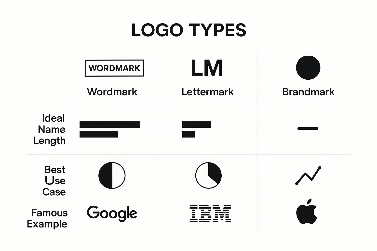
As you can see, the length and style of your company’s name is probably the biggest factor when deciding between these different approaches.
Choosing Your Logo Style: Wordmark vs. The Rest
Feeling a bit overwhelmed by the options? Don't be. This simple table breaks down the core logo types to help you find the perfect fit for your brand's personality and goals.
Ultimately, your choice depends on what you want your logo to do. Do you need to build name recognition from scratch, or do you have a complex name that needs simplifying? Answering that question is the first step toward picking the right logo style.
Is a Wordmark Logo Right for Your Business?

So, how do you know if a wordmark is the right move for your brand? It’s a great style, but it’s definitely not a one-size-fits-all solution. The decision really boils down to your company name, your industry, and what you want to achieve in the long run.
The biggest piece of the puzzle is your business name. Is it short, unique, and easy to stick in someone’s memory? Names like Visa, eBay, and Sony are prime examples—they’re distinctive and don't just blend into the background. A wordmark puts your name front and center, so it has to be strong enough to carry the weight.
Key Factors to Consider
Your industry offers some big clues, too. Think about professional services like law firms, financial groups, or consulting agencies. They often lean on wordmarks to project an image of authority, trust, and stability. There’s a seriousness and credibility that comes from a clean, text-based logo, with no distracting symbols to get in the way.
You also have to consider who you're talking to. If you’re going for a modern, minimalist vibe, a sleek wordmark can be the perfect fit. But if your brand is all about fun and games, especially for a younger crowd, you might find that another logo style connects better.
Ultimately, choosing a wordmark logo is a strategic decision that plays a pivotal role in creating a strong brand identity for your business. It’s about more than just aesthetics; it's about building a legacy.
Run through this quick checklist to see if a wordmark is calling your name:
- Your Name is Memorable: Is it short, catchy, and easy to say out loud?
- You Want Direct Recognition: Is getting your name known fast your top priority?
- Your Industry Values Simplicity: Does a clean, text-based look fit what customers expect?
- You Have a Timeless Vision: Are you building a classic brand that won’t feel dated in five years?
If you found yourself nodding "yes" to most of these, then a wordmark is probably a fantastic choice to build your brand around.
Frequently Asked Questions About Wordmark Logos
Even after getting the hang of wordmarks, a few questions always seem to come up. Let's clear up some of the common ones so you can move forward with confidence.
Can a Wordmark Logo Be Changed Over Time?
Absolutely. In fact, many of the world's most famous brands tweak their wordmarks every few years to keep things fresh. It's a smart way to stay visually relevant without losing the recognition they’ve built.
Think about Nescafé or Barbie. Their logos have evolved over the decades, but they’ve done it so thoughtfully that you always know who they are. It’s all about evolution, not revolution.
What Is the Difference Between a Wordmark and a Logotype?
This is a classic "trick" question in the design world, but the answer is simple: there’s no difference at all.
The terms wordmark and logotype are just two different ways of saying the exact same thing. Both refer to a logo built exclusively from the letters of a company's name. So, feel free to use whichever term you prefer—designers will know what you mean.
The biggest advantage of a wordmark is its directness. It puts your brand name front and center, which is a powerful way to build name recognition everywhere it appears, from a social media profile to a printed brochure.
Are Wordmarks Good for SEO and Digital Marketing?
Yes, they can be a real asset. Since your logo is literally your name, every impression reinforces brand recall. When people remember your name, they can search for you directly, which is fantastic for digital marketing.
The key, however, is to get the technical side right. Your logo needs to be a high-quality, scalable file (like an SVG). This ensures it looks crisp and professional everywhere, whether it's a tiny favicon in a browser tab or a massive banner on your homepage.
Ready to create a professional wordmark logo that tells your brand’s story? The expert designers at Softriver can craft a timeless and memorable logo for your business in just 48 hours. Start building your brand identity today by visiting the Softriver website.