
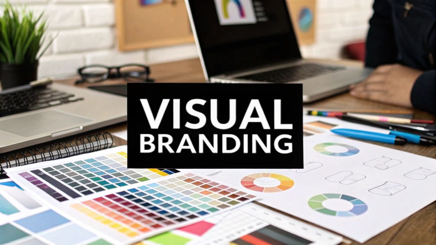
Ever wonder what makes a brand instantly recognizable? It’s not just the logo. It’s the entire visual story they tell. Visual branding is the collection of all the visual pieces a company uses to paint a picture of who they are.
Think of it like a person's personal style. It’s not just one shirt or a pair of shoes; it's the whole outfit, the haircut, the way they carry themselves. That complete picture makes them memorable. Visual branding is how your brand has a silent conversation with your audience before a single word is ever read.
What Is Visual Branding Beyond Just a Logo?
A lot of people think visual branding starts and ends with a logo. That’s a common mistake. The logo is absolutely the face of your brand, but the full visual identity is the entire body, complete with its own personality and way of speaking.
This visual language is built on a consistent set of rules for everything from colors and fonts to the style of photography you use. When you get it right, every single touchpoint—your website, your social media, even your business cards—feels connected and intentional. This consistency is what builds that gut feeling of trust and recognition.
Just think about the iconic shape of a Coca-Cola bottle or that specific shade of Tiffany Blue. You know them instantly, right? That’s the power of a strong visual system at work. To really get a handle on this, it helps to understand broader ecommerce branding strategies that put these visuals into a larger context.
Core Components of Visual Language
So, what are the building blocks of this visual language? It really comes down to a few key elements that work together to create a cohesive whole.
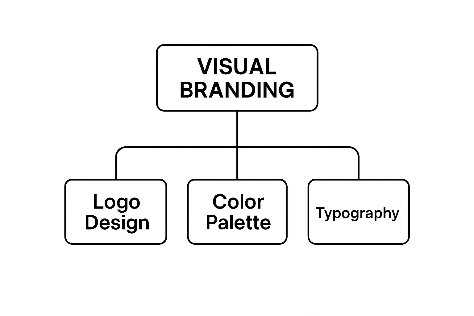
As you can see, the logo, color palette, and typography are the foundational pillars. These aren't just separate design choices; they need to work together in harmony to create a strong, unified identity that people remember.
Let’s quickly break down these core components in a table to see how they fit together.
Core Components of Visual Branding at a Glance
Each piece plays a crucial role in building a complete and compelling visual story for your brand.
Visual branding is a powerhouse in marketing. In fact, visual content gets 94% more views and is shared 40 times more often than content that’s just text.
That statistic alone shows this isn't just about making things look pretty. It's a strategic way to grab attention and get people engaged in a very noisy world.
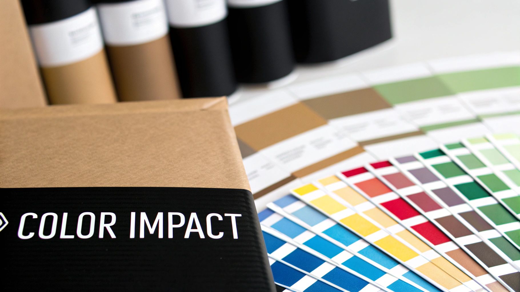
The Strategic Power of Color and Typography

When we talk about visual branding, it’s easy to think of color and typography as just decoration. But they're so much more than that. They are your brand's silent storytellers, triggering feelings and memories before a single word is even read.
Ever wonder why so many banks and tech companies lean on the color blue? It’s not a coincidence. Blue instinctively makes us feel trust, stability, and security—exactly the emotions you want people to feel when they're entrusting you with their money or data. That's color psychology at work.
The effect of color is huge. A signature brand color can boost brand recognition by up to 80%. What’s more, 90% of the snap judgments people make about products can be based on color alone.
Communicating Personality with Fonts
Typography has a similar, almost subconscious, impact. Think of fonts as your brand’s body language. A clean, modern sans-serif font like Helvetica or Arial feels straightforward and approachable, which is why you see it used by so many tech startups that want to appear fresh and innovative.
On the other side of the spectrum, a classic serif font like Times New Roman, with its little "feet," projects tradition, authority, and quality. This makes it a perfect fit for luxury brands, law firms, and universities that want to convey a sense of heritage and trustworthiness.
Your font choice is a direct reflection of your brand's personality. Is your brand playful and creative, or serious and dependable? The right typeface gets that message across in an instant.
Making Strategic Choices
Every decision you make about color and fonts helps build your brand's identity. Fast-food chains, for instance, often use red and yellow because these colors can create a sense of urgency and happiness, nudging customers toward a quick purchase.
Getting these psychological cues right is crucial. The right blend of color and typography ensures your visual brand isn't just seen—it's felt. If you want to dive deeper, our guide on how to master color theory in marketing to boost sales is a great next step.
Building a Cohesive Visual Brand Identity
A powerful visual brand is so much more than just a logo and a color palette. It’s a complete, harmonious system where every single piece works together to tell the same story. Building this kind of cohesive identity means weaving your imagery, icons, and supporting graphics into one seamless experience for your audience.
The photography and illustrations you choose are huge—they set the emotional tone. Does your brand feel bright and energetic, or is it more muted, sophisticated, and moody? This visual mood has to connect directly with your core brand personality to feel genuine and earn trust.
Beyond the big images, custom iconography creates a unique visual language for your website and apps. Think of these small, distinct symbols as a secret shorthand that only your customers understand. They learn to associate these icons exclusively with your brand, making their experience feel intuitive and uniquely yours.
Unifying Supporting Elements
To really build a memorable brand world, you have to go deeper and consider the textures and patterns that support your main visuals. These are the subtle elements that add depth and character across every single touchpoint.
A well-developed visual identity acts like a blueprint. It guides design choices and ensures everyone on your team is working from the same playbook, keeping the brand consistent and clear no matter who is creating content.
Think about how all these components come together to create a unified system:
- Patterns and Textures: These are perfect for backgrounds on social media posts, website sections, or even physical packaging. They add a tactile quality and visual interest that reinforces your brand’s unique style.
- Layout Grids: Using a consistent grid for your website, presentations, and documents creates a sense of order and professionalism. It makes everything feel familiar and intentional, even when the content changes.
- Compositional Style: How are things arranged on the page? Do you lean towards clean, minimalist layouts with plenty of white space, or do you prefer dynamic, layered compositions? This style needs to be applied consistently.
Every one of these pieces must be structured to work together. If you're juggling multiple sub-brands, understanding what brand architecture is and how it works is key to keeping your visual systems organized. The goal is for everything—from a quick social media post to your product packaging—to feel like it belongs to the same family.
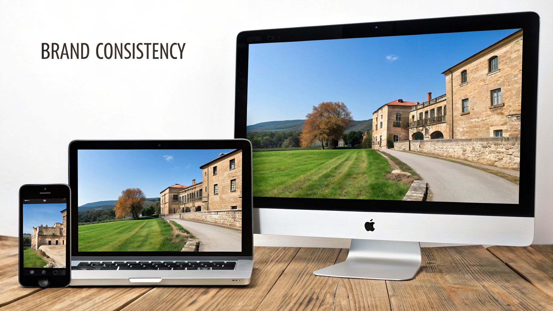
How Consistent Branding Drives Business Growth
Think of your visual branding as more than just a creative project—it’s a serious business tool. When you keep your visual identity consistent everywhere, from your website to your social media, you create a reliable and predictable experience for your audience. That consistency is what builds trust.
It's a lot like getting to know a person. If their personality and style were completely different every time you met, you'd probably be a little wary. The same goes for a brand. A cohesive look and feel gives customers confidence that they're making the right choice, which is the first step in turning a casual browser into a loyal fan.
From Recognition to Revenue
A unified visual system doesn't just build trust; it directly grows your bottom line. In fact, maintaining brand consistency can boost your revenue by 10% to 20%. One recent survey even found that 32% of businesses saw their revenue jump by over 20% after they doubled down on their branding efforts.
So, where does this financial boost come from? It boils down to a few key areas:
- Higher Perceived Value: A professional and consistent look makes your offerings feel more valuable, often letting you charge more.
- A Real Competitive Edge: In a sea of competitors, a distinct visual identity makes you instantly recognizable and much harder to forget.
- Deeper Customer Loyalty: When customers know what to expect from your look and feel, it reinforces their connection and keeps them coming back.
Ultimately, a strong visual brand just makes it easier for people to buy from you. It communicates quality and answers questions before a potential customer even reads a single word, smoothing out the path to purchase.
One of the biggest wins here is its power in driving brand awareness, which is crucial for getting noticed and growing. By showing up with a unified front, you leave a powerful impression that sticks around for the long haul.
Visual Branding Examples from Top Companies
Theory is great, but the real magic happens when you see visual branding in the wild. Looking at how iconic companies pull it off helps everything click into place. You start to see the deliberate thought behind every design choice and how it shapes what we think and feel about them.
Let's break down how three masters of the craft do it. These companies don't just have a logo; they've built entire visual worlds. Every color, font, and photo is chosen to tell their story and make you feel something, which is how they stand out in a sea of competitors.
Apple: The Power of Simplicity
Apple’s visual identity is a masterclass in minimalism. Think about their product shots or website—it's all about clean lines, a simple grayscale palette, and tons of white space. This isn't just a style choice; it communicates sophistication and user-friendliness without saying a word.
This "less is more" approach makes their products feel premium and focused. By stripping away anything unnecessary, Apple's visuals suggest that their technology is so intuitive, it speaks for itself.
Coca-Cola: Evoking Timeless Happiness
For more than a century, Coca-Cola has built its entire brand around happiness, nostalgia, and sharing moments. Their visual identity is the engine that keeps that feeling alive. The iconic, energetic Coca-Cola Red is so recognizable it instantly makes you think of the brand.
Then there's the custom Spencerian script font. It feels personal and classic, almost like a handwritten signature from an old friend.
The combination of that vibrant red and flowing script creates a promise of a happy, authentic moment. It’s so effective that you can spot a Coke ad from just a sliver of the logo or a splash of red.
Airbnb: Belonging Anywhere
Airbnb's mission is to make you feel like you can "belong anywhere," and their branding does a beautiful job of backing that up. Their logo's soft pink hue, which they call Rausch, feels warm and inviting. It's a world away from the cold, corporate blues you often see in the travel industry.
Their custom font, Cereal, is rounded and approachable, making the whole experience feel more human. This is paired with photography that features real people in authentic situations, not staged-looking models. It all works together to build trust and a sense of community, turning a booking into a feeling of belonging.
How to Build Your Own Visual Branding Strategy
Putting together a strong visual brand isn't something that just happens. It's a thoughtful process where you turn your core business ideas into a visual language that genuinely connects with people. The first step doesn't happen in a design program—it starts with some good old-fashioned self-reflection.
First things first, you have to get crystal clear on your brand's personality. Are you the bold, disruptive type, or more of a steady, reliable hand? Nailing this down is the bedrock for every visual choice you'll make later. If you skip this, your branding will end up feeling disjointed and confusing.
Once you know who you are, it's time to think about who you're talking to. You need to get inside your target audience's head. What do they like? What do they expect? What kind of visuals do they respond to? This isn't about chasing trends; it's about speaking their language so your message actually lands.
Charting Your Visual Course
With a solid grasp of your brand and your audience, the next move is to scope out the competition. A quick competitive analysis can show you where the visual gaps are in your market. This is your golden opportunity to carve out a unique space for yourself, making sure you stand out instead of just blending in.
Building a visual identity is like creating a blueprint for your brand. It guides every design decision, making sure everyone on your team is working from the same playbook to keep your brand consistent and clear.
After you've done your homework, you can start picking out the core visual elements. This is where the strategy becomes real and you start to see it all come to life.
- Color Palette: Choose a primary, secondary, and accent color. These should reflect your brand’s personality while also appealing to the people you want to reach.
- Typography: Pick out a primary and secondary font. Think one for headlines that needs to grab attention, and another for the main text that has to be easy to read.
- Imagery Style: What's the vibe of your photos and illustrations? Are they bright and full of energy, or more subtle and sophisticated?
Finally, pull all of these decisions together into a simple brand style guide. This document is your secret weapon for keeping everything consistent, no matter where your brand shows up. This is especially crucial for new businesses, which we cover in our guide to branding for startup companies. To help translate your vision into a functional website, using an essential website design brief template can be a huge help in getting everyone on the same page.
Got Questions About Visual Branding? We’ve Got Answers.
It's totally normal to have questions when you're diving into the world of visual branding. Let's clear up a few of the most common ones so you can feel confident moving forward.
What’s the Real Difference Between Brand Identity and Visual Branding?
Think of it this way: your brand identity is the whole personality of your business. It’s your mission, your core values, and the tone of voice you use. It's the who you are and the why you exist.
Visual branding, on the other hand, is how you show that personality to the world. It’s the collection of tangible design elements—your logo, color palette, fonts, and photography—that people actually see. Visual branding gives your identity a face.
Your brand identity is the soul of your business. Your visual branding is the face you show to the world. One is about who you are; the other is about how you look.
How Much Should I Actually Budget for Visual Branding?
This is a "how long is a piece of string?" question—the cost can really vary. You might spend a few hundred dollars on a basic logo from a freelance site, or you could invest tens of thousands with an agency for a complete visual system.
Honestly, the right amount depends on where your business is at. A brand-new startup can get by with a professionally designed logo and a simple style guide. As you grow and your needs get more complex, you can invest more into building out a comprehensive system that supports that growth.
How Often Should We Update Our Visual Branding?
There’s no magic number here. A full-on "rebrand" is a huge deal, and it's almost always tied to a major shift in business strategy. You might do it if you're tapping into a completely new market, or if your current look feels so dated that it no longer connects with your customers.
What’s far more common is a "refresh" every 5–10 years. This isn't about starting from scratch. It's about modernizing your logo, tweaking your colors, and updating your fonts to keep things fresh without losing the recognition you've already built. The goal is smart evolution, not a total revolution.
Ready to build a visual brand that not only looks great but also fuels your growth? At Softriver, we specialize in creating custom logos and brand identities that deliver professional results at a fantastic speed and value. It’s time to get the expert design your business deserves. Learn more and get started at Softriver.