
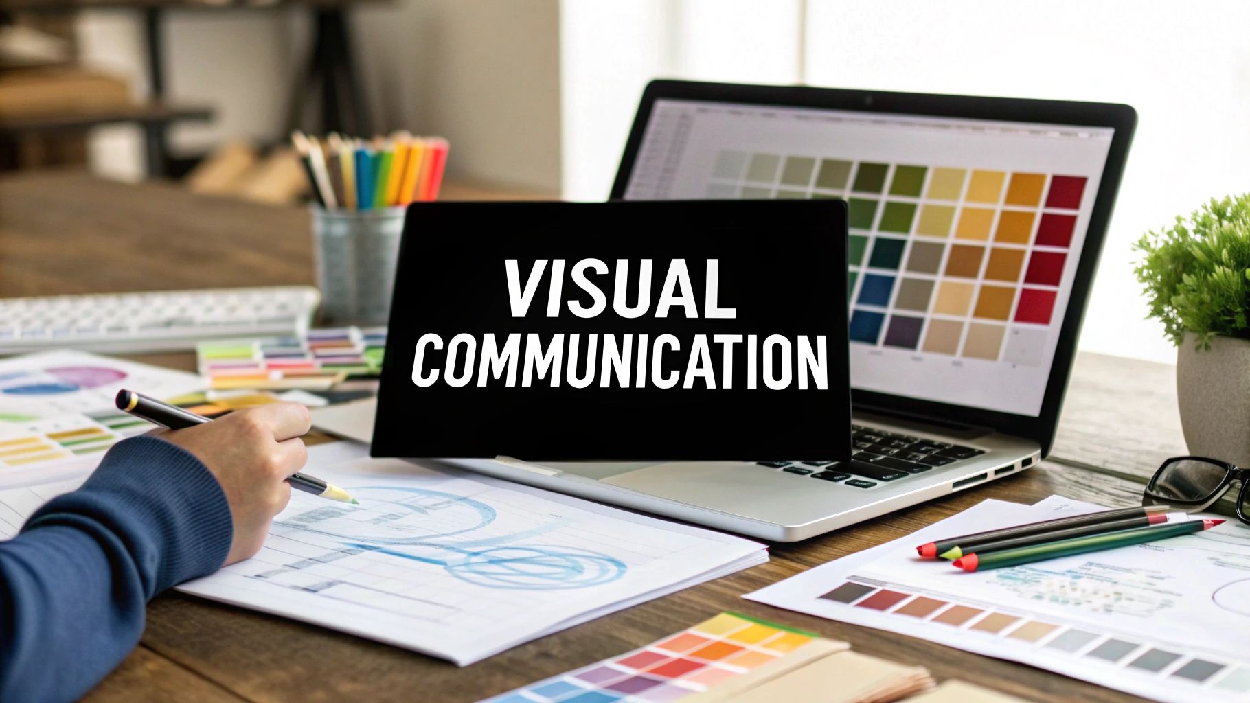
Ever seen a red stop sign and instinctively known to hit the brakes? That’s visual communication in a nutshell. It's the art and science of using visual elements—like images, colors, and layouts—to share a message, tell a story, or spark an emotion.
It’s a universal language. Visuals can cut through complexity and make big ideas easy to grasp, often much faster than words alone.
What Is Visual Communication, Really?
At its core, visual communication is about clarity and connection. Think back to that traffic light. You don't need a user manual to know red means "stop" and green means "go." That immediate, gut-level understanding is the true power of communicating visually.
This isn't just about making things look nice. It's strategic. One part is figuring out the message you want to send—whether it's to teach, persuade, or entertain. The other part is using design fundamentals to make sure that message is not only seen but also felt.
Why Visuals Matter More Than Ever
In a world overflowing with information, our attention spans are shorter than ever. Visuals are the perfect tool to cut through the noise, making information easier to digest and far more memorable. From a simple company logo to a detailed instructional video, these elements are the building blocks of powerful brand stories.
The numbers back this up. The global market for visual content was valued at around $38.46 billion in 2023 and is projected to skyrocket to over $71 billion by 2032. This isn't just a fleeting trend; it’s a fundamental shift in how we connect. Businesses and creators are pouring resources into their visual strategies because they know it's essential for standing out.
Visual communication is the key to unlocking clarity. It transforms abstract concepts into tangible ideas, helping people see, understand, and remember the message you want to share.
To give you a clearer picture, let's break down the core components that make up the visual language we see every day.
Core Components of Visual Communication
This table outlines the fundamental building blocks used to create compelling visual messages.
Understanding these individual pieces is the first step. The real magic happens when you combine them effectively.
As technology advances, so do our methods for visual engagement. For example, learning what interactive video means opens up new frontiers for audience participation. Ultimately, mastering visual communication is about building a foundation to ensure your message is truly seen, not just skimmed over.
The Building Blocks of Visual Language
If you think of visual communication as a language, then its core elements are the alphabet. These aren't just abstract terms for designers; they are the fundamental tools you use to build a message, piece by piece, just like letters form words. Getting a feel for how they work is the first step to becoming fluent.
Every visual you encounter—from a simple logo to a complex website—is a deliberate combination of these basic components. A designer chooses each one for a reason, knowing that a small tweak can shift the entire message. A jagged line feels tense and energetic, while a soft, flowing curve feels calm and inviting. This is where theory meets practice.
The infographic below breaks down these core elements, which act as the foundation for any design.
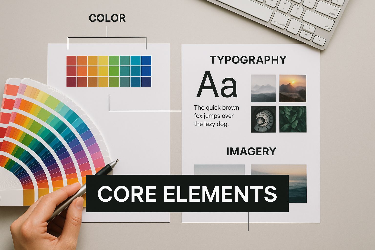
As you can see, foundational concepts like color and shape support more complex elements like typography and texture. Together, they create the final composition.
The Core Elements And Their Roles
To really get what visual communication is all about, you need to know the parts that make it up. Each element has a specific job in getting your message across and triggering a particular response from the viewer.
Let's break down the most essential building blocks:
- Line: This is the simplest element, used to outline shapes, separate content, and guide the viewer's eye. A thick, solid line feels strong and assertive, while a thin, dotted one might suggest something more delicate or temporary.
- Shape: Shapes are simply enclosed areas that create the objects in your design. Geometric shapes like squares and circles often feel structured and stable. On the other hand, organic shapes—think leaves or clouds—feel more natural and free.
- Color: Color is arguably the most powerful element for stirring emotion. Red can signal passion or urgency, while blue often communicates trust and calm. The right color palette can make a button irresistible to click or make a brand feel instantly dependable.
- Typography: This is the art of arranging text to make it legible and appealing. The font you pick says a lot. A classic serif font can communicate tradition and authority, while a modern sans-serif font feels clean and straightforward. You can check out some fresh ideas for logo design to see just how much typography can define a brand's personality.
Combining Elements for Impact
Of course, these elements rarely work alone. Their real power is unlocked when you start combining them. Texture, for example, can add a tangible feel to a design, making it seem rough, smooth, or even glossy without the viewer ever touching it. Space—or negative space—is just as important, helping you create focus and keep a design from feeling overwhelming.
The goal is to make these individual components work together harmoniously, so the final message is greater than the sum of its parts. Each element must support the others to create a clear and cohesive visual statement.
As you start to put these building blocks together, learning how they interact is crucial. For instance, when you explore effective techniques for overlaying text on images, you're really learning how to balance typography, color, and photography. Mastering that interplay is fundamental to creating professional visuals that truly connect with your audience.
Mastering the Principles of Visual Storytelling

Knowing the basic elements of visual language—like color, line, and shape—is a bit like knowing your ABCs. It’s a great start, but you can’t write a story with just letters. You need grammar to string them together into meaningful sentences.
That's where the principles of visual design come in. Think of them as the grammar that turns a jumble of visual elements into a clear and compelling message. They aren't rigid rules you can't break; instead, they're time-tested guidelines that help you direct your audience's gaze, evoke a certain feeling, and make sure your point gets across instantly.
Creating Order with Hierarchy and Contrast
One of the most important principles for clear communication is visual hierarchy. This is simply the art of arranging things to show what's most important. Without a clear hierarchy, your webpage, ad, or presentation becomes a confusing mess, leaving your audience wondering where to even start. A strong hierarchy is like a tour guide for the eyes, leading them from the main event down to the supporting details.
So, how do you build this hierarchy? The secret is contrast. You make important things stand out by making them different from everything else.
- Size: A big, bold headline naturally grabs more attention than the smaller body text.
- Color: Think of a bright red "Buy Now" button on a mostly white page. Your eyes go right to it.
- White Space: Leaving plenty of empty space around an element gives it room to breathe and draws the eye.
Imagine a website where all the text is the same size and color. It's overwhelming. Now picture that same site with a large title, a slightly smaller subtitle, and easy-to-read body text. You instantly know what the page is about and where to begin.
Hierarchy isn't just about making things look pretty—it's about making them work. It tells your audience, "Look here first, then over here, and finally, check this out," ensuring your message is received exactly as you intended.
Building Cohesion with Balance and Repetition
While hierarchy creates focus, other principles work together to create a sense of harmony and professionalism. Balance is all about distributing the visual weight in your design. A balanced layout feels stable and intentional. An unbalanced one can feel chaotic and amateurish, whether you're aiming for a perfectly symmetrical look or a more dynamic, asymmetrical feel.
Repetition is another key to creating a unified experience. When you consistently use the same colors, fonts, or logo style across your marketing materials, you build a sense of familiarity. This consistency doesn't just look professional; it reinforces your brand identity, making it more memorable and trustworthy over time.
To really get this right, exploring powerful visual storytelling techniques can help you captivate your audience and communicate more effectively. Ultimately, these principles are what elevate design from mere decoration to a strategic tool for communication.
Why Visuals Are Your Brand's Strongest Asset
In a marketplace packed with options, how does any brand cut through the noise and become instantly recognizable? It’s not magic; it’s powerful and consistent visual communication. This is what separates a business that’s just another name on a list from one that builds a genuine, lasting connection with people.
Think about it. A customer’s first impression of your business is almost always visual.
Take legendary brands like Apple or Nike. Their visual language goes far beyond a simple logo. It’s the clean, minimalist feel of an Apple store. It’s the bold, energetic typography splashed across a Nike ad. Every single visual element is pulling in the same direction, telling a consistent story. This is how they shape our perception of their quality and values, often before we've even touched a product.
When done right, design stops being an expense and becomes one of your most critical business investments. It’s how you build brand equity—that intangible trust and recognition that makes your brand the go-to choice.
Turning Visuals into Value
So, how does this actually work for your bottom line? A strong visual identity is like your best salesperson, working 24/7 to communicate who you are. When people see your signature colors, fonts, and style of imagery, it should be an instant mental shortcut. They know it's you, which builds familiarity and trust.
A cohesive visual system serves several key functions:
- First Impressions: It instantly signals your brand's personality. Are you modern and forward-thinking, or are you all about tradition and reliability?
- Differentiation: In a sea of sameness, a unique visual identity is what gets you noticed. It’s how you stand out from the crowd.
- Memorability: People are wired to remember what they see far better than what they read. A great visual system makes your brand stick.
Visual communication isn't just about making things look nice. It's about making a strategic impact. It’s the invisible thread that ties your products, marketing, and customers together into one clear, powerful brand story.
The financial proof is in the numbers. The global market for visual communication design services was valued at USD 45.3 billion in 2023 and is expected to nearly double, reaching USD 87.2 billion by 2032. This incredible growth, which you can discover more about this market's growth on dataintelo.com, highlights just how essential effective branding has become.
Every visual choice you make contributes to this powerful system. At the very center of it all? A well-designed logo. For a closer look at this foundational element, check out our guide on why logo design is important.
Visual Communication Examples in the Real World
It’s one thing to talk about theory, but it’s another to see it in action. The best way to truly grasp the power of visual communication is to look around. It’s everywhere—from the simple stick figures on a bathroom door to a stunningly complex data chart. Each one is a masterclass in sending a clear message without a single word.
Let's break down a couple of real-world scenarios where visuals do all the heavy lifting. By looking at how they work, you'll start to see design principles less as abstract rules and more as practical, everyday tools.
Intuitive User Interfaces
Have you ever opened a new app and just… known how to use it? That’s not magic; it’s brilliant visual communication at work. The user interface (UI) is designed to be a silent guide, using icons, layout, and color to steer you effortlessly.
- Icons for Clarity: We all know a tiny shopping cart means "see what I'm about to buy" and a magnifying glass means "search." These symbols are universal, cutting through language barriers to make the experience feel second nature.
- Hierarchy for Focus: That big, brightly colored "Add to Cart" button isn't an accident. It's intentionally designed to grab your attention, guiding you toward the most important action on the page.
When done right, this kind of intuitive design makes you feel smart. It removes friction and frustration, making technology feel less like a machine and more like an extension of your own thoughts.
A great user interface doesn't make you think. It anticipates what you want to do and presents the path forward so clearly that it feels like you knew the way all along.
Powerful Brand Storytelling
Think about your favorite brands. Chances are, a powerful image comes to mind before a slogan does. A picture of a triumphant athlete crossing a finish line, used by a sportswear company, instantly screams performance, dedication, and victory—a story far more resonant than any paragraph of text could be.
A logo is the ultimate visual shortcut. In one tiny symbol, it has to communicate everything a company stands for—its personality, its promise, and its values. It’s the cornerstone of a brand’s entire visual identity. You can find some fantastic logo design tips that show just how much strategy goes into creating that one memorable mark.
Together, these visual elements build a narrative that connects with us on an emotional level, creating a story that we remember long after we've looked away.
It feels like the world of visual communication is changing at lightspeed, doesn't it? We're moving far beyond just static images on a page. The future is about creating dynamic, interactive experiences that pull you right into the message.
Think about Augmented Reality (AR) for a moment. It's not just a gimmick for a mobile game anymore. Imagine trying on a new jacket from the comfort of your couch, using your phone's camera to see a digital version perfectly overlaid on your body. This kind of technology is already here, turning something as routine as online shopping into a truly visual, almost tangible experience. It’s all about blurring the lines between the digital and the real.
AI and Automation are Changing the Game
Another massive shift is happening thanks to Artificial Intelligence. Not too long ago, creating professional-looking graphics or a slick video required a ton of training and expensive software. Now, AI-powered tools like Canva or Adobe Express allow just about anyone to produce stunning visuals in minutes.
This is huge. It means small businesses, entrepreneurs, and content creators can finally compete on a more level playing field, crafting powerful visual stories without needing a big design budget.
This trend is also lighting a fire under the global economy. The market for visual communication systems is exploding, on track to hit $15 billion by 2025. That's a massive leap, driven by a 12% estimated CAGR as major tech companies pour resources into smarter, more automated visual tools. If you're curious about the numbers, you can dive into the full market analysis on datainsightsmarket.com.
The next wave of visual communication will be defined by personalization, interactivity, and data. Technology will enable us to create experiences that are not just seen, but are felt and interacted with on a personal level.
So, what does this mean for our skill sets? To keep up, we have to think differently. It’s becoming less about mastering one specific program and more about understanding the big picture.
The skills that truly matter now are:
- Data Literacy: Knowing how to read the analytics to see what visuals are actually connecting with people and why.
- Strategic Thinking: Choosing the right tool and the right type of visual for the job. Is a quick video better than an interactive infographic?
- Adaptability: Simply being open to learning. New tools and platforms are popping up all the time, and the most successful people will be the ones who embrace them.
The future of what is visual communication is exciting. Technology is tearing down old barriers, making it possible for our messages to be more immediate, immersive, and impactful than we ever thought possible.
Common Questions About Visual Communication
As you dive into the world of visual communication, a few practical questions almost always pop up. It's one thing to get the theory, but it's another thing entirely to put it into practice. Let's walk through some of the most common questions and roadblocks you might run into.
How Can Small Businesses Create Great Visuals on a Budget?
You absolutely don't need a massive budget to make your brand look professional. The secret isn't spending more money; it's about being more resourceful. Thankfully, we live in an age with a ton of free and affordable tools that give you some serious design power.
Here’s where to focus your energy:
- Embrace Free Tools: Platforms like Canva are a game-changer. They have gigantic libraries of templates, fonts, and graphics that let you create anything from social media content to business cards without spending a dime.
- Find High-Quality Free Photos: Forget cheesy, outdated stock photos. Websites like Unsplash and Pexels offer beautiful, professional-grade images that are completely free to use. This instantly elevates your brand's look.
- Prioritize Consistency Over Complexity: This is the big one. A simple, consistent visual style is far more powerful than trying to do something complicated and getting it messy. Settle on a core color palette and just two versatile fonts. Stick with them everywhere. That’s how you build a brand people recognize and trust.
What Is the Difference Between Graphic Design and Visual Communication?
This is a great question, and one that trips up a lot of people. The distinction is subtle but really important.
I like to use a house-building analogy:
Graphic design is the craft of construction—it’s the act of laying the bricks, painting the walls, and installing the windows. Visual communication is the architecture—it’s the master plan that ensures the house works, meets the owner's needs, and expresses a particular feeling or style.
Put simply, graphic design is the "how"—the hands-on creation of the visuals themselves. Visual communication is the "why"—the overarching strategy that uses those visuals to send a clear message, hit a specific goal, and truly connect with people. A brilliant visual communicator understands that great graphic design is the tool they use to execute their strategic vision.
What Are the First Steps for Building a Visual Identity?
Trying to build a visual identity from a blank slate can feel overwhelming. The trick is to break it down into a few manageable first steps. Your goal here isn't perfection; it's to create a solid foundation you can build upon over time.
- Define Your Message and Audience: Before you even think about colors or fonts, get crystal clear on what you stand for and who you're trying to reach. What's the one thing you want them to feel?
- Pick Your Core Elements: Keep it simple. Choose 2-3 primary colors that capture your brand's personality. Then, select two versatile fonts—one for headlines and one for body text—that are easy to read.
- Create a Basic Logo: Your logo is the anchor of your visual identity. It doesn't need to be complex. In fact, simple is often better. Just make sure it's memorable and reflects your core message.
The golden rule here? Start simple and be relentlessly consistent. A straightforward identity applied consistently will always beat a complicated one that’s all over the place.
Ready to build a powerful brand identity that truly connects with your audience? Softriver specializes in crafting custom logos and brand systems that blend strategic insight with top-tier design. Our streamlined process delivers exceptional quality and value, ensuring your brand stands out. Get your professional brand identity today.