
A great tech logo isn't just a slick graphic. It’s your company’s handshake, a visual shortcut that instantly tells people who you are and what you're all about. This is where the real work begins—long before you ever open a design app.
This early stage is pure strategy. It's about translating your big business goals into a clear design brief. Skip this, and you might end up with a logo that's pretty but ultimately hollow.
Think of it this way: your logo needs to communicate what you stand for. A fintech startup has to scream security and trust. A gaming company? It's all about energy and fun. Each one demands a completely different visual language.
Laying the Strategic Foundation for Your Logo
Before you dream up a single shape or color, you have to do some foundational work. This is the "why" behind your logo. It’s about digging deep into your brand’s identity and understanding where you fit in the market.
Define Your Brand’s Personality
First things first, you need to know who you are. Ask yourself the tough questions: Are we here to shake things up, or are we the steady, reliable choice?
Try to nail down three to five core attributes that define your brand. For a SaaS company, this might look something like:
- Efficient
- User-Friendly
- Scalable
These words aren't just fluff; they're your North Star. Every design choice, from font to color, should point back to them. This ensures your visual identity is telling the same story as your brand's voice, which is crucial for building a consistent presence everywhere, as explained in a modern social media branding guide.
Scope Out the Competition and Know Your Audience
Next, it’s time to do some homework. Take a good look at your competitors. What visual trends do you see? Are they all using the same colors, fonts, or icon styles? Your mission here isn't to blend in, but to find a gap. If every other logo in your space is blue, maybe a bold orange or a clean, minimalist mark is your ticket to getting noticed.
A great logo doesn't just look different; it feels different. It captures a unique space in the customer's mind that your competitors can't occupy.
Understanding your audience is just as critical. Are you selling to seasoned CIOs or trying to capture the attention of Gen Z? A formal, corporate audience will likely connect with classic, stable designs. A younger crowd, on the other hand, might be drawn to something more expressive and unconventional.
This strategic thinking helps you avoid designing in a bubble. It's what separates a logo that just is from a logo that works. This strategy also influences budget. While data from Exploding Topics shows that 23.7% of small businesses create their own logos and only a quarter are willing to spend over $100, legendary logos prove that impact isn't always tied to cost. Nike’s iconic 'Swoosh', for instance, was famously commissioned for just $35, a testament to the power of a smart, well-researched idea.
Bringing Your Brand Ideas to Life Visually

Alright, you've laid the strategic groundwork. Now for the fun part: taking all those abstract brand ideas and turning them into something you can actually see. This is where your brand finally starts to get a face.
But hold off on firing up Adobe Illustrator just yet. Your most powerful tool right now is a simple pen and paper. Seriously. Sketching lets you explore shapes, ideas, and compositions freely, without getting bogged down by pixels and anchor points. It's all about quantity over quality at this stage. Just fill pages with doodles and don't judge them. This is where the unexpected, brilliant ideas often come from.
Kickstarting Your Creative Process
So, how do you get the ink flowing? A couple of tried-and-true techniques can help connect your brand attributes to actual visuals.
One of my favorites is mind mapping. Just write your company name or a core value—like "Simplicity"—in the middle of a page. From there, branch out with every related word, feeling, or image that pops into your head. Let one idea spark the next until you have a whole web of inspiration to pull from.
Another great one is word association. List your key brand attributes—"secure," "innovative," "connected"—and next to each, jot down any words or images they bring to mind. This simple exercise builds a visual vocabulary that will fuel your sketches.
Your first sketches are not supposed to be masterpieces. Think of them as raw visual thoughts. The goal here is to get every idea out, no matter how wild, so you don't accidentally leave a genius concept behind.
This initial exploration is absolutely critical. Just look at the history of tech branding. Logos evolve. Xerox, for example, went from a torch symbol (representing its origins in photographic paper) to a pixelated 'X' for the digital age, and later to an even sleeker, modern mark. Each shift signaled a new chapter. You can see how major players have transformed over time, and it really shows how visuals have to keep up.
Choosing the Right Logo Type
As you sketch, you'll probably notice your ideas start falling into a few common categories. Knowing what these are will help you refine your concepts and pick a structure that makes the most sense for your brand.
- Wordmarks: These logos are built entirely from the company's name. Think Google or IBM. This is a fantastic choice if your tech company has a short, memorable name because it directly builds name recognition from day one.
- Letterforms (or Monograms): This style uses the company’s initials, like the iconic "hp" for Hewlett-Packard. It's a smart move for businesses with longer names, creating a compact and punchy brand mark.
- Symbols or Combination Marks: Here, you pair a wordmark with a distinct icon. Apple and Spotify are perfect examples. The beauty of this approach is that the symbol can eventually stand on its own, giving you incredible flexibility for everything from a tiny favicon to a massive billboard.
Think about your company's name and personality. Is the name unique enough to carry the brand as a wordmark? Or would a strong, simple symbol do a better job of communicating your focus on innovation? Answering that question will point your sketches in a much more powerful and functional direction.
Using Typography and Color with Purpose
Don't think of typography and color as just the finishing touches on your logo. They're the heart and soul of your design—the elements that communicate your brand’s personality before anyone even knows what you do. Get them right, and you can instantly signal trust, innovation, or friendliness. Get them wrong, and you risk looking amateurish or, even worse, sending a completely mixed message.
Selecting Your Brand’s Voice
Your font choice is your brand's voice. It sets the tone immediately.
Think about the difference a font makes. A clean, modern sans-serif like Proxima Nova feels efficient and forward-thinking, which is why you see it so often with SaaS companies. On the other hand, a classic serif font like Garamond suggests stability and tradition—a perfect fit for a fintech brand that needs to establish trust from day one.
The typeface you choose has to line up with your brand’s core personality. A playful, rounded font might be great for a user-friendly consumer app. A sharp, geometric typeface? That could be the ideal choice for an AI company that wants to project precision and intelligence. The goal is to create an instant, gut-level connection with your audience. To really get this right, you need a solid grasp of how fonts work, so I'd recommend digging into mastering typography design to sharpen your skills.
Visualizing how these choices impact branding is key, and color psychology is a huge piece of that puzzle.
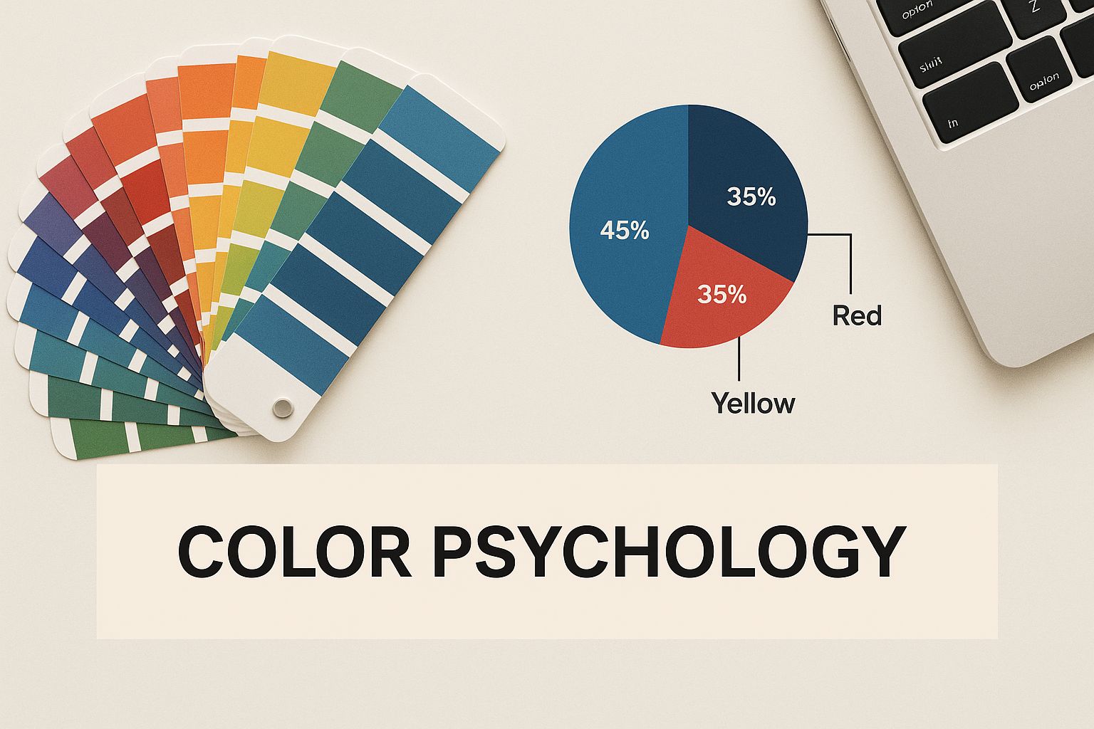
As the image shows, colors aren't just picked because they look nice. They're chosen to trigger specific feelings and ideas that align with a brand's place in the market.
Building a Strategic Color Palette
Just like fonts, color is a potent psychological shortcut. It shapes how people see your brand and can even influence their behavior. Your job is to build a palette that is both strategic and helps you stand out from the crowd.
When you look at the big players, a clear trend emerges: simplicity wins. A study of the world's 250 largest companies found that a massive 81.6% use logos with two colors or fewer. This minimalist approach makes a logo easier to remember and recognize at a glance.
Unsurprisingly, blue is the dominant force, showing up in 30.8% of top company logos. It's the go-to choice for communicating trust and security—two absolute must-haves for any tech business. Another interesting tidbit from that study? Over half (55.6%) of text-based logos are in all caps, which helps them feel more impactful and legible.
While blue is a safe bet, don't feel like you have to follow the herd. A vibrant green can signal growth and sustainability, orange can scream energy and creativity, and a simple black-and-white palette can project a sense of focus and sophistication.
To help guide your choice, here’s a quick reference for some of the most common color associations in the tech industry.
Common Color Associations in Tech Branding
This table breaks down what different colors tend to communicate, making it easier to match your palette to your brand's mission.
Remember, these are just general guidelines. The most important thing is that your color choice feels authentic to your brand and helps you stand apart from your direct competitors.
Your color palette should do more than just look good; it must reinforce your brand’s core message. Every hue should have a purpose, from your primary brand color to the secondary accents used in marketing materials.
If you want to go deeper on this, we've put together a full guide on what logo colors mean and how to apply that knowledge to your own design. Picking a palette that truly connects with your ideal customer while carving out your own visual space is one of the most critical steps you'll take.
How to Refine and Test Your Logo Concepts
Having a few solid concepts in hand feels great, but the real work is just beginning. Even the most brilliant spark of an idea needs to be polished and pressure-tested before it can truly represent a tech company. This is where we separate the good ideas from the great ones.
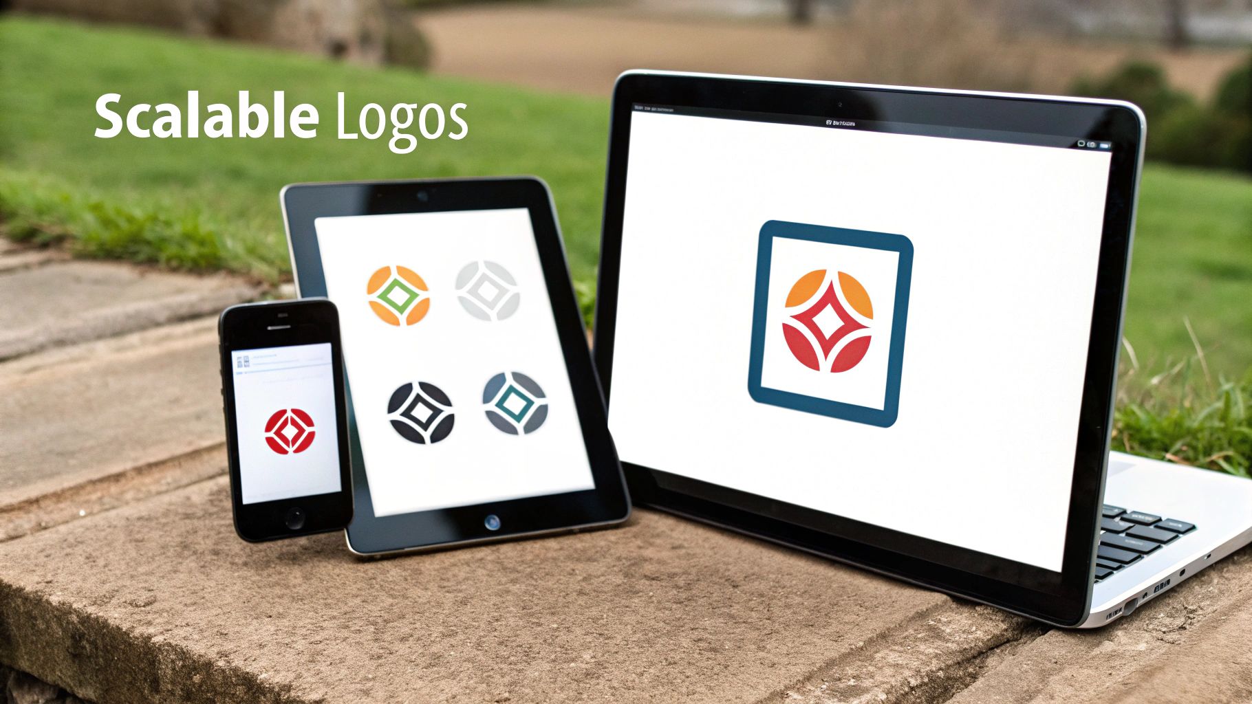
First things first, you need to see how your favorite designs hold up in the wild. A logo doesn't just live on a clean white background in your design file. It has to work everywhere—from a massive trade show banner to a tiny app icon on a phone. This is the scalability test.
Shrink your designs down until they're minuscule. Can you still make out the shape? Is it still recognizable? Now, blow it up. Imagine it plastered on the side of a building. Does it feel empty or fall apart at a larger size? A truly robust logo maintains its integrity and impact, no matter how big or small it gets.
The Black and White Test
Before you even think about color, every single one of your concepts has to pass the black and white test. I can't stress this enough—it's non-negotiable. Strip away all the color and look at the design based purely on its form, shape, and composition.
Why is this so critical? Because color can easily hide a weak design. A clunky or overly complicated logo might look okay with a flashy gradient, but it will completely fall apart on its own. A logo that works in simple black and white is structurally sound. You know it will look good on a single-color t-shirt, an engraved award, or a basic document header.
This is a core principle for building a timeless identity. If you want to dive deeper into what makes a logo truly effective, it's worth getting familiar with the 12 rules of logo design that every pro lives by.
Gathering Unbiased Feedback
Once your concepts have passed the technical hurdles, it’s time for the human test. It’s so easy to just ask your team, your friends, or your family what they think. The problem is, their feedback is almost always biased. They already know you and what you're trying to build.
To get feedback that actually helps, you need to put your designs in front of people who mirror your target audience. Their opinions are the ones that will ultimately impact your business.
Set up a simple survey or just have some casual conversations. The key is to avoid asking, "Do you like it?" That question only invites personal taste into the equation.
Instead, ask questions that reveal what the logo actually communicates:
- What three words first come to mind when you see this?
- What kind of company or product does this logo make you think of?
- Which of these options feels the most trustworthy? The most innovative?
This kind of feedback is pure gold. It tells you if your design is hitting the mark. If your target audience describes your enterprise SaaS logo as "childish" when you were aiming for "secure," you know it's time to head back to the drawing board. This process helps you catch misinterpretations early and make the final tweaks needed to connect with the right people in the right way.
Getting Your Final Logo Files Ready for Anything
Alright, your tech logo is designed, tested, and you’ve got the green light. What now? This is where many companies drop the ball. A fantastic logo is worthless if it ends up looking pixelated on a business card or distorted on your website. The final step is all about preparing a bulletproof set of files so your brand looks sharp and consistent absolutely everywhere.
You're essentially creating a master kit with every file type and variation your team, a print shop, or a web developer could ever ask for. To do this right, you first need to get your head around the two fundamental types of image files: vector and raster.
Vector Files (.AI, .SVG, .EPS): These are your master blueprints. They're built with math, not pixels, which means you can scale them from a tiny app icon to a giant billboard without losing a single bit of quality. These are non-negotiable for professional printing. Your main logo files should always be in a vector format.
Raster Files (.PNG, .JPG): These are your everyday, on-screen workhorses. Built from pixels, they're perfect for your website, social media, and email signatures. I almost always recommend PNGs over JPGs for logos because they support transparent backgrounds, letting you place your logo over photos or colored surfaces without that ugly white box around it.
I’ve seen this mistake a thousand times: a founder sends a low-resolution JPG to a printer for company t-shirts. The result is always a blurry, unprofessional mess that instantly cheapens the brand. Always, always provide vector files for anything physical.
To stop that kind of thing from happening, you need to give people clear instructions. That's where a simple brand style guide comes in.
Build a Quick Logo Usage Guide
Don't panic—this doesn't need to be a 50-page corporate manual. For a startup, a simple one-page PDF is more than enough. Think of it as the instruction manual for your logo.
Your guide should lay down a few ground rules to prevent your logo from being misused. Be sure to include:
- Color Codes: List the exact color values for your brand palette (HEX for web, CMYK for print, and Pantone for merchandise).
- Clear Space: Define the minimum amount of breathing room to keep around the logo. This prevents it from feeling crammed next to other elements.
- Dos and Don'ts: Show a few examples of how not to use the logo, like stretching it, changing its colors, or placing it on a busy background.
Getting a handle on how to organize these versions is a game-changer. For a deeper dive, it's worth learning about digital asset management best practices.
When you take the time to build this final package, you’re not just handing over a file; you’re empowering your entire team to represent your brand perfectly. If you want to get into the nitty-gritty of each format, check out our complete guide where logo file types are explained. This final effort protects your investment and keeps your brand identity strong as you grow.
Got Questions About Tech Logo Design?
Diving into logo design for a tech company can feel like navigating a minefield of questions. Founders, marketers, and product managers are all trying to make the right calls that will shape how their brand is seen for years to come. It’s totally normal to have questions, so let’s tackle some of the most common ones I hear.
How Much Should a Tech Startup Really Budget for a Logo?
This is the big one, isn't it? The truth is, the cost can swing from almost nothing to tens of thousands of dollars. You can try a DIY logo maker for the price of a few coffees, but the result often looks the part. On the other end of the spectrum, a full-blown branding agency will deliver incredible work, but their price tag can be a non-starter for an early-stage company.
So, where's the sweet spot? For most new tech businesses, hiring a talented freelance designer or a focused design agency is the way to go. You should expect to invest anywhere from a few hundred to a few thousand dollars. This range hits that perfect balance, giving you professional quality and strategic thinking without wiping out your runway.
Think of it less as a cost and more as an investment. A solid, professional logo builds immediate credibility and helps you avoid a confusing—and expensive—rebrand a couple of years down the road. That kind of trust is invaluable when you're just starting out.
What Actually Makes a Tech Logo Feel Modern?
A modern and effective tech logo isn’t about jumping on the latest design trend. It’s about sticking to a few core principles that give it longevity. When I'm working on a logo, I always come back to these three pillars:
- Simplicity: The tech space is incredibly noisy. A clean, simple logo cuts through the clutter and is far easier for people to recognize and remember at a glance.
- Scalability: This is non-negotiable. Your logo has to look just as crisp on a tiny browser favicon as it does blown up on a billboard at a trade show. If it doesn't scale, it doesn't work.
- Memorability: It has to be unique enough to stand out. Your logo needs that special something that makes it stick in a person's mind long after they've closed their laptop.
Get these three things right, and you'll have a logo that not only feels current today but will grow right alongside your company.
Should We Go with a Wordmark or a Symbol?
The classic dilemma: wordmark (a stylized company name) or a symbol (an icon)? There's no single correct answer here; it really boils down to your company's name and your long-term vision.
If you’re blessed with a short and punchy name—think Stripe or Google—a wordmark is a fantastic choice. It hammers home your name by making the logo and the name one and the same. It's a direct path to building brand recognition.
On the other hand, if your name is a bit longer, more complex, or maybe not the most unique, a strong symbol can become a powerful visual shortcut for your brand. Nobody needs to see the word "Apple" next to the iconic apple shape to know who it is.
Many of the most successful brands use a combination mark that includes both. This approach offers the best of both worlds and gives you incredible flexibility.
A combination mark is often the smartest play. It gives you the versatility to use the symbol alone in tight spaces like an app icon, while using the full logo on your website or official letterhead.
What are the Most Common Mistakes to Avoid?
It's surprisingly easy to get a logo wrong. One of the biggest mistakes I see is designing for a trend. Remember all those glossy, "Web 2.0" logos with the reflections? They looked great for about a year, and now they just scream "outdated."
Another major pitfall is overcomplicating the design. A logo packed with intricate details and tiny text becomes a blurry, unreadable mess when you shrink it down. Always test your design at a small size before you commit.
And finally, please, don't use generic stock art. It makes your brand look forgettable and cheap. Worse, you can't trademark it, which means you can't legally own or protect your brand's most important visual asset. Your logo needs to be as unique as your company.
Ready to create a professional logo that sets your tech company up for success? The team of expert designers at Softriver specializes in crafting custom, market-aligned logos and brand identities with a 48-hour turnaround and a 100% money-back guarantee. Start your design journey today.