
The elements of design are the essential ingredients every designer works with. Think of them as the alphabet of visual language—the individual letters like line, shape, form, color, texture, space, and value that we combine to create meaningful words, sentences, and stories.
What Are the Building Blocks of Visual Communication?
Every single piece of design you encounter—from a simple logo to a complex website—is constructed from a basic set of visual tools. These aren't just fuzzy artistic ideas; they're the practical components used to build meaning, direct the viewer's eye, and tell a brand’s story.
Learning to see these elements is the first real step toward creating visuals that do more than just look good. It's about making them work. Just as a chef needs to understand salt, fat, acid, and heat, a designer must have a deep feel for how each of these components functions on its own and in harmony with others.
This infographic gives a great overview of how these elements fit together into a complete toolkit.
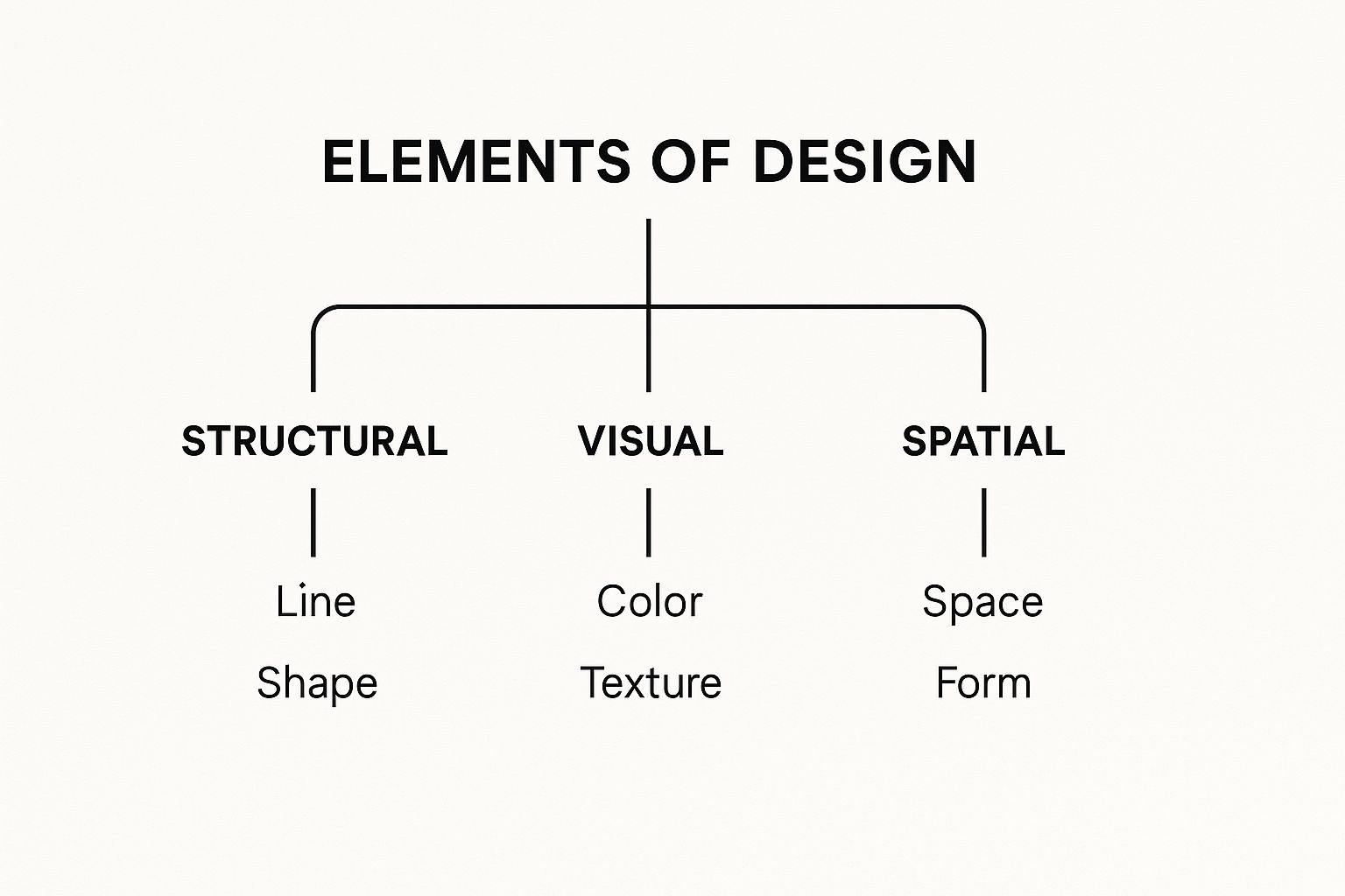
You can see how everything from structure to space plays a role in what we create.
Why Mastering the Elements Matters
Getting a handle on these fundamentals is what allows you to design with purpose. Once you truly understand how a simple line can guide someone’s gaze or how a splash of color can change a mood, you're no longer just making things pretty—you're in control of the conversation.
For example, a tech startup wanting to feel sleek and modern might rely heavily on clean lines and generous negative space. On the other hand, a brand for kids’ toys would likely go all-in with vibrant colors and playful, organic shapes to communicate fun and energy.
The elements of design are a universal language. Whether you're designing a mobile app or a print poster, these principles are the constant foundation for effective visual storytelling.
To give you a quick reference, here’s a simple breakdown of the core elements and what they do.
The 7 Core Elements of Design at a Glance
This table is just a starting point. The real magic happens when you start combining these tools to create something new.
From Theory to Practical Application
Grasping these components is your ticket to doing more advanced, thoughtful work. It’s what lets you look at someone else’s design and figure out why it works (or doesn't). This knowledge is power, allowing you to build a clear visual hierarchy, create a sense of balance, and make sure your message lands exactly as you planned.
By understanding these core pieces, designers can then confidently follow top website design best practices to build digital experiences that are not only beautiful but also incredibly effective.
Ultimately, these seven elements aren't just items on a checklist. They're the vocabulary you need to speak visually. Learning to use them with confidence is how you turn a simple idea into a powerful and memorable reality.
Using Line and Shape to Tell a Visual Story
Every great design, no matter how complex, starts with two simple things: a line and a shape. Think of them as the skeleton of your brand's visual identity. They’re the framework everything else is built on, and they do more than just look pretty—they guide the eye, set a mood, and start telling your brand’s story before a single word is read.

A line is basically a path for the viewer's eye to follow. It subtly tells them where to look and in what order. The kind of line you use—whether it’s thick and bold, thin and delicate, straight or curvy—instantly injects a specific feeling into the design.
The Power and Personality of a Single Line
Lines come with their own built-in psychology. A straight, horizontal line feels calm and steady, like the horizon at dusk. Flip it vertically, and it suddenly suggests height, power, and ambition, like a skyscraper reaching for the clouds.
Diagonal lines are all about energy. They create a sense of movement, action, and sometimes even tension. The Nike swoosh is the perfect masterclass in this; it’s just one simple, curved line, but it screams speed, agility, and forward momentum without saying anything at all.
Think about how different line types can shape a brand's personality:
- Thin, delicate lines hint at elegance, precision, and high-end sophistication. You’ll often see them used by luxury jewelry brands.
- Thick, bold lines feel strong, confident, and important. A construction company might use them to look dependable, or a news outlet to appear authoritative.
- Jagged, chaotic lines can create a feeling of excitement, rebellion, or disruption. They're a natural fit for a punk band's poster or an extreme sports brand.
When you consciously choose the right line, you're guiding the viewer's journey through your design and setting the emotional tone from the very first glance.
This is what strong composition is all about, and it's one of the core elements of design that separates truly professional work from the rest.
How Shapes Communicate Meaning Instantly
Once a line closes in on itself, it creates a shape. Just like lines, shapes are basic communicators our brains are wired to understand instantly. We can generally sort them into two buckets: geometric shapes (like circles, squares, and triangles) and organic shapes (the free-flowing, irregular forms you see in nature).
Geometric shapes feel orderly, structured, and logical. Their clean, predictable forms make them seem reliable and efficient—think of them as man-made.
Organic shapes, on the other hand, feel more natural, spontaneous, and human. A wellness brand might use soft, leaf-like shapes to show its connection to nature and holistic health. The difference is easy to feel: one seems engineered, the other seems to have grown naturally.
The Hidden Psychology of Geometric Shapes
Every geometric shape carries subconscious baggage, which makes them incredibly useful for building a brand identity. If you understand what these shapes imply, you can pick the ones that reinforce your brand's message.
These associations are no accident. They tap into a shared visual language that helps people "get" a brand's identity almost instantly. By mastering how lines and shapes work together, you take control of your design’s foundational story, making sure every little piece works together to communicate something clear and compelling.
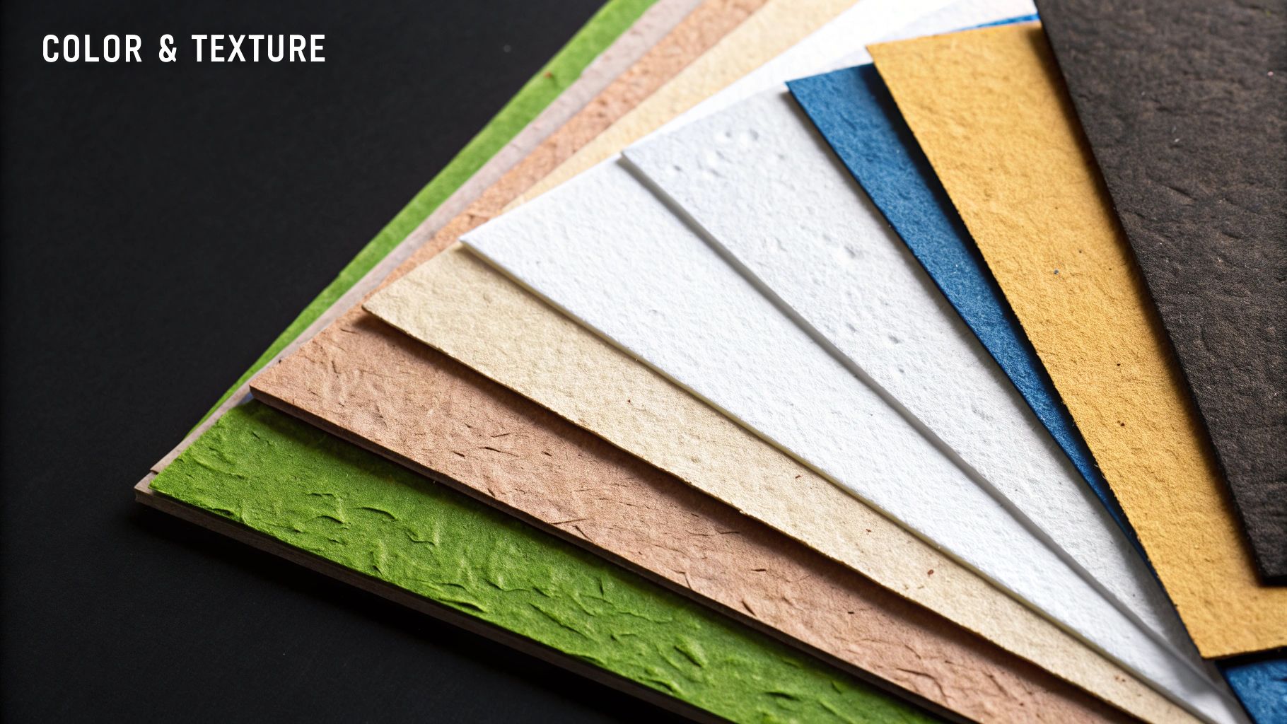
How Color and Texture Evoke Emotion
If line and shape build the skeleton of a design, then color and texture are its heart and soul. They’re what breathe life into a brand, turning a simple layout into a full-blown emotional experience. These elements are powerful communicators, capable of shifting a brand's entire vibe—making it feel trustworthy, exciting, or sophisticated without saying a single word.
Of all the elements of design, color is arguably the most influential. Its impact is immediate and hits us on a subconscious level. In fact, research consistently shows that up to 90% of snap judgments people make about products can be based on color alone.
Color plugs directly into our memories and cultural wiring, triggering feelings long before our logical brain has a chance to catch up.
The Psychology of Color in Branding
Every color carries its own psychological baggage, and the smartest brands know exactly how to use this. Think about Coca-Cola's iconic red—it's not just a pretty shade. It’s a deliberate choice meant to stir up feelings of energy, excitement, and passion.
On the flip side, you have financial giants like Chase Bank that rely heavily on blue. Why? Because blue communicates stability, security, and trust—exactly what you want from the people handling your money.
Understanding these built-in associations is key to creating a color palette that backs up your brand’s core message.
- Red: This one’s all about energy, passion, and urgency. It’s a classic for sales promotions or any brand that wants to get your pulse racing.
- Blue: The color of trust, calm, and dependability. It’s a favorite in the corporate and tech worlds for its professional, steady feel.
- Yellow: Like a ray of sunshine, yellow radiates optimism, warmth, and clarity. Brands like IKEA and McDonald's use it to feel friendly and accessible.
- Green: Instantly connects to nature, growth, and health. It’s the go-to for wellness brands, organic products, and even financial services hinting at growth.
- Black: Nothing says luxury, power, and elegance quite like black. High-end fashion and tech brands use it to signal premium quality.
Color doesn't just decorate; it communicates. A well-chosen color palette acts as a silent ambassador for your brand, telling your audience who you are and what you stand for.
Picking the right combination of colors is a make-or-break step in building a brand identity. If you want to go deeper, you can learn how to master color theory in marketing to boost sales and craft a truly effective visual presence.
Adding a Sensory Dimension with Texture
While color speaks to our emotions, texture appeals to our sense of touch. It’s the surface quality of an object—the thing that makes you want to reach out and feel it. In design, it adds a layer of depth and realism that can make a flat image feel surprisingly tangible.
We can break texture down into two main types.
- Actual Texture: This is the real deal—the physical surface you can actually feel. Think of the raised lettering on a business card or the rough-hewn paper of a fancy restaurant menu. It adds a memorable, physical quality.
- Implied Texture: This is the illusion of a physical surface on a 2D screen. It’s what makes a photo of a wooden table look splintery or a digital graphic of silk look smooth. This is the kind you’ll see most often in digital branding.
How Texture Shapes Brand Perception
The type of texture you use can completely change a brand's personality. A grainy, rustic texture on a coffee shop’s logo, for instance, can make it feel artisanal and authentic. It hints at natural ingredients and a hands-on process.
On the other hand, a smooth, glossy, or metallic texture gives off a totally different vibe—modern, sleek, and often luxurious. Apple is the master of this, using smooth textures in its product photography to make its devices look clean, futuristic, and impeccably engineered.
In the end, color and texture are a team. Color sets the initial emotional tone, and texture comes in to add character, depth, and believability. When used together thoughtfully, these two elements can transform a simple design into a powerful story that connects with people on a much deeper level.
2. Using Space and Form to Create Impact
While flashy colors and bold shapes tend to grab all the attention, two of the most powerful design elements work their magic behind the scenes. Space and form are the unsung heroes of visual identity. They give a design room to breathe, create a sense of realism, and steer the viewer's eye with uncanny precision. Getting these two right is often what separates a good design from a truly memorable one.
Think of space not as just "emptiness," but as an active, intentional part of your composition. It's the stage where all the other elements perform. We're mainly talking about negative space here—the areas around and between the focal points of your design. It's like the silence between notes in a song; without it, you just have noise.
The Power of Negative Space
When you use it deliberately, negative space (often called whitespace) becomes one of your most effective tools. It cuts through the clutter, makes things easier to read, and can give a brand a feeling of sophistication and calm. A design that’s jam-packed with information just feels chaotic and overwhelming, and most people will simply tune it out.
By giving elements plenty of breathing room, you're silently telling the audience what matters most. Apple is a master of this. Look at their product pages. You'll often see a single, stunningly shot iPhone floating in a sea of clean, empty space. This intense focus makes the product feel premium, simple, and the undeniable star of the show.
Here’s how negative space makes a real difference:
- It Creates Focus: When you surround a key element with nothing, you’re essentially putting a spotlight on it. The eye is drawn there instantly.
- It Improves Readability: Generous spacing between lines of text and paragraphs makes content far easier to scan and digest. This isn't just a "nice-to-have"; it's crucial for a good user experience.
- It Communicates Sophistication: A clean, uncluttered layout feels modern, elegant, and confident. It sends the message that the brand doesn't need to yell to be heard.
Space isn't a void to be filled. It's a powerful tool for creating emphasis, defining relationships between elements, and guiding someone's journey through your design.
Using negative space well is a conscious choice, and it brings clarity and purpose to your entire composition.
Giving Designs a Third Dimension with Form
While space organizes the two-dimensional layout, form is what brings a sense of three-dimensional reality to a flat surface. Form is the illusion of depth, weight, and volume. It’s what makes an icon on your phone look like a button you can actually press, or a product illustration feel like something you could reach out and grab.
So, how do designers pull off this trick? The secret is in the clever use of light and shadow. By adding subtle gradients, highlights, and shadows to a simple shape, you can fool the eye into seeing it as a 3D object. A flat circle becomes a sphere; a plain square becomes a cube.
This technique is absolutely essential in modern digital design, especially for user interfaces. That tiny shadow under a button on a website signals that it’s clickable and sits "above" the page. This application of form provides vital visual cues that make an interface feel intuitive and interactive.
The rise of digital tools has made creating form easier than ever. The shift started with computer typesetting in the 1960s, moving design away from purely manual processes. Today's software gives designers incredible power to build complex visual elements with ease. This evolution has made graphic design more dynamic, opening the door for motion and interactive elements that lean heavily on the illusion of form. If you're curious about how technology has shaped the industry, you can find insights on the history of design at Study.com.
Unifying Space and Form for Maximum Impact
Space and form don't work in isolation; they team up to build a believable and engaging visual world. Space sets the stage and creates a clear hierarchy, while form gives the actors on that stage a sense of physical presence.
Think about a well-designed mobile app. Negative space is used to separate different functional areas, making the interface feel clean and easy to navigate. Within those areas, form is used to make buttons, sliders, and toggles look tangible and responsive.
The result is a design that isn’t just nice to look at, but is also functional and incredibly easy to understand. By mastering both space and form, you can create designs that feel balanced, impactful, and truly alive.
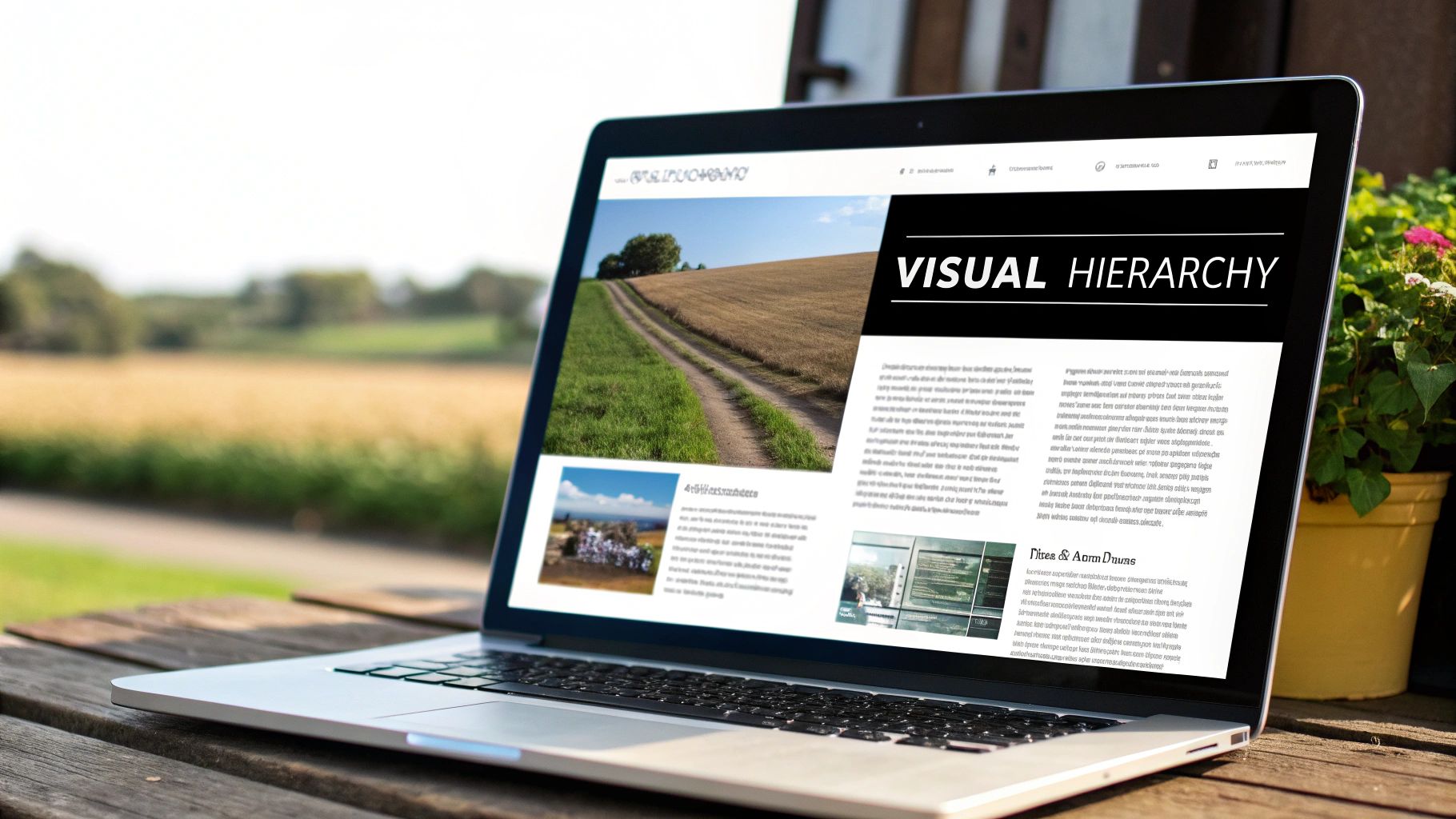
6. Typography and Value: The Unsung Heroes of Visual Hierarchy
Think of a design as a conversation. If you want people to listen, you can't just shout everything at once. You need to control your tone and volume. That's exactly what typography and value do for your visuals. They work together to create a natural order, telling the viewer what's most important and guiding their eye on a clear, effortless path through the message.
Without a strong visual hierarchy, even the most beautiful design becomes a confusing mess.
Typography is so much more than just picking a pretty font. It’s the art of arranging text to be legible, readable, and appealing. It’s about giving voice to your words. The right typeface can make a brand feel classic and trustworthy or modern and innovative before the user even reads a single word.
This isn’t a new concept. The power of type in design exploded with technologies like lithography, invented way back in 1796, which first allowed for the mass production of visual communications. This leap forward, especially with the later rise of magazines, gave designers a brand-new playground to experiment with type and visual storytelling, paving the way for everything we do today.
Understanding Typeface Personalities
Every typeface has its own personality, almost like a character in a play. Choosing the right one is like casting an actor for a role—it has to fit the character of the brand.
- Serif Typefaces: These are the ones with the little "feet" (serifs) at the ends of the letters. They feel traditional, established, and authoritative. Think of brands that want to convey history and reliability, like universities or law firms.
- Sans-Serif Typefaces: Clean, modern, and straightforward, these fonts lack the extra strokes. Their simplicity feels accessible and current, which is why they absolutely dominate the tech and startup worlds.
- Script Typefaces: Mimicking handwriting, scripts can feel personal, elegant, or casual. They're often used for logos or headlines to add a distinct human touch.
When you start combining different typefaces, weights (like bold or light), and sizes, you're creating typographic hierarchy. This is the system that tells a reader what to look at first (the headline), what to read next (the subheadings), and what’s just supporting information (the body text). Good hierarchy makes your content scannable and easy to digest. You can learn to master typography for graphic design with our in-depth guide to really hone this skill.
Using Value to Direct Attention
Working hand-in-hand with typography is value, one of the most critical elements of design. Simply put, value refers to the lightness or darkness of a color. A design with a wide range of values—from bright whites to deep blacks and all the grays in between—will have strong contrast and a ton of visual punch.
Value is the engine of contrast. High contrast grabs attention and creates powerful focal points, while low contrast produces a more subtle, calming effect.
Imagine a bright yellow "Buy Now" button on a dark gray background. The high value contrast makes it impossible to miss. Your eye is drawn there instantly, which is a deliberate choice to guide user behavior.
On the flip side, light gray text on a slightly darker gray background has very low contrast. This is perfect for secondary information, like a photo caption, that shouldn't compete with the main message.
By getting a handle on value, you can:
- Create Focal Points: The element with the highest contrast will always win the battle for attention.
- Establish Depth: Lighter values tend to feel further away, while darker values appear closer, creating a simple illusion of depth.
- Set the Mood: High-contrast designs feel energetic and bold. Low-contrast designs feel more subdued and serene.
Ultimately, typography organizes your content, and value tells the eye where to look. When they work together, they create a seamless visual flow that makes your message clear, compelling, and incredibly easy to understand.
Putting It All Together: Building a Cohesive Brand Identity
The individual elements of design we’ve covered are like ingredients in a recipe. They’re powerful on their own, but the real magic happens when they’re combined thoughtfully. A strong brand identity isn’t just about picking a great color or a clever shape; it’s about making every element work together to tell one clear, memorable story.
This is where the theory hits the road. Think about a brand you instantly recognize, like Spotify. You know it’s them at a glance, and it’s not just because of the logo. It’s because every single design choice works as a team.
How Spotify Creates Harmony
Let's look at how Spotify pulls this off so well. They’ve built an entire visual language that feels uniquely them.
- Color and Shape: That vibrant "Spotify Green" is impossible to miss. It feels modern and full of energy. They pair it with simple, friendly shapes like circles and soft-edged rectangles, which makes the whole experience feel accessible and human.
- Typography: Spotify even has its own custom font, Spotify Circular. It’s a clean, no-fuss sans-serif that’s incredibly easy to read. This choice quietly reinforces their promise of a simple, seamless user experience.
- Space: Open the app and you’ll notice it never feels crowded. The design uses plenty of negative space to let the content breathe, making it easy to find what you’re looking for. The focus is right where it should be: on the music and podcasts.
Whether you see a Spotify ad on a bus, open their app, or browse their website, the feeling is the same. That’s the goal—a visual language that’s instantly recognizable and uniquely yours.
A brand identity is so much more than the sum of its parts. When every design element is aligned, you create a visual system that communicates your brand's personality, values, and promise without you ever having to say a word.
This idea of a unified visual system isn't new. In fact, the term 'graphic design' was officially coined way back in 1922 by an American artist named William Addison Dwiggins. He helped professionalize a field that was already creating stunning work, like the flowing lines and organic forms of the Art Nouveau movement.
Creating Your Brand’s Visual System
Achieving this kind of harmony doesn’t happen by accident; it requires a game plan. You have to start by defining your brand’s core personality and then deliberately choose design elements that bring it to life.
Once you’ve made those choices, you need to document them. This is where brand guidelines become your most important tool. For anyone just starting out, these principles are central to effective small business branding tips.
To get this right, you’ll need a blueprint for applying your visual identity everywhere, consistently. You can check out our guide on how to create brand guidelines to build a brand that truly connects with people.
Answering Your Questions About Design Elements
As you start getting your hands dirty with the building blocks of design, you're bound to have questions. It’s one thing to know the theory, but it's a completely different ballgame to actually put it into practice. This little Q&A is here to clear up some of the most common sticking points and give you practical answers that will help you connect the dots.
Think of it as your go-to guide for those "aha!" moments. Let's tackle some of the questions that trip up designers the most.
What’s the Difference Between Elements and Principles?
This is easily the most common question I hear from new designers. The simplest analogy is cooking: the elements of design are your ingredients—the line, shape, and color you have to work with. The principles of design are the recipe that guides you on how to combine those ingredients.
Principles like balance, contrast, hierarchy, and repetition are the instructions. For example, you use the element of value (light and dark) to create the principle of contrast. You can't really have one without the other; they're completely intertwined.
- Elements: The "what." These are the tools in your toolbox.
- Principles: The "how." These are the rules and techniques for using those tools effectively.
I’m a Beginner. Where Should I Even Start?
It’s completely normal to feel a bit lost at first. My best advice? Just start seeing. Before you even try to create anything, spend time analyzing the designs you see every day—websites, logos, book covers, you name it.
Don't try to learn everything at once. Pick one or two elements and really focus on them. For a week, just pay attention to how line and shape create structure in different logos. The next week, shift your focus to how brands use color to make you feel something. This kind of active observation builds your design eye faster than any textbook ever will.
The goal isn't to memorize definitions. It's to build an instinct for why a design just works. Start by taking apart what others have made before you worry about building your own masterpiece from scratch.
How Do These Elements Apply to UI and UX Design?
In fields like User Interface (UI) and User Experience (UX) design, these foundational elements are more critical than ever. The screen may be digital, but the goals are timeless: communicate clearly and guide the user's attention.
In UI/UX, the elements get very practical, very quickly:
- Space: Negative space is your best friend. It’s what creates clean, uncluttered screens that don't overwhelm the user.
- Color: This is used to signal actions, like a green button for "Go" or a red alert for an error. It creates a visual roadmap for the user.
- Shape: Using consistent, simple shapes for things like buttons and icons makes an app feel predictable and easy to learn.
Every single choice either helps or hurts the user's experience. Getting a solid handle on these core elements is non-negotiable for creating digital products that are a joy to use, not just nice to look at.
Ready to build a brand identity that truly connects? The expert designers at Softriver mix a deep understanding of design elements with sharp strategic thinking to create logos and brand systems that leave a lasting impression. Get your professional brand identity started today.