
Typography isn't just about picking fonts. It’s the art of arranging letters and words in a way that makes text clear, easy to read, and visually engaging. Think of it as the strategic use of style, spacing, and structure to really land a message, set a specific tone, and create an experience for the viewer.
Why Typography Is Your Most Powerful Design Tool
Let's get past the idea that typography is just about choosing pretty fonts. It’s so much more than that. Typography is the actual voice of your design—it sets the mood, builds trust with your audience, and helps make your message stick. Every truly successful project has a backbone of smart, intentional typographic choices.
Imagine typography as a skilled actor's voice. It can be loud and booming to command attention, or it can be soft and gentle to deliver a sensitive message. The actor changes their tone, volume, and pacing to tell the story, and as a designer, you do the exact same thing with type. This is what takes your work from just looking good to actually communicating with intent.
The Voice of Your Brand
Every font has a personality. A classic serif like Garamond can feel traditional and trustworthy, making it a great fit for a law firm's website. On the flip side, a clean sans-serif like Montserrat feels modern and friendly, which is perfect for a tech startup’s mobile app. Your type choices are the first impression your brand makes, often before anyone sees an image or reads a single word. It's your first shot at building a real connection.
These choices aren't just for looks; they have a tangible impact on how people see a brand. For instance:
- Trust and Credibility: Professional, well-thought-out typography tells people a brand is reliable and cares about the details.
- Emotional Connection: The right typeface can stir up specific feelings, from high-energy excitement to quiet sophistication.
- Brand Recognition: Using a unique typographic style consistently helps build a brand identity that people remember.
Typography is the craft of endowing human language with a durable visual form. It’s not just what you say, but how you say it visually.
A Skill Beyond Software
Learning to control this "voice" is what separates a designer who just uses fonts from a strategist who truly wields typography. To get the most out of it, you need to see how it fits into the complete graphic design process. This bigger picture helps you make smart decisions from the start that align with the project's goals. When you know how to use this powerful tool, you can guide your audience, simplify complex information, and create designs that don't just grab attention—they keep it.
Getting to Know the Building Blocks of a Typeface
If you really want to get good at using type in your designs, you have to learn its language. Think of it like this: a great chef knows the difference between a dozen kinds of salt, they don't just see "salt." As a designer, you need to see a letter as more than just a shape. Understanding the anatomy of a typeface is what lets you move from making guesses to making confident, professional choices.
This isn’t about memorizing a bunch of textbook terms. It's about getting a feel for the little details that give every font its unique personality and purpose. Once you start seeing these details, you gain real control over how your designs look and how easily they can be read.
The Core Parts of a Letter
So, what are these "parts"? Type anatomy is just a way of talking about the individual components that make up a letterform. Some of these are absolutely crucial, directly impacting how a typeface feels and how legible it is.
Let's break down a few of the most important ones:
- Serif vs. Sans-Serif: This is the big one, the first major split you'll encounter. Serifs are the small "feet" or decorative strokes you see at the end of the main strokes on letters. Sans-serif fonts, as the name suggests ("sans" is French for "without"), don't have these, giving them a much cleaner, more modern look.
- X-Height: This sounds technical, but it’s simple. The x-height is just the height of a typeface's lowercase 'x'. Fonts with a taller x-height often feel more open and are typically easier to read, especially in smaller sizes.
- Ascenders and Descenders: An ascender is the part of a lowercase letter, like 'b' or 'h', that extends up past the x-height. A descender is the part that drops below the main baseline, like in 'g' or 'p'. How long or short these are can completely change the rhythm and style of a paragraph.
You can think of these anatomical parts like the features on a face. A sharp serif is like a strong jawline, a large x-height is like wide, open eyes, and a tall ascender is like a long nose. They all work together to create a distinct personality.
Knowing these features helps you pick fonts that don't just look pretty but actually work for what you need them to do. It’s a core design skill, and if you want to dig deeper, you can find more in our quick reference guide to graphic design terminology.
It’s All About the Space Between
The shapes of the letters are only half the story. The empty space around them is just as important. The way letters and lines of text are spaced determines if your design feels calm and inviting or cramped and stressful. The two big concepts here are kerning and leading.
Kerning is all about adjusting the space between specific pairs of letters to make them look right together. Not all letter combinations fit together naturally. A classic example is the gap between an 'A' and a 'V'—without good kerning, they look way too far apart.
Think of kerning as managing the personal space between letters. You want them to be close enough to feel like a single word, but not so close they're stepping on each other's toes. When it's done well, you don't even notice it. When it's bad, it sticks out like a sore thumb.
Leading (pronounced "ledding," not "leeding") is the vertical space between lines of text. The term comes from the old days of printing presses, when typesetters would literally insert thin strips of lead to create space between lines of metal type.
Proper leading is absolutely essential for readability. Too little, and your text becomes a dense, intimidating wall. Too much, and the lines feel disconnected from each other. Getting the leading right is like giving your text room to breathe, guiding the reader’s eye smoothly from one line to the next.
Creating a Clear Visual Hierarchy
Good design is never an accident. It’s a deliberate, carefully planned journey for the viewer’s eye, and in graphic design, visual hierarchy is the map you give them. It's how you arrange text to signal importance, telling people exactly what to look at first, then second, and so on.
Without it, everything on the page screams for attention at the same volume. The result? A confusing wall of text that most people will just skip. A strong hierarchy, on the other hand, brings order to the chaos. It makes your key message unmissable while ensuring the supporting details are there when someone wants them.
The Three Levels of Typographic Importance
The simplest and most reliable way to build a visual hierarchy is to think in three distinct levels. Picture it like casting a movie: you have your main star, a key supporting actor, and all the background extras. Each has a specific job, and together, they create a balanced and easy-to-read scene.
This framework is incredibly versatile, working just as well for a quick social media graphic as it does for a detailed multi-page report.
This diagram breaks down how a primary heading, a secondary heading, and the main body text all work together as a team.
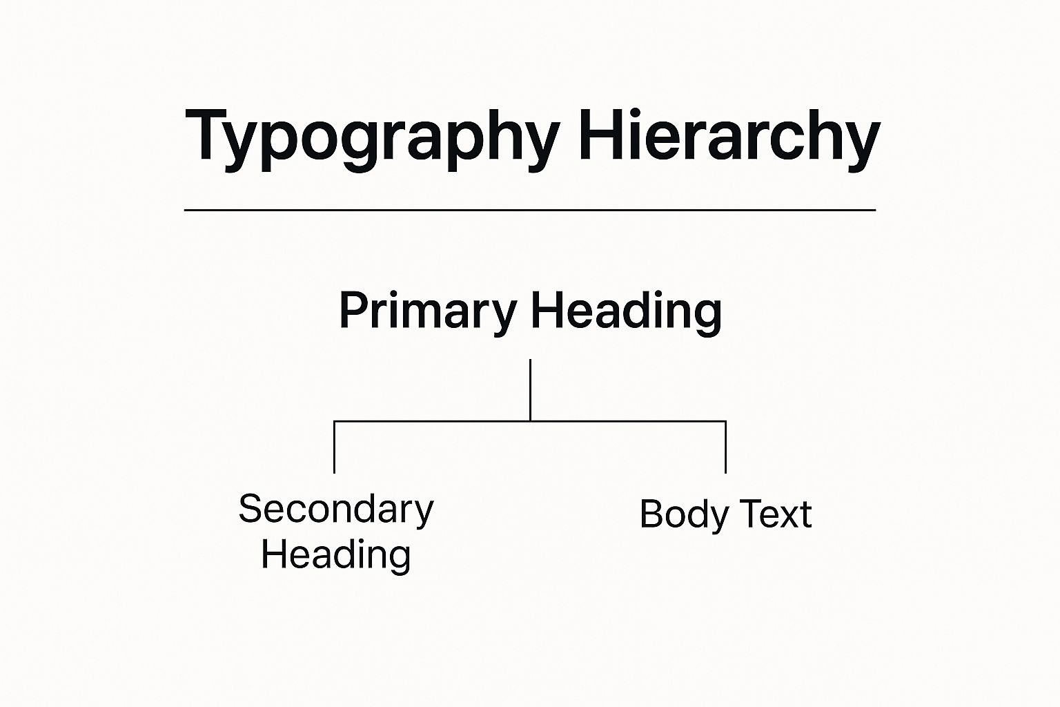
As you can see, each level has a clear purpose. The primary heading grabs the spotlight, while the body text delivers the substance.
Level One: The Headliner
Your Level One text is your headline—the big, bold statement designed to grab someone's attention from across the room. This is your hook. It’s the very first thing people should read.
To make it the star of the show, you’ll usually want to use your largest font size and boldest weight. The goal is to make it so visually dominant that the eye has no choice but to land there first. Think of a concert poster—the band’s name is always, without question, Level One.
Level Two: The Supporting Details
Once you’ve hooked them with the headline, your audience will naturally look for a bit more context. That’s where Level Two typography comes in. These are your subheadings, pull quotes, or short intros that act as a bridge between the big title and the detailed copy.
They need to be smaller than Level One but still distinct from the main text. This level is crucial for breaking content into scannable, digestible chunks, making the whole design feel much less intimidating.
Here are a few ways to create that clear distinction:
- Size: Make it noticeably smaller than your headline but still larger than the body text.
- Weight: If your headline is Extra Bold, maybe your subheading is a Regular or Medium weight.
- Color: Using a secondary brand color or a muted tone can create a clean separation.
- Style: Sometimes, something as simple as using an italic style or a different font can do the trick.
Level Three: The Core Message
Finally, we have Level Three: your body copy. This is where the real meat of your information lives—the paragraphs, descriptions, and all the fine details. It may be the smallest text on the page, but its job is arguably the most important. It has to be readable.
The primary goal for body text isn't to attract attention but to hold it. Comfort and clarity are paramount. If your body copy is difficult to read, your entire message will be lost, no matter how great your headline is.
This means you need to pick a clean, legible typeface and give it plenty of leading (the space between lines of text) so that reading longer passages doesn’t feel like a chore. The focus here shifts from pure visual impact to effortless communication.
By mastering these three levels, you can turn a simple block of words into a structured, intuitive story that guides your audience from start to finish.
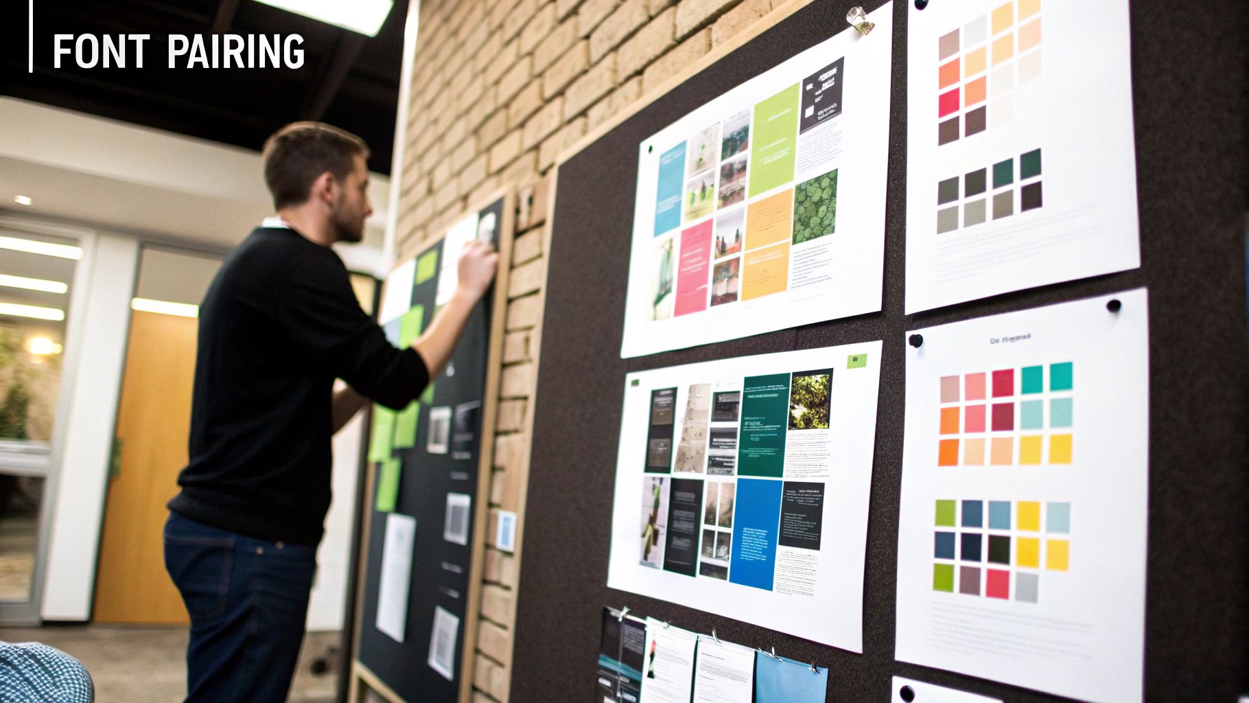
The Art of Professional Font Pairing
Choosing fonts that work well together can feel like a dark art, but it's really a skill you can learn. The whole point isn't just to pick two pretty fonts; it's to find a pair that reinforces your message and your brand's personality. When you get this right, your typography becomes a powerful design tool.
Think of it like putting together an outfit. You wouldn't wear a tuxedo jacket with gym shorts because the styles are just wrong for each other. Fonts work the same way. They need to complement each other's vibe to create a single, cohesive look that feels deliberate, not accidental.
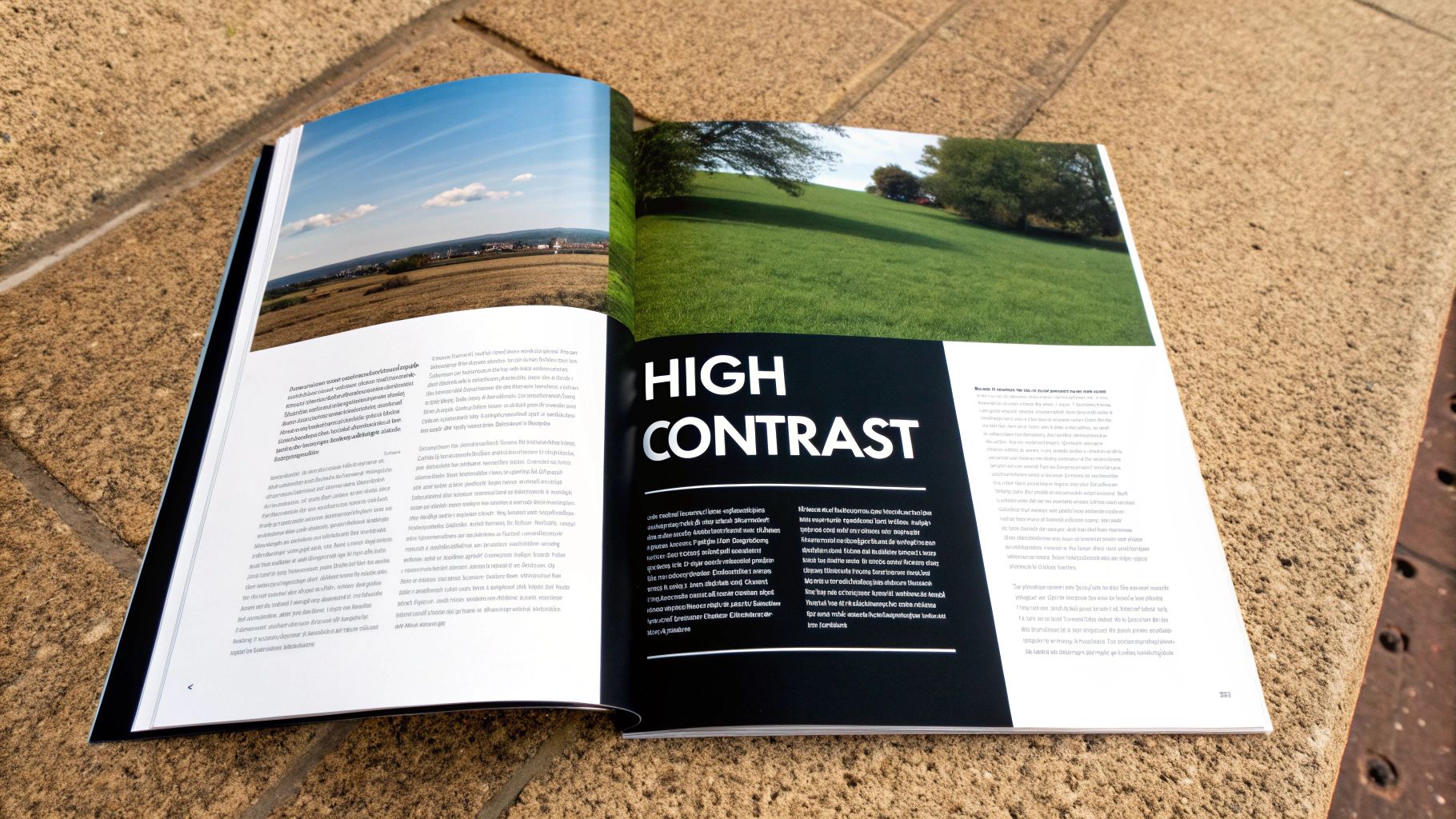
Establish a Clear Contrast
One of the most common missteps is picking two fonts that are almost the same but not quite. This creates a weird visual tension that just feels… off. The secret to a great pairing is to create clear and deliberate contrast.
You can achieve this in a few tried-and-true ways:
- Pair a Serif with a Sans-Serif: This is the go-to strategy for a reason. The classic, structured feel of a serif headline plays perfectly against the clean, modern look of a sans-serif body text. It’s a timeless combo.
- Combine Different Weights: Try using a bold or heavy version of a font for your headlines and a light or regular weight for the text. This builds an instant hierarchy while keeping everything in the same family.
- Play with Proportions: You can create some really interesting visual energy by pairing a tall, narrow font with a short, wide one. Their different shapes naturally draw the eye.
A good font pairing is like a good conversation. One font takes the lead (the headline), while the other provides supportive context (the body). They have distinct voices but work together to tell a single, unified story.
Seek Harmony and Shared Traits
While you want contrast, your fonts still need to feel like they belong in the same room. The best pairs share a subtle, underlying quality that ties them together and keeps the design from feeling chaotic.
Look for a common thread. Maybe both fonts have a similar x-height (the height of the lowercase 'x'), which gives them a consistent rhythm on the page. Or perhaps they share a similar geometric DNA, like perfectly round "o"s. You're looking for fonts that are different enough to stand out but similar enough to be friends.
Developing a solid font system is a huge part of branding. You can find more practical tips in our guide on choosing fonts for your brand.
Limit Your Font Choices
Want to make a design look amateur in a hurry? Use too many fonts. A cluttered typographic palette is confusing for the reader and completely wrecks the visual hierarchy you're trying to build.
As a rule of thumb, stick to no more than two or three fonts in a single design.
- Primary Font: This is your main event, used for headlines and big titles. It should be eye-catching and set the overall tone.
- Secondary Font: This is for your body copy and subheadings. Its number one job is to be readable.
- Accent Font (Optional): You can bring in a third font for small, specific things like a button or a pull quote. Use it sparingly to draw attention where it's needed most.
Honestly, the safest and often most professional approach is to just use one versatile font family that comes with lots of weights and styles (like light, regular, bold, and italic). A "superfamily" like this gives you all the contrast you need while guaranteeing a cohesive look.
To make things even clearer, here are some classic strategies designers use all the time.
Classic Font Pairing Strategies
This table is a quick reference guide to proven font pairing techniques that create harmony and contrast in graphic design.
By keeping these simple strategies in mind, you can move from just guessing to making confident, smart decisions that will take your typography to the next level.
Exploring Modern Typography Trends and Tools
Typography isn't some static art form stuck in the past. It’s a living, breathing field that evolves right alongside technology. The tools and trends we see today are constantly pushing creative boundaries, giving designers fresh ways to solve old problems and invent entirely new visual languages.
This evolution isn’t about throwing out the timeless principles of good design. Far from it. It’s about building on that solid foundation with powerful new capabilities. Staying on top of these shifts is how you keep your work fresh, functional, and genuinely engaging for modern audiences.
The Rise of Variable Fonts
Imagine a single font file that behaves like an entire font family. That’s the magic behind variable fonts. Instead of needing separate files for light, regular, bold, condensed, and every style in between, a variable font packs all that information into one efficient package.
This technology gives designers an incredible amount of flexibility. You can fine-tune weight, width, and other attributes with pinpoint precision, often with just a simple slider.
- Responsive Design: For web designers, variable fonts are a total game-changer. They let text adapt flawlessly to any screen size without swapping files, which improves performance and keeps the look consistent.
- Creative Expression: They also unlock new avenues for animation and interaction. Think of type that can expand, contract, or shift its weight based on how a user scrolls or clicks.
- Streamlined Workflows: Let's be honest—managing one file is a lot easier than juggling dozens. It just makes project organization cleaner.
Variable fonts give designers a level of control that was once unimaginable. It's like having a full mixing board for your typography, allowing you to find the perfect note for any design context.
This isn't just a fleeting trend; it’s a fundamental shift in how we work with type, empowering designers to build more dynamic and responsive systems than ever before.
AI and the Future of Type Design
Artificial intelligence has moved from a sci-fi concept to a practical tool that designers are using every day to speed up their work and spark new ideas. AI-powered tools aren't here to replace designers, but to act as creative partners—handling tedious tasks and suggesting unexpected creative paths.
We're seeing a fascinating blend of traditional craft and digital innovation. For instance, variable fonts are now used by about 93% of designers in their projects. At the same time, around 71% of designers have started using AI-powered tools like Fontjoy to explore unique pairings and kickstart the creative process. Even more telling, 85% of designers report that AI-driven typography helps improve user engagement, proving it has a real impact on business goals. You can find more insights on modern typography trends on GraphicDesignJunction.com.
Practical Tools for the Modern Designer
Keeping your skills current means knowing which tools help you work smarter, not harder. Beyond the big-picture trends, a few types of software have become essential for anyone serious about typography for graphic design.
Here are a few categories of tools worth checking out:
- Font Management Software: Programs like FontBase or RightFont are lifesavers. They help you organize, preview, and activate fonts from your collection, saving you from the chaos of thousands of files scattered across your system.
- Web-Based Pairing Tools: Websites like Fontjoy and Typewolf offer curated examples and smart suggestions, taking a lot of the guesswork out of finding typefaces that work well together.
- Prototyping Software: Tools such as Figma and Adobe XD have powerful typography controls. They let you test your hierarchy, spacing, and responsiveness in a realistic digital environment before you lock in a final design.
By embracing these modern tools and trends, you’re setting yourself up to create work that is not only beautiful but also intelligent, adaptable, and perfectly suited for the demands of today’s visual world.
The Business Impact of Strategic Typography
Great typography is so much more than just making words look pretty on a page. It's a workhorse that delivers real, measurable business results. Every choice a designer makes, from the font itself to the space between letters, shapes how a customer feels about a brand, how much they trust it, and ultimately, whether they'll stick around.
Think about it: when you see consistent, professional typography across a company’s website, social media, and packaging, it sends a clear message. It says they’re reliable and they care about the details. That kind of visual consistency builds a powerful brand identity that helps you stand out in a sea of competitors.
Turning Readability Into Revenue
At its heart, good typography is about making information easy to digest. When text is clear, legible, and logically organized, people are far more likely to stay engaged. This improved user experience directly fuels key business metrics.
- Boosted Engagement: Easy-to-read text removes friction, plain and simple. It encourages people to spend more time on your site and actually interact with your content.
- Higher Conversion Rates: When a call-to-action button is easy to spot and product details are a breeze to read, customers feel more confident hitting that "buy now" button. A simple font refresh can genuinely lead to more sales.
- Better Accessibility: Thoughtful typography ensures your message reaches everyone, including those with visual impairments. This isn't just good practice; it expands your potential market.
The numbers back this up. The global graphic design market is valued at over $60 billion, with North America alone accounting for more than $19.65 billion. Research even shows that people often spend more time looking at a website's logo—a core typographic element—than any other part of the page. That's your first impression right there. You can find more of these graphic design market insights on ExplodingTopics.com.
Proving the Value to Stakeholders
As a designer, one of your most important skills is connecting your creative work to business outcomes. This is what elevates you from being just a creative to a strategic partner who solves tangible problems. When you present your designs, frame your typographic decisions around business goals.
Instead of saying, "I chose this font because it looks modern," try this: "I selected this sans-serif for its excellent legibility on mobile screens. This will improve the user experience on our key landing pages and help lower bounce rates."
This simple shift helps clients and managers see typography for what it is: a powerful business tool. The best way to keep this consistency going is by documenting all your standards. To learn more, take a look at our guide on what is in a style guide and how to create one. By explaining the "why" behind your design choices, you demonstrate just how valuable thoughtful typography really is.
Got Typography Questions? Let's Get Them Answered.
Once you start diving into typography, a few questions always seem to pop up. It's one thing to know the theory, but another to put it into practice. Let's tackle some of the most common hurdles designers run into so you can feel confident in your choices.
How Many Fonts Are Too Many?
When in doubt, less is more. A solid rule of thumb is to stick to two, maybe three, fonts for any single design.
A classic setup is using one font for your headlines and another for your body text. If you really need a third, save it for something special—like a call-to-action button or a standout quote. Pushing past three typefaces almost always makes a design feel chaotic and unprofessional. A much cleaner way to get contrast is to use different weights from the same font family, like pairing a bold with a light or regular version.
What's the Real Difference Between a Font and a Typeface?
This one trips up a lot of people. Think of a typeface as the entire family of a design—like Helvetica or Garamond. It’s the art, the overall style. A font is the specific file you actually work with, like Helvetica Bold in 12-point size.
Here's a simple way to remember it: A typeface is the album, and a font is one of the songs on that album.
While you'll hear designers use the terms interchangeably all the time, knowing the difference shows you’ve really dug into the craft. You choose a typeface for its personality, then you pick specific fonts from that family to build the structure of your design.
Where Can I Find Good Fonts for My Projects?
Thankfully, we’re spoiled for choice these days. Where you should look really depends on your budget.
Here are some of the best spots to start your search:
- Free (and fantastic): Google Fonts is the king here. It has a massive, open-source library that’s perfect for just about any project, web or print.
- Subscription-based: If you're already in the Adobe ecosystem, Adobe Fonts is a goldmine. Thousands of top-tier fonts are included with a Creative Cloud subscription.
- Premium one-offs: For something truly unique, check out marketplaces like MyFonts and Fontspring. You can also buy directly from independent type foundries, which is a great way to support the artists who craft these amazing letterforms.
One last tip: always, always check the license. Make sure you're cleared for commercial use if your project needs it. It’ll save you a major headache down the road.
Ready to build a brand with typography that truly stands out? Softriver specializes in crafting custom logos and complete brand identities that make an immediate impact. Our team of expert designers handles everything from market research to final asset delivery, ensuring your brand communicates with clarity and professionalism. Explore our branding packages and start your project today.