
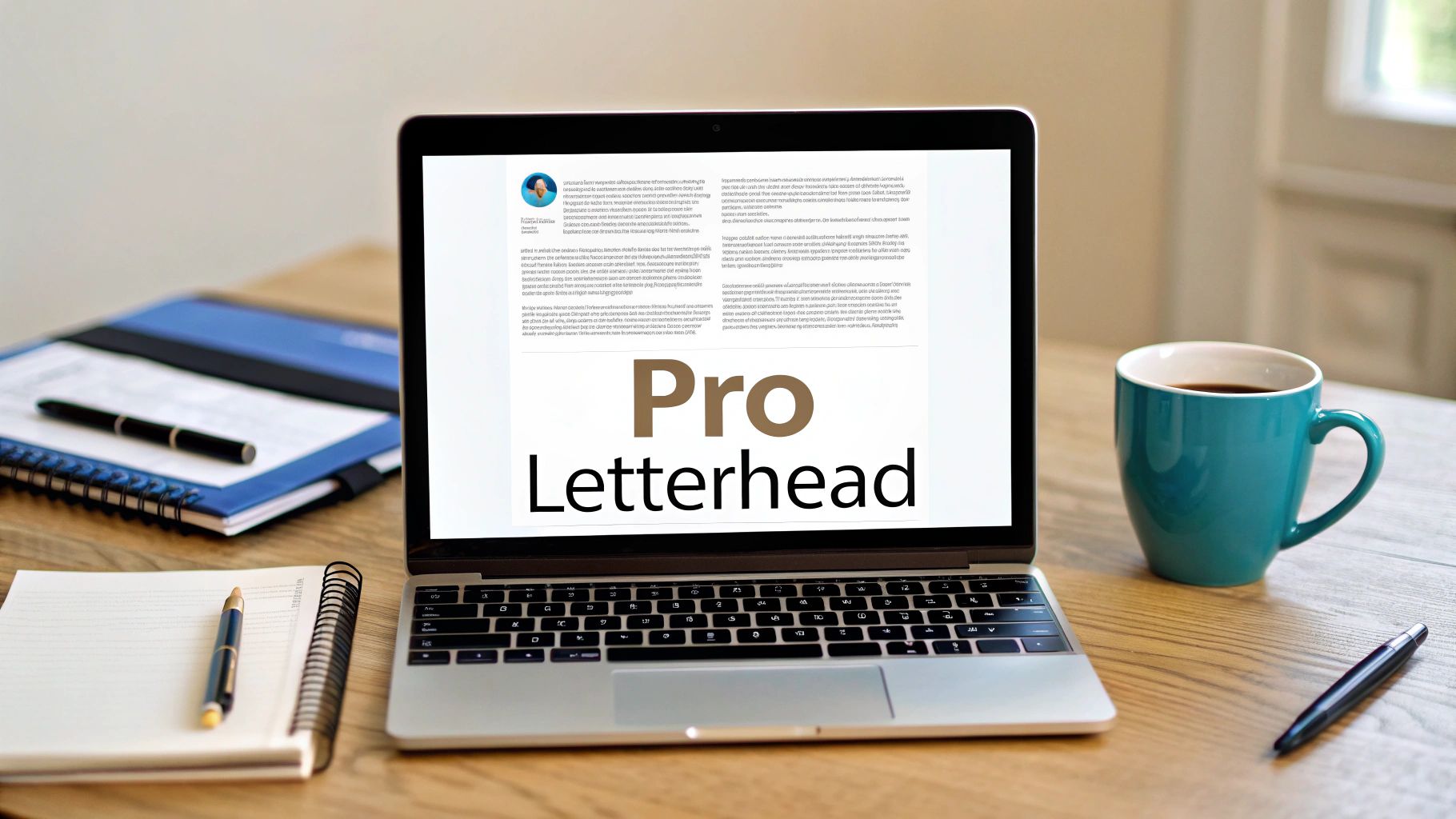
Before we get into the nuts and bolts, let's talk about why you should even bother with a custom letterhead. Think of it as your business's digital handshake—it’s often the very first impression someone has of your brand on an official document.
A sharp, professional letterhead does more than just look good. It's a subtle but powerful tool that tells your clients, partners, and prospects that you're serious and you pay attention to the details. Every single time you send an invoice, a proposal, or even a simple cover letter, you're reinforcing who you are.
Why a Professional Letterhead Matters
So, what does a great letterhead actually do for you? It's all about building a consistent and trustworthy brand image.
- It boosts your brand recognition. Your logo, colors, and font become instantly familiar.
- It builds trust. A polished design signals that your business is legitimate and reliable.
- It keeps everything consistent. No more haphazardly slapped-on logos. Every document that leaves your office looks uniform and professional.
Considering how central Microsoft Word is to the business world, this is a skill worth mastering. For example, a staggering 90% of legal professionals use it daily, often for hours at a time, making it the go-to for critical documents. You can learn more about how professionals rely on Word in their day-to-day work.
A proper letterhead elevates a plain Word doc into a powerful piece of communication that represents your brand.
To get it right, you need to include a few key pieces of information. This isn't just about a logo; it's about providing all the essential details someone would need to identify and contact you.
Key Elements for a Professional Letterhead
Nailing these components ensures your letterhead isn't just a design element but a functional tool that helps people connect with your business. It's the foundation for creating a document that looks polished and professional from top to bottom.
Designing Your Letterhead in the Header
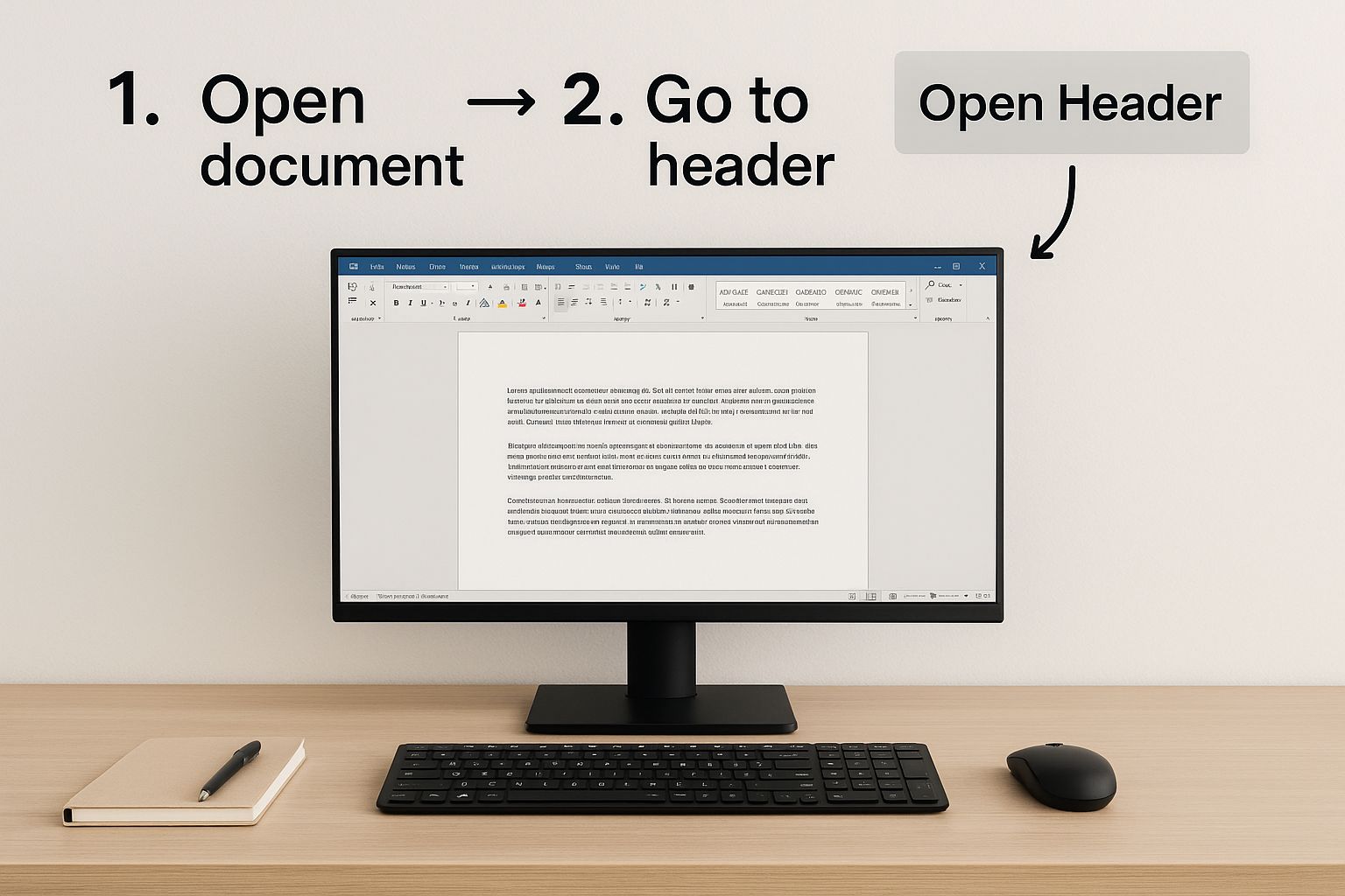
Alright, you've got the essential components in mind. Now, let's get our hands dirty and build your custom letterhead from scratch, right inside Word’s header. The header is the best spot for this job because anything you put there automatically shows up on every page. It's built-in brand consistency.
The easiest way to get started is to just double-click in the top margin of your document. That single action pops you right into the Header & Footer editing mode, which is basically your design canvas.
Once you're in this mode, you can add all your branding elements without messing with the main body of your document.
Adding Your Logo and Contact Details
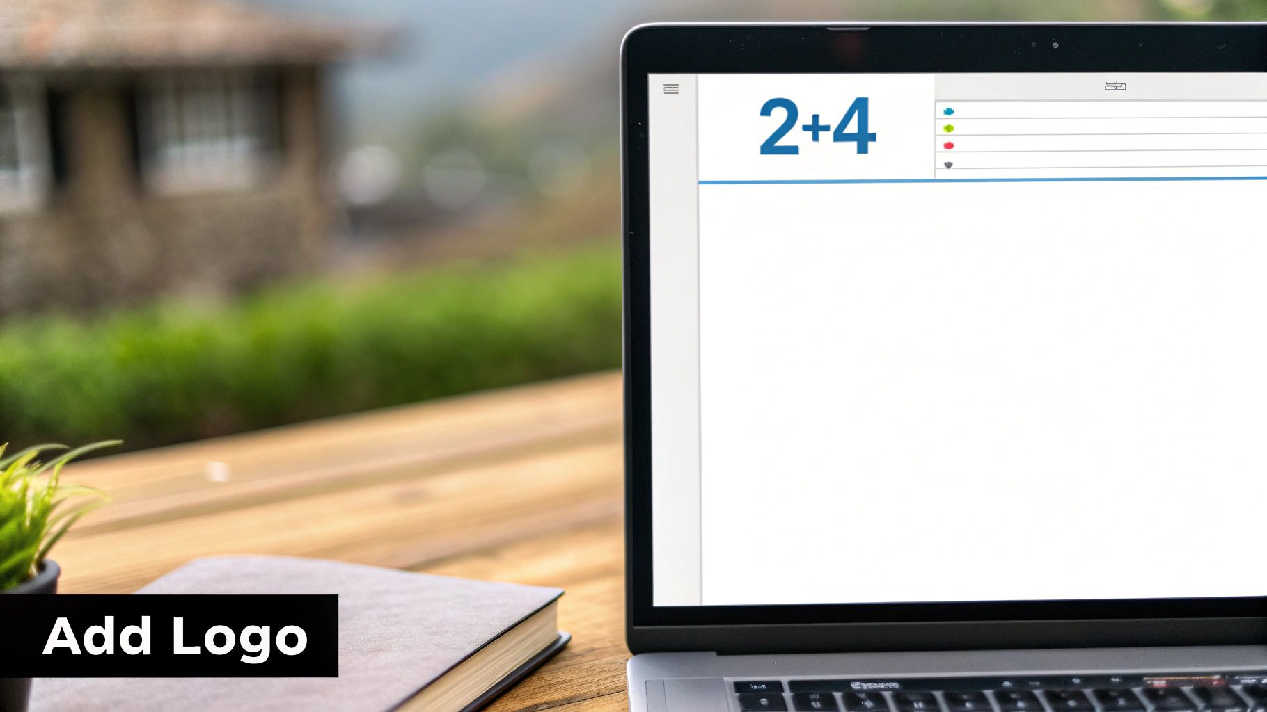
First things first: your logo. It’s the visual anchor of your letterhead. Head over to the Insert tab, click Pictures, and find your logo file.
Once it's in the header, it probably won't be in the right spot. Here's the key trick: select the image, go to the Picture Format tab, click on Wrap Text, and choose In Front of Text. This is a game-changer. It frees your logo from the normal text flow, letting you drag it exactly where you want it in the header.
A sharp, high-quality logo is non-negotiable here. If you're unsure about file types, our guide on choosing the right format can help: https://www.softriver.co/blog/logo-file-types-explained-how-to-choose-the-right-format
Next up, your contact details. You could just type them in, but for way more control, use text boxes.
- Go to Insert > Text Box and pick Draw Text Box.
- Draw separate boxes for your address and another for your phone and email. This makes arranging them a breeze.
- To get rid of the ugly default border, just right-click the text box, choose Format Shape, and under Line, select No line.
Pro Tip: Using text boxes isn't just a suggestion—it's essential. It locks your design in place, so when you start typing your letter, your beautifully crafted header won't suddenly jump around or reformat itself.
Aligning Your Design Elements
With your logo and text boxes on the page, the last step is to make it all look deliberate and professional. That means alignment.
As you drag your logo or text boxes, you'll see helpful green lines appear. These are Word's smart alignment guides, and they are your best friend. They help you snap objects perfectly to the page margins or line them up with each other. Use them! A perfectly aligned header looks clean and polished.
For companies serious about their image, this is where you can really shine. Learning how to create robust brand guidelines will give you a clear rulebook for your letterhead and everything else you produce. Consistency is what separates the pros from the amateurs, especially when you consider that over two million companies use Microsoft 365. You want your documents to stand out.
Giving Your Letterhead a Professional Polish
Okay, you’ve got the basics down. Now, let’s add the small touches that make your letterhead look less like a DIY project and more like something from a professional designer. These little tweaks in Word can really make your documents stand out.
Taming the Header for Multi-Page Documents
Here’s a common problem: your full letterhead looks great on the first page, but it's just too much on every page after that. Seeing your full address and contact info repeated over and over is distracting.
There’s an easy fix. Just double-click on your header area to bring up the Header & Footer tab. Look for an "Options" group and you'll find a checkbox labeled Different First Page. Go ahead and check it.
Key Takeaway: Checking "Different First Page" is a game-changer. It creates two distinct header areas: one for page one and another for all subsequent pages. This lets you have your full, impressive letterhead up front and a clean, simplified version everywhere else.
Refining the Details
Once you've enabled that first-page header, scroll down to the second page of your document. You'll see the header area is now blank, waiting for your input. This is the perfect spot for a more subtle design—maybe just a small version of your logo tucked into the right corner or a simple page number.
Don't forget the bottom of the page, either. A matching footer can tie the whole look together. You can add your website URL, a short tagline, or page numbers. Simply scroll to the bottom and click into the footer to add a text box or your desired info.
The fonts and colors you choose are just as important. For a professional feel, stick to one or two brand fonts that are clean and legible. If you're looking to dive deeper into font pairing, check out our guide on how to master typography for graphic design tips.
A simple horizontal line can also add a touch of class, creating a nice visual separation between your header and the document's content.
- To add one, just go to Insert > Shapes and pick the line tool.
- Pro Tip: Hold down the Shift key while you click and drag to draw a perfectly straight line.
- You can then change its color and thickness to perfectly match your branding.
You might notice that many modern designs are more minimalist, often using subtle colors. This isn't just a style choice; it also helps reduce printing costs and presents a more eco-friendly image. These small, thoughtful details are what make a document feel truly polished and professional.
Saving Your Design as a Reusable Template
You’ve put in the work to create a sharp, professional letterhead. Now, let's make sure you never have to do it again. Instead of the old copy-and-paste routine for every new document, the smart move is to save it as an official Word template.
This simple, one-time setup is a huge time-saver. By creating a template, you guarantee that every document your company sends out—from invoices to formal proposals—looks perfectly on-brand. Getting this right is a foundational step to help you organize your documents for effortless productivity and keep things consistent.
Creating Your Word Template File
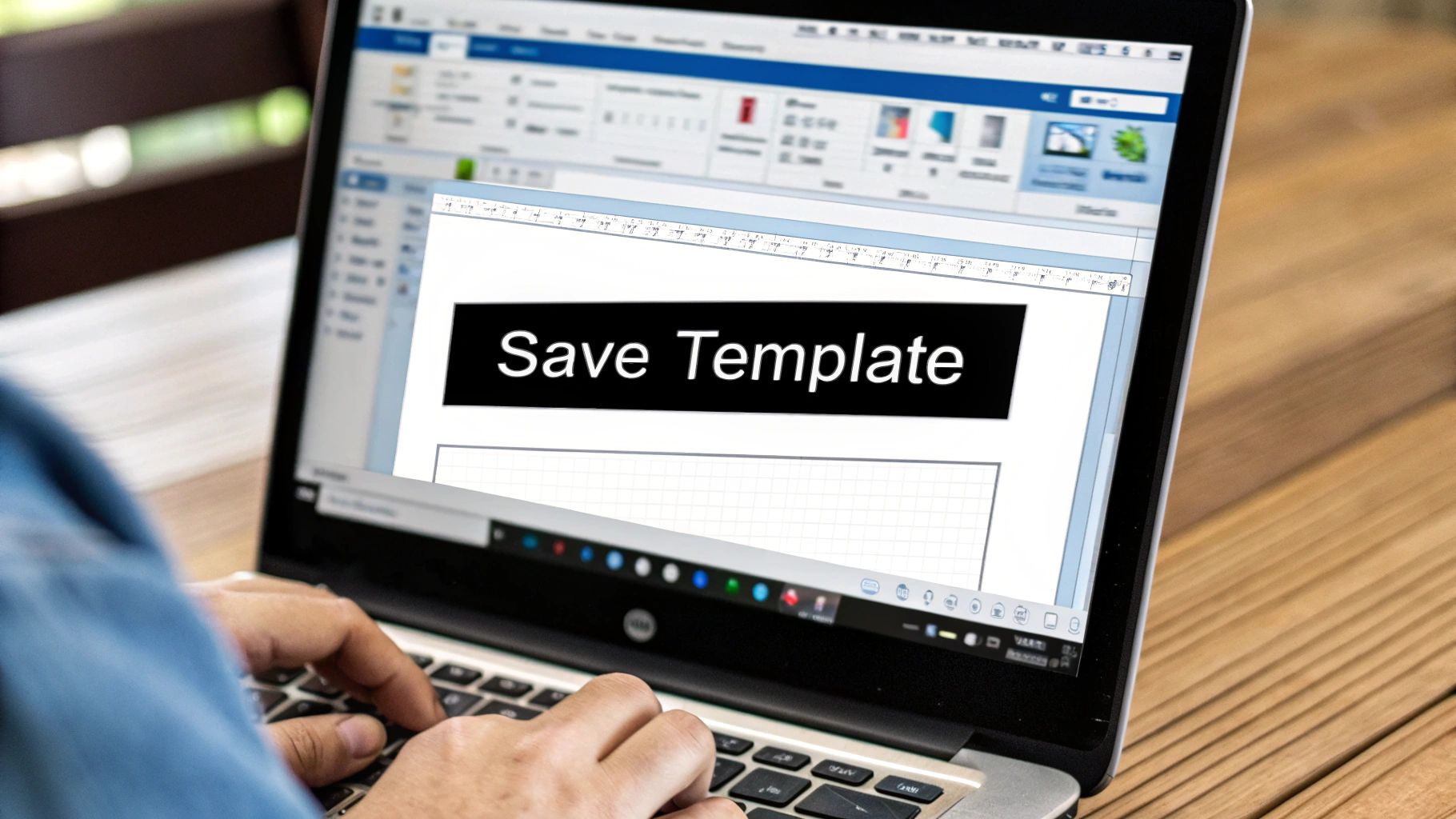
Ready to make it official? Head up to File > Save As. When the dialog box pops up, pause before you hit save. This next step is the most important one.
Find the Save as type dropdown menu and be sure to select Word Template (*.dotx). This little change tells Word that this isn't just another document; it's a blueprint for all future documents.
I always recommend giving the template a clear, descriptive name. Something like "Official Company Letterhead" or "Marketing Dept Letterhead" works great. You’ll notice that as soon as you select the *.dotx format, Word automatically tries to save it in a folder called Custom Office Templates. Just let it. Saving it here is the key to making it easy to find later.
Key Insight: Saving as a .dotx file is the secret sauce. This special format is what adds your design to the "New" document gallery, turning it into a permanent, one-click option for anyone on your team.
So, how do you use it? The next time you need to write a letter, just go to File > New. You should see a "Personal" or "Custom" tab right next to the standard templates. Click that, and your beautiful letterhead will be waiting for you, ready to go.
This is also the perfect way to make sure everyone on your team is using the correct branding. Just share the .dotx file, and you've instantly standardized your company's documents. For a deeper dive into this, our guide on https://www.softriver.co/blog/how-to-create-brand-guidelines-easy-step-by-step-guide is a great resource for maintaining that consistency.
Troubleshooting Common Letterhead Problems
Even the most carefully crafted letterhead can hit a snag in Microsoft Word. It's a frustrating experience, but don't worry—when things go wrong, it's usually due to a handful of common issues that are surprisingly easy to fix.
Let's walk through some of the classic problems I've seen over the years and how to solve them, so you can get that professional document out the door.
One of the biggest culprits is a blurry or pixelated logo. This almost always comes down to the quality of the image file you started with.
To get that crisp, professional look on-screen and on paper, you absolutely need to use a high-resolution image. I always recommend using a PNG file with at least 300 DPI (dots per inch) for the best results.
Fixing Layout and Printing Glitches
Another classic problem? Your beautifully placed letterhead suddenly shifts around the moment you start typing. This is a tell-tale sign that the elements in your header aren't properly anchored.
- Here's the fix: Right-click your logo or text box and navigate to Size and Position. In the Position tab, you'll see a checkbox for Lock anchor. Tick that box. This essentially pins the element to that specific spot, stopping it from jumping around.
You might also notice your header content overlapping with the main body of your document. It just looks messy and unprofessional, but it's a simple margin issue.
Quick Tip: While you're in the "Header & Footer" tab, find the "Position" settings. You can increase the "Header from Top" measurement to push your letterhead elements higher. Alternatively, jump over to the main "Layout" tab and increase your document's top margin to give your text more breathing room.
Finally, what happens when your letterhead doesn’t print all the way to the edge of the paper? This isn't a Word problem; it's a limitation of your printer. Most desktop printers can't print edge-to-edge and have a built-in non-printable area.
The best way to handle this is to design with it in mind. Keep your essential design elements at least 0.25 inches away from the edge of the paper to ensure nothing gets cut off.
Answering Your Top Questions About Word Letterheads
Even with a perfect guide, you're bound to run into a few tricky spots when building a letterhead in Microsoft Word. I've seen the same questions come up time and again, so let's tackle the most common ones right now.
How Do I Stop the Letterhead from Appearing on Page Two?
This is probably the most frequent question I get, and the fix is surprisingly simple. You want your full, beautiful letterhead on the first page, but a cleaner, simpler look for the rest.
Just double-click anywhere in the header area to bring up the Header & Footer tab. Look for the "Options" section and check the box next to Different First Page.
That one click tells Word to treat your first page's header and footer independently from all the others. Now you can have your main letterhead on page one and a streamlined version (or nothing at all) on every page that follows. It's a must for professional reports and multi-page letters.
Why Does My Letterhead Look Faded on the Screen?
Seeing your crisp logo suddenly turn pale can be alarming, but don't worry—it’s not a mistake. This is actually a helpful visual cue from Word.
When you're working on the main body of your document, Word intentionally grays out the header and footer content. It's just showing you that those sections are "locked" while you focus on typing. The moment you go to print or save it as a PDF, your letterhead will appear in its full, vibrant color.
My Advice: If you want to see what it will really look like, just use the Print Preview function (Ctrl+P or Cmd+P). This gives you an accurate snapshot of the final output.
Can I Use a Background Image for My Letterhead?
You definitely can, and it's a great way to add a subtle, professional touch. But instead of just inserting an image into the header, the best tool for the job is the Watermark feature.
Here’s how to do it right:
- Navigate to the Design tab.
- Click on Watermark, then choose Custom Watermark.
- Select "Picture watermark" and upload your image file.
The key is to make sure the Washout option is checked. This fades the image just enough so it sits gracefully behind your text, adding a layer of branding without making the document hard to read.
Ready to create a brand identity that stands out on every document? Softriver specializes in crafting custom logos and brand guidelines that make an immediate impact. Our team of expert designers delivers professional, market-aligned designs with a streamlined process and a 100% money-back guarantee. Get your professional branding started today.