
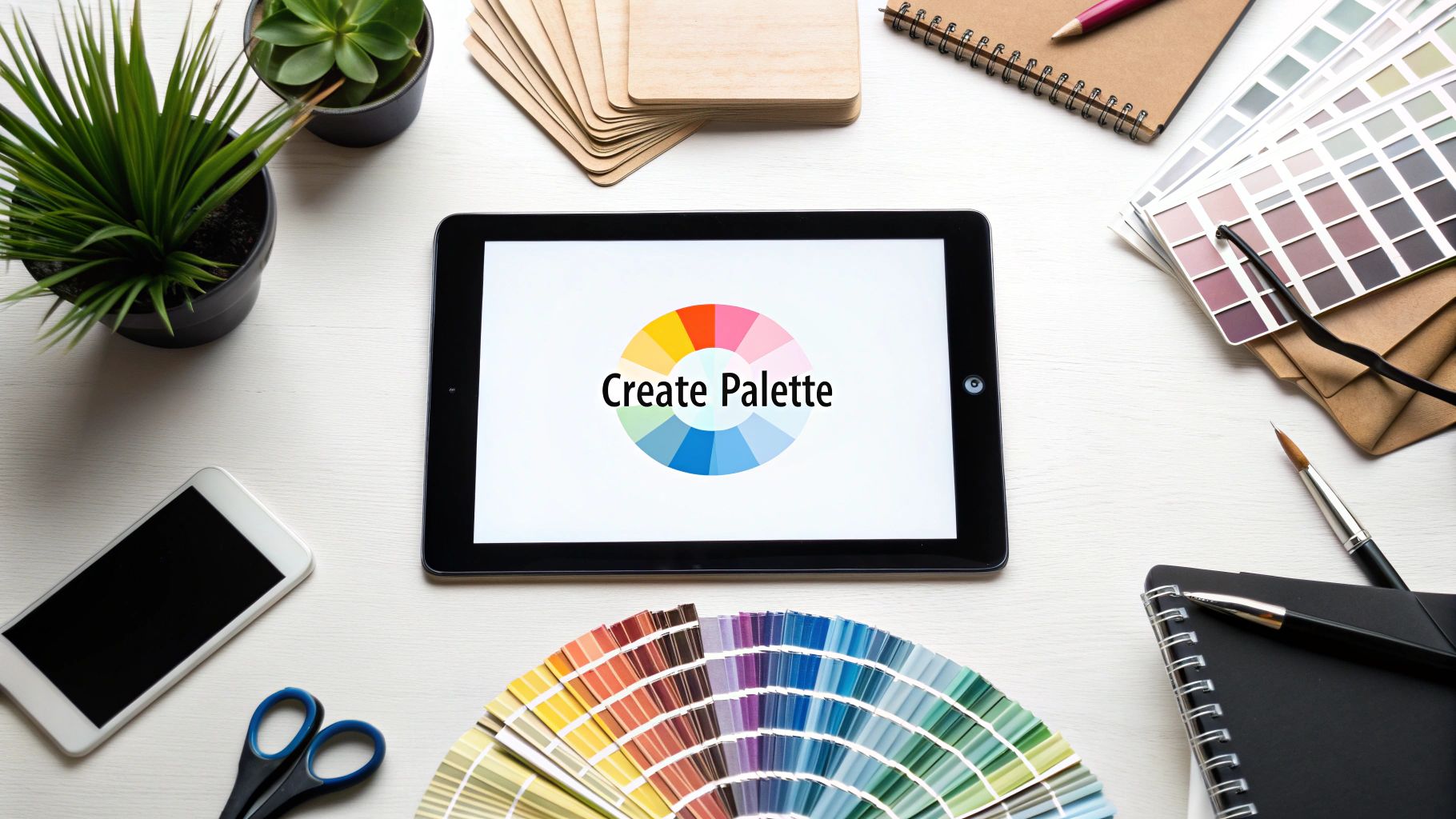
Creating a color palette isn't just about picking shades you like; it’s about crafting a strategic visual language that speaks for your brand. This is where art meets science—combining a gut feeling for what looks good with a solid understanding of color psychology to create something that’s both beautiful and effective.
Why Your Color Palette Defines Your Brand

Before we get into the "how," let's talk about the "why." Your color palette is often the very first impression someone has of your brand. It sets the entire tone for their experience, working as a silent communicator that shapes perception before they even read a single word.
Think about Spotify. That vibrant green and black combo feels energetic and modern—a perfect fit for music discovery. On the other hand, a bank like Chase uses a deep, dependable blue to project security and trust. These aren't random choices. They're intentional decisions designed to stir specific feelings and forge an instant connection with the right people.
The Psychology of Color in Action
Colors have real psychological weight and cultural meaning that can sway how people feel and act. A well-thought-out palette does way more than just make your website look pretty. It's a workhorse that helps you:
- Build Instant Recognition: Consistent colors make your brand stick in people's minds.
- Communicate Brand Personality: Are you playful and bold, or calm and sophisticated? Your colors tell that story at a glance.
- Influence Customer Decisions: The right colors can subtly guide a user's eye and nudge them toward taking action.
This isn't just design theory—it's proven. Brands with a signature color palette are recognized 80% more often than those with a chaotic or inconsistent look. Your palette is a powerful business asset, not just an aesthetic choice.
Turning Feeling into Function
The impact of color is backed by solid research. Studies show that between 48% and 85% of consumers believe color is a major factor in brand visibility and can even influence their decision to buy.
Getting this right from the start saves you from expensive and confusing rebranding efforts later on. It ensures every visual element is pulling its weight for your business. For a deeper look at this, check out our strategic guide to choosing colors for your brand. This foundational step is key to building a palette that's as smart as it is stylish.
Making Sense of Color Theory
https://www.youtube.com/embed/YeI6Wqn4I78
Let’s be honest, you don't need an art degree to pick great colors. But knowing a few key ideas from color theory can make a world of difference. It’s less about abstract rules and more about having a practical toolkit that helps you make smart decisions instead of just guessing what works.
Everything starts with the color wheel. At its core, color theory is simply a way to explain how we see colors and what happens when you mix, match, and contrast them. It gives you a logical framework for what can feel like an endless sea of options. Nailing these fundamentals is the secret to building palettes that are not just pretty, but powerful.
The Building Blocks of Color
Every single color you can imagine is built from three simple components. Once you get a feel for these, you'll be able to talk about and tweak colors with way more confidence. This is a game-changer when you're hunting for that perfect shade.
- Hue: This is what most of us mean when we say "color"—red, green, blue. It's the pure, unadulterated pigment before you add any white, black, or gray.
- Saturation: Think of this as the intensity or vibrancy of a hue. A highly saturated color is rich and bold, while a less saturated one looks more muted, subtle, or even grayish.
- Value (or Brightness): This is all about the lightness or darkness of a color. When you add white to a hue, you get a lighter value (called a tint). When you add black, you get a darker one (a shade).
Playing with these three elements is how you create depth and hierarchy. For example, a brand might use a super-saturated blue for a "Sign Up" button to grab attention, but a desaturated, lighter blue for a subtle background texture. To really see how these choices influence customers, you can master color theory in marketing and learn how to drive action.
Simple Frameworks for Combining Colors
Once you've got the basics down, you can lean on proven color relationships from the color wheel to build your palette. These frameworks, often called color schemes, are reliable starting points that take the guesswork out of the process.
You don't have to reinvent the wheel. These time-tested formulas are like recipes for great design—they guide you toward combinations that are almost guaranteed to work.
Here are a few of the most popular and effective schemes to get you started:
- Complementary: This is a high-impact approach that uses two colors directly opposite each other on the color wheel, like blue and orange or red and green. The high contrast is fantastic for making a specific element pop.
- Analogous: This scheme uses colors that are neighbors on the color wheel, like green, blue-green, and blue. The result is always serene and harmonious—perfect for creating a calm, cohesive feel.
- Triadic: A bit more dynamic, this involves three colors that are evenly spaced around the wheel, forming a perfect triangle. It delivers strong visual contrast while still feeling balanced and rich.
A Practical Method for Building Your Palette
So, you've got the color theory basics down. Now, how do you turn all that knowledge into a real, working color palette? It all starts with one crucial decision: choosing your anchor color.
Think of this as the cornerstone of your brand's visual identity. It's the one hue that captures the essence of who you are and what you stand for. It does most of the emotional heavy lifting. For a sleek new tech startup, that anchor might be a sharp, innovative electric blue. For an organic skincare line, it’s more likely to be a calming, earthy sage green. Take your time with this step—getting the anchor right makes everything else fall into place.
This quick visual breaks down how you can build out from that single anchor color.
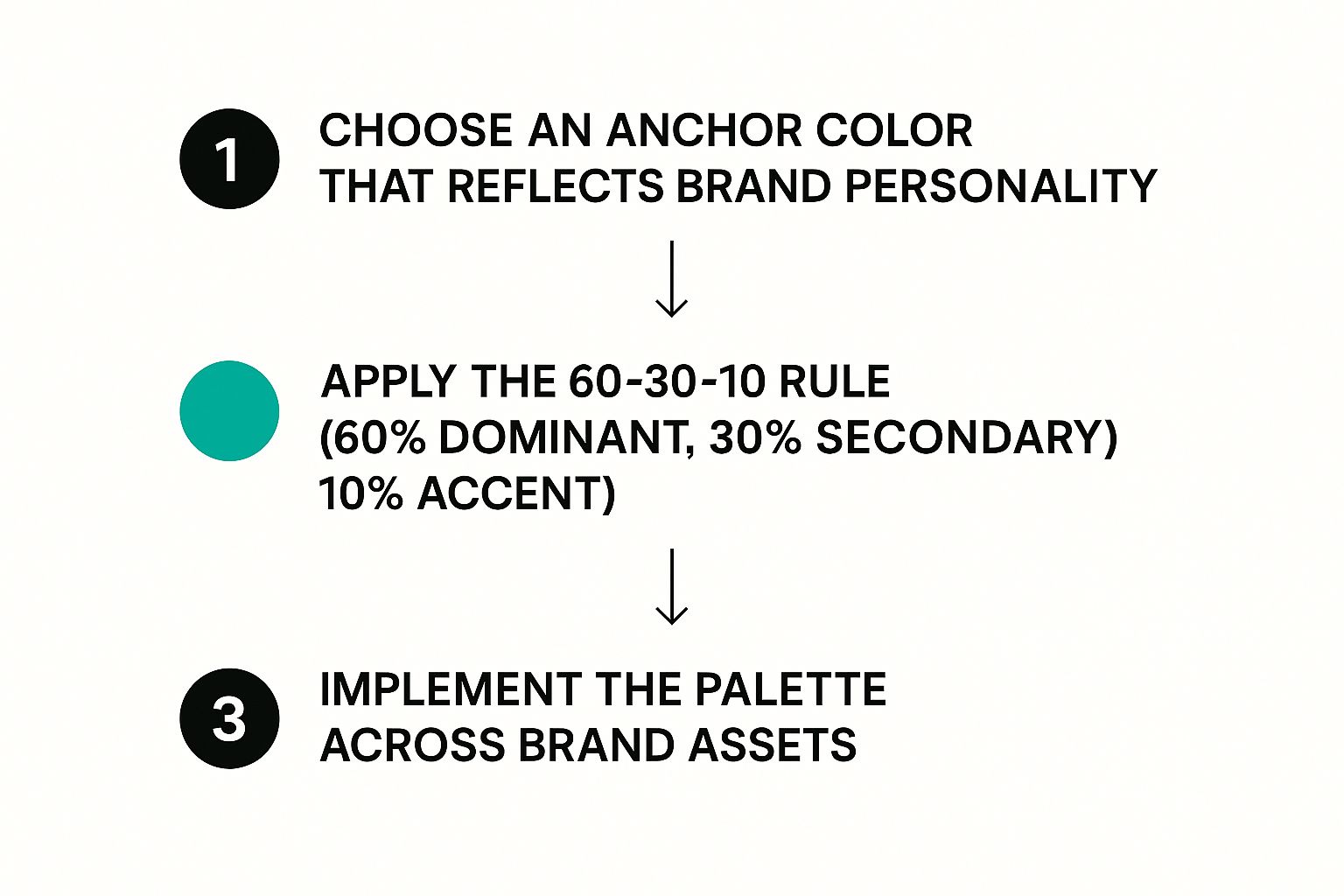
As you can see, the whole process flows logically, from defining your brand's personality to creating a balanced visual system you can actually use.
Applying The 60-30-10 Rule
With your anchor color set, the next move is to build a balanced palette using a tried-and-true design principle: the 60-30-10 rule. This isn't a rigid law, but it's an incredibly helpful guideline that stops your colors from clashing and creates a clear visual hierarchy. It just works.
Here’s the simple breakdown:
- 60% Dominant Color: This is your primary, most-used color. It's often a neutral like a soft gray, off-white, or a muted version of your anchor hue. It covers the most real estate—think website backgrounds—and sets the overall tone.
- 30% Secondary Color: This is usually your anchor color or another hue that complements it well. You'll use it to create contrast and highlight important information, like subheadings, key graphics, or secondary call-to-action buttons.
- 10% Accent Color: This is where the magic happens. It’s the boldest, most vibrant shade in your palette, saved for things that demand immediate attention. We're talking "Buy Now" buttons, important icons, or notifications.
This framework gives your colors specific jobs. Let’s go back to that tech company with the electric blue anchor. Their palette might use a clean, crisp white (60%) for backgrounds, their signature electric blue (30%) for feature sections, and a high-energy coral (10%) to make those "Get Started" buttons impossible to miss.
The 60-30-10 rule isn’t about limiting your creativity—it's about giving it structure. By assigning each color a purpose, you create a cohesive design that guides the user's eye exactly where you want it.
The real power of this rule is its versatility. You can see how different brands might interpret these percentages to achieve completely different vibes. A playful children's brand and a sophisticated law firm could both use the 60-30-10 rule, but their color choices would communicate vastly different messages.
The table below shows how this might look for a few different brand archetypes.
The 60-30-10 Rule in Practice
Notice how the dominant color is almost always a neutral? That’s what gives the other colors space to shine without overwhelming the viewer.
Real-World Scenarios
The same method can produce wildly different results depending on the brand. Let's revisit our organic skincare brand with its sage green anchor. Their take on the rule would create a totally different experience.
They might use a warm, creamy off-white as their 60% dominant shade to feel soft and inviting. The sage green becomes the 30% secondary color, appearing on product packaging and section headers. For their 10% accent, a rich, earthy terracotta adds a touch of warmth to "Add to Cart" buttons.
As you start playing around with your own palette, it can be really helpful to see how others approach it. Reading a guide on how to determine your color palette can offer some fantastic insights and spark new ideas. Ultimately, this simple but powerful method ensures all your colors work together in harmony.
Using Digital Tools to Find the Perfect Colors
You absolutely don't need to be a professional designer to pull together a great color palette. Honestly, with the incredible online tools available today, anyone can create beautiful, effective color combinations. These platforms take what used to be a really complex task and turn it into something genuinely fun and inspiring.
Many of the best tools are completely free and pack features that were once locked away in expensive design software. They can pull colors from a photo you love, let you browse palettes made by pros, or even spark new ideas with a single click. They do all the heavy lifting with color theory, so you can just focus on finding what looks and feels right for your brand.
Getting Started With Color Palette Generators
If you're wondering where to begin, I always recommend starting with platforms like Adobe Color and Coolors. Think of them as digital playgrounds for color. You can lock in one color you already know you want to use—maybe your main brand color—and the tool will instantly show you complementary, analogous, or triadic options that just work.
One of my favorite features, and one that’s incredibly useful, is the ability to extract a palette from an image. Just upload a photo that has the exact vibe you're going for. The tool will analyze it and pull out the dominant colors, handing you a perfectly harmonious palette on a silver platter.
Here’s a look at the Adobe Color wheel in action. It's designed to generate color schemes based on classic harmony rules.

As you can see, you can physically drag the points around the wheel. This gives you hands-on control to tweak the hue, saturation, and brightness until every color is just right.
Key Features to Look For
When you're trying out these tools, a few specific functions can make a huge difference. They’re what separates a list of pretty colors from a truly functional and professional palette.
- Accessibility Checkers: The best generators have built-in contrast checkers. They’ll immediately tell you if your text is readable against your background, which is crucial for meeting Web Content Accessibility Guidelines (WCAG).
- Export Options: A tool is only as good as its export function. Look for the ability to easily copy HEX, RGB, or CMYK codes. You can then hand these values straight to a designer or developer.
- Color Blindness Simulators: Some advanced tools will show you how your palette appears to people with different types of color vision deficiency. This is a simple but powerful way to make your designs more inclusive.
Here's a personal tip I always share: once you have a few palettes you like, don't commit right away. Live with them for a day or two. Mock them up on your website or create a quick social media graphic. Seeing your colors in a real-world context is the ultimate test.
Use Browser Extensions for On-the-Go Inspiration
Inspiration doesn't just happen when you're sitting at your desk. It can strike anywhere online. That's where browser extensions like ColorZilla or ColorPick Eyedropper come in handy. See a website with a color scheme you love? You can grab the exact color code with a single click.
This is a fantastic way to learn from what’s already working out in the wild. You can start building your own library of colors and combinations that you find compelling. From there, it's much easier to adapt those ideas into something that’s uniquely yours.
Once you’ve settled on a palette, jumping into beginner-friendly graphic design software feels a lot less intimidating because you already have a clear visual direction.
How to Test and Refine Your New Palette

Alright, you've built a palette that looks great on your screen. Now comes the hard part: making sure it actually works in the real world. This is where we pressure-test our choices to see if they're just pretty or if they're truly functional, accessible, and versatile enough for every place your brand shows up.
A color that sings on your high-res monitor can fall flat on a phone, look muddy in an Instagram post, or turn into something else entirely when printed on a business card. The goal here is to bridge that gap from a theoretical set of colors to a tough, reliable system that keeps your brand looking sharp and consistent, no matter what.
Practical Application and Context Testing
There's only one way to know if your palette has legs: put it to work. Before you lock anything in, you absolutely have to create mockups of your colors in their natural habitats. Don't just stare at swatches—apply them to actual designs.
- Digital Mockups: Drop your colors into a wireframe of your website. How does that bright accent color really look on a CTA button? Does your secondary color make subheadings pop or just fade into the background?
- Social Media Templates: Mock up a few sample graphics for Instagram or LinkedIn. You'll quickly find that bold, high-contrast combinations tend to grab attention much better in a fast-scrolling feed.
- Print Previews: If you're creating anything physical, from packaging to flyers, print your palette out. The shift from screen (RGB) to print (CMYK) can be dramatic, and it's better to find that out now.
To avoid any nasty surprises with printed materials, getting a handle on mastering color management in printing is a non-negotiable part of the process. It will save you a ton of headaches and money down the road.
Prioritizing Accessibility and Readability
A beautiful color palette means nothing if people can't read your text. Let me be clear: accessibility is not optional. It's just good design, plain and simple. The biggest piece of this puzzle is color contrast, especially between your text and its background.
Your design has to work for everyone, and that includes people with visual impairments. Using a free tool like WebAIM's Contrast Checker isn't a "nice-to-have"; it's a critical step to ensure your choices meet Web Content Accessibility Guidelines (WCAG) standards.
Just plug in the HEX codes for your text and background. The tool spits out a contrast ratio and a simple pass/fail grade. You're shooting for a ratio of at least 4.5:1 for normal-sized text. This one simple check makes your message clear and accessible to the widest possible audience.
It’s also smart to keep an eye on what’s working out in the wild. For example, while current data shows 65% of consumers lean toward minimalist designs, we also know that strong contrast pairings can boost social media interaction by 40–50%. This just shows the balancing act between clean aesthetics and performance-driven design.
Got Questions About Color Palettes? I've Got Answers.
As you get your hands dirty with color, a few questions always seem to pop up. Trust me, I've heard them all. Getting straight answers to these common sticking points is the key to finalizing your palette with confidence and actually using it well.
Let's cut through the noise. Here are the most frequent questions I get asked during the color selection process, from "how many?" to "can I change my mind later?"
How Many Colors Should I Actually Use?
For most brands, the sweet spot is three to five colors. This gives you enough flexibility to create interesting, dynamic designs without overwhelming your audience or making things look messy.
A solid, practical palette usually breaks down like this:
- One Primary Color: This is your hero, the color that does most of the talking and defines your brand's personality.
- One or Two Secondary Colors: These are your supporting actors. They complement the primary color and are great for subheadings, icons, and background textures.
- One or Two Accent Colors: Think of these as your highlighters. They’re the bold, high-impact shades you save for calls-to-action, buttons, or anywhere you need to grab someone's attention.
Following this kind of structure gives your designs a clear hierarchy and the consistency you need to build a recognizable brand.
Where Can I Find Good Color Inspiration?
Honestly, inspiration is everywhere once you train your eye to look for it. A fantastic starting point is to create a mood board on a site like Pinterest. Pin anything and everything that captures the feeling you're after—don't just look at other logos! Landscapes, interior design, fashion, and art are often where the real gems are.
Digital tools can also be a goldmine. The 'Explore' tab on Adobe Color, for instance, is packed with thousands of palettes from other designers that you can filter by keyword. And don't forget to check out your competitors. See what they're doing and decide: do you want to fit in, or do you want to break the mold?
The biggest mistake I see is people looking for inspiration in just one spot. The truly great palettes often come from mashing up ideas from different worlds—like the muted tones from a nature photo paired with a single, vibrant color from a piece of modern art.
How Do I Make Sure My Colors Are Accessible?
This one's not optional. Making your colors accessible is a must, and the most critical piece of the puzzle is the contrast ratio between your text and its background. If the contrast is too low, people with visual impairments simply can't read your content.
The Web Content Accessibility Guidelines (WCAG) set the standard here: a minimum contrast ratio of 4.5:1 for normal text.
You don’t have to guess. Free tools like WebAIM's Contrast Checker make it incredibly simple. Just plug in the HEX codes for your text and background, and it will tell you instantly if you pass. Make sure you test all your main color combinations.
Is It Okay to Change My Brand Colors Down the Road?
Yes, but tread carefully. Brands evolve, and so do their colors. But a sudden, dramatic shift can confuse your audience and dilute all the brand recognition you've worked so hard to build.
Most of the time, established brands go for a color refresh, not a complete overhaul. This could mean slightly tweaking the saturation of your current colors, adjusting a shade here or there, or maybe introducing a new secondary color to feel more current.
If you do need a major change because your entire brand strategy is shifting, you absolutely need a communication plan. You have to guide your audience through the transition and explain the "why" behind it.
Ready to build a brand identity that stands out? The expert designers at Softriver craft custom logos and complete brand ecosystems that make an immediate impact. Get your professional brand identity today.