

A great logo isn't just born from a spark of creative genius. It’s built on a solid foundation of strategy. Before you even think about picking up a pencil or opening up design software, you need to do some foundational work.
This is the part that separates a good-looking logo from one that actually works for your business. It's about building a creative brief that becomes your roadmap, ensuring every choice you make is intentional.
Think about it: 75% of consumers recognize a brand by its logo alone. That’s a massive number. And it gets better—brands that are visually consistent can see their revenue jump by an average of 23%. On the flip side, 60% of people will actively avoid brands with logos they find odd or unappealing. This isn't just about aesthetics; it's a core business decision.
Building Your Brand’s Visual Foundation
So, where do we begin? Not with design, but with identity.
Define Your Core Brand Identity
First things first, you need to look inward. What is your business all about? Your logo is the visual summary of your brand's entire story, so you better know that story by heart. It’s not just what you sell, but why you sell it.
To get started, try thinking of your brand as a person. What’s its personality?
- Is it playful and energetic, or more serious and trustworthy?
- Does it feel modern and innovative, or traditional and classic?
- Is the vibe luxurious and exclusive, or affordable and accessible?
Nailing down these traits helps set the emotional tone your logo needs to hit. This is a critical piece of creating a strong brand identity that connects with people before they even know what you do.
To help you get clear, use this quick checklist to hash out the basics.
Core Brand Identity Checklist
Use this checklist to define the fundamental elements of your brand before you start the design process.
Answering these questions gives you a solid base to build from, ensuring your logo truly reflects who you are.
Pinpoint Your Target Audience
Remember, this logo isn't for you. It's for your customers. To design something that resonates, you absolutely have to know who you're talking to. What do they care about? What visuals do they gravitate towards?
A logo for Gen Z tech founders will look completely different from one aimed at retirees planning luxury cruises. For instance, a fintech app targeting millennials might go for bold, clean fonts and a bright color scheme to feel fresh and simple. A wealth management firm, however, would likely lean into a classic serif font and a muted color palette to signal trust and legacy.
This whole strategic process—from defining your brand to understanding your audience and competition—is what leads to a logo that sticks.
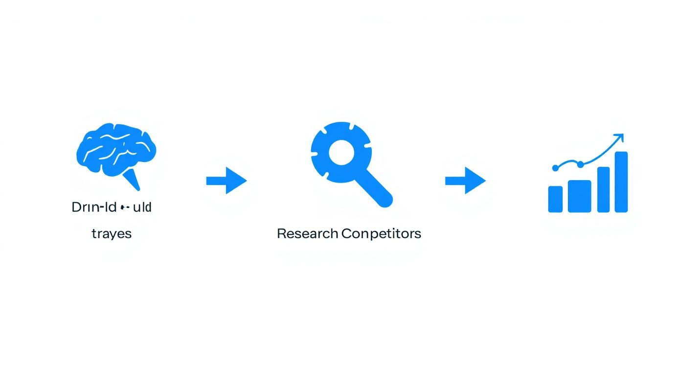
As you can see, a successful logo comes from a clear, step-by-step plan, not just a random stroke of inspiration.
Analyze Your Competitors
Finally, it's time to do a little recon. Check out the logos of other players in your space. The goal here isn't to copy anyone, but to spot opportunities to stand out.
Are they all using the same shade of blue? Do their logos all feature a similar icon? Take notes. These patterns are your chance to break the mold and create something people will actually remember.
If you want to organize your findings and inspiration visually, our guide on how to create a brand mood board that actually works is a great next step: https://www.softriver.co/blog/how-to-create-a-brand-mood-board-that-actually-works.
Once you’ve done this homework, you’ll have a clear, actionable plan to guide you toward a logo that isn't just a pretty picture, but a powerful business asset.
Turning Ideas Into Visual Concepts
Alright, with your brand strategy nailed down, it's time for the fun part: turning all those words and ideas into actual visuals. This is where the creative magic happens, and you absolutely don't need to be a professional artist to get it right. The goal here is just to explore, to throw everything at the wall and see what sticks.
Seriously, don't edit yourself. The first order of business is simply getting thoughts out of your head and onto paper (or a screen). This isn’t about making a final product; it’s about creating a huge sandbox of raw ideas to play in. At this stage, quantity beats quality every single time.
From Brainstorming to Mood Boards
A fantastic way to get the ball rolling is with a mind map. Just put your core brand concept in the middle of a page—let’s say, "eco-friendly kids' toys"—and start branching out. Jot down any related words, feelings, or images that pop into your head: nature, growth, play, safe, wood, leaves, laughter, imagination.
This simple exercise helps you build a web of connected ideas, often sparking visual directions you wouldn't have thought of otherwise. Once you have this, you can start building a mood board. This is basically a collage of images, textures, colors, and fonts that capture the feeling you're going for. It's your brand's personality, visualized.
A mood board is your visual compass. It keeps you honest, making sure every sketch, font, and color you choose actually lines up with the brand identity you worked so hard to define.
Think of it as setting the stage. You're establishing the emotional tone and visual language before your logo, the main character, even shows up.
Sketching Your First Logo Ideas
Now, grab a pencil and paper. I know it sounds old-school, but the freedom and speed of sketching by hand is just unbeatable for getting a flood of ideas out quickly. Your mission is to fill a few pages with dozens of small, rough "thumbnail" sketches.
Don't spend more than a minute on each one. The whole point is to rapidly cycle through different styles and see what feels right. Try a few of these common approaches:
- Wordmarks: Just focus on your company name. How does it feel in a bold, modern font versus a classic, elegant serif?
- Letterforms: Could you make a single initial memorable? Think of the 'M' for McDonald's or the 'N' for Netflix.
- Abstract Marks: Explore simple shapes that suggest a feeling. The Nike swoosh is the perfect example—it screams motion and speed without being a literal picture of a shoe.
- Combination Marks: This is often the safest and most flexible route for new businesses. Try pairing a simple icon or symbol with your brand name.
For instance, a sustainable coffee brand might sketch a leaf icon inside the letter 'O', try out a wordmark with a soft, earthy font, or draw an abstract shape that looks like a steaming cup. If you want to go deeper on this, our guide on how to sketch logo ideas has some great hands-on techniques.
Identifying Your Strongest Concepts
Once you've filled a few pages, step away. Go get a coffee, take a walk, whatever. Come back with fresh eyes and start circling the sketches that jump out at you. But don't just pick the ones that look the "coolest." You need to judge them against your brand strategy.
For each promising sketch, ask yourself these crucial questions:
- Is it Simple? A great logo is recognizable in a split second. If it’s too busy, people won't remember it.
- Is it Memorable? Does it have a little something—a clever twist or unique shape—that makes it stick in your mind?
- Is it Appropriate? Does the style actually fit your brand and your audience? A playful, cartoonish logo won't work for a high-end law firm.
- Is it Timeless? Try to steer clear of hot design trends. You want a logo that will still look good in 5 or 10 years, not one that will look dated by next Christmas.
- Is it Versatile? Picture it everywhere: on your website header, as a tiny social media icon, on a t-shirt. Will it work in all those different places and sizes?
By the end of this process, you should have filtered your dozens of doodles down to just two or three strong contenders. These are the concepts that have real potential, the ones you'll take to the next stage for digital refinement. It's this deliberate process of wide exploration followed by critical filtering that turns a vague idea into a truly effective design.
Choosing Your Logo’s Color and Typography
You’ve explored a few concepts and now have a handful of strong, black-and-white contenders for your logo. Great! The next step is where the real personality comes in: adding color and typography. These two elements are the emotional core of your design. They give your logo a voice and tell your audience how to feel about your brand before they’ve even read a single word.
This isn’t just about picking your favorite color or a font that looks cool. It’s a strategic choice, one that’s grounded in psychology and solid design principles. The right combination can make your logo instantly recognizable and memorable. The wrong one can send a completely mixed message.
The Psychology of Color in Logo Design
Color is a language all its own. Different hues trigger very specific emotions and associations in our brains, and understanding this can give your logo a massive advantage right out of the gate.
The data backs this up. A well-chosen color can boost brand recognition by up to 80%. The world's top brands get this. You'll see blue, a color associated with trust and reliability, in 33% of their logos. Black and grayscale tones are close behind at 28%, often picked for their timeless and versatile appeal.
What’s really telling is that 95% of these leading brands use just one or two colors. It's proof that when it comes to logos, simplicity is almost always the most effective path.
Here’s a quick rundown of what some common colors communicate:
- Red: Passion, excitement, and urgency. It’s a bold choice perfect for brands that want to grab attention, like Netflix or Coca-Cola.
- Blue: Trust, stability, and professionalism. This is why it's so popular among tech companies and financial institutions like IBM and PayPal.
- Green: Nature, growth, and health. It’s a natural fit for brands focused on wellness, sustainability, or finance—think Whole Foods or John Deere.
- Yellow: Optimism, happiness, and energy. Think of brands like McDonald's and Snapchat that want to create a friendly, positive vibe.
- Black: Sophistication, power, and luxury. It’s often used by high-end fashion and lifestyle brands like Chanel and Nike to create a classic, premium feel.
Your color palette should directly support the brand personality you defined earlier. A playful, energetic brand would feel disconnected with a serious, muted color scheme, no matter how beautiful the design is.
My advice? Start with one primary color that anchors your brand and then add one or two secondary colors for accents. This approach keeps your logo clean and versatile.
Selecting the Right Typography
If color is the emotion, typography is the voice. The font you choose says a lot about your company's personality, from its style to its readability. Getting this right is a crucial part of creating a logo that truly connects with people.
There are three main font families you'll be working with:
- Serif Fonts: These have small "feet" at the ends of the letters. They feel traditional, trustworthy, and established. Think of brands like Tiffany & Co. or The New York Times.
- Sans-Serif Fonts: Lacking the "feet," these fonts are clean, modern, and straightforward. They are incredibly popular for their readability on screens and are used by Google, Airbnb, and countless others.
- Script Fonts: These mimic cursive handwriting and can feel elegant, personal, or creative. They're great for adding a human touch, as seen in the logos for Instagram and Coca-Cola.
Finding the Perfect Font Pairing
Pairing fonts is a delicate balance of contrast and harmony. You want fonts that are different enough to create some visual interest but complementary enough that they don't clash.
Typography is a huge piece of your logo's identity. For more in-depth guidance, I recommend exploring resources on pairing the right fonts for your logo. A good rule of thumb I often follow is to pair a serif with a sans-serif, or a bold, decorative font with a simple, clean one. This creates a clear hierarchy and makes sure your brand name is always easy to read.
Ultimately, your typography and color choices have to work together to tell your brand's story. It's time to test different combinations on your strongest concepts and see which pairing best captures the unique essence of your business.
Refining and Vectorizing Your Design
You've sketched out a bunch of ideas, and now, one of them is jumping off the page. It just feels right. That's a fantastic milestone, but the journey from a pencil drawing to a polished, professional logo isn't over yet. It’s time to bring your design into the digital world—the right way.
This part of the process is all about precision, refinement, and making sure your new logo is ready for anything.
Here, we'll turn that hand-drawn concept into a clean, scalable digital file. It’s a bit technical, but this step is what gives your logo the power to look sharp absolutely everywhere.
Why Vector Is a Non-Negotiable
Before getting into the nitty-gritty, you need to understand why we're doing this. Your logo absolutely must be created as a vector graphic, not a raster image like a JPG or PNG. Raster images are made of tiny squares called pixels. When you try to make them bigger, they get blurry and jagged—a dead giveaway of an amateur design.
Vector graphics, on the other hand, are built with math—points, lines, and curves defined by equations. This means you can scale a vector file to any size imaginable, from a tiny website icon to a massive billboard, and it will never lose quality. This infinite scalability is the gold standard for a modern logo.
Think of your vector file (formats like SVG, AI, or EPS) as the master key to your brand identity. It guarantees your logo looks crisp and professional in every application, protecting your brand’s reputation.
This is exactly why pros use software like Adobe Illustrator or Affinity Designer. These tools give you the pinpoint control you need to get every detail just right.
The Process of Digitizing and Refining
First things first, get your sketch onto the computer. You can either scan it or just snap a high-quality photo with your phone. Once it’s imported into your design software, drop it onto its own layer, lock it, and turn down the opacity. This will be your tracing guide.
Now, using tools like the Pen Tool, you’ll meticulously trace over your sketch, building the logo with clean lines and perfect shapes.
But this isn't just a simple trace job. As you go from sketch to vector, you'll be making dozens of tiny but crucial tweaks. This is your opportunity to sand down the rough edges, fix any wobbly lines from the original drawing, and make sure the whole thing feels balanced and intentional.
Keep a sharp eye on these details:
- Perfecting Curves: Are your arcs smooth and flowing, or are they a little bumpy? A wonky curve can make a whole logo feel off.
- Kerning and Spacing: If you have text, you'll need to manually adjust the space between each letter—a process called kerning. Good kerning makes your brand name look cohesive and easy to read.
- Line Weight Consistency: Are all the lines the same thickness? If not, does it look like a deliberate stylistic choice, or just a mistake?
- Compositional Balance: Zoom out and look at the whole picture. Pay attention to the negative space. Does one element feel too heavy or overpowering?
Refining is an iterative dance. You’ll zoom way in to nudge a single anchor point, then zoom way out to see how it affects the overall design. It’s this meticulous work that elevates a good idea into a truly great logo.
Creating Your Essential Logo Variations
One logo is never enough for the real world. A truly flexible brand needs a small family of logo variations that work in different spaces and layouts. Once your primary logo is locked in, the very next thing you should do is create these key alternates.
Here are the must-haves for any professional logo package:
Building these versions from day one will save you so many headaches later on. It means that no matter where your logo needs to show up, you’ll have a professional, on-brand option ready to go. This kind of foresight is what separates a decent logo from a lasting and effective brand identity.
Preparing Your Logo for the Real World
https://www.youtube.com/embed/qSkhaLNKdX0
Alright, your logo is vectorized, polished, and looking sharp on your screen. But a design isn't truly finished until you've confirmed it can survive out in the wild. This is the final, crucial stage where we test its resilience and bundle up all the files you’ll ever need.
Think of it as putting your logo through boot camp before sending it into the world. This is what ensures your new visual identity looks professional and consistent, no matter where it shows up.
Put Your Logo Through a Stress Test
It's easy to fall in love with a design on a clean, white artboard, but that’s not where it's going to live. Before you even think about exporting files, you have to see how your logo holds up in the real world.
Here’s a quick checklist I run through with every logo project:
- The Shrink Test: How does it look as a tiny social media profile picture or a website favicon? Is it still recognizable or does it turn into an unreadable smudge?
- The Billboard Test: On the flip side, what happens when you scale it way up for a presentation slide or a banner? Does it still look crisp and strong?
- The Background Test: Drop your logo onto light backgrounds, dark backgrounds, and even busy, colorful photos. This is where your one-color versions (all-black and all-white) prove their worth.
- The One-Color Challenge: Does the design fall apart without its colors? A truly strong logo is recognizable even in a single color, which is critical for things like embroidered shirts or branded merchandise.
A great logo is like a great actor—it should be able to perform well on any stage. If it only works in a perfect, controlled environment, it’s not ready for the spotlight of your brand.
This testing phase almost always reveals small tweaks that make a huge difference in the final result.
Building the Perfect Logo Package
Once you’re confident the design is bulletproof, it’s time to create the full set of files your business will need for years to come. Handing over the right file for the right job is a pro move that will save you and your team a ton of headaches down the line.
The need for this versatility is more important than ever. If you look at the latest directions in logo design trends on wix.com, you'll see a major push toward simplicity. Brands like TikTok show how clean, minimal designs work better on small screens. That less-is-more approach demands a logo that’s flexible enough for any modern platform.
So, what files do you actually need in your brand toolkit? Let's break it down.
Your Logo File Type Cheat Sheet
Having a well-organized folder with every necessary format means you're ready for anything, whether a printer asks for a vector file or your web developer needs an SVG. Each file type has a specific job.
This quick-reference table breaks down the most common logo file types and where you should use them.
Knowing the difference between these is key to keeping your brand looking sharp everywhere. For a more detailed breakdown, check out our complete guide on choosing the right logo file format.
By methodically testing your design and exporting a complete set of versatile files, you’re not just finishing a logo—you’re equipping your brand for success.
A Few Common Logo Design Questions
Even with the best roadmap, you're bound to hit a few questions on the logo design journey. It’s completely normal. From figuring out a realistic budget to knowing what separates a decent logo from a truly iconic one, getting clear answers can make all the difference.
Let's walk through some of the most common questions that come up.
How Much Should a Professional Logo Actually Cost?
This is the big one, right? The honest answer is that the price tag can be all over the map. You’ve got free DIY tools on one end and massive agency projects that run into the tens of thousands on the other.
For most small businesses, the sweet spot is usually found with a professional freelance designer. You can expect a quality logo package from an experienced freelancer to land somewhere between $300 and $1,500. The final price often comes down to their experience level, how complex your vision is, and the number of revisions included in the project.
Think of your logo as a long-term investment, not a one-time expense. It’s the face of your brand, working around the clock to build trust and recognition. Budgeting for quality design will pay for itself for years to come.
What Are the Biggest Mistakes I Should Avoid?
Knowing what not to do is half the battle. So many brands, especially when they're just starting out, stumble into the same predictable traps.
Here are the three big ones to watch out for:
- Overly Complicated Designs: A busy logo is a forgettable one. If people can't process it at a glance, it's failing. Simple is almost always more memorable and definitely more versatile.
- Riding the Trend Wave: What feels cool and modern today can look painfully dated tomorrow. Your goal should be a timeless design that will still look sharp in five or ten years, not something that just copies the latest fad.
- Using the Wrong File Types: This is a huge technical mistake. If your primary logo file is a raster image (like a JPG or PNG), you're setting yourself up for failure. It will look pixelated when you try to resize it. Always, always start with a vector format for infinite scalability.
Should I Just Design My Own Logo or Hire Someone?
This really comes down to a classic trade-off: your budget versus your time and expertise. Using an online tool to design a logo yourself is a valid option if you're just getting started and the budget is tight. It can absolutely get you a basic visual identity to get things rolling.
But hiring a professional designer brings a whole different level of insight to the table. A pro doesn't just make pretty pictures; they understand brand strategy, the psychology of color, the subtle art of typography, and all the technical specs needed for a logo that works everywhere. If your brand’s image is a critical piece of your business puzzle, investing in a professional is almost always the right move.
What Really Makes a Logo Design Great?
So, what’s the secret? What elevates a logo from "good enough" to "great"? It really boils down to five fundamental principles. A great logo is:
- Simple: You can recognize and understand it in a fraction of a second.
- Memorable: It has that unique spark that helps it stick in someone's mind.
- Timeless: It sidesteps fads and will remain effective for years.
- Versatile: It looks fantastic whether it's tiny on a business card or huge on a billboard.
- Appropriate: It feels right for your industry and speaks directly to your target audience.
At the end of the day, a great logo instantly communicates who you are and what you stand for, creating a connection before you’ve even said a word.
Ready to get a professional logo that truly represents your brand, without all the guesswork? The expert designers at Softriver deliver custom, high-quality logos and brand identities, with a guaranteed 48-hour turnaround. Get a timeless design that sets your business up for success. Learn more and get started at Softriver.