
Before you even dream of picking a color palette or a font, you need a plan. Great banner ad design isn't just about making something that looks good; it's about building a strategic tool that gets real results. Skipping this foundational step is the fastest way to create an ad that gets scrolled past and forgotten.
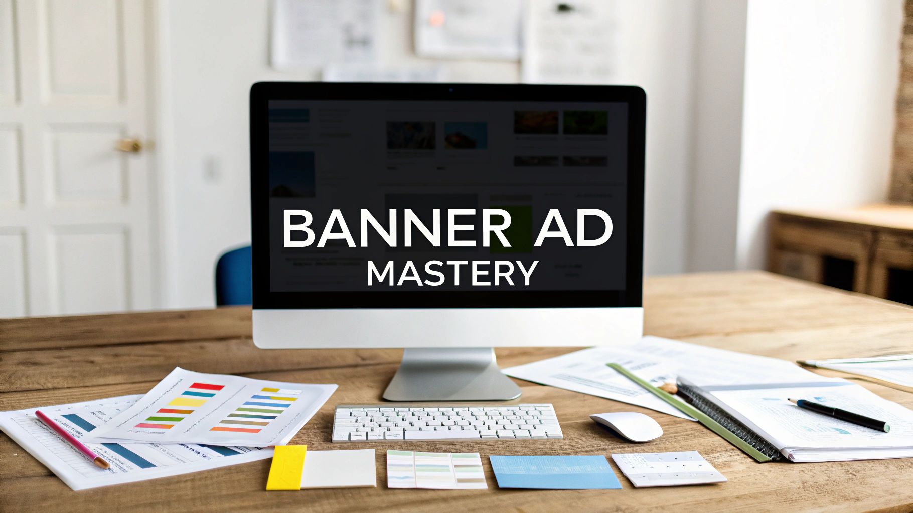
Building a Banner Ad Strategy That Works
The best banner ads are never a happy accident. They start with a focused strategy that answers a few critical questions long before any design software gets opened. This blueprint is what ensures every single design choice has a purpose, guiding your audience to take a specific action.
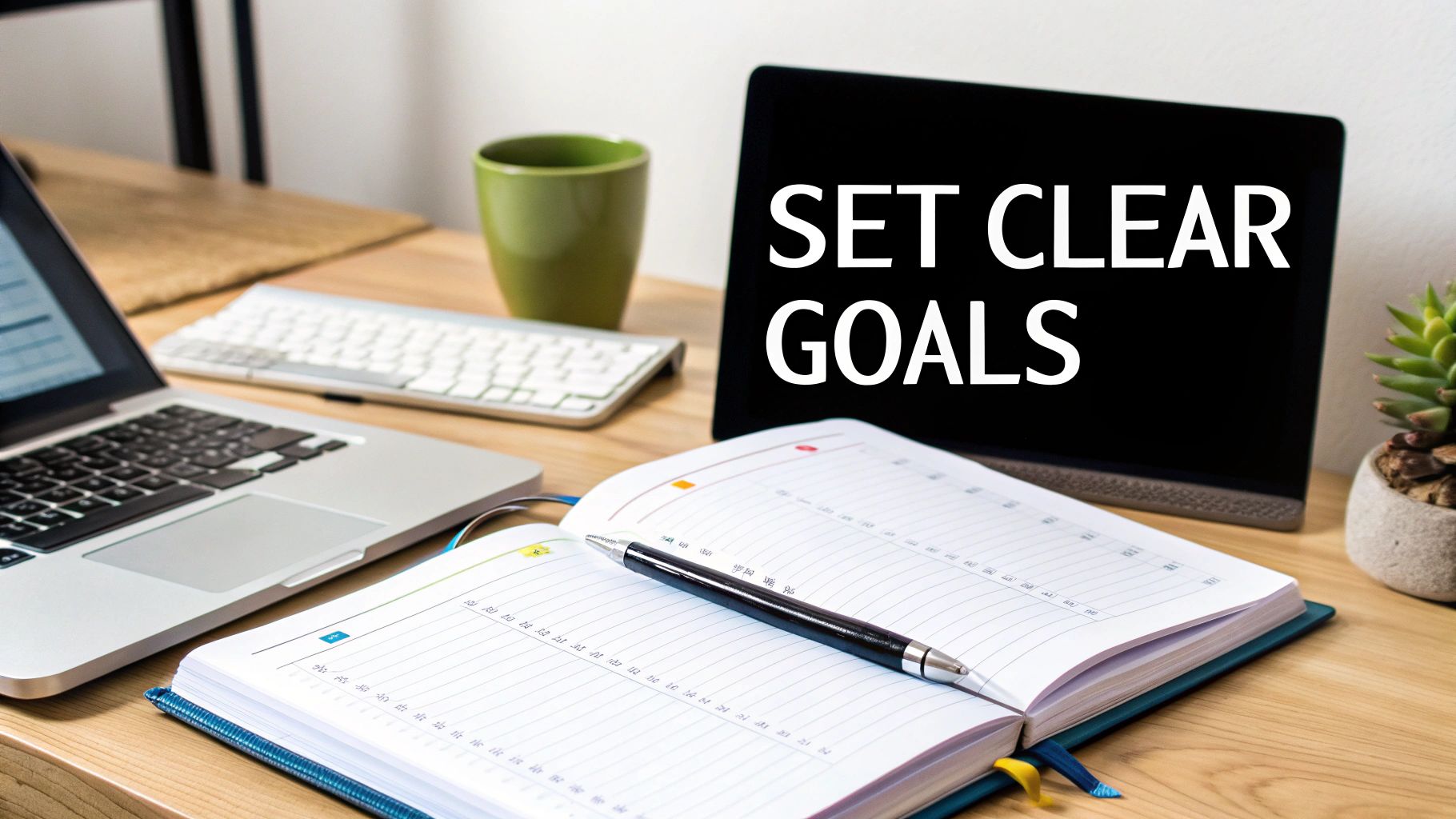
The very first thing you need to do is lock in a single, primary objective. If you try to do everything at once—boost brand awareness, generate leads, and drive sales—your message will be a confusing mess. Pick one clear goal for the campaign.
- Brand Awareness: Here, it's all about visibility. Your logo needs to be front and center, paired with a simple, memorable message about who you are.
- Lead Generation: The focus pivots to offering value. You're giving something away—a free guide, a webinar spot, a consultation—in exchange for their contact info.
- Direct Sales: This is purely about the offer. You need to highlight a can't-miss discount, a limited-time deal, or a product benefit that makes them want to buy right now.
Knowing Your Audience and What They Need
Once you know your goal, you have to figure out who you're talking to. A truly effective banner ad connects with the specific needs and pain points of your target audience. You have to ask yourself: What problem am I solving for them? What actually motivates them to act?
Think about it this way: a software company trying to reach busy project managers should build its ad around efficiency and saving time. On the other hand, an e-commerce brand selling eco-friendly soap should appeal to the customer's values with natural imagery and messaging about sustainability.
When your design is aligned with what your audience actually cares about, you create a genuine connection. This kind of strategic thinking is a key piece of many digital marketing strategy frameworks that help businesses sync their marketing with what customers want.
A banner ad is a conversation starter. If you don't know who you're talking to or what you want to say, the conversation will end before it even begins.
Nailing the Value Proposition and Call-to-Action
Finally, your strategy needs two non-negotiable elements: a clear value proposition and a compelling call-to-action (CTA). Your value proposition is the short, punchy statement that answers the viewer's immediate question: "What's in it for me?" It's the core benefit you're offering them.
The CTA is the instruction that tells them exactly what to do next. It has to be impossible to miss. Use strong, action-oriented words like "Shop Now," "Get Your Free Trial," or "Learn More." A powerful CTA creates a sense of urgency and clarity, making it effortless for someone to go from seeing your ad to taking the next step. Without it, even the most beautiful design is just a passive billboard on the digital highway.
Designing for Attention with Visual Hierarchy
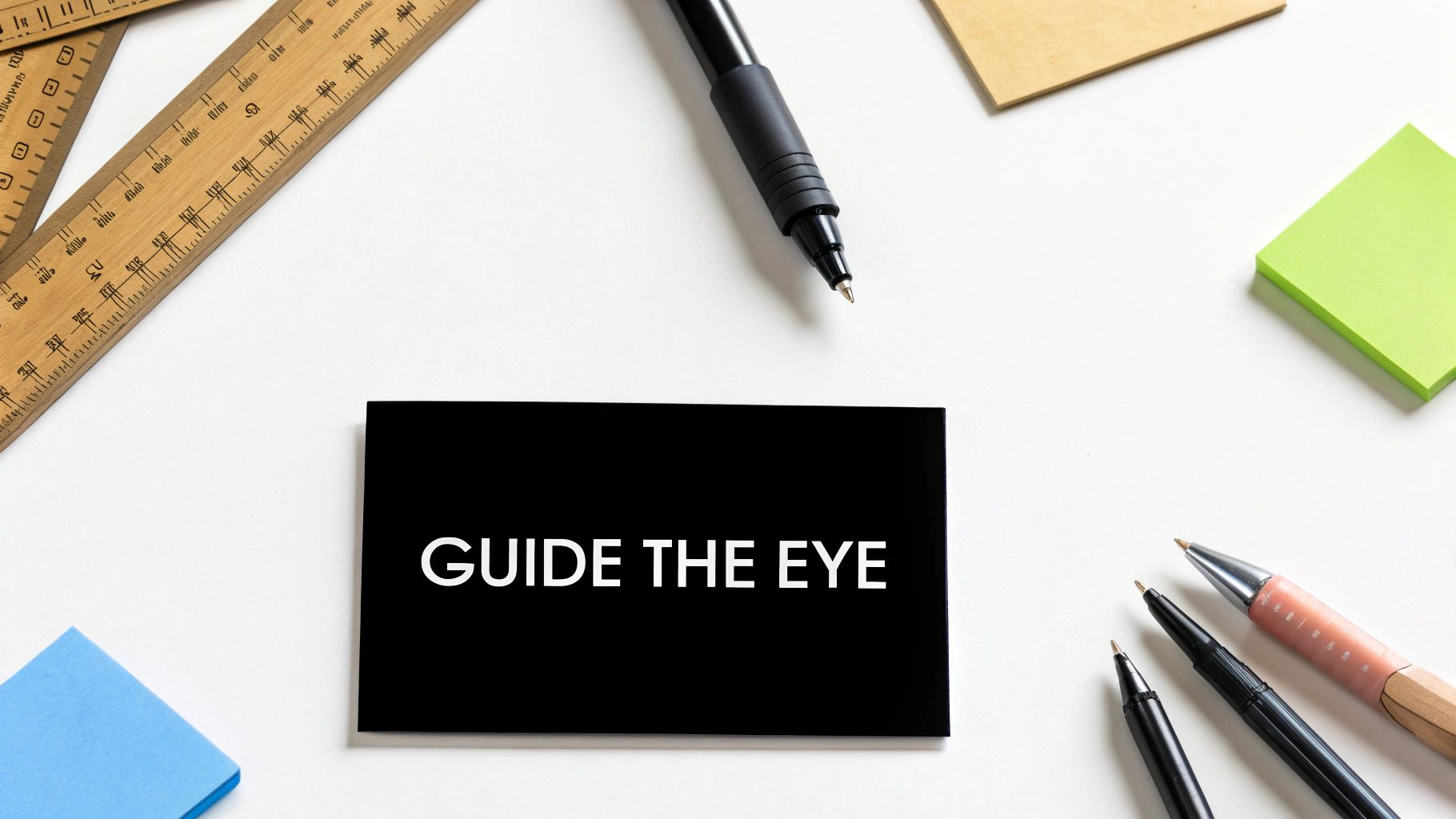
You’ve got maybe a second—tops—to get someone’s attention. In that tiny window, a solid visual hierarchy is your best friend. It’s what tells the viewer’s eyes where to go, creating a natural path through your message from start to finish.
Without that clear path, your ad is just noise. The headline, image, and button all scream for attention at once, and the user gets overwhelmed and just keeps scrolling. A well-designed ad, on the other hand, guides them effortlessly: this is the main point, here’s why it matters, and here’s what you do next.
Think of it like telling a quick story. You need a strong opening, a brief plot, and a clear ending. For a deeper dive into the theory, our guide on what is visual hierarchy in design is a great resource.
Creating a Clear Path for the Eye
The whole game is about making one element the undeniable star of the show. Usually, this is your headline or a killer image. Everything else on the canvas is just a supporting actor.
Getting this right isn't complicated. It comes down to a few powerful techniques:
- Size and Scale: Bigger is better for your main point. The largest thing on the ad is almost always what people see first, so make sure your value proposition gets top billing.
- Color and Contrast: A vibrant call-to-action button against a neutral background is impossible to miss. Contrast is your secret weapon for making the most important parts of your ad pop.
- Negative Space: Don't be afraid of empty space! Packing every pixel with information is a recipe for disaster. White space gives your key elements room to breathe and makes them stand out even more.
A cluttered ad is a confusing ad. When you give each part of your design its own space and a clear role, people can absorb your message in a flash.
Practical Layout Principles in Action
How you arrange your elements matters. Most people in Western cultures read from top-to-bottom and left-to-right, so play into that. It’s why you so often see a logo in the top-left or top-right corner. From there, the eye should naturally flow to the headline, then the supporting details, and land on the call-to-action at the bottom.
Banner ads have been around since 1994, and certain formats have become universally understood. The 300x250 pixel 'medium rectangle' remains a workhorse on desktops because it fits neatly into content without being too intrusive. But because it's so common, a strong visual hierarchy is absolutely critical to make your ad the one that gets noticed.
If you’re looking to create compelling visuals more efficiently, you can leverage AI image generators with expert tips to spark some new ideas and speed up your workflow.
Weaving Persuasion with Color and Type
Think of color and typography as the unsung heroes of your banner ad. Long before someone reads your headline, these two elements are already hard at work, setting the mood, building trust, and nudging them toward a click. They're not just decoration; they're your ad's first impression.
Color is visceral. It hits you instantly and speaks a language of emotion. That's why you see so many tech and finance companies using blue—it just feels trustworthy and secure. In the same way, a wellness brand might lean on green to signal health, nature, and new beginnings.
The trick is to create a palette that’s true to your brand while also serving the ad's purpose. If you're starting from scratch, we have a complete guide on how to create a color palette that can give you a solid footing. A pro tip I always follow: use high contrast where it matters most. A bright, can't-miss-it call-to-action button set against a calmer background is a timeless tactic for a reason—it gets results.
Choosing Fonts That Actually Convert
Like color, the fonts you choose are quietly sending signals. Your typography should feel like a natural part of your brand's voice, but above all else, it has to be one thing: readable.
Here are a few pointers I've picked up over the years for making fonts work for you:
- Clarity Comes First: If people have to squint, you've already lost. Clean, simple sans-serif fonts like Helvetica, Open Sans, or Lato are usually a safe bet for digital ads because they stay crisp on any screen.
- Less Is More: Stick to one or, at most, two font families. Any more than that and your ad starts to look cluttered and unprofessional.
- Build a Clear Path: Use size and weight (like bold vs. regular) to create a visual hierarchy. The headline should grab attention first, followed by the supporting details, and finally, the CTA.
This structure isn't just about looking good; it's about leading the viewer's eye exactly where you want it to go.
Typography isn't about what the letters spell out, but what they feel like. A clunky, hard-to-read font can make an incredible offer feel sketchy in a split second.
Of course, visuals are only half the battle. The actual words you use are what seal the deal. For some help on that front, you can even explore modern tools for effective AI ad copy generation to make sure your text is as compelling as your design.
When you pair powerful copy with intentional color and typography, you create a banner ad that doesn't just catch the eye—it's engineered to convert. Every single choice, from the shade of blue to the font weight, should push your audience toward that final, all-important click.
Choosing the Right Banner Sizes for Every Platform
You can have the most brilliant banner ad in the world, but if it's the wrong size, it's just not going to work. Think about it—people are browsing on massive desktop monitors, tablets, and tiny phone screens. Your ad has to look great on all of them, or you're just wasting your money.
Picking the right banner dimensions isn't just about fitting in; it's a strategic move. Certain sizes just perform better in specific spots. Some are perfect for sitting alongside an article, while others are built for the endless scroll of a social media feed. Nailing this is one of the first and most important steps to a successful campaign.
The Go-To Banner Ad Sizes
While there are countless ad dimensions out there, a few have become the industry standard for a simple reason: they get results. If you're just starting out, focusing your design efforts on these proven performers is the smartest way to go.
Here's a quick rundown of the sizes you’ll see and use most often.
- Medium Rectangle (300x250 pixels): Often just called the "M-Rec," this is the absolute workhorse of banner advertising. It fits so well within content on both desktop and mobile, making it incredibly versatile and a top pick for most advertisers.
- Leaderboard (728x90 pixels): This is that wide, horizontal banner you typically see plastered right at the top of a webpage. Its prime real estate makes it a fantastic choice for brand awareness campaigns where you need to make a strong first impression.
- Wide Skyscraper (160x600 pixels): You'll find this tall, skinny ad running down the sidebars of websites. It's great because it stays in view as users scroll, giving your brand a constant, subtle presence on the page.
- Mobile Leaderboard (320x50 pixels): As the name implies, this one is tailor-made for mobile browsing. It's small enough to sit at the top or bottom of the screen without being annoying, but it's still effective for delivering a quick, punchy message.
This infographic gives you a great visual sense of how the core design principles we've talked about—like color, typography, and layout—play out across these different ad formats.
The big takeaway here is that even when the canvas changes shape, the fundamentals of clear communication and strong visual hierarchy always apply.
To help you visualize where each of these standard sizes fits, here's a quick table breaking down their common platforms and best use cases.
Top Performing Banner Ad Sizes for Desktop and Mobile
Sticking to these well-supported dimensions ensures your ads will have the best chance of reaching your audience, no matter how they're browsing.
Keep an Eye on File Size and Format
A gorgeous ad that takes forever to load is completely useless. Ad networks are incredibly strict about file sizes because slow-loading pages create a terrible user experience. If your ad is too heavy, it will get rejected outright or, even worse, just won't load in time for anyone to see it.
Your final banner ad file should always be under 150KB. This isn't just a friendly suggestion; it's a hard-and-fast rule for most major ad platforms, including the Google Display Network.
To stay under that limit, you have to be smart about your file format.
- JPG: This is your best bet for any ad with photos or complex color gradients. You can compress JPGs quite a bit to shrink the file size, but just be careful you don't end up with a pixelated mess.
- PNG: Use PNGs when you need a transparent background, like for a logo or a standalone product shot. They often result in a larger file size than JPGs, so only use them when that transparency is essential.
- GIF: If you want to add a simple, looping animation, GIFs are the way to go. They’re great for catching the eye, but keep in mind they are limited to a 256-color palette, so they aren't ideal for complex visuals.
- HTML5: This is the modern standard for creating rich, interactive, and animated ads. It offers a ton of creative freedom but does require more technical know-how to build.
Whatever format you choose, make sure you run your final ad through an image optimization tool. A quick pass through a tool like TinyPNG or ImageOptim can shave off crucial kilobytes without hurting the visual quality, helping your ad load in a flash.
Making Your Banner Ads Move (and Why It Works)
On a crowded webpage, our eyes are naturally drawn to movement. It’s just how we’re wired. That’s why adding a bit of animation to your banner ad can make all the difference, helping you cut through the static and grab someone's attention. This is your best weapon against "banner blindness," where people have trained themselves to completely ignore ad placements.
Now, when I say "animation," I'm not talking about creating a mini Pixar movie. Over-the-top animations can be distracting and, frankly, annoying. The most effective ones are often simple, subtle, and serve a clear purpose.
Think of it this way: you want to catch someone's eye with a confident nod, not shout in their face. The goal is to be interesting, not just loud.
The Magic of Subtle Motion
Simple HTML5 animations are perfect for this. They are incredibly lightweight, so they don't slow down page load times, but they add a layer of polish and engagement that a static image just can't compete with. You don't need to tell a complex story; you just need to guide the viewer's eye.
Here are a few simple but powerful ideas I’ve seen work wonders:
- The Gentle Pulse: Have your call-to-action button slowly pulse with a subtle glow or a slight size change. It’s a magnet for the user’s gaze.
- The Clean Fade-In: Let your headline appear first, followed by your key value proposition. This creates a natural reading order and a small narrative flow.
- The Smooth Slide-In: Elements sliding in from the sides of the ad can create a dynamic, modern feel and reveal your message piece by piece.
These small movements make the ad feel alive and interactive. That little bit of life is often just enough to spark curiosity and get your message read.
Keep it short and sweet. A good rule of thumb is to keep your animation loop under 15 seconds. Any longer, and you're moving from a helpful guide to a noisy distraction.
When Video Banners Make Sense
Subtle motion is great, but sometimes your message needs a bit more firepower. If you need to actually show how a product works or tell a more involved story, video is the way to go.
In fact, recent tests from 2025 have shown that video banners can outperform static ones by four times when it comes to clicks, engagement, and brand recall. As mobile networks get faster, video is becoming a seriously powerful tool for advertisers. You can dig into more digital advertising trends to see just how much this is shaking up campaign strategies.
Of course, using video introduces new technical hurdles, mainly around file size and loading speed.
So, which should you choose? It really comes down to your campaign goals. If you have a clear, simple offer, a touch of elegant animation is often all you need to make your banner ad stand out and earn that click.
Testing and Improving Your Ad Designs
Think of your first ad launch as the starting line, not the finish. The real magic happens when you start paying attention to what works, what doesn't, and then fine-tuning your approach based on actual data. This is where A/B testing becomes your best friend, turning a good ad into a great one.
The concept is beautifully simple. You create two versions of your ad—let's call them A and B—but you only change one single thing between them. Run both, and see which one people respond to more. By isolating that one variable, you get undeniable proof of what your audience prefers.
What’s Actually Worth Testing?
The sheer number of things you could test can be paralyzing. From my experience, it's best to focus on the elements that consistently deliver the biggest wins. Start here before you get bogged down in tiny, insignificant tweaks.
- The Headline: This is your hook. Try pitting a clear benefit against an intriguing question. For example, "Save 50% on All Orders" is direct, while "Ready to Upgrade Your Style?" is more engaging. See which one pulls people in.
- The Call-to-Action (CTA): You'd be amazed at how a couple of words can change everything. Test "Shop Now" against "Get Your Deal," or "Start for Free" against "Create Your Account." You're looking for the phrase that feels most urgent and valuable to your customer.
- Imagery: Do people respond better to seeing a person happily using your product, or do they prefer a crisp, clean shot of the product on its own? Each visual tells a different story.
- Color Scheme: This is a classic test for a reason. Simply changing your CTA button color to something brighter and more high-contrast can have a surprisingly huge impact on clicks.
A quick tip: make sure you run your tests long enough to get reliable data. A day or two isn't enough to account for random traffic spikes. Give it at least a week to get a clear picture.
Your first design is just a well-informed guess. A/B testing is how you turn that guess into a proven, high-performing asset by letting real user behavior guide your decisions.
Making Sense of the Numbers
Once the test is done, it's time to dig into the results. It's not just about which ad got more clicks; you need to understand what the metrics are telling you about your design choices.
Two numbers matter most here:
- Click-Through Rate (CTR): This is simply the percentage of people who saw your ad and clicked. A high CTR tells you your ad is doing its job—it's grabbing attention and making people curious. If it's low, something about your visual, headline, or offer isn't strong enough to stop the scroll.
- Conversion Rate: This is the big one. Of the people who clicked, how many actually followed through and completed the goal (like buying something or signing up)? If you have a high CTR but a low conversion rate, it's a huge red flag that your ad is making a promise your landing page doesn't keep.
This process creates a powerful feedback loop. You test, you learn, you refine. Each test gives you another piece of the puzzle, allowing you to steadily improve your designs and, ultimately, your campaign's success.
Ready to create a professional brand identity that stands out and converts? Softriver delivers custom logos and full branding packages designed by top-tier talent, with a 48-hour turnaround and unlimited revisions. Get the high-quality design your business deserves at https://softriver.co.