
Think of visual hierarchy as the unspoken language of design. It's the art of arranging everything a person sees—text, images, buttons—to show what's most important. It’s the invisible hand that guides your eyes from one point to the next in a logical, effortless sequence.
The Secret Language of Great Design
Have you ever landed on a website and just known exactly where to click? That’s not a happy accident. It’s visual hierarchy at work.
Without a clear order, a design is just a jumble of elements all shouting for attention at once. It’s chaotic and confusing. A well-designed hierarchy, on the other hand, creates a clear conversation. It uses tools like size, color, contrast, and spacing to create a smooth path for the viewer's eye. The biggest, boldest headline grabs you first, then you're naturally guided to the supporting details, and finally to the smaller print.
Mastering this concept is what separates a designer who just makes things look pretty from one who truly communicates. To get a better handle on the specific terms designers throw around, our graphic design terminology guide is a great place to start.
Why Our Brains Love Order
Our brains are constantly looking for shortcuts. We're wired to spot patterns and make sense of our surroundings with as little effort as possible. Visual hierarchy plays right into this natural tendency. By organizing information clearly, it lowers the cognitive load, making the content easier and faster to digest.
The brain is a visual powerhouse. We process images an incredible 60,000 times faster than text, which is why a strong visual structure is so crucial for getting a message across quickly. Good design feels intuitive because it works with our brain, not against it.
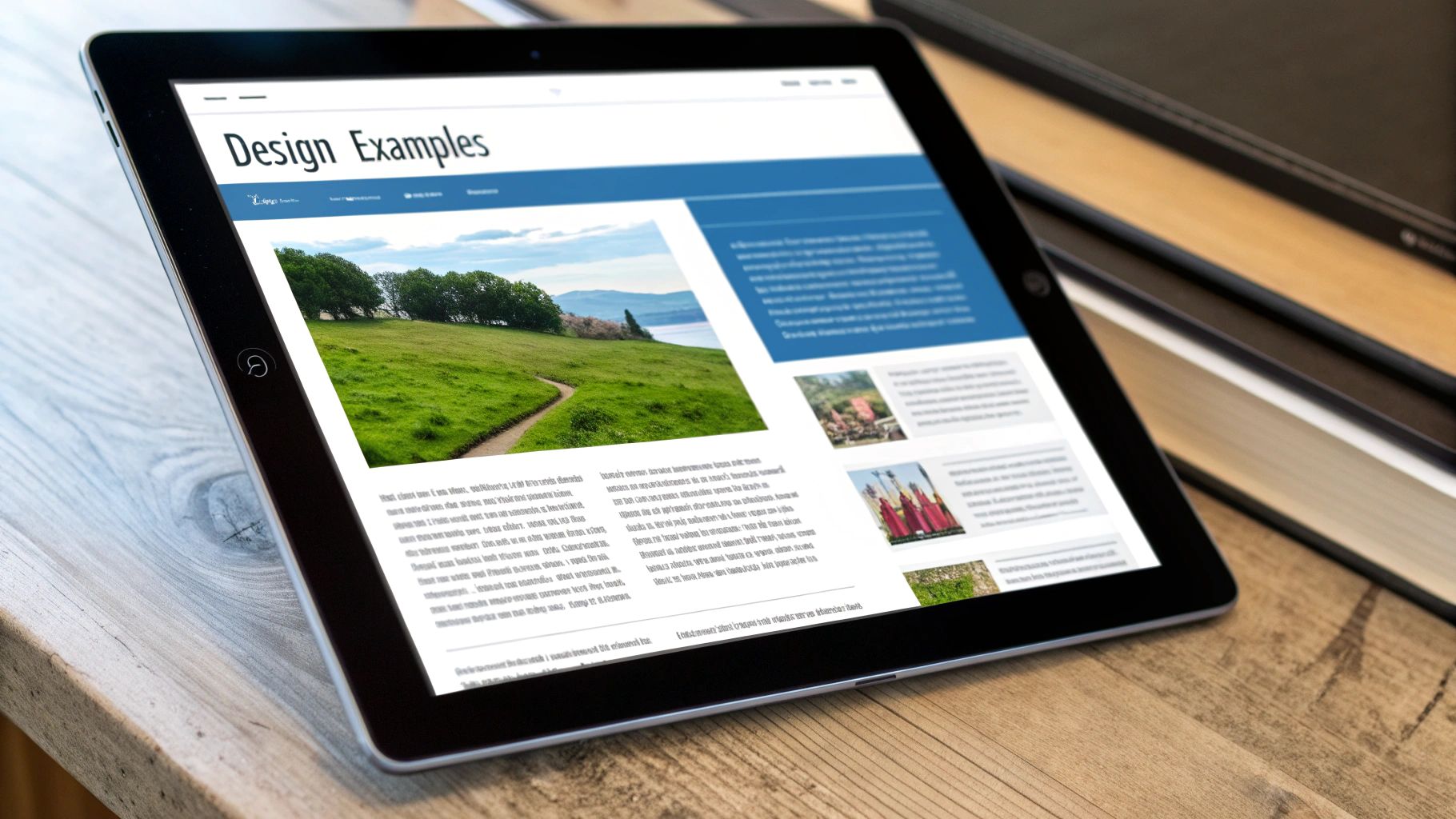
Let's look at the Wikipedia homepage. It’s a perfect example of managing a huge amount of information without overwhelming the user.
What's the first thing you notice? Probably the large globe logo and the big, inviting search bar right in the middle. These are the primary actions, so they’re given top billing. The language options below are smaller and clustered together, signaling they’re secondary. This simple, clear structure makes the site immediately usable.
This isn't just about aesthetics; it's backed by science. Studies show that people remember 80% of what they see but only 20% of what they read. A strong visual hierarchy makes your message stick.
Key Principles of Visual Hierarchy at a Glance
To really get a grip on this, it helps to break down the core elements that designers use to establish that all-important order. These are the foundational tools for directing attention.
The table below gives you a quick rundown of these principles, what they do, and where you'll see them in action.
Understanding how to mix and match these principles is what allows you to build a design that's not only beautiful but also incredibly effective at communicating its message.
The Core Principles That Shape Perception
To really get what visual hierarchy is, you have to look inside the designer’s toolbox. These core principles are the essential building blocks we use to guide a viewer’s eye and make an experience feel intuitive and clear. They all work together, often in subtle ways, to create a sense of order on the page.
Think of these principles as a director telling actors what to do. Each one gives an element a role—stand out and grab the spotlight, support another element, or fade into the background. Let's dig into each one with examples you probably see every single day.
This graphic gives a great overview of how these principles come together to build a solid visual structure.
As you can see, things that are bigger and have more contrast naturally come forward and demand our attention, while smaller, lower-contrast items take a back seat.
Size and Scale
This is the most straightforward and powerful principle of them all. Simply put, bigger things feel more important. Our eyes instinctively go to the largest object in a design first, which makes size a fantastic tool for creating an instant focal point.
A classic newspaper headline is a perfect example. Its huge size practically yells, "Read me first!" long before you notice the smaller subheadings or the actual article text. On a website, the main "hero" image and its headline usually take up the most space, making it obvious what the page is all about.
Color and Contrast
Bright colors and high contrast create what we call visual weight, making certain elements pop right off the page. A splash of a vibrant color in an otherwise quiet design is like a magnet for your eyes. This is exactly why call-to-action buttons are so often a bright, contrasting color—it’s a simple trick to make them impossible to ignore.
But contrast isn't just about color. You can also create it with texture, shape, or just plain light and dark. For instance, a bold, dark font on a pale background has high contrast and is super easy to read, automatically placing it higher in the hierarchy than some light gray text next to it.
Key Takeaway: One of the most common design mistakes is a lack of contrast. If everything has a similar color and brightness, the user’s brain doesn't know where to look first. This creates a confusing and often frustrating experience.
Typography Hierarchy
Text is so much more than just words on a page; the way it looks creates its own ranking system. Different font sizes, weights (like bold or light), and styles (like italics) are all cues that tell a reader how to process the information in front of them.
- Headlines (H1, H2): These are the biggest and boldest, signaling a major topic.
- Subheadings (H3, H4): Smaller than headlines, they break the main topic into more manageable chunks.
- Body Text: This is your standard, smallest font, designed to be comfortable to read for longer periods.
- Captions & Labels: Often even smaller or in italics, these signal that the text is extra, supporting information.
This structure allows people to scan a page quickly, getting the main idea without having to read every single word. To get this right, you really need to master typography for graphic design as a foundational skill.
Whitespace or Negative Space
Whitespace isn't just "empty" space—it’s an active and powerful design element. It’s the breathing room you leave around objects, and it’s what helps define and separate the different sections of a layout. Giving an element generous whitespace around it actually makes it seem more important and draws more attention to it.
For example, when you see a product photo with tons of negative space around it, it instantly feels more high-end and focused. This space also makes text much easier to read by preventing it from feeling cramped and overwhelming.
Proximity and Alignment
Finally, where you place elements in relation to each other sends powerful signals to the brain.
Proximity is the idea that we see objects placed close together as a single group. Think about a photo and its caption—their closeness tells you they belong together. When you group related links or form fields together, it makes an interface much simpler to navigate.
Alignment, on the other hand, creates a clean, organized, and connected feeling. When elements are lined up along a common edge or center line, the design feels less chaotic and more intentional. This invisible structure reduces the mental work needed to scan the page, creating a sense of calm and order. To truly get a handle on this, it's worth exploring the fundamental design principles that tie all these concepts together.
How Visual Hierarchy Makes for a Better User Experience
A strong visual hierarchy isn't just about making things look organized; it’s about shaping how a person feels when they interact with your design. When you get it right, an interface feels completely intuitive. People find what they need without even thinking about it, and that seamlessness is the bedrock of a great user experience (UX).
The biggest win here is the reduction in cognitive load—that’s the amount of brainpower someone has to use to figure out your product. A clear visual path means users aren't wasting mental energy trying to decide where to look or what to do next. This keeps them from getting frustrated and bouncing, which means they’ll stick around longer.
A professional, well-structured design also builds trust almost instantly. If a layout feels chaotic or confusing, it can make your brand seem unprofessional or even sketchy. On the flip side, a clean and logical hierarchy communicates competence and makes people feel more confident in what you have to offer.
Guiding Users Toward Action
At the end of the day, a good visual hierarchy is really about guiding behavior. By making certain elements pop, you create a natural path that leads people toward the most important actions you want them to take, whether that's signing up for a newsletter or hitting the "buy" button. This is where design directly translates into business goals.
Let's take a classic e-commerce product page as an example. The hierarchy is deliberately built to encourage a sale:
- Product Image: It’s big, it’s high-quality, and it’s the first thing you notice. It grabs your attention.
- Product Title and Price: These are usually placed right near the top in a large, bold font. They give you the key info you need to make a decision.
- "Add to Cart" Button: This is the grand finale. It’s almost always a bright, contrasting color with plenty of space around it, making it the obvious final step in the visual journey.
This structure isn't an accident; it’s a carefully drawn map designed to lead to a conversion. It’s one of the most powerful ways to apply essential user experience design patterns that actually get results.
A well-constructed visual hierarchy guides viewers to the most important information first and then through supporting content, which improves clarity and persuasion. Brands that implement strong visual hierarchy principles enjoy greater credibility and better connection with their audiences. Discover more insights about visual hierarchy's impact on Dragonfly AI.
By controlling what users see and when they see it, you’re not just making a pretty picture. You’re building a more effective, persuasive, and user-friendly experience from the ground up. This connection between clear design and user action is precisely why visual hierarchy is such a critical skill for anyone in a creative or marketing role.
Visual Hierarchy Examples in the Wild
It’s one thing to talk about the principles of visual hierarchy, but it’s another to see them in action. The theory really starts to click when you see how top-tier brands use these rules to build experiences that are clear, intuitive, and ultimately, persuasive.
Let's look at a few real-world examples. Once you start noticing how deliberate these design choices are, you’ll start seeing them everywhere. It’s not just about making things look good; it's about smart communication.
Apple: The Master of Simplicity and Focus
Apple’s website is a perfect case study in using scale and whitespace to command your attention. The moment you land on their homepage, your eyes lock onto a single thing: the hero product. They pull this off with a few simple, powerful techniques.
- Massive Scale: The main product image and its headline are huge. They dominate the screen, making them the undeniable focal point. There’s no question what you’re supposed to look at.
- Generous Whitespace: Notice what’s not there. No cluttered sidebars, no busy menus. The vast negative space acts like a spotlight, pushing the product forward and giving it a feeling of importance.
- Minimalist Text: The copy is incredibly concise. A bold headline grabs you, a smaller sub-headline gives a bit of context, and the smaller "Learn More" or "Buy" links are clearly secondary actions.
This creates a rock-solid hierarchy. The user’s path is crystal clear: see the product, read the benefit, and decide what to do next. There's zero confusion.
The New York Times: Scannable Information Architecture
News outlets like The New York Times have the opposite problem of Apple—they need to present an enormous amount of information without overwhelming you. Their solution is a masterful typographic hierarchy that makes the entire page scannable.
Visit their homepage, and you’ll instantly get a sense of the day's biggest stories. The main headline is the largest and boldest, signaling its importance. As you scroll, other headlines get smaller and lighter depending on their newsworthiness. This lets you scan the page in seconds and still walk away with the main takeaways.
By creating a clear typographic structure, news sites allow users to build their own information journey. You can dive deep into a major story or simply skim the smaller headlines for a quick overview.
This system works so well because it mirrors how we naturally sort information in our minds. It turns a potential wall of text into a structured, digestible map of the day's news.
Google Analytics: Clarity in Complexity
Dashboards are all about data, and platforms like Google Analytics have to make complex information easy to grasp at a glance. For them, color and grouping are the heroes.
Google Analytics uses a simple and consistent color palette to help you tell different types of data apart in its charts. For example, new users might always be blue and returning users might be green. This color-coding becomes a mental shortcut, letting you interpret a graph without having to read every single label.
At the same time, they use proximity to group related stats together in modules or "cards." The empty space between these cards creates clear divisions between different data sets, like your audience overview and your traffic sources. This thoughtful organization keeps the dashboard from feeling like a messy spreadsheet and turns raw data into something you can actually use.
Using Visual Hierarchy in Branding and Marketing
Visual hierarchy isn't just a rule for a single webpage layout; it's one of the most powerful tools you have for building a strong brand. When you use it consistently, it helps create a memorable identity that connects with people everywhere they see you—from a tiny business card to a massive billboard. Think of it as your brand's storyteller, making sure the most important parts of your message are always told first.
A perfect real-world example is product packaging on a crowded store shelf. You have maybe two seconds to grab someone's attention. A smart design uses hierarchy to guide a shopper’s eye instantly from the brand logo, to the product name, and then to a key selling point, like "organic" or "50% more." That quick visual journey can be the difference between a sale and getting completely ignored.
Building a Cohesive Brand Experience
For a brand to feel memorable, every piece of marketing you create has to look like it belongs to the same family. Consistency is everything here, and applying the same visual hierarchy principles across the board is how you achieve it.
- Consistent Typography: Stick to a defined set of font sizes and weights. Your main headline font on the website should feel related to the headline font on your social media graphics.
- Strategic Color Use: Use your primary brand color for the most important things, like call-to-action buttons. Your secondary colors can handle the less critical information, creating a visual language people learn to expect.
- Uniform Spacing: Keep your approach to whitespace and alignment consistent in all your designs. This simple discipline makes your brand feel clean, professional, and organized.
This kind of consistency creates a seamless experience that makes your brand feel reliable and trustworthy. Our guide on what visual branding is and why it matters dives deeper into how to build this kind of cohesive identity.
Driving Engagement in a Fast-Paced World
In the world of digital marketing, you have just a split second to earn someone's attention. Picture a social media feed—your ad is sandwiched between a dozen other posts. A strong visual hierarchy is what makes someone stop scrolling. By making your headline the biggest and boldest element, followed by a great image and a crystal-clear call-to-action, you create an ad that gets its point across instantly.
The data backs this up. Research shows that a staggering 94% of first impressions are design-related, and 72% of consumers say that a product’s packaging design influences their buying decisions. This proves that a well-planned visual path doesn't just look nice; it directly shapes how people behave and builds real brand loyalty. Learn more about how packaging visuals influence shoppers on eyesee-research.com.
Ultimately, visual hierarchy is a core brand strategy, not just a design task. It ensures your most important messages are always seen first, building recognition and driving action in a cluttered world.
Common Questions About Visual Hierarchy
Once you’ve got the basics down, you’ll find that putting visual hierarchy into practice brings up a whole new set of questions. It's one of those things that’s simple in theory but can be tricky to get right in the real world. Nailing that balance is what makes a design feel both clear and completely effortless.
Let's walk through some of the most common hurdles that designers and marketers face, so you can move from just understanding the idea to confidently using it.
What's the Most Important Principle?
If you had to pick just one, size is probably the most powerful tool in your kit. It’s direct, it's immediate, and everyone understands that bigger usually means more important. Our eyes are just naturally drawn to the largest thing on the page first.
But size rarely works alone. Its real magic happens when it's paired with other principles. For example, a huge button with terrible color contrast might still be missed. So, the real most important principle is context. Understanding your audience and what you want them to do will always tell you which elements to emphasize and which tools will get the job done.
Here's a classic trick: try the squint test. Back away from your screen and squint until the design blurs. What still pops out? Those are the elements at the top of your hierarchy. If they aren't your most critical pieces of information, it’s time for a tweak.
How Do I Know if My Design Is Working?
The squint test is a great gut check, but if you want hard proof, you need to see if you’re actually guiding people’s attention the way you intended.
You can get clear answers by looking at user data:
- Heatmaps: These tools are fantastic. They create a visual map showing you exactly where people are looking and clicking. You'll know in an instant if your main call-to-action is being ignored.
- User Testing: Nothing beats watching a real person try to use your design. Ask them to complete a simple task and just observe. You'll quickly see if the visual path you created is a clear highway or a confusing maze.
If your heatmap shows people are focused on a decorative image instead of your "Buy Now" button, you know your hierarchy is off.
Can You Have Too Much Visual Hierarchy?
Oh, absolutely. It's a classic rookie mistake. When you try to make everything important, nothing stands out. The result is just visual noise that overwhelms and confuses anyone looking at it.
Think of it like everyone in a room shouting at once—you can't understand a single voice. Overdoing it with bold fonts, bright colors, and massive text all at once kills the effect. The goal isn't to make every element scream for attention; it's to create a clear, prioritized journey for the eye.
Great visual hierarchy often feels invisible. It guides you so smoothly that you don't even notice the techniques being used. The design just feels right.
Ready to build a brand with a powerful, clear, and professional visual identity? Softriver specializes in crafting custom logos and brand systems that communicate your message with impact. Our expert designers create timeless, market-aligned designs that set you up for success.