
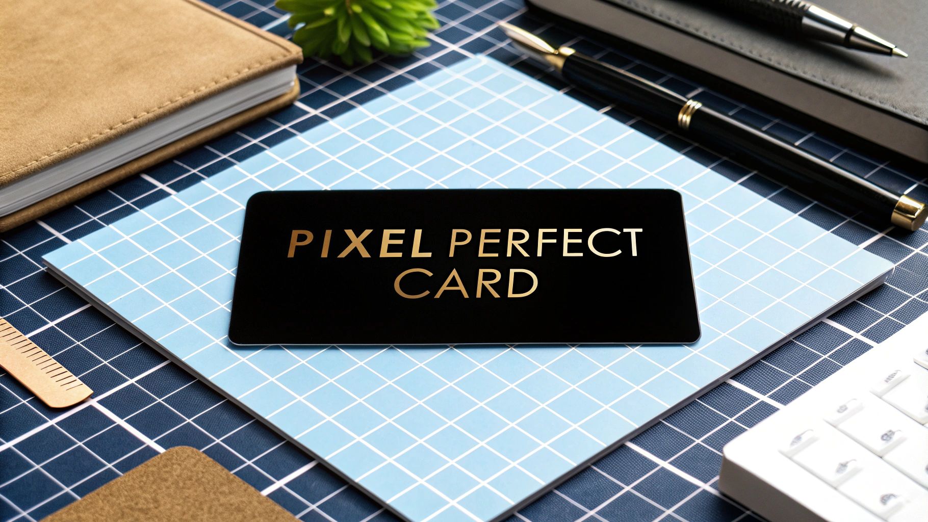
When you're getting business cards printed, the magic number for a standard US card is 1050 x 600 pixels. This isn't just a random figure; it's calculated from the standard 3.5 x 2-inch card size printed at 300 Dots Per Inch (DPI), which is the industry standard for crisp, professional-quality printing.
Why Pixels and DPI Matter for Business Cards
So, how do we get from inches to pixels? It all comes down to resolution. Digital images are made up of tiny dots called pixels, and DPI tells you how many of those pixels get printed within a one-inch line. The more dots you pack in, the sharper the final image looks.
In the US and Canada, a standard business card is 3.5 inches wide by 2 inches tall. To make sure that physical card looks sharp and not fuzzy, your design file needs to be set to 300 DPI. Do the math (3.5 inches x 300 DPI and 2 inches x 300 DPI), and you get the required 1050 x 600 pixels.
Print vs. Screen Resolution: A Critical Difference
It's really important to get this right: what works for a screen looks terrible in print.
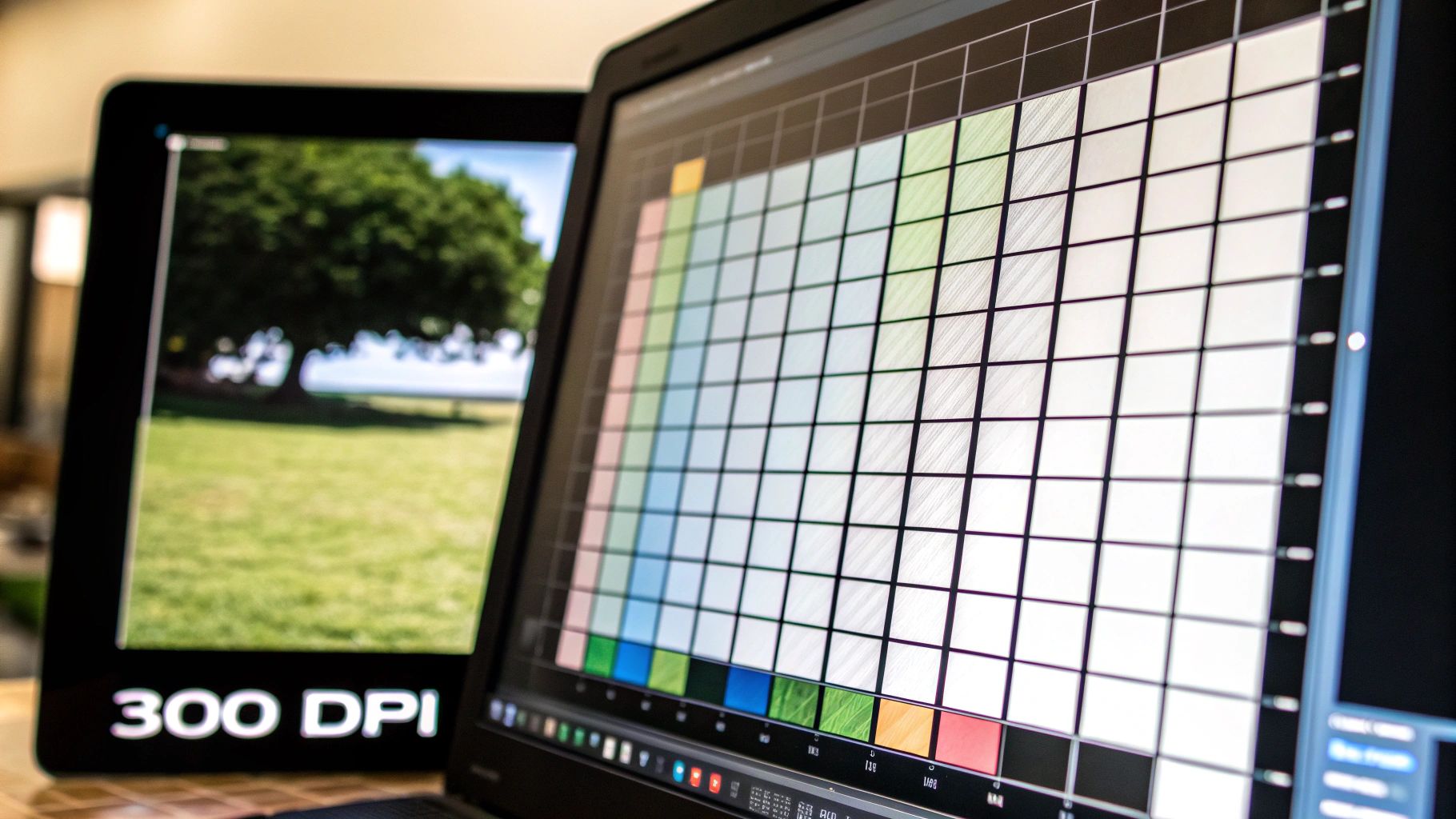
Web graphics usually hover around 72 DPI. This is perfectly fine for a monitor, but if you send a 72 DPI business card file to a printer, you’ll end up with a blurry, pixelated mess. The image simply doesn't have enough data for a quality print.
On the flip side, using a massive 300 DPI file for a website is overkill and will just slow down page loading. It's a different world from optimizing pixel dimensions for digital platforms like Pinterest. Always make sure your design’s resolution is set for its final destination—print or web.
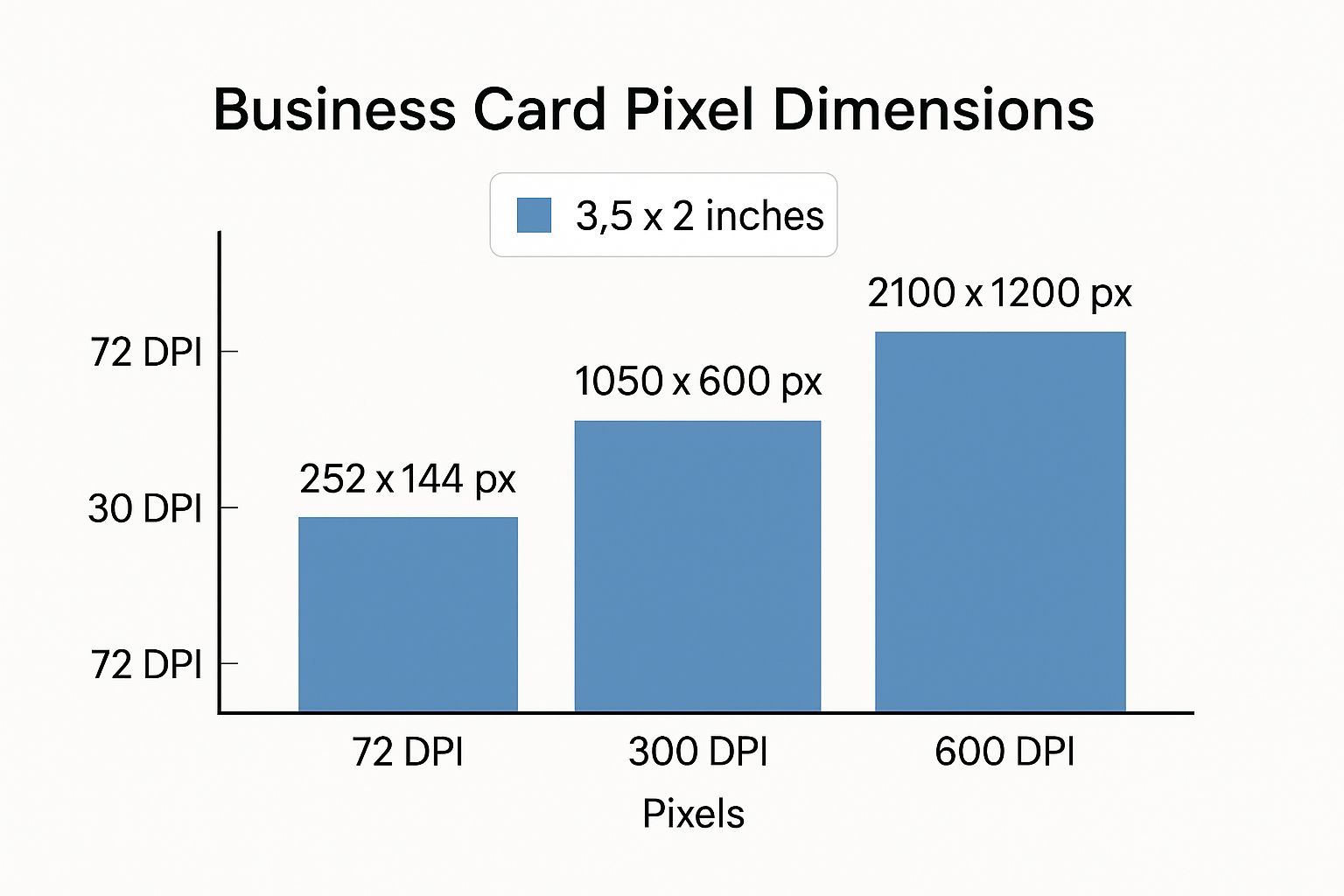
To really see how resolution impacts pixel dimensions for the same physical size, check out this table. It shows the pixel requirements for a standard 3.5" x 2" US business card at different DPI settings.
Standard US Business Card Size (3.5" x 2") At Different Resolutions
As you can see, the difference is huge. Sticking to the 300 DPI standard ensures your printer has all the detail they need to produce a business card you’ll be proud to hand out.
Why 300 DPI is the Non-Negotiable Standard for Printing
When you’re designing a business card, it's easy to get fooled by what you see on your screen. A design can look perfectly sharp and clear on your monitor, but then come out of the printer as a blurry, unprofessional mess. What gives?
The disconnect happens because screens and printers handle resolution in completely different ways. Your monitor is likely displaying your design at 72 to 96 DPI (Dots Per Inch), which is perfectly fine for digital viewing. But for a physical, printed card, you need way more detail packed into every inch.

This is why 300 DPI has become the gold standard for any professional print job. It’s the minimum resolution required to make sure your images, logo, and text look crisp and clean on paper, not pixelated.
How Pixel Density Works
Think of DPI as the density of information in your printed image. A low-DPI file tries to stretch a small number of pixels over a physical surface, which is what causes that fuzzy, blocky look. On the flip side, a 300 DPI file has enough pixel data to render smooth lines and sharp details.
For example, a business card designed at the standard 1050 x 600 pixels but at only 72 DPI will look terrible once printed. That same pixel count at 300 DPI, however, contains the right amount of information to produce a high-quality, professional card.
This high-resolution mindset should apply to everything you put on your card. The quality of your logo, photos, and other graphics is just as important as the file's overall settings. For a deeper dive into making images look their best, check out these strategies for stunning product photography results.
Key Takeaway: Always, always set your design file to 300 DPI before you start designing. You can't just increase the resolution later and expect it to look good; that often makes it worse. Starting with the right settings from the get-go is the only way to guarantee a print you’ll be proud of.
Setting Up Bleed, Trim, and Safety Margins in Pixels
Knowing the standard business card size in pixels is a great start, but it's only half the battle. To get a perfect, professional-looking print, you need to get familiar with three key boundaries: the bleed, the trim line, and the safety margin. These guides are essential for dealing with the physical cutting process and making sure nothing important gets chopped off your final card.
Think of the bleed as a small, extra border of your background color or image that extends past where the card will actually be cut. Printers don't cut cards individually; they're printed on big sheets and then trimmed to size. Because the mechanical cutters aren't always perfect down to the micrometer, this bleed area acts as a buffer. If a cut is a tiny bit off, you'll see more of your background instead of an ugly and unprofessional white sliver of paper.
Calculating Your Bleed and Final Dimensions
The industry-standard bleed is 0.125 inches (or 1/8th of an inch) added to all four sides. When you're working at a print quality of 300 DPI, that 0.125 inches translates to 38 pixels. So, you need to add this to your final card dimensions.
Here’s how the math breaks down for a standard US business card:
- Total Width with Bleed: 1050 pixels (trim) + 38 pixels (left) + 38 pixels (right) = 1126 pixels
- Total Height with Bleed: 600 pixels (trim) + 38 pixels (top) + 38 pixels (bottom) = 676 pixels
This means the actual design file you create—your canvas size—should be 1126 x 676 pixels to include the full bleed area.
Defining Trim and Safety Lines
With your canvas set up correctly, the next step is to place guides for your trim and safety lines. These lines won't actually print on the card; they're just visual aids for you in your design software like Adobe Photoshop or Canva.
The trim line is the most straightforward—it's the final edge of the card where the printer intends to cut. For a standard US card, this is your 1050 x 600 pixel area. Everything outside this line is considered bleed and will be trimmed away.
Inside the trim line, you need a safety margin. This is an inner boundary, usually another 0.125 inches (38 pixels) from the trim line. All your critical information—your logo, name, phone number, and email—must stay comfortably inside this safe zone. This guarantees that even if the cutter shifts slightly, none of your vital content will get clipped.
Crucial Tip: A classic rookie mistake is placing text or logos right up against the trim line. Don't do it. Always keep important elements well within the safety margin. This simple habit is what separates professional print design from amateur work and helps you avoid the headache of a reprint.
A Guide to International Business Card Pixel Dimensions
If you're designing for a global audience, remember that the standard 3.5 x 2 inch business card is mostly a North American thing. Go anywhere else, and you'll find that sizes can change quite a bit. Getting it right shows you've done your homework and respect local customs—plus, it ensures the card actually fits in someone's wallet.
Knowing the correct business card size in pixels for different regions is key to creating a professional, print-ready file.
This usually means setting up your design file using the local millimeter measurements common in Europe, Asia, or elsewhere. The good news is that the industry-standard resolution for print is almost always 300 DPI, which makes converting those measurements to pixels pretty simple.
Common Global Standards
For instance, across most of Europe—including the UK, France, and Germany—the go-to size is 85 x 55 mm. It feels a little shorter and wider than the American card. Over in Japan, the traditional "Meishi" is a bit larger at 91 x 55 mm. If you hand someone a US-sized card in Tokyo, it will immediately stand out, and not always in a good way.
To help you navigate these differences, I’ve put together a quick reference table. It breaks down the most common international business card sizes and gives you the exact pixel dimensions you'll need for a 300 DPI print file.
International Business Card Sizes And Their Pixel Dimensions (300 DPI)
This table is a quick-reference guide to standard business card dimensions in different countries and regions, including their pixel equivalents for print design. Use it to set up your design canvas correctly from the start.
Keep this chart handy, but always remember one thing: when you’re working with a new client or printer, especially overseas, it never hurts to ask for their specific print requirements. These are the common standards, but a local printer might have their own preferences for bleed or trim that are worth knowing ahead of time.
Picking the Right Software and File Format for Print
https://www.youtube.com/embed/LjhoGuK5oDs
Knowing the right business card size in pixels is a great start, but the tools you use and the files you create are just as vital. The software you choose can make or break the quality of your printed card, especially when it comes to the sharpness of your text and logo.
Vector vs. Pixel: Why It Matters
For truly professional results, you’ll want to work with vector-based software. The industry standard is Adobe Illustrator, and for a good reason. Vector graphics are built with mathematical paths, not pixels. This means you can scale your logo or text to any size—tiny or gigantic—and it will stay perfectly crisp and clear.
On the flip side, you have pixel-based (or raster) software like Adobe Photoshop. While it’s the king of photo editing, it’s not the best choice for designs heavy on text and sharp lines. If Photoshop is what you have, just make sure you set up your document at 300 DPI from the very beginning. If you don't, you risk a final print that looks blurry or pixelated.
Getting Your File Ready for the Printer
Once your design is complete, saving it correctly is the final, crucial step. The absolute best format to send to a printer is a high-resolution PDF. PDFs are fantastic because they lock everything in place—they preserve vector data, embed your fonts, and hold the correct color profile. This ensures what you see on your screen is exactly what comes off the press.
Speaking of color, always design in CMYK color mode, not RGB. It’s a common rookie mistake. RGB (Red, Green, Blue) is for digital screens, while CMYK (Cyan, Magenta, Yellow, Key/Black) is the four-color process used for printing. If you design in RGB, you're going to see some disappointing color shifts on the final printed card. Getting the colors right is an art in itself, and you can dive deeper in our guide on choosing business card colors to make your brand stand out.
Pro Tip: When you export to PDF, look for a preset called "Press Quality" or "High Quality Print." Using this setting is a lifesaver. It automatically handles important details like compressing images properly and embedding all the fonts you used, so you don't get any nasty surprises from the print shop.
Common Design Mistakes and How to Avoid Them
Getting the pixel dimensions right is a huge step, but a few common design mistakes can still trip you up and derail an otherwise great print job. If you can steer clear of these classic pitfalls, you’ll save yourself a lot of time, money, and frustration.
The goal is a professional, polished card on the first try. Let's walk through what to watch out for.
Designing in the Wrong Color Mode
One of the most frequent slip-ups I see is designing in the wrong color mode. Your computer screen displays colors using RGB (Red, Green, Blue) light, which is why digital colors can look so bright and vibrant. Printers, on the other hand, use ink—specifically, CMYK (Cyan, Magenta, Yellow, Black).
If you design in RGB, the colors will shift when converted for printing, and those vibrant tones will often look disappointingly dull.
The Fix: It's simple. Before you do anything else, set your design software's color mode to CMYK. This ensures that what you see on your screen is a much truer representation of what will come off the press.
Low-Resolution Images and Crowded Layouts
Two other classic mistakes are using fuzzy images and cramming your design too close to the edges. A logo that looks perfectly sharp on your website can end up blurry and pixelated in print if it’s not a high enough resolution. The industry standard for print is a crisp 300 DPI.
Likewise, placing important text or parts of your logo right up against the edge is asking for trouble. The cutting process is precise, but not perfect, and anything in that outer margin risks being chopped off.
Here’s how to avoid these headaches:
- Use High-Resolution Assets: Double-check that every image, icon, or logo you place in your design is at least 300 DPI at the size it will be printed.
- Respect the Safety Margin: Keep all your crucial elements—like names, phone numbers, and logos—at least 0.125 inches (or 38 pixels) away from the final trim line.
Nailing these fundamentals is a core part of creating a professional business card design that wins clients. Interestingly, while we're talking about print, these principles of clear visual communication carry over into the digital world. For example, you can see similar ideas at play in some email newsletter design best practices.
Common Questions About Business Card Dimensions
Even with all the best guides, a few questions always seem to pop up right when you're about to send your design to the printer. Nailing these final details is what separates a good result from a great one, ensuring your grasp of business card pixel sizes leads to a perfect physical card. Let's tackle some of the most common sticking points.
What Is the Best File Format for a Printer?
Hands down, the gold standard for any print job is a high-resolution PDF. A properly saved PDF is a self-contained little package—it embeds all your fonts, keeps logos and text as sharp vector graphics, and locks in your CMYK colors. It's the closest you can get to a "what you see is what you get" guarantee.
Sure, you can sometimes get away with formats like JPG or PNG, but only if they're saved at a crisp 300 DPI with the right pixel dimensions. Even then, they can be a bit risky. For professional, reliable results, PDF is always the way to go.
Do I Still Need a Bleed if My Background Is White?
Yes, absolutely. It's a common misconception, but you still need a bleed even if your card has a plain white background. The bleed isn't really about the color; it’s a physical production buffer for the cutting machine.
Think of it this way: without that extra bleed margin, any tiny misalignment in the trimmer—even less than a millimeter—could slice into your card, making it slightly smaller than intended. The bleed gives the machine a safe zone to cut in, guaranteeing your cards come out at the correct final size, every single time.
Can I Just Scale Up a 72 DPI Design to 300 DPI?
This is a big one: no, you can't just scale a low-resolution file up and hope for the best. When you ask design software to blow up a 72 DPI image to 300 DPI, it has to guess what pixels should fill the new space. This process, known as interpolation, almost always creates a blurry, pixelated mess.
Always start your project in a 300 DPI canvas from the very beginning. It’s the only way to ensure a sharp, professional print. Of course, resolution is just one piece of the puzzle. Getting your branding right is also critical, and you can learn more about the psychology behind effective logo colors for business.