
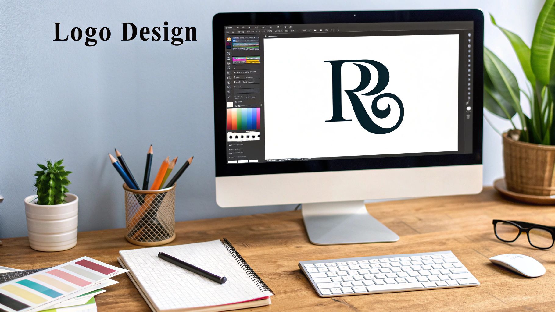
At its heart, a monogram logo is a design built from two or more letters that are artfully combined to create one unified symbol. It’s a clever way to distill a company's identity down to its initials, turning a potentially long name into a sleek, memorable visual.
What Exactly Is a Monogram Logo?
Think of a monogram as a sophisticated shorthand for your brand. Instead of spelling out a full name, which can sometimes be a mouthful, you use initials to create a compact and stylish emblem. It's a powerful move because it boils a brand's essence down to its simplest form, making it much easier for people to recognize and remember.
Take Home Box Office, for instance. We all know it as "HBO." The same goes for the New York Yankees and their iconic interlocking "NY." It’s a completely different approach from a wordmark logo, which uses the full company name in its design. We dive deeper into that style in our guide on what a wordmark logo is and when to use one.
The ultimate goal here is to craft a symbol that is:
- Memorable: People can recall a couple of letters far more easily than a long, multi-word name.
- Scalable: A great monogram looks just as sharp on a tiny social media icon as it does on a massive billboard.
- Timeless: There's an inherent sense of class and heritage that comes with a well-designed monogram.
A monogram logo is more than just letters; it's a visual puzzle where typography, negative space, and composition merge to tell a story of legacy and identity with minimal elements. It's the ultimate expression of "less is more" in branding.
A Quick Trip Through Monogram History
You might think of monogram logos as a modern design choice, but their story actually stretches back thousands of years. This isn't some new trend. It's a timeless way of telling a story visually, connecting today’s brands to ancient cities, medieval masters, and even royal families. It’s this deep history that gives monograms their classic, authoritative feel.
The first monograms we know of popped up in ancient Greece way back around 350 BC. Cities would stamp their coins with the first two letters of their name—a simple, effective way to prove the coin was legit and show where it came from. Think of it as the earliest form of civic branding. You can dig deeper into the rich history of monograms and their many uses over time.
From a Craftsman's Mark to a Royal Seal
As centuries passed, the monogram shifted from a symbol for a place to a mark for a person. In the Middle Ages, skilled artisans and craftsmen started carving their initials into their work. It was their personal signature, a way to claim ownership and vouch for the quality of their craft. This was a key moment—the monogram became a symbol of personal pride and professional skill, much like how modern brands use them.
This timeline gives you a great visual of how the monogram’s role has changed through the ages.
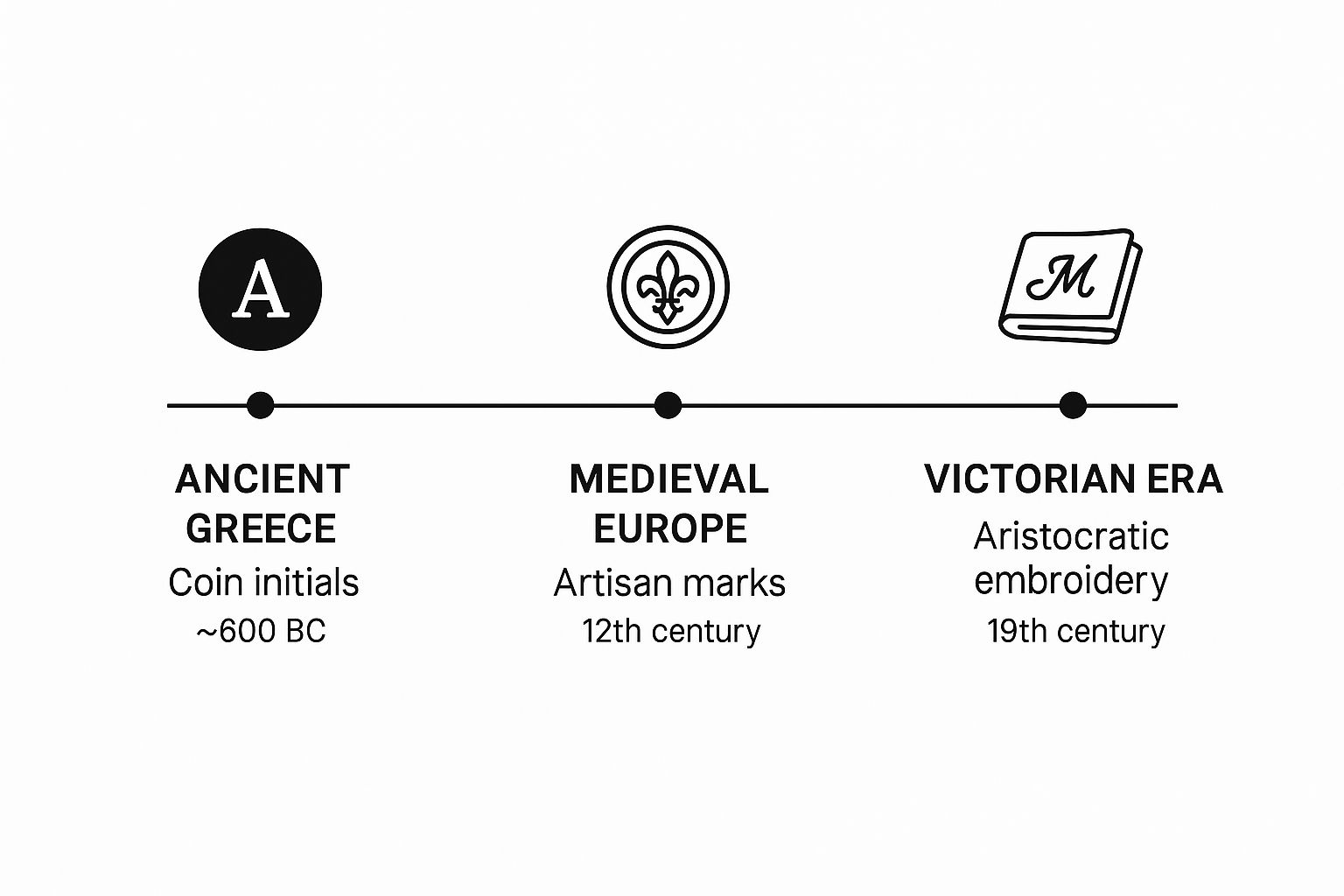
You can really see its journey here: from a mark on a coin to a personal stamp of quality, and finally, a symbol of elite status.
A monogram is so much more than just a couple of initials. It’s a piece of history. Each letter carries the weight of centuries, evolving from a simple signature into a powerful statement of identity, quality, and heritage.
But it was really the Victorian era that cemented the monogram's link to luxury and high society. The wealthy elite put their initials on everything—fine linens, silverware, even their carriages. A personal monogram wasn't just for show; it was a clear, elegant signal of your social standing. It was a sophisticated mark of ownership that screamed wealth and class. This is exactly why a well-crafted monogram can give a brand an instant air of prestige and timelessness today.
Why Monograms Are a Smart Choice for Modern Brands
https://www.youtube.com/embed/mKNAWeKIMfo
In a marketplace overflowing with noise, you have to find a way to cut through it. Monogram logos do this beautifully by giving your brand a clean, direct, and powerful symbol. Their simplicity is their secret weapon—it makes them ridiculously easy to remember.
Think about how fast you recognize the intertwined "LV" for Louis Vuitton or the back-to-back "CC" of Chanel. That immediate recognition is what a great monogram delivers. It can take a long or complicated name like "Home Box Office" and distill it down to a single, memorable mark: "HBO."
Suddenly, a name becomes a scalable and instantly recognizable brand asset.
Versatility Across All Mediums
One of the biggest wins for a monogram is its incredible versatility. A simple, type-based design stays crisp and clear no matter where you put it. It looks just as sharp on a tiny website favicon as it does embroidered on a shirt or blown up on a giant billboard.
This adaptability is key for keeping your branding consistent across every touchpoint, from digital ads to the various essential types of outdoor business signs a company might invest in.
That kind of flexibility means your brand identity always looks professional, no matter the context.
A great monogram communicates legacy and sophistication with just a few letters. It feels established and trustworthy, giving brands an immediate air of authority and class that can take years to build otherwise.
Communicating Prestige and Trust
Beyond just being practical, monograms carry a certain weight. They naturally suggest a sense of heritage, elegance, and professionalism, which is why they're so popular in industries that want to project an image of quality and exclusivity.
You see this play out all the time:
- Luxury Goods: High-end brands use monograms to signal timeless style and opulence.
- Law Firms: Here, a monogram projects stability, tradition, and authority.
- Tech Companies: A clean lettermark can communicate efficiency and modern simplicity.
By choosing a monogram, a brand can tap into these deep-seated associations. It's a clever shortcut to building customer trust and making a sophisticated impression that lasts.
Learning from Iconic Monogram Logos
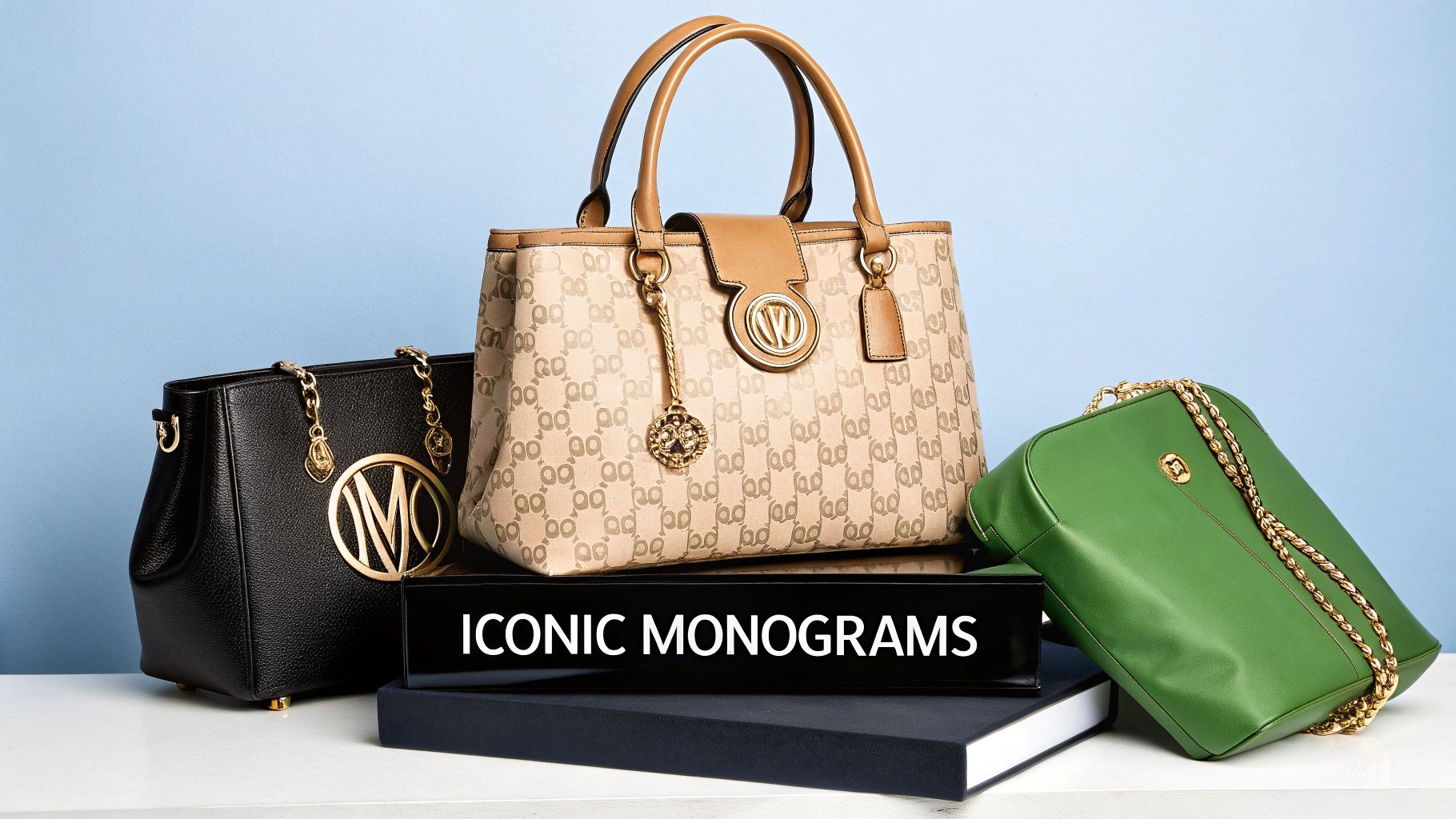
The best way to really get what a monogram logo is all about is to look at the ones that have stood the test of time. The world’s most iconic monograms are so much more than just a couple of letters smashed together. They’re mini-masterclasses in branding, typography, and visual storytelling.
Let's start with Chanel’s interlocking "CC" logo. It's a perfect example of how simplicity can be incredibly powerful. The clean lines and flawless symmetry just scream timeless elegance. The design feels balanced and refined, which is exactly the feeling Chanel wants to evoke.
Then you have the Yves Saint Laurent "YSL" logo. It's a fantastic take on a vertical monogram. The way the letters stack and weave together creates this really chic, high-fashion structure. It proves a monogram doesn’t have to be perfectly symmetrical to be memorable; sometimes, it’s all in the arrangement. If you’re hunting for more ideas, our guide on logo design inspiration is a great place to start.
The Power of Heritage and Strategy
The Louis Vuitton "LV" monogram is a fascinating story of both heritage and shrewd business. It was originally created back in 1896 specifically to stop people from making cheap knockoffs of their luggage. Fast-forward to today, and that same mark of authenticity anchors a business pulling in over $9 billion a year. It's become one of the most recognizable symbols of luxury on the planet.
This isn't an isolated case. Fashion powerhouses like Dior, Gucci, and Fendi have all built their empires around their own distinctive monograms. In fact, these lettermarks are so effective that they rank among the top three most recognized logo types for premium brands anywhere in the world.
The most successful monograms are deceptively simple. They rely on carefully chosen typography, clever letter interaction, and the strategic use of negative space to create a symbol that is instantly recognizable and emotionally resonant.
So, what can we learn from these legendary brands? A great monogram isn’t just a pretty picture; it’s a strategic tool that works hard for the business. It manages to do several things at once:
- Projects an Aura of Exclusivity: A well-designed monogram just feels personal and high-end.
- Builds Lasting Recognition: Simple initials are often far easier for our brains to remember than a long company name.
- Tells a Story of Legacy: It creates a direct line back to the founder and the brand's history.
By looking at the masters, we see that a monogram logo is where art, history, and commerce all come together to make one unforgettable mark.
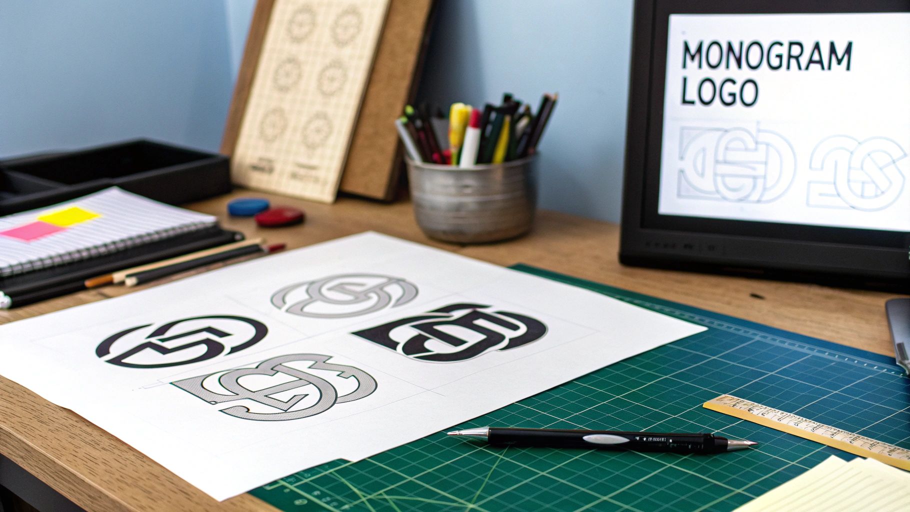
How to Design a Monogram Logo That Lasts
If you want to create a monogram that feels timeless, your journey begins with one critical decision: typography. The font you choose is the very soul of your design. It sets the emotional tone for your brand before anyone even reads a word.
Think about the impression you want to make. A classic serif font, with its little "feet," feels traditional, reliable, and sophisticated. It’s a perfect fit for a law firm or a high-end fashion brand. On the other hand, a clean sans-serif font gives off a modern, approachable, and no-nonsense vibe, making it a great choice for tech startups or minimalist lifestyle brands.
If you’re after a more personal or creative feel, a flowing script font can work wonders. It feels like a signature and hints at craftsmanship. And don't ever rule out custom lettering—it's the surest way to create a mark that is uniquely yours.
Mastering Composition and Balance
Once you've landed on a font style, the real artistry begins with composition. How you arrange the letters is what turns a couple of initials into a memorable symbol. The goal here is to create something that feels balanced, intentional, and visually interesting.
The magic of a great monogram lies in its composition. It’s a delicate dance of interlocking letters, negative space, and balance that turns initials into a timeless piece of brand art.
There are a few proven techniques for arranging letters. You can learn more about how to combine letters to make a logo that looks polished and professional. Some of the most common approaches include:
- Interlocking: Weaving the letters together to form a single, unified shape. Just think of the iconic Gucci or Chanel logos.
- Stacking: Placing initials on top of or next to each other for a clean, structured look. The Yves Saint Laurent mark is a great example of this.
- Flipping or Mirroring: Creating a sense of symmetry by reflecting one of the letters, which can add a clever visual twist.
No matter which path you take, the final design has to be balanced and easy to read.
Finally, always think about scalability. Your logo must look just as sharp on a tiny business card as it does blown up on a billboard. Understanding its real-world applications is key; for a premium and durable finish, you can even explore options like custom embroidery logo branding.
Still Have Questions About Monogram Logos? Let's Clear Them Up
As we've journeyed through the world of monograms, you might still have a few questions bubbling up. That's perfectly normal. Let's tackle some of the most common ones I hear from clients to make sure you're crystal clear on how these logos work.
Is a Monogram a Good Choice for a New Business?
I get this question all the time. The short answer? It can be a brilliant move, especially if your company has a long, complicated, or hard-to-pronounce name. Think about it: boiling a mouthful like "Hewlett-Packard" down to "HP" makes it instantly easier for people to remember.
How Many Letters Should I Use?
There's no hard-and-fast rule, but the sweet spot is usually two or three initials. This gives you enough creative material to work with without making the design feel cluttered or confusing. The goal is a clean, recognizable mark, and sticking to this range helps you achieve that.
How is a Monogram Different From Other Logos?
This is a great clarifying question. A monogram (also called a lettermark) is all about typography—it's built exclusively from the initials of a brand name.
It’s different from a pictorial mark, which is a symbol (like Apple's apple), or a combination mark, which pairs a symbol with text. With a monogram, the letters are the hero.
Aren't Monograms a Bit… Old-Fashioned?
Absolutely not! While they definitely have deep roots in luxury and tradition (think Louis Vuitton), modern designers have given the monogram a complete facelift.
A monogram doesn't have to feel stuffy. With the right font, a clever layout, and a fresh color palette, it can look incredibly minimalist and modern—perfect for a tech startup or a cutting-edge fashion brand.
To wrap things up, here are a few final tips from my own experience:
- Your Font Choice is Critical: The typeface you select sets the entire mood. A classic serif font whispers tradition and trust, while a clean sans-serif screams modernity and innovation.
- Never Sacrifice Readability: You can get super creative, but if people can't easily decipher the letters, the logo isn't doing its job.
- Test for Scalability: Your monogram has to look sharp everywhere. Make sure it's just as clear on a tiny website favicon as it is blown up on a billboard.
When done right, a monogram isn't just a logo; it's a timeless, powerful asset that can grow with your brand for years to come.
Ready to create a timeless brand identity that stands out? The expert designers at Softriver specialize in crafting custom logos and brand guides that make an immediate impact. Get your professional, handcrafted design in just 48 hours. Start building your brand's legacy by visiting our official website today.