
If you've ever tried talking to a graphic designer, you know it can feel like they're speaking a different language. Getting a handle on that language is the first step to creating great visuals and working better with creative pros. This glossary is here to translate, breaking down the terms designers use every day, from basic principles to the nitty-gritty technical stuff.
Whether you're just starting out or have been around the block a few times, this guide will help you talk shop with clarity and confidence.
Why Bother Learning Design Jargon?
Let's be honest, navigating the world of visual communication can be tricky. Designers have a specific vocabulary for a reason—it helps them describe ideas accurately, give feedback that actually makes sense, and make sure the final product matches what was in your head. Without a shared understanding of core graphic design terms, projects can easily go off the rails, leading to frustration and expensive do-overs.
Think of this guide as your go-to reference. We've broken down all the complex jargon into simple, practical definitions with examples you can actually relate to. Getting this stuff down will help you:
- Talk the Talk: Explain what you want and give feedback with precision. No more "make it pop."
- Choose Wisely: Understand why one design choice works better than another.
- Work Better Together: Create a smoother workflow with designers, developers, and your marketing team.
The graphic design industry isn't small potatoes—it’s on track to become a $55.7 billion market by 2025. That number tells you just how much businesses rely on quality visuals. Knowing the language of design isn't just for designers anymore; it’s a crucial skill for anyone involved in bringing a brand or project to life. For a deeper dive into market trends, check out the analysis on IBISWorld.
Understanding Core Design Principles
Before you can even think about picking fonts and colors, you have to get a handle on the rules that make a design work. These core principles are the secret sauce behind every effective visual, quietly guiding the viewer's eye and making sure the message lands perfectly. Don't think of them as rigid restrictions; see them as a reliable framework for building visuals that actually communicate.
Getting these concepts down is non-negotiable for any aspiring designer. They're what separate a jumbled mess from a polished, professional piece of work. By learning these graphic design terms first, you're building a solid foundation for everything else. While these principles are the 'how,' you can check out our guide on the core elements of design to get a grip on the 'what.'
Alignment and Proximity
Alignment is all about the invisible lines that connect every element on the page. It’s what gives a design a sharp, organized look, ensuring nothing feels like it was just thrown there by accident. Whether your elements are lined up to the left, right, or center, good alignment makes the whole piece feel cohesive and intentional.
Next up is proximity, which is simply the idea of grouping related things together. When you place items close to each other, our brains automatically see them as a single, connected unit. A perfect example is putting a photo caption right under the image—their closeness instantly signals a direct relationship.
Hierarchy and Contrast
Visual hierarchy is how you show what’s most important in your design. By playing with size, color, and placement, you can tell your audience exactly where to look first, second, and so on. A big, bold headline is the most common way to create a clear focal point and establish that a visual pecking order exists.
Then there’s contrast, which is the tool you use to make key elements pop. You can create it with opposing colors (like classic black and white), different text sizes (big vs. small), or even contrasting shapes. A design without enough contrast will just feel flat and boring, making it tough for a user to know where to focus.
"Good design is about creating a visual path for the user. Principles like hierarchy and contrast aren't just for aesthetics; they are essential tools for clear communication and guiding user actions."
To help you keep these straight, here's a quick reference table.
Core Design Principles at a Glance
This table is a great starting point, but let's finish our breakdown of the last two principles.
Repetition and White Space
Repetition helps unify a design by using the same or similar elements over and over. This could mean sticking to a specific color palette, using the same font family, or bringing back a recurring shape or icon. It’s what makes a design feel like a complete, cohesive package and reinforces brand identity.
Finally, let's talk about white space—also known as negative space. This is the empty area surrounding your content, and it’s anything but wasted. Think of it as an active element that gives your design room to breathe. Using white space effectively cuts down on clutter, makes text easier to read, and can give your work a touch of class and focus.
These fundamentals are a huge deal in the real world. In fact, over 90% of businesses believe professional design is crucial for their brand. With the industry projected to hit $57.8 billion by 2026, thanks in large part to social media, mastering these principles is more important than ever. If you're curious about the numbers, you can find more graphic design statistics and insights on Cropink to see the full picture.
A Practical Guide to Typography Terms
Typography is so much more than just choosing a pretty font. It's the art of arranging text so it’s easy to read, legible, and visually engaging. Honestly, it’s one of the most powerful skills in any designer’s toolbox because the right typography can completely change how a message is received.
If you can confidently talk about typography, you can better articulate your design choices. This glossary will walk you through the essential graphic design terms, from the basics to the finer details that distinguish good design from great design.
Font Versus Typeface
Let's clear up one of the most common mix-ups right away: the difference between a font and a typeface. People use these terms interchangeably all the time, but for a designer, knowing the distinction is crucial.
A typeface is what you'd call the design "family"—it's the overall look and feel of the characters. Think of Helvetica, Garamond, or Futura. Each one is a unique artistic creation that defines the shape of every letter.
A font is a specific instance within that family. For example, "Helvetica Bold 12pt" is a font. It spells out the typeface (Helvetica), the weight (Bold), and the size (12pt). A great way to remember it is this: a typeface is like an album, and the fonts are all the individual songs on it.
Serif and Sans Serif
At the highest level, most typefaces fall into two main camps: serif and sans serif. The difference is simple, but it has a huge impact on the tone and readability of your design.
Serif: These typefaces have little decorative "feet" at the ends of the strokes. They tend to feel more traditional, classic, or even academic. Times New Roman is probably the most famous example.
Sans Serif: The word "sans" is French for "without." So, as you can guess, these typefaces don't have those little feet. This gives them a cleaner, more modern, and straightforward appearance. Arial and Helvetica are two of the most widely used sans-serif typefaces.
Choosing between them isn’t just about looks; it’s about function. Serif fonts are often preferred for long blocks of body text in print because those little feet can help guide the reader's eye. On the other hand, sans-serif fonts typically shine on screens, where their clean, simple letterforms offer great clarity.
Mastering Spacing: Kerning, Tracking, and Leading
The characters themselves are only half the story. The space around and between them is just as important for creating a polished, professional look. This is where leading, tracking, and kerning come in.
Leading (pronounced "ledding," not "leeding") is the vertical space between lines of text. The name comes from the old days of letterpress printing when typesetters would place thin strips of lead between lines of metal type. Getting the leading right is key to making large paragraphs feel breathable and easy to read.
Tracking, sometimes called letter-spacing, adjusts the horizontal space across a whole word, sentence, or block of text. When you loosen the tracking, you can create an airy, elegant feel. Tightening it up makes the text feel more compact and urgent.
Kerning is the final, most detailed touch. It’s the process of adjusting the space between two specific letters to create a more visually pleasing result. While tracking is a global adjustment, kerning is a targeted fix. For instance, the gap between an "A" and a "V" often needs to be manually tightened to look right. Think of it this way: tracking sets the general spacing for a crowd, while kerning fine-tunes the personal space between two individuals standing next to each other.
For a deeper dive into making these adjustments work for you, our guide can help you master typography for graphic design with advanced tips and techniques.
Navigating Color Theory and Application

In a designer's toolkit, color is easily one of the most powerful tools. It can set a mood, draw the eye, and express a brand's entire personality without saying a word. When you really understand the language of color, you stop making subjective guesses and start making strategic decisions.
This section dives into the essential graphic design terms that every designer needs to know about color theory and how to apply it. Once you have this vocabulary down, you can talk about color with confidence and build palettes that are not just beautiful, but incredibly effective, whether they're on a screen or a printed page.
The Building Blocks of Color
Every single color you can imagine is built from three core properties: hue, saturation, and value. Getting a solid grip on these concepts is the first step to controlling color, not just choosing it.
Hue: This is what we typically mean when we say "color"—it's the pure pigment, like red, green, or blue. If you ask, "What color is that?" you're asking for its hue.
Saturation: Think of this as the intensity or purity of the color. A highly saturated color is vivid and bold, while a desaturated one is more muted, dull, or washed out, leaning towards gray.
Value: Also known as brightness, value tells you how light or dark a color is. When you add white to a hue, you get a "tint" (a lighter value). Add black, and you get a "shade" (a darker value).
Knowing how to balance these three elements is what creates real depth and contrast in a design. A palette that sticks to one hue but plays with different saturations and values can feel far more sophisticated than one that just throws a bunch of different hues together.
Color Models for Print and Screen
Where your design will be seen completely changes how its colors are built. This is a crucial point, and using the wrong color model is a classic rookie mistake that leads to disappointing results. These are easily some of the most critical graphic design terms to get right.
RGB (Red, Green, Blue) is an additive color model, which means it's built for anything with a screen—monitors, cameras, and smartphones. It works by mixing red, green, and blue light together. When you combine all three at their highest intensity, you get pure white.
CMYK (Cyan, Magenta, Yellow, Key/Black) is the opposite. It's a subtractive model made for the world of print. Here, you're starting with a white background (like paper) and subtracting brightness with ink. The more ink you layer on, the darker the color gets.
You absolutely have to choose the right model from the get-go. A design made in RGB will look muddy and off-brand if you try to print it without converting it to CMYK properly. To really make your colors pop, you'll also want to explore practical color correction techniques to get the visual results you're after.
Practical Color Terminology
Beyond the theory, designers have a go-to set of terms for managing color in their day-to-day work. A Color Palette, for instance, is simply the specific group of colors you've chosen for a project to keep everything looking consistent.
A Gradient is just a smooth blend from one color to another, and it’s a great way to add depth or a modern feel to a design. Finally, a Hex Code is a six-digit code (like #FFFFFF for pure white) that tells a computer the exact RGB color you want. It's the universal language for color on the web.
If you're interested in going deeper on this, we have a whole guide where you can learn how to master color theory in marketing to boost sales.
Mastering Image and Composition Vocabulary
Every great design rests on two pillars: strong imagery and a well-thought-out layout. If you want to create visuals that look sharp everywhere—from a tiny phone screen to a massive billboard—you have to get comfortable with the lingo of images and composition. This is the stuff that ensures your files are set up correctly and your designs feel balanced and professional.
Getting these terms right is what saves you from common, costly mistakes. Think of a logo that turns into a blurry mess on a t-shirt or a beautiful brochure that comes back from the printer with weird white edges. This is the practical, nitty-gritty knowledge that separates polished, professional work from the amateur stuff.
Raster Versus Vector Images
One of the first and most critical distinctions you’ll learn in design is the difference between raster and vector images. Picking the wrong format can completely ruin your work, so it's a big one.
Raster images are what most people are familiar with. Think JPEGs, PNGs, and GIFs. They're built from a grid of tiny colored squares called pixels. Just like a mosaic, if you zoom in far enough, you'll see the individual tiles. This pixel-based structure is perfect for capturing the rich detail in photographs. The catch? Raster images have a fixed size. If you try to blow one up too much, it gets blurry and "pixelated" because you’re essentially just making those little squares bigger and more obvious.
Vector images, on the other hand, are totally different. They're created with math—a series of points, lines, and curves defined by equations. Common vector formats include SVG and AI. Because they're based on formulas instead of a pixel grid, you can scale them to any size you can imagine. From a tiny icon on a smartwatch to a giant banner for a trade show, a vector graphic will stay perfectly crisp and clear. This is why logos and illustrations should always be created in a vector format.
This infographic really helps visualize the key differences.
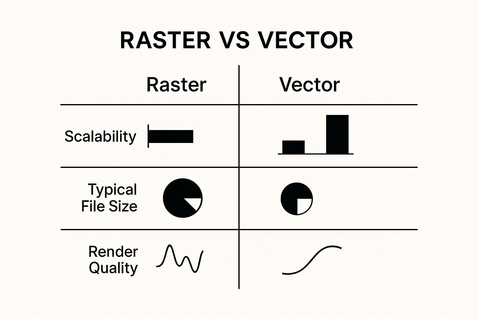
As you can see, vectors are all about scalability and quality, making them the go-to for logos and icons. Rasters shine when you're dealing with complex photos where massive file sizes could be an issue.
Resolution DPI and PPI
Now that we’ve talked about pixels, let's get into Resolution. This is all about how much detail an image holds. We measure it in two ways: DPI (Dots Per Inch) for print and PPI (Pixels Per Inch) for screens. People often use them interchangeably, but they refer to two different worlds.
DPI is a printing term. It literally means how many physical dots of ink a printer lays down within a one-inch line. For anything you want to look sharp and professional in print—like a magazine or flyer—the gold standard is 300 DPI.
PPI is for the digital world. It's the number of pixels packed into one inch of a screen. For web images, 72 PPI is the standard. It’s plenty to look sharp on most displays without creating huge files that would bog down a website.
Trying to print a low-resolution image is a classic rookie mistake. A 72 PPI web graphic will look like a fuzzy, unprofessional mess in a printed brochure because the printer is forced to stretch a small amount of pixel data over a much larger physical space.
Key Compositional Rules
Beyond the technical side of an image file, the way you arrange all the elements on the page is what really makes a design work. Composition is how you guide the viewer’s eye and create a layout that feels intentional and engaging.
A Grid is your best friend for creating order. It’s an invisible framework of intersecting lines that you use to align text, images, and other elements. Using a grid is what gives your layout a sense of structure and consistency.
The Rule of Thirds is a time-tested guideline for creating more dynamic compositions. Just imagine your canvas is split into nine equal parts by two horizontal and two vertical lines. The rule suggests placing your key elements along those lines or where they intersect. It’s a simple trick that helps you avoid boring, centered layouts and creates a more natural visual flow.
Essential Print Design Terms
Finally, if you’re designing anything that will be printed, there are a few terms you absolutely have to know to keep your printer happy and avoid costly reprints.
A Margin is simply the empty space around the edges of your design. It acts as a safety buffer between your content and where the page will be trimmed. Margins make things easier to read and stop important info from getting chopped off.
A Bleed is a small extra area of your design that extends past the final trim edge. Why? Because printers aren't perfect. They can't print right to the very edge of the paper with 100% accuracy. The bleed ensures that when the final piece is trimmed down to size, you don't end up with any ugly white slivers along the edge. It's a non-negotiable safety net for any design where colors or photos run all the way to the edge.
If you want to see how these principles apply in the digital space, looking at examples like guides on creating high-converting iOS app screenshots can show how good composition and image choices drive results.
Decoding Digital and Web Design Terms
The design world has moved far beyond just print. Today, it’s all about pixels, and if you’re working on websites, apps, or any kind of digital product, you need to speak the language. Knowing these specific graphic design terms is crucial for creating experiences that not only look good but actually work for the people using them.
This section will walk you through the essential vocabulary of modern digital and web design. We'll untangle core concepts like UI and UX, break down the key stages of the design process—from wireframe to prototype—and explain what it means for a design to be truly responsive.
https://www.youtube.com/embed/wIuVvCuiJhU
UI vs. UX: What's the Difference?
You’ll hear UI (User Interface) and UX (User Experience) thrown around all the time, often interchangeably. While they're definitely a team, they play two very different roles in the design game.
User Interface (UI) design is what you see. It’s the visual part of the equation—the look, feel, and interactivity of a product. A UI designer sweats the details on everything from the buttons and icons to the typography and color palette. Their job is to make the interface beautiful, visually consistent, and intuitive to navigate.
User Experience (UX) design, on the other hand, is about the entire journey. It’s a much bigger picture, covering every single interaction a person has with a product and how it makes them feel. A UX designer is focused on how the product functions. Is it logical? Does it solve a real problem? Is it a joy to use or a total headache? Good UX is about making sure the experience is smooth, efficient, and satisfying from the moment someone lands on your site or opens your app.
A great analogy I've heard is this: UI is the saddle, the stirrups, and the reins. UX is the feeling you get from actually being able to ride the horse. You need both to have a great ride.
The Stages of Digital Product Design
Building a digital product is a journey, not a single event. It moves from a rough sketch to a fully functional model, and each step has its own purpose and deliverable. Getting these stages right—wireframe, mockup, and prototype—is key to a smooth workflow and clear communication with your team and clients.
Wireframe: Think of this as the architectural blueprint for a website or app. It's a low-fidelity, black-and-white outline that focuses strictly on structure and layout. You'll see simple boxes and placeholder text showing where content and functional elements will go, but no colors or fancy graphics. The goal here is to map out the user flow and information hierarchy without any visual distractions.
Mockup: This is where the design starts to look like the real thing. A mockup is a static, high-fidelity image that takes the wireframe’s structure and applies the full visual design—the colors, fonts, images, and branding. It looks exactly like the final product, but you can't click on anything. Mockups are perfect for getting feedback on the visual direction before a single line of code is written.
Prototype: This is the interactive dress rehearsal. A prototype is a clickable, high-fidelity simulation of the final product. It lets you and your testers actually navigate between screens, tap on buttons, and experience the product's flow. It's the closest you can get to the finished article without full development, making it invaluable for user testing and getting that final sign-off.
The design process doesn't happen in a vacuum, and it’s a field with some serious momentum. If you’re looking at where things are headed, keep an eye on AR/VR and 3D visual design. This niche is growing at a massive 15% CAGR as immersive tech becomes more common in e-commerce and training. Interestingly, small and medium businesses account for 57.5% of this market's revenue, proving just how vital a strong digital presence is for everyone. You can dig deeper into these trends by checking out the latest graphic design industry reports.
When it comes to building a website or app, the design process is typically broken down into distinct stages, each with a clear purpose. This table lays out what happens at each step.
Digital Design Process Stages
As you can see, each stage builds on the last, moving from abstract ideas to a concrete, testable product ready for development.
Finally, no discussion of web design is complete without mentioning Responsive Design. This isn't just a buzzword; it's a foundational principle. It’s an approach where a website's layout fluidly adjusts to fit any screen size, whether it’s a giant desktop monitor, a tablet, or a smartphone. The goal is to provide a perfect, consistent viewing experience for every single user, no matter what device they’re on.
Got Questions About Design Terms? We’ve Got Answers.
Jumping into graphic design can feel like you're trying to learn a whole new language. To help you out, we’ve put together some quick, straightforward answers to the questions we hear all the time from people new to design.
Think of this as your cheat sheet for those terms that always seem to trip people up. Getting a handle on these concepts makes collaborating on creative projects a whole lot smoother.
What’s the Difference Between a Font and a Typeface?
This is easily one of the most common mix-ups in design. People use "font" and "typeface" like they're the same thing, but they're not.
A typeface is the design of the lettering—it’s the creative family, like Helvetica or Times New Roman. Think of it as the overall look and feel. A font is a specific variation within that family, like Helvetica Bold in a 12-point size.
A great way to remember it is to think of a typeface as an album, and the fonts are all the individual songs on it.
When Should I Use RGB vs. CMYK?
Picking the right color model is a big deal if you want your colors to look how you intended. The one you choose comes down to a simple question: will it be on a screen or on paper?
RGB (Red, Green, Blue): This is your go-to for anything digital. If it's going to be seen on a screen—websites, social media posts, app interfaces—use RGB. It works by mixing light to create colors.
CMYK (Cyan, Magenta, Yellow, Black): This one is strictly for print. Business cards, posters, brochures, t-shirts—if you can touch it, it should be CMYK. This model uses ink to subtract light from paper.
Get this wrong, and you're in for a surprise. That vibrant blue you designed in RGB can look disappointingly dull and muddy when it comes off the printer without being properly converted.
Why Is a Vector File So Important for a Logo?
Your logo needs to work everywhere, and that’s precisely why it must be a vector file (like an .AI or .SVG). There’s no getting around this one.
Unlike images made of pixels (like a .JPG or .PNG), a vector graphic is built with mathematical formulas. This means you can scale it to any size imaginable—from a tiny icon on a website to a massive billboard—and it will stay perfectly crisp and clear. If you try that with a pixel-based logo, you’ll end up with a blurry, pixelated mess. Your logo has to be a vector to look professional in every situation.
Ready to build a brand identity that stands out? The expert designers at Softriver create custom logos and full brand packages with unmatched speed and quality. Start your design project today and get a timeless brand that makes an immediate impact.