
Creating an icon is about so much more than just drawing a pretty picture. It's a strategic process, a careful distillation of a big idea into a tiny, powerful symbol. The real secret? All the critical thinking happens before you even dream of opening up your design software. This groundwork is what separates an icon that just looks nice from one that actually works.
Think First, Design Second

Before a single pixel is pushed, the most important work happens in your head and on your notepad. An icon is a visual shortcut. If that shortcut doesn't lead someone to the right place instantly, it’s failed. Your goal here is to build a rock-solid conceptual foundation that will inform every design choice you make down the line.
This early stage is all about asking the right questions. Without clear answers, you’re just guessing, and that can lead to an icon that’s vague or, even worse, completely misses the point. A great icon is born from clarity, not just a flash of creative genius.
Nail Down Your Icon’s Core Purpose
First things first, you need to define what this icon's job is. This isn't just about aesthetics; it's about function. Taking the time to get this right will save you from a world of painful revisions later.
I always focus on these three core questions:
- Who is this for? Think about your audience. An icon designed for a kids' educational game will look and feel completely different from one made for a corporate finance app.
- What is the message? What is the one, single, unmistakable idea this icon needs to get across? Think simple actions like "save," "settings," or "new message." Ambiguity is the arch-nemesis of a good icon.
- Where will it live? Context is everything. A tiny 16x16 pixel favicon for a browser tab has entirely different constraints than a big, beautiful app icon on a home screen.
An icon has to be instantly gettable. If a user has to pause and wonder what it means, the design has already failed. This principle of immediate recognition should be your north star.
Gather Inspiration and Do Your Homework
Once you know your icon’s purpose, it's time to see what’s out there. I always start by looking at how competitors and other designers in the space are solving similar visual challenges. You're not looking to copy anyone; you're trying to understand the established visual language and find opportunities to do something fresh and effective.
Start pulling together examples of styles, metaphors, and color palettes that align with your project. I love using Figma or Pinterest to create mood boards for this. To really get the creative juices flowing, you can even play around with AI tools. Some resources offer AI-powered prompt generation for design inspiration that can help you break out of a creative rut. This research phase is what makes your design informed, relevant, and unique.
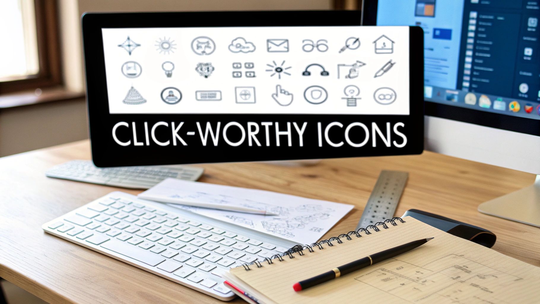
Bringing Your Icon Ideas to Life with Sketches
This is where the magic really starts—turning those abstract ideas into something you can actually see. Don't worry about being an artist. The goal here is pure exploration and speed, not a gallery-worthy masterpiece.
It’s always tempting to jump straight into a tool like Figma or Illustrator, but trust me, that's a trap. Digital tools trick you into obsessing over pixel-perfect lines and flawless curves way too early, long before you’ve even nailed down the core concept. Good old-fashioned pen and paper frees you from that pressure.
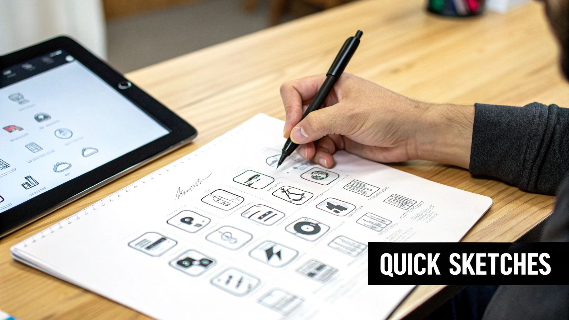
Brainstorming Visual Metaphors Rapidly
First thing's first: you need to translate your icon's purpose into a visual. If the icon is supposed to mean "secure," what does that look like? A lock? A shield? A key? Get them all down on paper.
Give yourself just 10-15 minutes to brainstorm as many rough ideas as you can.
- Quantity over quality is key here. Your first idea is almost never your best one, so fill a whole page with tiny, quick drawings.
- Play with different compositions. What if you combined ideas? Maybe that "secure" icon is a shield with a checkmark inside it.
- Think in basic shapes. Boil every concept down to its simplest forms—circles, squares, triangles, and lines.
This rapid-fire approach helps you get all the obvious clichés out of your system, which often opens the door to more interesting and memorable concepts. It's a low-stakes way to weed out weak ideas early, saving you a ton of time down the road. The principles are very similar to logo design, which you can read more about in our guide on how to sketch logo ideas.
The best icons are almost always built on the ghosts of a dozen discarded sketches. Every rough drawing gets you one step closer to clarity, letting you test your concept long before you ever commit to a vector design.
Refining and Testing Your Strongest Concepts
Once you have a page full of ideas, take a step back and circle the three to five sketches that feel the strongest. You're looking for the ones that are instantly recognizable and get the message across without a second thought.
Now you can spend a little more time on these few. Draw them a bit larger, clean up the lines, and think about the balance between the elements.
Even at this early stage, you can do a quick "squint test." Seriously, just step back from your sketches and squint your eyes until they're blurry. Does the core shape and meaning still come through? If it just turns into a blob, it’s not going to work when it’s shrunk down to a tiny size on a screen. This simple trick is an incredibly valuable part of making an icon that stays legible everywhere it’s used.
Bringing Your Icon to Life in Vector Software
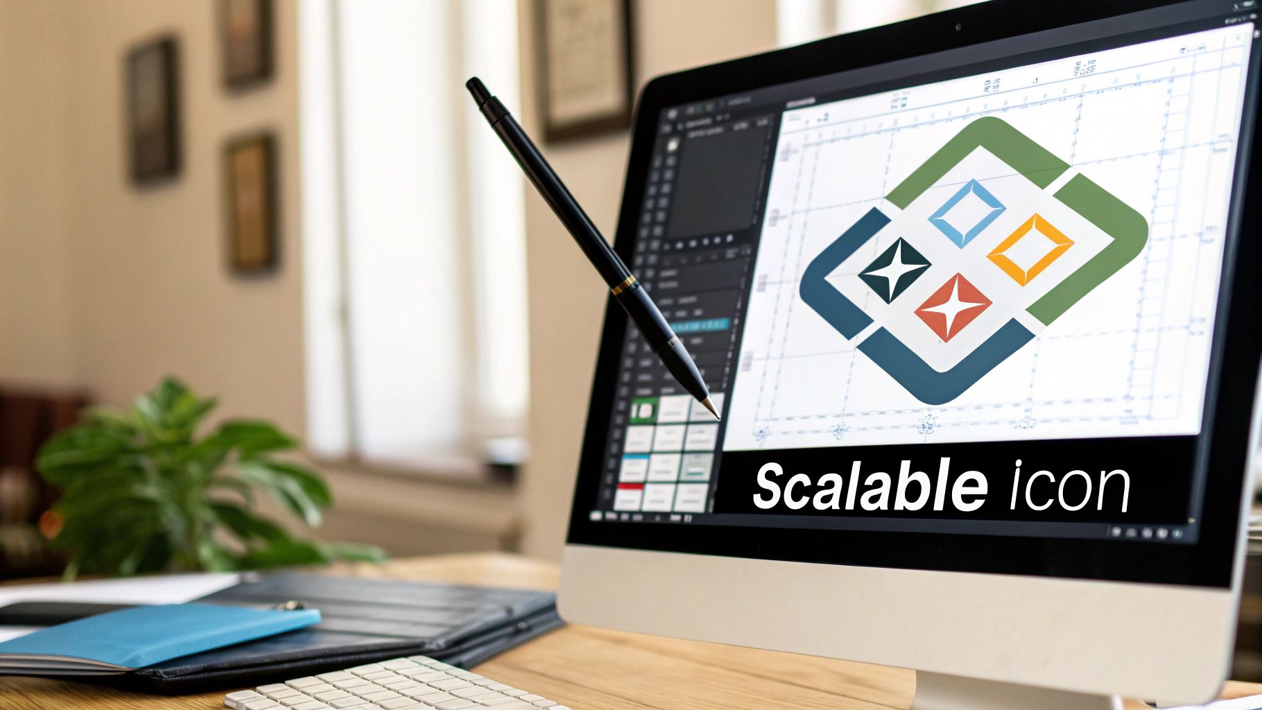
Once you’ve got a sketch you're happy with, it’s time to move it to the digital canvas. This is the stage where we build the final, polished icon, and for that, vector software is absolutely essential. I'm talking about tools like Adobe Illustrator or Figma.
Why vector? Because vector graphics are built with math, not pixels. This means your icon can be scaled to any size—from a tiny app icon on a watch to a massive billboard—and it will always stay perfectly sharp. This is non-negotiable for professional work. We're about to turn that hand-drawn idea into a precise, scalable masterpiece.
Building on a Grid With Basic Shapes
Every well-designed icon needs a solid foundation, and that starts with a grid. Before I draw a single path, I set up a pixel grid in my software. This simple step is the secret sauce for creating icons that look balanced and intentional, guiding every decision about spacing and alignment.
From there, I look at my sketch and break it down into its most basic geometric parts. That gear icon for "settings"? It's not a complex shape; it's really just a circle with a few rectangles cut out of it. Thinking this way makes the whole process faster and more precise.
- Start with circles, squares, and rectangles to build the main structure.
- Use Pathfinder or Boolean operations to combine or subtract shapes, creating complex forms without free-handing them.
- Decide on a consistent stroke weight, like 2px, and apply it everywhere for a unified look.
This methodical approach is what gives your final icon that clean, visually stable feel.
Mastering Curves With the Pen Tool
While basic shapes can get you surprisingly far, you'll eventually need to create custom curves. This is where the Pen Tool comes in. It can seem a bit tricky at first, but it's the key to making an icon that doesn't feel overly rigid or boxy.
My best advice? Use as few anchor points as you can. More points create lumpy, awkward curves that are a nightmare to edit. Think of it as connecting the dots—only place an anchor point where a curve actually changes direction. This gives you those smooth, elegant lines you're after.
An icon's scalability isn't just a technical feature; it's a strategic one. A vector-first workflow ensures your design remains professional and consistent across every user touchpoint, from a smartwatch to a 4K display.
If you're still deciding on which software to use, our guide on graphic design software for beginners is a great place to start.
Ultimately, working in vector is all about the power of formats like SVG (Scalable Vector Graphics). The flexibility of SVGs has had a huge impact on modern design, especially when paired with bold, geometric styles. This approach uses clean lines and simple shapes to create an instantly recognizable visual language—perfect for brands that want to communicate trust and reliability. This ensures your icons look fantastic on any screen, without ever losing quality.
Crafting a Consistent and Recognizable Style
Icons almost never stand alone. Think of them as a visual family, where each member needs to look like it belongs. The real magic happens when you move beyond designing a single symbol and start building a unified visual language for your entire user experience.
This language is built on a set of simple, repeatable rules. These rules are your secret weapon for ensuring that the icon for "settings," "profile," or "cart" all feel like they came from the same reliable place. When things are consistent, users know what to expect, and that builds trust.
Nailing Down Your Icon Set's DNA
Before you get too deep into designing individual icons, you need to establish a style guide. This isn't about stifling your creativity—it's about setting up a smart framework that makes every design decision faster and more cohesive down the line.
Your guide should really just answer a few core questions:
- Filled vs. Outline? Pick a default. Outline styles tend to feel lighter and more modern, while filled icons can feel more substantial and are sometimes easier to see at tiny sizes.
- What's the Line Weight? Decide on a standard stroke thickness. Sticking to a consistent weight, like 2px, is probably the most impactful thing you can do to create harmony.
- Sharp or Rounded Corners? Will your corners be crisp and sharp, or soft and rounded? Define a specific corner radius (say, 4px) and stick with it.
- What's the Color Palette? Keep it simple. Most UI icon sets look best with just one or two main colors, plus a neutral for backgrounds.
A great icon system is like a well-written sentence. Each icon is a word with a specific job, but when they're all put together with the same grammar and style, they tell a much bigger, clearer story.
The Undeniable Power of Simplicity
Our screens are more crowded than ever, which is why a minimalist approach to icon design isn't just a trend—it's a necessity. Minimalism is all about cutting out the visual noise. We're talking about ditching the extra gradients, shadows, and fussy details to make things clearer and easier on the user's brain. For a deeper look at where things are headed, you can see how icon design trends are evolving on bigredillustration.com.
Here’s a good way to think about it: the more visual information you pack into an icon, the harder someone has to work to figure out what it means. When you rely on basic geometric shapes and a clear hierarchy, your icons become instantly scannable. This not only makes your interface feel more intuitive but also ensures your icons don't turn into unrecognizable blobs when scaled down.
Every line and shape should have a clear purpose. If an element doesn't add to the icon's core message, it’s probably just getting in the way.
Exporting Your Icon for Any Platform
So you've nailed the design and your vector icon looks perfect on your artboard. That’s a huge milestone, but we're not quite at the finish line. An icon's real job begins when it leaves your design software, and how you export it makes all the difference.
This final step is less about creativity and more about technical know-how. Every platform—from websites to app stores—has its own set of rules. Getting the export wrong can turn your sharp, beautiful icon into a blurry, pixelated mess or a file that slows everything down. Let's get it right.
Choosing the Right File Format
Picking a file format isn't just a random choice; it dictates how your icon will perform in the wild. You’ll mostly be dealing with three key players, and knowing when to use each is non-negotiable for making an icon that works flawlessly.
SVG (Scalable Vector Graphics): This is the undisputed champion for web and user interfaces. Since SVGs are code-based, they can be scaled up or down to any size without a hint of quality loss. They’re also incredibly lightweight, which is fantastic for site performance. For any icon living on a website or in a digital product, start with SVG.
PNG (Portable Network Graphics): When you need a pixel-based image with a transparent background, PNG is your best friend. It’s the standard for app icons on both iOS and Android and is perfect for any scenario where SVGs aren't supported. Unlike JPEGs, PNGs handle sharp edges and transparency beautifully.
ICO (Icon File Format): This one is a little old-school but still critical for one specific job: favicons. You know, those tiny icons that show up in your browser tabs. The magic of the
.icoformat is that it can bundle multiple image sizes into a single file, allowing the browser to pick the perfect one for the job.
Grasping the differences is key. If you want to go deeper, our guide explaining different logo file types is a great resource.
The infographic below highlights how consistent design elements tie an icon set together. Preserving this consistency during export is crucial.
As you can see, the rules you set for color, line weight, and style form a visual language. Your export settings need to protect that language.
A Quick Guide to Icon File Formats
Here’s a quick-reference table to help you decide which format to use and when.
This table should serve as a handy cheat sheet as you prepare your files for different applications.
Sizing and Optimization Best Practices
You can't just export one file and expect it to look great everywhere. With high-resolution screens like Apple's Retina displays now the norm, you have to provide multiple sizes to keep your icons looking sharp.
A standard workflow is to export raster icons at 1x, 2x, and 3x resolutions. So if your base UI icon is 32x32 pixels, you'll also need to export 64x64 pixel and 96x96 pixel versions to cover all your bases.
Once you have your final files, there's one last crucial step: optimization.
Don't skip this. Running your images through a compression tool can shrink the file size dramatically with zero visible loss in quality. For PNGs, I always use a tool like TinyPNG. For SVGs, there are specialized tools that clean up the code. This tiny action makes your icons load faster, improving the overall user experience in a small but meaningful way.
When to DIY vs. Hire a Professional Icon Designer
So, you need an icon. The big question is: do you roll up your sleeves and tackle it yourself, or do you bring in a pro? This is a critical decision that really depends on what the icon is for.
For things like internal tools, super early mockups, or maybe a personal side project, going the DIY route is often the smart play. Using an online icon maker or even just sketching something out yourself can be fast, cheap, and good enough to get the job done when the stakes are low.
But when that icon is going to be front-and-center for your customers—think a mobile app icon on the App Store or a set of icons that define your brand's user interface—the investment in a professional designer is worth every penny. A pro brings a level of strategic thinking and technical polish that you just can't fake. They understand the subtle visual language that makes a brand feel trustworthy and legitimate.
When a Professional Is Non-Negotiable
Here's the hard truth: a poorly designed icon can make your entire brand look amateurish. It’s often the first visual handshake you have with a user, and if it feels cheap, it can directly hurt user trust and even lower conversion rates.
A professional designer obsesses over the details you might not even think about, from ensuring the icon scales perfectly on any screen to considering the psychological impact of its shape and color.
A great mobile app icon isn't just decoration; it's a powerful tool for growth. Research has shown that a well-designed, optimized app icon can boost user acquisition by up to 25%. That's because people respond to visuals that instantly communicate an app's purpose and grab their attention in a crowded marketplace.
If you’ve decided that hiring an expert is the right move, understanding the ins and outs of outsourcing graphic design is a fantastic next step. Remember, an experienced designer doesn't just deliver a pretty picture; they create a strategic asset that strengthens your brand and helps you hit your business goals.
Got Questions About Icon Design? Let's Clear Things Up.
Diving into icon design always stirs up a few key questions, especially for those new to the process. I see the same handful of queries pop up time and again. Let's tackle them head-on with some straight-to-the-point advice.
What's the Best Software for Making Icons?
Stick with vector-based software. This is non-negotiable for professional work. My go-to tools are Adobe Illustrator, Figma, or Sketch.
Working in vector means your icon is built from mathematical points and paths, not pixels. This is a lifesaver because you can scale it up to the size of a billboard or shrink it down for a smartwatch screen without it ever getting blurry or pixelated.
Should I Go With Filled or Outline Icons?
This really comes down to your brand’s personality and where the icon will live. There's no single "right" answer, but here's a quick way to think about it:
- Outline icons tend to feel airy, modern, and a bit more sophisticated. They work great when you want a lighter touch.
- Filled icons are often bold, grounded, and easier to spot at a glance, especially when they're tiny. They have more visual weight.
The golden rule here is consistency. Pick one style and stick with it across your entire icon set. Mixing filled and outline icons in the same interface almost always looks accidental and can really confuse the user.
What Size Should My Artboard Be?
Start big, but think small. I always design my icons on a large, square canvas—something like 1024x1024 pixels. This gives you a ton of space to perfect the details without feeling cramped.
But here’s the most important part of my workflow: I constantly check how the icon looks at its final, real-world size. Zoom out to see it at 16x16 pixels or 32x32 pixels. Does it turn into an unrecognizable blob? If so, you need to simplify. The details that look great at 1024px can completely vanish when the icon is shrunk down. An icon that isn't clear when it's small has failed its one job.
Ready to create a brand identity that stands out? The experts at Softriver craft custom logos and branding packages that make a lasting impact. Get your professional design today!