
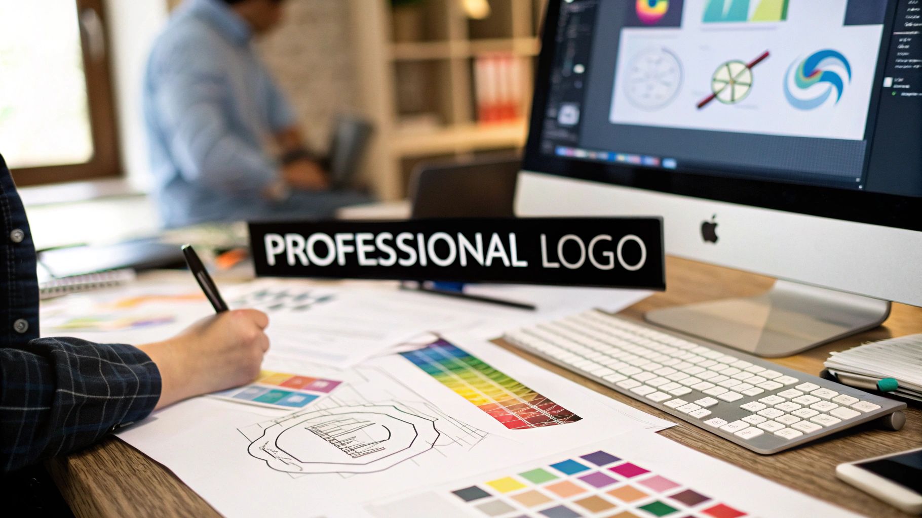
Creating a professional logo isn’t just about making something look good. It’s a thoughtful process that unfolds in four key stages: strategy, concept development, digital execution, and final delivery. This journey takes you from defining your brand and researching your audience to sketching ideas and ultimately building a scalable vector design that builds trust and makes you stand out.
Why a Professional Logo Is Non-Negotiable
Before we jump into the creative side of things, let’s talk about why a well-designed logo is one of the most important assets your business will ever have. It's so much more than a pretty graphic. It’s the face of your brand, the first thing people see, and it’s responsible for that gut feeling—that instant recognition and trust—that wins over potential customers.
In a marketplace overflowing with noise, a great logo acts as a powerful visual shortcut. It communicates your company's personality and values in a single, memorable glance. A professional logo isn't just a design choice; it's one of your most fundamental marketing essentials.
The Power of Visual Identity
Think about it: your logo is often the very first handshake between your business and a new customer. Research shows just how critical that first impression is. A staggering 75% of consumers can recognize a brand by its logo alone, which shows you its raw power as an identifier.
Even better, using a consistent logo across all your platforms can boost revenue by up to 23%. That’s proof that great design, applied consistently, directly impacts your bottom line. On the flip side, about 60% of consumers admit to avoiding brands with logos they find unattractive or weird. A bad logo doesn't just fail to attract—it actively pushes people away.
This infographic breaks down the key stages of the logo design process, from the initial strategy to final delivery.
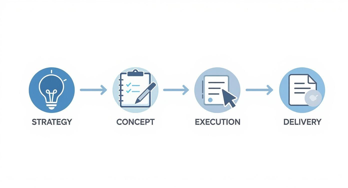
As you can see, a successful logo isn't just a quick sketch. It's the result of a deliberate, multi-stage workflow designed to produce a strategic asset.
To help you get a clearer picture of this process, here's a quick summary of the core pillars that support every great logo design project.
The Four Pillars of Professional Logo Design
These pillars form the foundation of a process that ensures the final logo isn't just visually appealing but also strategically sound.
What Makes a Great Logo
A truly effective logo isn't just a matter of taste; it’s built on solid design principles. Think of these less as strict rules and more as guiding concepts that ensure your final design is functional, memorable, and built to last.
Simplicity: The most iconic logos are almost always the simplest. A clean, uncluttered design is easy to recognize at a glance and stays legible whether it’s on a giant billboard or a tiny favicon in a browser tab.
Memorability: Your logo has to be distinctive enough to stand out and stick in people's minds. A unique mark prevents confusion with your competitors and helps you build real brand equity over time.
Versatility: A professional logo has to work everywhere. It needs to look just as sharp in a single color (like on a promotional pen) as it does in its full-color version on your website.
A logo becomes the visual representation of a business's values and emotions in a single glance. Simplicity is key for memorability and adaptability across platforms.
When you start thinking this way, you shift your focus from just making something that looks cool to creating a strategic business tool that gets real results.
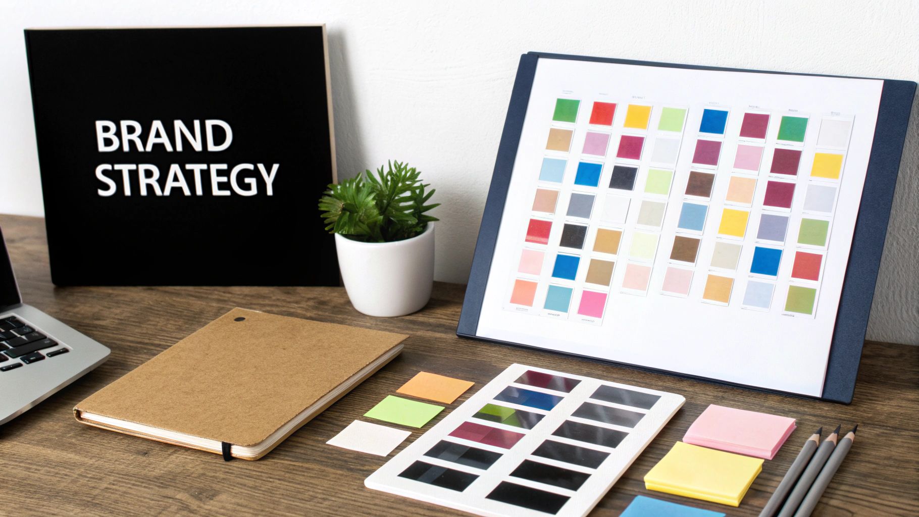
Laying the Foundation: Brand Strategy First
Before you even think about opening a design program, the journey to a great logo starts with a simple question: "What are we all about?" This is the strategic bedrock of the entire process. Without it, you’re just making a pretty picture. With it, you’re forging a powerful tool that tells your story and connects with the right people.
Jumping straight into Illustrator is like trying to build a house without a blueprint. Sure, you might end up with four walls and a roof, but it won't be sound, and it won't feel like home. Your brand strategy is your North Star, the guide that informs every choice you make, from the weight of a font to the psychology behind a color.
Define Your Brand's Core Identity
So, what's the soul of your brand? It’s that unique mix of your mission, your values, and your personality. Nailing this down is crucial, so take your time and get specific.
Start by answering a few honest questions:
- What is our mission? Think bigger than what you sell. A local coffee shop isn't just selling caffeine; its mission might be "to create a welcoming third place for our community to connect." That feels different, right?
- What are our core values? Pick three to five non-negotiable principles. Are you all about sustainability? Unbeatable customer service? Disruptive innovation? These values need to come through in your visuals.
- What is our brand personality? If your brand walked into a room, what would it be like? Is it buttoned-up and sophisticated? Playful and a bit quirky? Or maybe it's rugged and ready for anything. A few solid adjectives here go a long way.
Getting this right is the first major step in creating a full brand identity. If you want to go deeper on this, our guide on what brand identity design is and how to build one is a great next read.
Understand Your Audience and Competitors
A logo never exists in a bubble. It has a job to do: speak to your ideal customer and stand out from the crowd. This means it’s time for a little research.
First, who are you talking to? Get a clear picture of your target audience. Think about their demographics, what keeps them up at night, and what they aspire to. A logo for teenage gamers is going to have a completely different vibe than one for C-suite executives.
Next, size up the competition. Pull the logos of your top three to five competitors and lay them all out.
- What are the common threads? Is everyone using the color blue? Are serif fonts the standard?
- What’s working for them, and what just feels generic or dated?
- Most importantly, where are the gaps? Finding a visual lane that nobody else owns is your opportunity to carve out a unique space.
The point isn't to copy anyone. It's about understanding the visual conversation happening in your industry so you can decide how to join in—or how to shake things up.
Create a Visual Mood Board
Okay, you've got the strategy and the research. Now it's time to start turning those abstract ideas into a tangible visual direction. Enter the mood board.
A mood board is simply a curated collage of images, colors, textures, and fonts that capture the feeling you're aiming for. It's a visual brainstorm.
Go on a hunt for inspiration. Use Pinterest, design blogs, photography sites—anywhere you can find visuals that resonate with your brand's personality. Don't just look for other logos; pull in anything that evokes the right mood.
Your mood board isn't the final design—it's a compass. It gets everyone on the same page about the aesthetic and stops the feedback process from becoming a chaotic mess of personal opinions.
Once you’ve gathered 20-30 images, start looking for patterns. What colors keep popping up? Is there a consistent typographic style? This refined collection becomes the direct inspiration for your sketches, ensuring your creative work is always tethered to your strategy.
This groundwork is what makes a logo memorable. After all, research shows 59% of shoppers prefer buying from brands they recognize, and a strong logo is the cornerstone of that recognition. You can find more stats on the importance of a recognizable visual identity that really drive this point home.
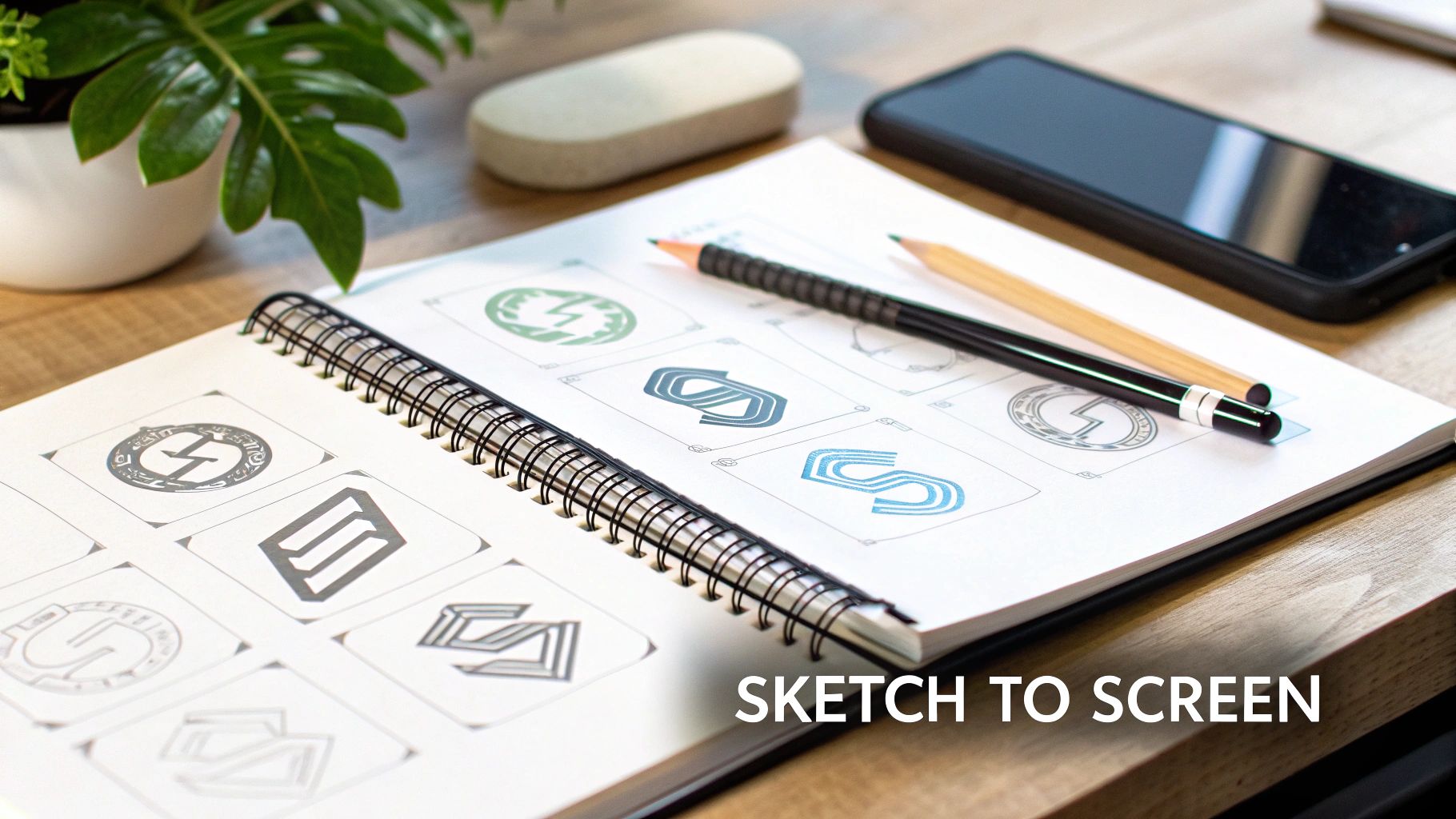
From Sketch to Screen: Bringing Your Logo Concepts to Life
Alright, you've done the strategic groundwork. You have a solid brand brief and a mood board that captures the right vibe. Now for the fun part—turning those abstract ideas into something you can actually see. This is where your brand’s personality starts to get its face.
But hold on. Step away from the computer. Before you touch a single pixel, grab the most powerful (and cheapest) tool in your arsenal: a pencil and paper. Sketching is your secret weapon for brainstorming, letting you blast through dozens of ideas without getting bogged down by software.
Why You Should Always Start with a Sketch
Sketching is all about freedom. It tears down the technical walls and lets your creativity run wild. The goal here is pure quantity over quality. Don't get hung up on perfect lines or clean shapes; you're just trying to get as many raw thoughts onto the page as possible.
Think of it as a creative sprint. Set a timer for 30 minutes and see if you can fill a page with 20-30 quick, rough logo ideas. This little exercise forces you to get past your first, most obvious thoughts and unearth the more interesting concepts hiding underneath. If you want a deeper dive into this process, we have a whole guide on how to sketch logo ideas effectively.
As you sketch, play around with the different types of logos to see what feels right for your brand. A quick drawing can tell you almost instantly if a style is a good fit.
- Wordmarks: All about the name itself, like Google or Coca-Cola. Try out different lettering styles—are you bold and blocky? Sleek and elegant? Quirky and playful?
- Symbols or Pictorial Marks: An iconic, image-based logo like the Apple silhouette or the Twitter bird. What single object or abstract shape could tell your brand's story?
- Combination Marks: The best of both worlds, pairing a symbol with a wordmark. Think of the Nike swoosh alongside the name—it’s instantly recognizable.
Separating the Good from the "Meh"
After your timer goes off, you'll have a page (or two) of scribbles. It's time to switch hats from creator to curator. Take a break, grab a coffee, and come back with fresh eyes.
Circle the sketches that have a spark. Which ones feel the most memorable? Which ones align with the brand personality you defined earlier? You're not looking for the prettiest drawing; you're looking for the strongest idea.
Pro Tip: Ask yourself this one simple question for each sketch: "If I saw this for three seconds, would I remember it an hour later?" This is a great gut check to weed out concepts that are too generic or overly complicated.
Your mission is to narrow down the entire collection to just 3 to 5 of the most promising concepts. These are the winners you’ll carry forward into the digital phase. This step is crucial because it focuses your energy where it matters most.
The Bridge Between Paper and Pixel
Now you're ready to move to the screen. That messy, hand-drawn sketch holds the DNA of your final logo—it has the core idea, the energy, and the personality that you’ll now refine with digital tools.
So many iconic logos started as nothing more than a quick doodle on a napkin. That initial spark gets carefully translated into a vector format, where every line is perfected, every curve is balanced, and every proportion is dialed in.
This journey from an imperfect sketch to a polished final product is the essence of professional logo design. The sketch gives the logo its soul, and the software gives it a sharp, professional body. By following this workflow, you ensure your final design is not only technically perfect but also authentic to your original creative vision.
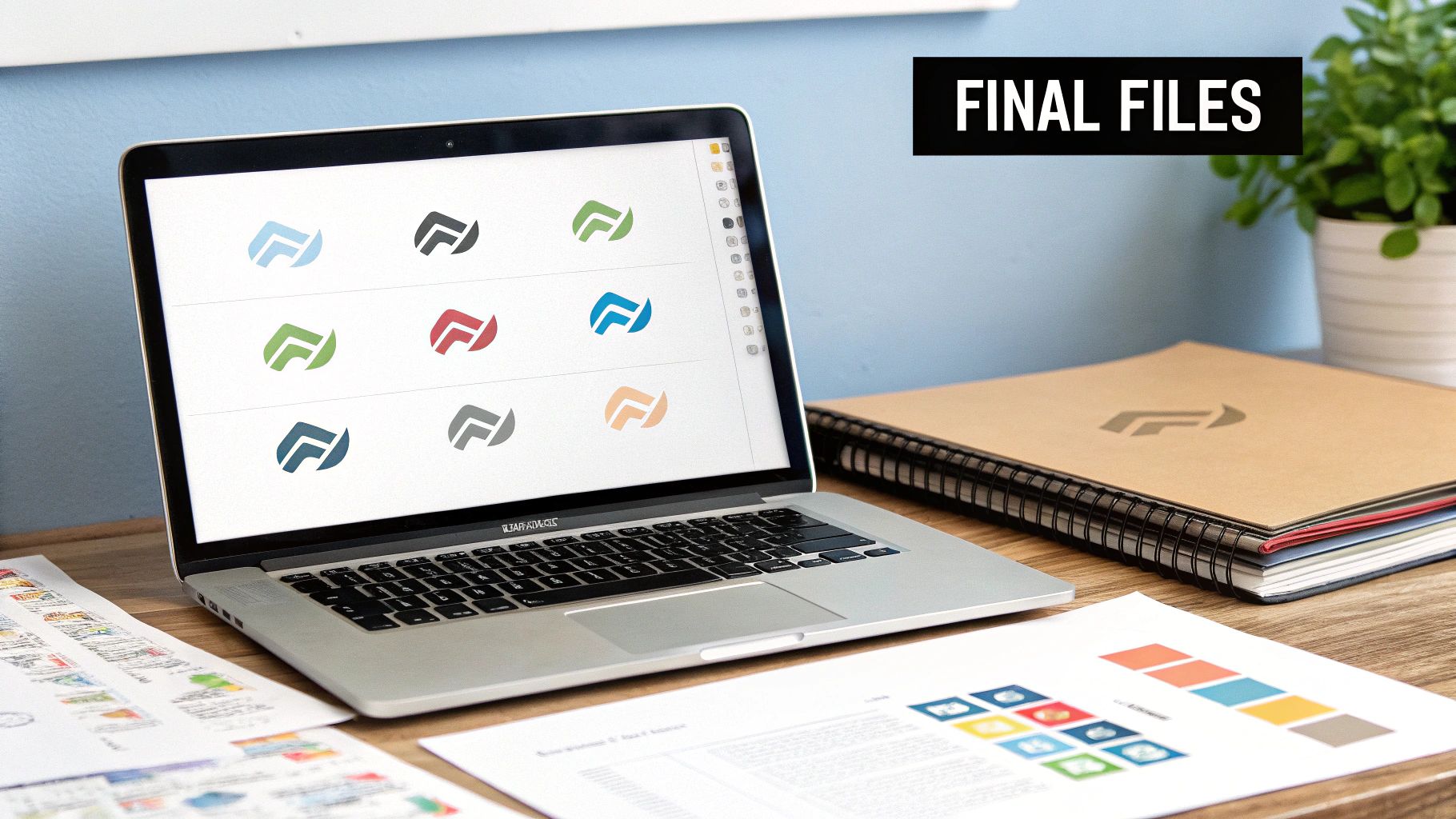
Bringing Your Logo to Life with Vector Software
The image above gives you a peek into a designer's world—specifically, Adobe Illustrator, the industry workhorse for logo design. This is where the magic happens, where your best sketch gets a serious upgrade from a rough idea to a polished, professional brand asset.
Okay, you've got your winning sketches. Now it's time to move from the freedom of pencil and paper to the precision of vector software. This is the nitty-gritty of logo design, the part where you carefully build, tweak, and perfect every last line. And just to be clear, forget about pixel-based tools like Photoshop for this job. For logos, it’s vector or nothing.
Why Vector is the Only Way to Go
So, what’s the big deal with vector? Unlike pixel-based images (like a photo), a vector graphic is built with math—a series of points, lines, and curves. This means you can stretch it from the size of a tiny app icon to a massive billboard, and it will stay perfectly crisp and clean. No blurriness, no jagged edges.
This infinite scalability is exactly why every professional logo is always built as a vector. If you create a logo in a pixel-based program, it's going to look like a mess the moment you try to enlarge it. A vector logo, on the other hand, ensures your brand looks sharp and credible everywhere it appears.
The Essential Tools of the Trade
Jumping into software like Adobe Illustrator or Affinity Designer can feel overwhelming at first, but here’s a little secret: you don't need to know every single button and menu. To build a solid logo, you just need a good handle on a few core tools.
Start by getting comfortable with these:
- The Pen Tool: This is your bread and butter. It lets you draw custom, precise shapes by placing anchor points and manipulating curves. Getting the hang of the Pen Tool is a rite of passage for every designer, giving you total control over the form of your logo.
- Shape Tools: The humble rectangle, ellipse, and polygon tools are your best friends. They’re the building blocks for countless iconic logos. You can start with these perfect geometric shapes and then twist and modify them into something completely new.
- The Pathfinder/Shape Builder: Think of these as your digital scissors and super glue. They let you combine, subtract, merge, and divide simple shapes to create far more complex forms. Want to create a crescent moon? Just subtract one circle from another. It’s that simple.
A great logo is often just a clever combination of simple geometric shapes. The Pathfinder tool is where you can really get creative, building intricate designs from basic elements with absolute precision.
Getting Typography Just Right
If your company name is part of the logo, the typography you choose is just as crucial as the symbol itself. A font has a personality—it’s your brand’s voice. The playful, rounded font that’s perfect for a toy store would feel completely wrong for a serious financial firm.
But it's not enough to just type out the name and call it a day. Real craftsmanship comes from kerning—the meticulous process of adjusting the space between individual letters. This fine-tuning creates a more balanced, harmonious look that just feels right. Sometimes, designers even go a step further and customize letterforms, tweaking a font to make it truly one-of-a-kind.
Building a Smart Color Palette
Color is pure emotion. It’s one of the most powerful tools you have for shaping how people perceive your brand. When you’re developing your color system, don’t just settle for one favorite color.
A versatile brand palette should include:
- A Primary Color: This is your hero, the main color everyone will associate with your brand.
- Secondary Colors: One or two supporting colors that complement your primary choice.
- A Neutral: A go-to black, white, or gray for text and backgrounds.
Here’s a critical pro-tip: your logo absolutely must work in a single color. Before you fall in love with your palette, test your design in solid black and solid white. If it’s still strong and recognizable, you’ve got a winner. This is non-negotiable for things like single-color printing, stamping, or embroidery.
As you finalize the details, it’s always a good idea to see what’s happening in the wider design world. For instance, designers are now using AI tools to iterate on concepts faster, while trends like 3D logos and motion are becoming huge for digital-first brands. You can check out the latest design directions shaping the industry to make sure your final design feels current and connects with today's audiences.
Refining and Delivering Your Final Logo Files
A logo isn't really “done” just because it looks good on your screen. The last leg of the design process is all about testing and preparation, and it’s arguably the most critical. This is where you ensure your hard work translates perfectly into the real world, no matter where your brand needs to show up.
Think of it as the quality control phase. You have to be confident the design is versatile enough to handle any situation you throw at it. After all, a logo that shines on a website but falls apart on a business card isn't professional—it's a liability.
Putting Your Design Through a Stress Test
Before you pop the champagne, it's time to test your logo’s flexibility. This isn't just about looks; it's about pure, unadulterated function. A truly strong logo is one that communicates clearly under any and all conditions.
Here’s a quick checklist I run every final design through:
- The Scalability Test: First, shrink it way down. Does it hold up as a tiny favicon in a browser tab? Now, imagine it blown up on a massive billboard. If details get lost or the whole thing turns into a fuzzy mess at either extreme, you need to simplify.
- The One-Color Challenge: This is a big one. Does the logo work in solid black? What about solid white (often called a "knockout" or "reversed" version) on a dark background? This is non-negotiable for things like merchandise embroidery, vinyl decals, or simple one-color print jobs.
- Background Versatility: Drop your logo onto different backgrounds. Try it on busy photographs and on top of the various solid colors from your brand palette. If it gets lost in the noise, you might need to create an alternate version with a subtle outline or contained within a shape.
If your design is failing these tests, it’s not about making a few minor tweaks. It usually points to a deeper issue, like the concept being too complex from the start. A truly solid idea should be able to handle these challenges without breaking a sweat.
Gathering Constructive Feedback
You've tested the logo yourself, and now it's time for a fresh set of eyes. But be strategic about who you ask for an opinion. Showing it to your mom or your best friend might get you some polite compliments, but it probably won't deliver the actionable insights you actually need.
Instead, present your final design to a small, trusted group. Ideally, these are people who understand your target audience or at least have a decent eye for design. The key is to avoid asking, "So, do you like it?" That question just invites vague, subjective opinions.
Ask targeted questions to get useful feedback. Try prompts like, "What three words come to mind when you see this?" or "What kind of company do you think this logo represents?" This helps you gauge if the design is communicating the intended message.
Their answers will quickly reveal whether your logo's personality aligns with your brand strategy. If people describe your slick tech startup logo as "traditional" or "a bit old-fashioned," you know you've missed the mark somewhere. Listen, take good notes, and be willing to make those final adjustments.
Building the Ultimate Logo Package
Once the design is locked in, your last job is to create a comprehensive delivery package. This is the complete toolkit that you (or your client) will pull from for years to come. Providing the right files from the get-go prevents a world of future headaches, like pixelated images on a t-shirt or weird colors on a printed flyer.
A professional logo package should always include different file types and color variations to cover both print and digital needs. When you're getting files ready for print, you absolutely need to be thinking about professional quality standards like understanding 300 DPI resolution for printing.
At a minimum, your export list should include:
- Full-Color Version: The primary, go-to logo with its complete color palette.
- All-Black Version: For single-color applications where black is needed.
- All-White (Reversed) Version: Essential for using your logo on dark backgrounds.
For each of these color variations, you'll need to export a handful of specific file formats. Honestly, getting this right is so important that we wrote a whole guide on it. You can learn which logo file types you need and why to make sure your logo's integrity is protected everywhere it goes.
Common Logo Design Mistakes to Avoid
Even with a solid game plan, it's surprisingly easy to fall into common traps that can sink your logo's effectiveness. Honestly, knowing what not to do is just as crucial as knowing what to do. Sidestepping these mistakes early on will save you from a painful and expensive rebrand later.
A great logo should feel timeless, not like a flavor of the month. One of the biggest blunders I see is jumping on a short-lived design trend—think of all the swooshes and gradients that screamed "early 2000s." It might look fresh for a hot minute, but it will quickly date your brand and make you look out of touch. The goal should always be a simple, memorable mark that will still look good in ten years.
Overlooking Simplicity and Versatility
Another frequent misstep is making the design way too complex. A professional logo has to be a chameleon; it needs to look just as sharp as a tiny favicon in a browser tab as it does embroidered on a polo shirt. If your design is packed with intricate lines, too many colors, or flashy effects, it’s going to turn into an unrecognizable blob when you shrink it down.
Here’s a pro tip: always test your design in a single color. If the logo loses its punch or becomes confusing in plain black and white, it means you're relying too heavily on color and the underlying form isn't strong enough. This is a critical stress test that many DIY designers completely forget.
A logo's real strength is in its core concept and structure. If it's clear, balanced, and recognizable in its simplest form, it will work anywhere you need it to—from print to pixels.
Choosing the Wrong Typography
The font you choose does more than just spell out your company's name—it screams personality. Using a generic, overused font like Comic Sans or Papyrus is an instant red flag for amateurism. At the same time, picking a font that’s hard to read or doesn't fit your brand's vibe creates a weird disconnect with your audience.
Here are a few typographic nightmares to avoid at all costs:
- Poor Kerning: The spacing between letters matters. When it's awkward or inconsistent, it just looks unprofessional and makes your name hard to read.
- Too Many Fonts: Stick to one or two fonts that work well together. Anything more is just visual noise that creates chaos.
- Trendy but Unreadable Scripts: That fancy script might look elegant, but if your customers can't figure out what your brand name is, your logo has failed its most basic job.
In the end, learning how to design a professional logo means spotting these potential landmines before you step on them. By sidestepping these common mistakes, you’re ensuring your logo is more than just a pretty picture—it's a hard-working, functional asset for your brand.
A Few Common Questions About Logo Design
When you're diving into the logo design process, a few questions tend to pop up again and again. Getting these sorted out early on can save you a lot of headaches down the road and make sure your investment really pays off.
How Much Should a Logo Really Cost?
This is probably the number one question, and the answer is... it depends. You could use a simple logo maker for under $100, or you could work with a top-tier agency and see a bill for over $10,000.
Most small businesses find themselves somewhere in the middle. A good freelance designer will typically charge between $300 and $2,500. The final price tag really hinges on their experience level, how many different concepts they'll explore with you, and what final files you'll get.
What's the Big Deal with Vector vs. Raster Files?
You'll hear designers talk about this a lot, and it’s crucial. Here’s the simple breakdown:
A vector logo (usually an SVG or AI file) is made from mathematical formulas. Think of it like a recipe. You can tell it to make a cake the size of a billboard or a cupcake, and it will be perfectly crisp and clear every single time. This is what you need for professional use.
A raster logo (like a JPG or PNG) is built from a grid of tiny squares, or pixels. When you try to make it bigger, the image just stretches those pixels, and things get blurry and jagged fast.
Always, always make sure your final logo package includes vector files. It’s non-negotiable for true versatility.
How Many Colors are Too Many?
It's tempting to want a logo that uses all your brand colors, but simplicity is almost always more effective. Most iconic logos stick to just one to three colors. This makes them easier for people to remember and can significantly lower your printing costs for things like merchandise and stationery.
A great rule of thumb from my own experience: if your logo doesn't work in solid black and white, it's not strong enough.
A logo that holds its own in a single color is a logo that will look good anywhere—from a busy website header to a simple embroidered polo shirt. Keeping these points in mind will help you steer your project with confidence, ensuring you end up with a design that's not just beautiful, but built to last.
Ready for a logo that's professionally designed without the long wait? The team at Softriver specializes in creating high-quality brand identities quickly. Let's build something that sets you up for success. Learn more at https://softriver.co.